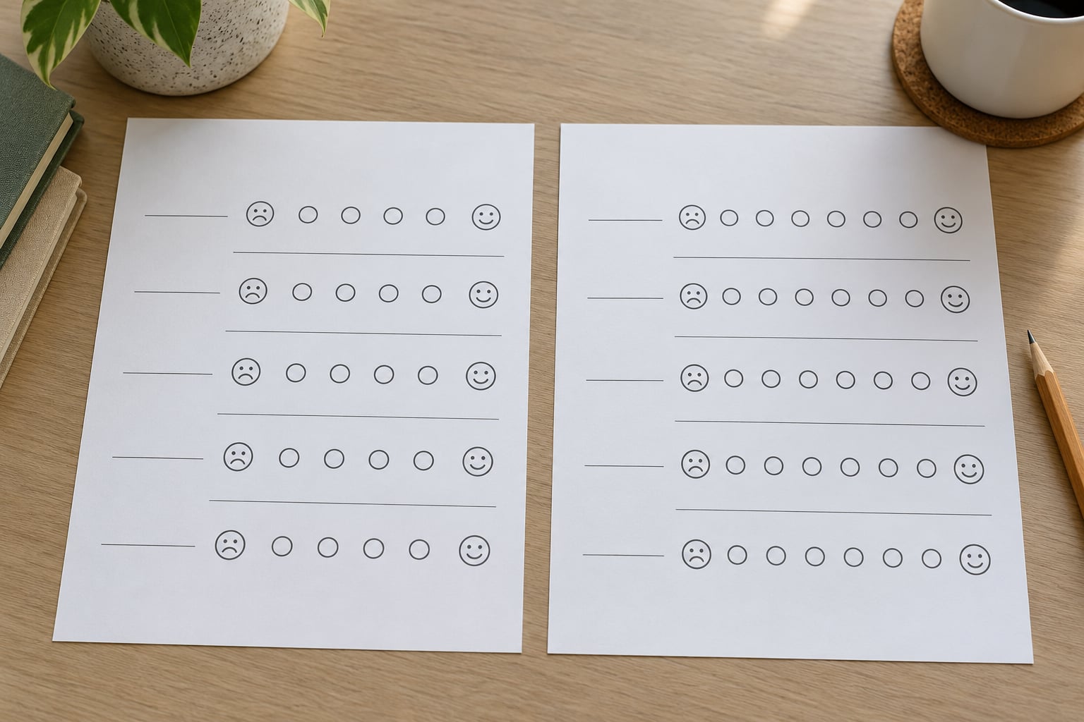
Survey scales change the answers you get because answering is not reporting. People read the question, search their memory for relevant episodes, form a judgment, and then squeeze that judgment into the exact options you handed them. Change the options and you change which memories surface, how strong the judgment sounds, and which answer becomes the path of least resistance.
That sounds like a subtlety. It is not. Swap a 5-point scale for a 7-point one, add a neutral option, or reword an endpoint, and the distribution can move more than a real change in attitude would. I’ve watched teams chase a satisfaction “drop” that turned out to be a reworded anchor on the previous wave.
Below is the working list of what actually moves numbers, in the order I’d work through it when something looks off.
Table of Contents
- Why Survey Scales Change the Answers You Get
- How Scale Changes Alter Measurement
- Which Parts of a Scale Make the Biggest Difference?
- 1. The number of response options
- 2. Unequal visual intervals
- 3. Anchor wording
- 4. How labels get interpreted
- 5. Direction
- 6. Midpoint structure
- 7. Category order
- 8. Forced choice versus neutral alternatives
- 9. Prior questions and context
- How Response Style Creates Scale Differences
- Before-and-After Examples of Better Scale Design
- How to Test and Document Scale Changes
- Frequently Asked Questions
- Are five-point survey scales always better than seven-point scales?
- Does changing the direction of a rating scale change the results?
- How can researchers compare data after changing a survey scale?
- Do verbal labels create more bias than the number of scale points?
- How do we know whether two survey scales are measuring the same thing?
- Conclusion: Make Scale Changes Deliberate
Why Survey Scales Change the Answers You Get
There are five separate explanations and they get confused all the time, so it’s worth separating them before you go hunting.
Measurement is about what the response options are. A 3-point scale asks for a direction of travel. A 0-to-10 scale asks for an intensity. Those are different constructs even when the stem is identical, and no amount of analysis repairs the gap.
Wording is about the labels on the points. “Poor” to “Excellent” and “Bad” to “Great” are not interchangeable, and neither is “Neither agree nor disagree” sitting next to a stem with a negative word in it.
Order is about where the option falls and what came before it. Position in a list, the question asked immediately above, and the number of options itself all shift selection rates.
Context is about everything around the item: the topic of the questions before it, whether the survey is on a phone, whether the respondent has been asked fifteen similar things already.
Respondent-level explanations are about the person, not the scale. Some people agree with whatever sits in front of them. Some pick something plausible fast to get through it. These tendencies interact with scale design rather than sitting beside it.
How Scale Changes Alter Measurement
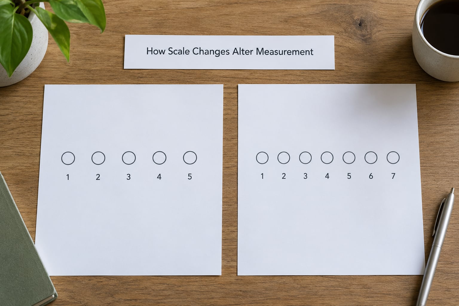
The clearest way to see a scale changing the construct is to hold the question fixed and vary only the format. Ask “How satisfied are you with your current provider?” four ways and you get four different measurements, not four versions of the same measurement.
| Format | What it actually asks | What happens to the distribution |
|---|---|---|
| 3-point (Bad / OK / Good) | Direction only | Most mass in the middle, no intensity information, strongest floor and ceiling crowding |
| 5-point fully labelled | Direction plus a coarse strength | Most familiar, endpoints used lightly, middle categories absorb the undecided |
| 7-point fully labelled | Direction plus finer strength | Wider spread, slightly more people at the extremes, more work per item |
| 0-to-10 numeric | Intensity on a numeric distance | Concentrates around 7 to 8, splits 9 and 10, invites recall of a remembered number rather than a judgement |
| Slider (visual analog) | Continuous position | Fewer committed endpoints, more mass in the middle band, sensitive to the start position |
Note that none of these rows is a bug. Each is fine for a purpose. The mistake is picking one by default and then describing the result as though the underlying opinion is now on a comparable footing with the last wave.
One practical consequence: the more points you add, the more spread you get. Researchers switching between formats report a higher standard deviation on fully labelled numeric scales, which looks like “more insight” in a chart and is really just a wider instrument. If you are comparing means across formats, that difference is instrument, not population.
Which Parts of a Scale Make the Biggest Difference?
Here are nine effects I would rank, roughly in order of how often they explain a strange result. The ordering is a starting point, not law. The size of each one depends on the topic, the sample, the mode, and what you plan to do with the data.
1. The number of response options
More points feel more precise. They mostly add work. Five labelled points is the format almost every respondent has answered before, so the interpretation cost is near zero. Seven points costs a little. Ten or eleven points starts to invite a different strategy: people pick a round number, or they treat the middle of the range as “normal” and the ends as reserved for opinions they feel strongly about.
The honest benefit of more points shows up in distributions with real density. If you expect bimodal answers, seven or more points can separate two clusters that a 5-point scale smears together. If you expect a broad unimodal spread, extra points mostly add noise.
2. Unequal visual intervals
A scale that looks like a thermometer implies equal spacing. Most ratings are not equally spaced: the gap between “disappointed” and “mildly annoyed” is not the same size as the gap between “delighted” and “ecstatic”. When the visual presentation implies equal steps, respondents compress the ones that feel far apart and stretch the ones that feel close.
Pictorial face scales are the clearest case, where the vertical distance between faces deliberately does not match the wording. That is a feature. It is only a bug when the numeric values get treated as interval data in a mean.
3. Anchor wording
The endpoints do more work than the middle. Ask how often you feel “irritated” and offer “rarely” at one end, and you get less irritation than when you offer “all the time”. Same question, same people, different frequency reports, because the anchor supplied a reference point the respondent did not otherwise have.
This is the classic context effect from Schwarz’s self-report work: the options become the standard the respondent measures their own experience against.
4. How labels get interpreted
“Strongly agree” is not understood consistently. Some people read it as the strongest agreement available. Some read it as agreement they feel strongly about, which is weaker. If you have categories between your endpoint and agreement, you can sometimes catch the difference.
Balanced anchors (a category at each point) generally increase accuracy on attitude items because they remove the job of guessing what the intermediate numbers mean. Fully labelled scales also push people toward the extremes, since extreme words pull attention.
5. Direction
Reversing the scale, or flipping positive wording to negative, breaks more than it looks like it should. People misread reversed stems, and they misread the answer options as well.
In a matrix with a handful of items the error rate on reversed rows is usually small. In a long matrix, straight-lining across rows becomes more likely and reversed rows are where it shows up. That is one reason researchers report more misresponse on reverse-coded items when they add points.
6. Midpoint structure
An odd-point scale with a neutral category offers an exit. Some people take it because they genuinely sit in the middle. Others take it because a category called “neutral” is socially easier to pick than an admission of not knowing, which inflates the share of people who are undecided.
An even-point scale forces a side. That is useful when neutrality tells you nothing, and it costs you when neutrality is the truthful answer. The trade is predictable: even points raise the total of positive and negative responses, and the base of respondents who simply did not want to commit.
There is a demographic and cultural wrinkle worth knowing about. Use of the middle option varies by population, so a neutral category can look like a strong position in one segment and a shrug in another.
7. Category order
In any list, earlier options get picked more often. Position bias is well established, which is why serious questionnaires randomise option order for attribute lists rather than fixing a sequence.
Order also works through the response options you place next to a stem. Presenting “excellent” before “poor” and the reverse produces different selections at the extremes, and neither order is neutral by default.
8. Forced choice versus neutral alternatives
A separate mechanism from point count: whether a “don’t know” or “not applicable” option exists. Add one and some of the population moves into it, which lowers every substantive category at once. Remove one and that same population guesses, scattering across the middle.
For a knowledgeable, involved audience, forcing a choice usually improves data. For a general-population sample on an unfamiliar topic, an opt-out often gives you a cleaner read on the people who actually have an opinion.
9. Prior questions and context
Strack, Martin and Schwarz’s 1988 study is the one people remember. Ask life satisfaction first, then how many dates someone had in the past year, and the correlation is around +.66. Ask the dating question first and it drops to about -0.12. The same respondents, the same two measures, a different number.
Scale design and question order are the same problem wearing different clothes. A question placed after a depressing one behaves like a different question, whichever scale you put on it.
So: no effect size here is universal. If you need one number for your instrument, measure it on your population with your topic. Otherwise treat the ranking above as a debugging order.
How Response Style Creates Scale Differences
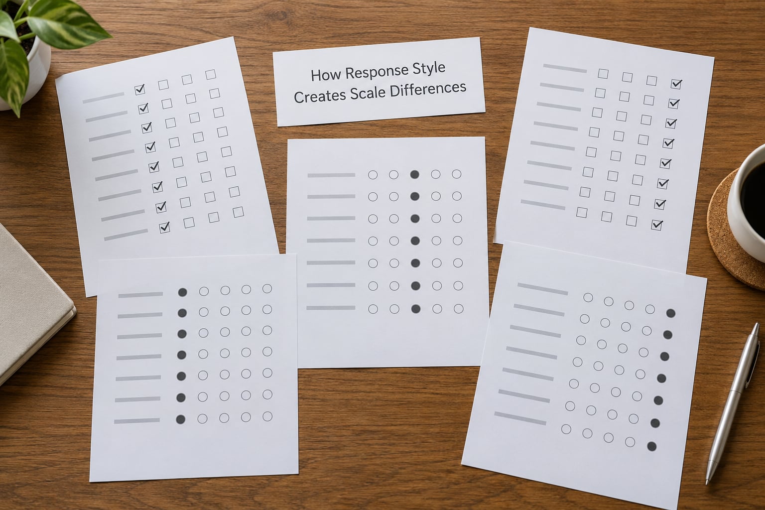
Scale effects are partly respondent effects. These are the habits that turn a scale into a slightly different instrument than the one on your screen.
Acquiescence is the tendency to agree with whatever is in front of you. It hits agreement scales hardest, and it explains a stubborn chunk of 60 to 70 percent agreement in attitude batteries. Swapping “agree” stems for direct questions reduces it.
Satisficing is the good-enough strategy: read enough of the item to answer plausibly and move on. It produces mid-range ratings and the occasional pattern that is right for the wrong reason. Long matrices and many-point scales both raise the odds of it.
Straight-lining is the extreme version, where the same response is clicked down a column. It is a data-quality flag more than an opinion. In a rectangular matrix it is easy to spot; in a one-item-per-screen mobile survey, nearly impossible.
Extreme responding is the habit of using only the ends. It clusters in small samples, in strong-opinion panels, and on scales where the endpoint words are vivid.
Midpoint preference shows up most in long surveys and on unfamiliar topics. A middle-heavy distribution in wave three of a tracking study usually means fatigue, not a sudden moderation in your market.
Scale-use differences between cultures, ages, and education levels are the reason one panel’s 1-to-5 scale looks like another panel’s 1-to-7 scale. This is a live problem in translated surveys, where the middle option carries different norms depending on where it is being answered.
Fatigue is the umbrella. Every item after the fortieth is answered with less of the respondent’s attention than the first ten, and the scale format decides how much that costs you. Three points with clear labels ages better than ten points with vague ones.
Before-and-After Examples of Better Scale Design
The fixes below are mostly about making the categories do the work that the respondent’s head would otherwise have to do.
| Construct | Weak version | What it invites | Revised version |
|---|---|---|---|
| Customer satisfaction | How satisfied are you? 1-5 | A single global impression with nowhere to put “it depends” | Overall, how satisfied are you with [provider]? 1 Very dissatisfied – 5 Very satisfied – Not applicable |
| Likelihood to buy | How likely are you to buy? 0-10 | Recall of a number rather than a judgment, with heavy 7-8 mass | How likely are you to buy in the next 3 months? Definitely will not – Probably will not – Might – Probably will – Definitely will |
| Brand personality | Rate this brand 1-5 on 12 adjectives | Straight-lining, and every adjective judged independently | Forced choice: which of these two words fits the brand better? Plus one 7-point item for warmth |
| Overall product experience | Rate your overall experience 1-10 | Extreme avoidance and a small peak at 7-8 | How would you describe your overall experience? Poor – Fair – Good – Very good – Excellent |
On the satisfaction row, the weak version looks harmless and is the single most common complaint in research ops threads: everyone lands on 4 or 5 because the scale has no home for a mixed experience. Add “neither” and the real spread shows up, at the cost of some genuine neutral voters moving there.
On brand personality, the change is bigger than it looks. Rating twelve adjectives independently imposes no trade-off, so every adjective can rate high, and feature-importance matrices behave the same way. UX researchers report product managers rating everything as important precisely because a rating scale never asked them to give anything up. A forced choice does ask.
On the likelihood row, watch the first response in the analysis. With a 0-to-10 format, the mode of the distribution carries the interpretation; with the labelled five-point version, the split between “probably will” and “might” carries it. Report them differently.
How to Test and Document Scale Changes
If a scale only changes formatting, it still needs to be chosen deliberately. This is the workflow I use before a wave goes live.
1. Define the construct in one sentence. “Satisfaction” is not a construct description. “How the customer feels about the overall service in the last 30 days” is. If you cannot write it, you cannot decide how many points you need.
2. Map answer options to meaningful categories. Every point should correspond to a position someone could actually occupy. If two adjacent options would produce the same action from you, merge them. This is the fastest way to shorten a scale honestly, rather than by chopping points off the end.
3. Decide the midpoint deliberately. Write one sentence saying what a neutral response would mean and when it should be used. If you cannot, use an even-point scale and accept the forced choice. If the panel is general public, offer a don’t know option instead of a midpoint and treat the two differently in analysis.
4. Pilot with cognitive interviews. Ten to fifteen interviews where people talk through how they read the scale tells you more than a pilot of 200 silent respondents. The classic test is to ask what a specific point means. If two people in five describe different positions, the labels are failing.
5. Check the mode. The same scale behaves differently on a desktop grid, a phone screen, and an interviewer-administered form. Sliders behave differently again, and their attribute effects, including where they start, are still not fully settled. If you changed device since your last wave, you changed the scale too.
6. Run a split-sample scale experiment. Randomly assign your sample to two formats, keep the stem identical, and compare the distributions. This is the method nobody on the research forums seems to have a clean walkthrough of, and it is straightforward: 90/10 split, both arms complete the same survey, you compare the shape of the answer distribution and the mean. It costs you precision on both arms and buys you a defensible answer about your own instrument.
7. Pre-test the full questionnaire, not the item. Scale effects compound with order, matrix length, and preceding questions. An item that behaves well alone can behave badly at position 30.
8. Document anchors, direction, and missing-data treatment. Write it into the questionnaire specification and keep it with the data. Also write down the scale on every chart and table, including years-old ones, because that is what nobody does and it is exactly what you need when someone asks why an older wave looks different.
One warning. Changing a scale after seeing the results, without a stated reason, breaks the trend and quietly invites the reader to treat everything after it as noise. If the change is justified, state it, keep the overlap, and report both formats for at least one wave.
Frequently Asked Questions
Are five-point survey scales always better than seven-point scales?
Five-point scales are the safer default because respondents have answered them many times and the interpretation cost is close to zero. Seven points earn their place when you expect a spread with real density, such as two clusters of opinion that a five-point scale would blur together. More points also mean more work per item, and in a long questionnaire that shows up as more middle-range and slightly careless answers. Pick the number your population can interpret comfortably, not the number that looks most precise.
Does changing the direction of a rating scale change the results?
Sometimes, and it is hard to predict which way. Reversing the scale or flipping a positive stem to a negative one confuses people, and the confusion does not cancel out evenly. In short items the errors are minor. In long matrices, reversed rows attract misreading and straight-lining, which is one reason researchers report more errors on reverse-coded items once scales get longer. If direction must change for consistency, say so in the questionnaire documentation and check the result against the previous wave rather than assuming equivalence.
How can researchers compare data after changing a survey scale?
You cannot cleanly, unless you plan for it in advance. Two workable routes exist. Run both formats in parallel for one wave as a split-sample experiment, which gives you a conversion estimate and a defensible bridge. Or keep the old items in the new questionnaire for one wave as an anchor set, so the overlap period connects the two series. Whatever you do, document the format, anchors, and direction on every chart, because an undocumented change is the main reason trend lines get misread as real movement.
Do verbal labels create more bias than the number of scale points?
Usually more. Point count changes how much room respondents have to express a judgment, and most of that extra room goes unused. Labels change what the judgment means, because the wording of the categories becomes the yardstick the respondent measures their own experience against. This is why reworded endpoints can shift reported frequency on the same question. Fully labelled scales also tend to pull people toward the extremes, since vivid words at the ends attract attention. If you have budget for one thing to get right, make it the anchor wording.
How do we know whether two survey scales are measuring the same thing?
Run three checks before assuming two scales match. First, map the categories of each scale onto the decision you will make, and confirm each point corresponds to a position a respondent could genuinely occupy. Second, ask ten to fifteen people in cognitive interviews what a specific middle point means to them. Third, put both formats in a split sample and compare the shape of the distributions, not just the mean. Different shapes mean different measurements, however similar the labels look on paper.
Conclusion: Make Scale Changes Deliberate
Define what the response scale has to measure, keep it stable when trend comparisons matter, pilot anything you redesign, and document every change you make. That is the whole discipline, and it takes an afternoon per questionnaire.
The immediate step: open your last three waves of results and check that the scale, anchors, and direction are identical across all of them. If they are not, you already know what is moving why survey scales change the answers you get in your data, and the trend line is not telling you what you thought it was telling you.