
A MaxDiff study — maximum difference scaling, also called best-worst scaling — shows each respondent several sets of options and asks them to pick the single most and single least appealing option in each set. Learning how to run a max diff study and read the results properly is mostly about discipline: a focused item list, a balanced design, enough tasks, and a scoring step that separates real differences from noise.
Most of the bad MaxDiff reports I have seen were not caused by a bad model. They were caused by six things that could have been fixed before fieldwork: an objective written as a topic instead of a decision, fifteen overlapping features, sets of eight items, a design nobody checked, a sample of 120, and a deck full of scores with no intervals.
The whole process takes two to four weeks of setup plus field time, and the hard part is front-loaded. Once you have decided what the study must inform, the rest is a sequence of checkable steps. Below is that sequence, from the first decision through to the recommendation.
Table of Contents
- What You Need
- Step-by-Step
- Step 1: Define the decision the study must support
- Step 2: Choose the right concepts or attributes
- Step 3: Select the max diff task structure
- Step 4: Build and check the experimental design
- Step 5: Recruit and define the sample
- Step 6: Collect and clean the data
- Step 7: Score and analyze the results
- A worked example
- Step 8: Check diagnostics and report the findings
- Common Mistakes
- Frequently Asked Questions
- How to read MaxDiff results?
- How is MaxDiff calculated?
- What is the recommended sample size for a MaxDiff survey?
- How many alternatives should be shown per task?
- What is a good MaxDiff score?
- Do MaxDiff scores need to sum to 100?
- Conclusion
What You Need
Before you open a survey tool, get these eight things settled. If any one of them is still vague, fieldwork will not fix it later.
- The decision. What specific choice will someone make differently because of this study? Rank ten messages for the campaign, or cut six features from the roadmap.
- The audience. The population that actually makes that decision, defined with the screener variables you will later use for quotas and subgroup analysis.
- The item list. The options being compared: features, benefits, claims, messages, packaging designs or concepts. Aim for eight to fifteen, with no two items saying the same thing.
- The sample size. Set by the number of items and the subgroups you need to read, not by what the panel happens to cost.
- A budget and timeline that includes incentive, panel fees, programming and a two-day analysis window nobody should compress.
- Tooling. A survey platform that supports best-worst task logic, plus analysis software — Q, Displayr, R or a specialist MaxDiff tool.
- A coding scheme agreed in advance for items, tasks and respondents, so the data file arrives already labelled.
- A written decision rule. Before you see a single result, decide what gap between two items counts as meaningful. Without it you will argue about the numbers in the debrief instead of deciding anything.
Step-by-Step
The workflow below runs in order. Steps one and two are where studies are won or lost, and they take an afternoon each.
Step 1: Define the decision the study must support
Turn the business question into a decision with a name, an owner and a date. Broad objectives produce vague item lists, and vague item lists produce rankings nobody acts on.
Write down what a useful result looks like before you build anything. If the decision is which two claims to test in the next round, then success is a clear top two with a visible gap between them, not a flat list of twelve. If the decision is which six features to keep, success is a defensible cut line with items three through eight sitting close enough together that a reviewer can argue about the boundary.
That distinction matters more than it sounds. A study designed to produce a cut line needs the mid-range items separated carefully. A study designed to crown a winner needs the top items to be well clear of the field. You cannot optimise for both in one questionnaire.
Step 2: Choose the right concepts or attributes
Build the item list from language your audience already uses, then test whether each item can be told apart from every other one. Two items that feel similar to you may feel identical to a respondent who has never read your deck.
Watch for near-duplicates disguised as specifics. Free shipping and fast delivery are one idea. Twenty-four-hour support and round-the-clock help are one idea. If you keep both, respondents will split their votes and both items will land in the middle of the ranking for no useful reason.
Balance the list across the dimensions that plausibly drive preference: some items that are functionally better, some cheaper in spirit, some more familiar, some newer. A list of ten items that are all nice-to-haves produces ten similar scores and tells you nothing about trade-offs. Aim for spread, then cap the list at around fifteen. Past that, respondent fatigue and item similarity both erode the discriminating power you paid for.
Step 3: Select the max diff task structure
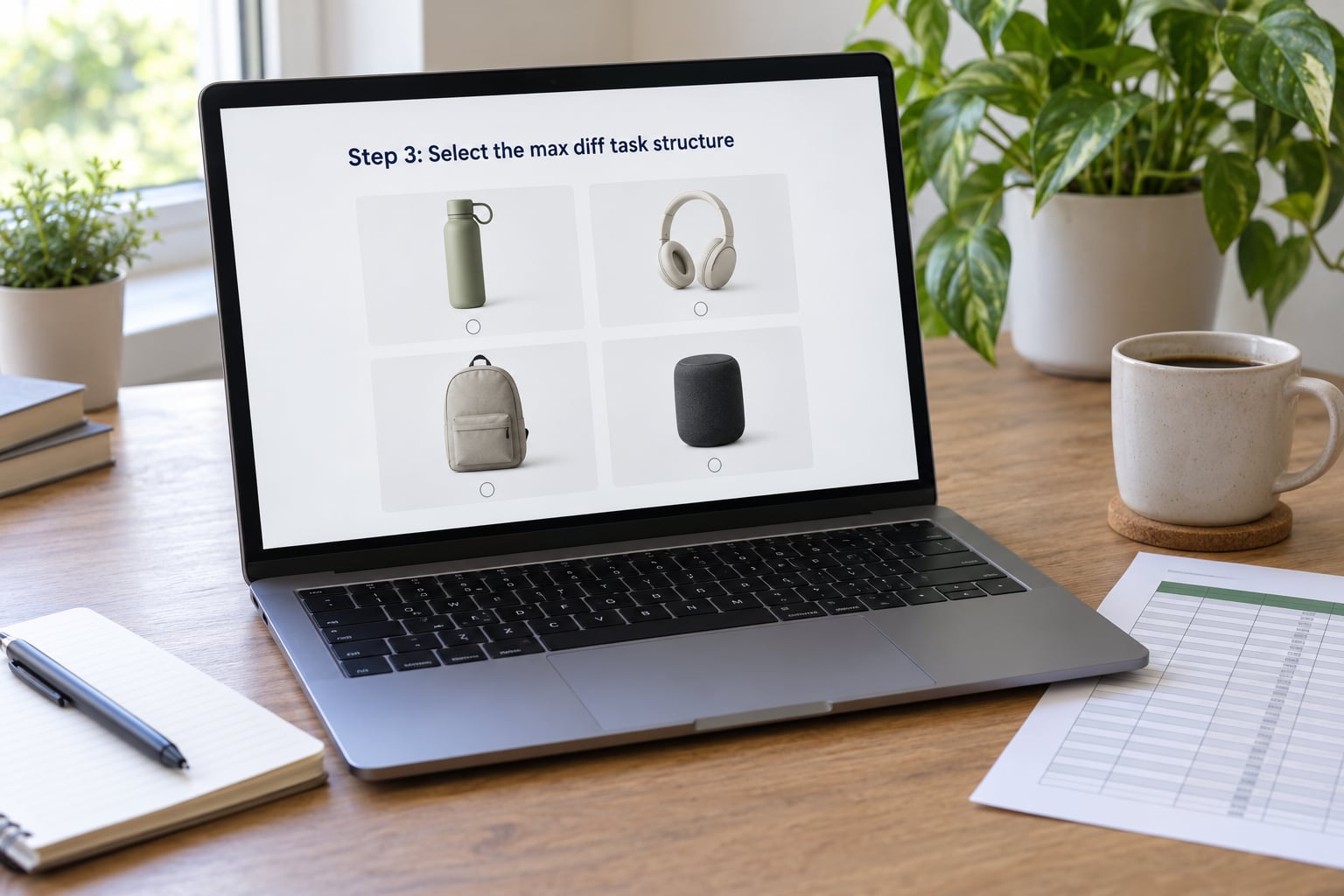
Two numbers define the task structure: how many options appear in each set, and how many sets each respondent completes. The standard rule of thumb is:
number of tasks = (3 × number of items) ÷ alternatives per task
So ten items shown five per set gives six tasks. Ten items shown four per set gives eight tasks. Each respondent then makes six or eight best and worst choices in a row, which is what turns raw opinions into something a model can rank.
Three to five alternatives per set is the usual working range. Three gives the sharpest contrast and the lowest fatigue. Six or more works, but respondents slow down and start guessing, and guessing is the fastest way to lose clean data.
The trade-off is straightforward: wider sets mean fewer tasks for the same coverage, narrower sets mean more clicking. The mistake is going wide and long at once — eight items per set across ten tasks is a long, tiring survey that produces the noisiest data per minute spent.
A typical task reads like this: Which of these five delivery options is most appealing? Which is least appealing? The respondent picks one of each. Nothing is rated on a scale, and no ties are allowed, which is what forces a genuine choice.
Step 4: Build and check the experimental design
The design is the grid of which items appeared together in which task. It must be balanced so that every item appears the same number of times and co-occurs with the others roughly equally often.
Check three things on every design before you field it:
- Balance. Each item appears the same number of times across the study. With ten items, five per set and six tasks, that is 6 × 5 ÷ 10 = three appearances each.
- Repetition. Each respondent should see each item at least once, and three times is the practical floor for a stable individual-level score.
- Column correlation. Items that always appear together cannot be told apart. Look for negative correlations between design columns, since that is what lets the model separate two similar items.
If the design check fails, escalate in this order: raise the number of tasks first, then cut the item count, then reduce alternatives per task. Adding tasks is usually the least damaging fix, because it costs field time and incentive rather than coverage.
Step 5: Recruit and define the sample
Most MaxDiff studies run with 300 to 500 completes. The binding constraint is not the headline number but how many times each item gets judged, so precision on a specific item comes from tasks per respondent times repeats, not from raw sample alone.
Three hundred is a sensible floor for stable item-level scores in a single market. Add sample for every subgroup you intend to read: a 10% segment inside a 300-person study gives you 30 people, which is enough to notice a pattern and not enough to defend it.
Set quotas on the screener variables that matter to the decision, and hold the sample to the target population rather than to whoever responds fastest. Quality control matters more here than in a rating survey, because a speeder who clicks a best and worst at random injects exactly the noise you are trying to measure away.
Step 6: Collect and clean the data
Monitor the field while it runs, not after. Look at completion rate by device, median task time and straight-lining — the same item chosen as best in every task, or a respondent whose worst pick matches the position of the worst pick every time.
Decide your exclusion rules before you look at results, so they cannot be bent later. Typical rules: completion time below a fixed threshold, straight-lining across all tasks, attention-check failures, and duplicate or fraudulent device fingerprints. Keep every exclusion in a log with the reason and the timestamp.
That log is what makes the study defensible. When a stakeholder later asks why the sample is 312 rather than 300, you want one page of exclusions to hand over, not a recollection. Run the analysis both with and without the marginal cases and check whether any conclusion depends on them.
Step 7: Score and analyze the results
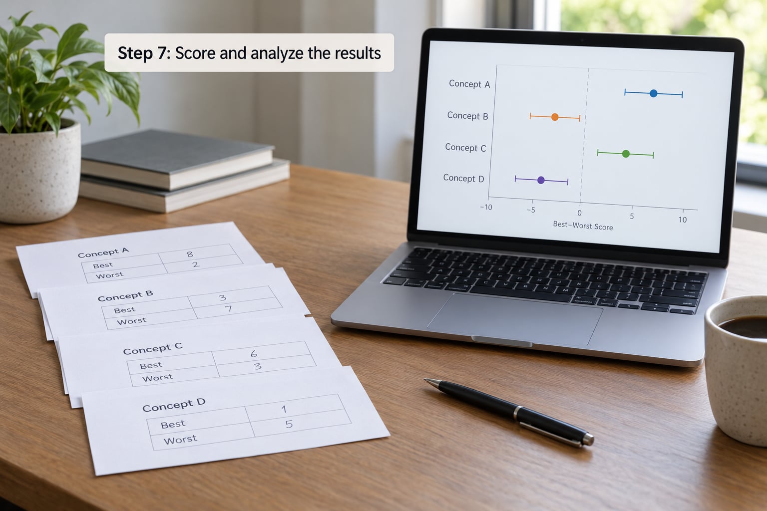
Most tools will offer several models. They differ in how they handle individual variation, and picking the simplest one that answers your question is usually right.
| Model | What it assumes | Use it when |
|---|---|---|
| Multinomial logit | Everyone shares one set of preferences | You need a fast, transparent read and no segmentation |
| Hierarchical Bayes | Each respondent has their own scores, pulled toward the group average | Default choice: you want individual-level scores, stable small-sample behaviour and share estimates |
| Latent class analysis | Respondents cluster into a small number of preference patterns | You suspect real segments exist and want to name them |
| Varying coefficients | Relationships differ by respondent characteristic | You need to explain scores using screener or usage variables |
The basic score is easy to compute by hand. Every task contributes one best pick and one worst pick, and the best-worst score for an item is the share of times it was chosen best minus the share of times it was chosen worst. The scores across all items average out near zero, which is why only the gaps between items mean anything.
A worked example
Ten features, five per set, six tasks, 300 respondents. That is 1,800 tasks and 9,000 item appearances, so each item appears 900 times and is judged best or worst a total of 1,800 times across the sample.
| Feature | Times best | Times worst | Best-worst score | HB utility | Preference share |
|---|---|---|---|---|---|
| Free shipping over threshold | 400 | 20 | 21.1 | 1.85 | 39% |
| Easy returns window | 320 | 40 | 15.6 | 1.10 | 18% |
| 24/7 live support | 250 | 70 | 10.0 | 0.72 | 13% |
| Price match guarantee | 190 | 100 | 5.0 | 0.38 | 9% |
| Two-year warranty | 150 | 140 | 0.6 | 0.10 | 7% |
| Loyalty points | 130 | 190 | -3.3 | -0.30 | 5% |
| Faster delivery window | 120 | 240 | -6.7 | -0.62 | 3% |
| Gift wrapping option | 100 | 290 | -10.6 | -0.95 | 2% |
| Store locator tool | 100 | 320 | -12.2 | -1.15 | 2% |
| Redesigned app | 40 | 390 | -19.4 | -1.13 | 2% |
Four things fall out of that table. Free shipping is not just first, it is well clear of second. Easy returns and 24/7 support look separated on the point estimates but their intervals touch, so treat them as a tie until more sample says otherwise. Loyalty points through store locator form one undifferentiated middle band. And the redesigned app scoring worse than gift wrapping is the kind of result that should trigger a follow-up conversation with product, not a line in a deck.
Utility scores are zero-centered, which means the average item sits at zero and one item at 1.10 is twice as preferred as an item at 0.55. That ratio property is the reason utilities are better than best-worst shares for communicating magnitude, even though shares are easier for a general audience to read.
Preference share converts each utility into the percentage of total preference that item absorbs, so the shares always add to 100. It answers a different question from the utility: not how much better item A is, but how much of the pie A takes. For a stakeholder deciding which two items to develop, share is often the number that ends the meeting.
Step 8: Check diagnostics and report the findings
Before the recommendation goes out, look at five diagnostics. Sample balance against the target population, task completion rate, root likelihood or the model fit statistic your software reports, consistency of the design, and whether any conclusion changes when marginal respondents are removed.
Then check the subgroup sizes one more time. A difference that only shows up in a 40-person segment is a hypothesis for the next study, not a recommendation. Report the segment, the number behind it and the interval, and let the reader decide.
Write the report in the order the decision needs it: the decision, the answer, the evidence with intervals, the caveats, and the diagnostics in an appendix. Put best-worst scores and shares in the main body; keep the model detail where the data team can find it.
Common Mistakes
Almost every MaxDiff failure I have worked through traces back to one of these, and every one of them has a concrete fix.
| Mistake | Why it hurts | Fix |
|---|---|---|
| Objective written as a topic | Vague question produces a vague item list | Name the decision, its owner and its date |
| Too many concepts, or near-duplicates | Votes split and mid-range items collapse | Cap at roughly fifteen and merge anything respondents would confuse |
| Unbalanced design | Similar items never get separated | Run the design check, then add tasks or cut items |
| Undersized sample | Intervals too wide to support a decision | 300 floor, plus headroom for every subgroup you will read |
| Leading descriptions | Items are scored on wording rather than meaning | Use neutral, parallel phrasing of equal length |
| Fixed option order | Position bias drives the result | Randomise set order and order within the set at fieldwork |
| Reading subgroups without checking n | Small cells produce confident nonsense | Print the base size beside every subgroup figure |
| Reporting percentages with no intervals | Readers treat noise as a finding | Show confidence intervals and flag overlapping pairs |
Two more deserve a sentence each. Never read a single task as a ranking: one best-worst choice tells you one item beat another in that set, and nothing about the items left out. And if your item list produces no spread at all, that is usually a list problem, not a model problem — go back to step two before you try a fancier estimator.
Frequently Asked Questions
How to read MaxDiff results?
Start with item-level utility scores and their confidence intervals, not the raw counts. Check whether the intervals of the two items you plan to compare overlap, then read preference shares to see how much of the total each item absorbs. Only after that should you look at subgroups, and only where the segment base is large enough to defend.
How is MaxDiff calculated?
Each task produces one best choice and one worst choice, which expand into pairwise comparisons between the options in that set. A model such as hierarchical Bayes or multinomial logit stitches those partial rankings into one utility per item, with the average utility fixed at zero so scores behave like a ratio scale.
What is the recommended sample size for a MaxDiff survey?
Most MaxDiff studies run with 300 to 500 completes. The binding constraint is usually tasks per respondent and repeats per item rather than the headline number. Treat 300 as a floor for stable item scores in one market, then add sample for every subgroup you plan to read.
How many alternatives should be shown per task?
Three to five alternatives per set is the usual working range. Three gives the sharpest contrast and the lowest fatigue, while six or more slows respondents down until they start guessing. If the item list is long, raise the number of tasks rather than widening the sets.
What is a good MaxDiff score?
There is no pass mark, because scores depend on your item list and sample. What matters is separation: whether the gap between two items is larger than the noise around it. A score near zero means average appeal, a positive score means above average, and the overall spread tells you how discriminating your list was.
Do MaxDiff scores need to sum to 100?
Preference shares do, because they turn utilities into percentages of total preference that add to 100. Best-worst scores and utility scores do not. Best-worst scores average near zero and utilities are zero-centered, so only the differences between items carry meaning, never the absolute values.
Conclusion
Start with the decision, not the survey. Write down the choice someone has to make, build an item list of eight to fifteen things that are genuinely different, then settle the sample size and the analysis plan before a single respondent is recruited.
That is the whole discipline behind a useful max diff study. The model is the easy part. What makes the results trustworthy is a balanced design, a sample sized for the subgroups you will read, exclusions logged before you look, and intervals printed next to every score so a two-point gap is never mistaken for a finding.
Run it that way in 2026 and the ranking you take into the room will hold up when someone asks why.