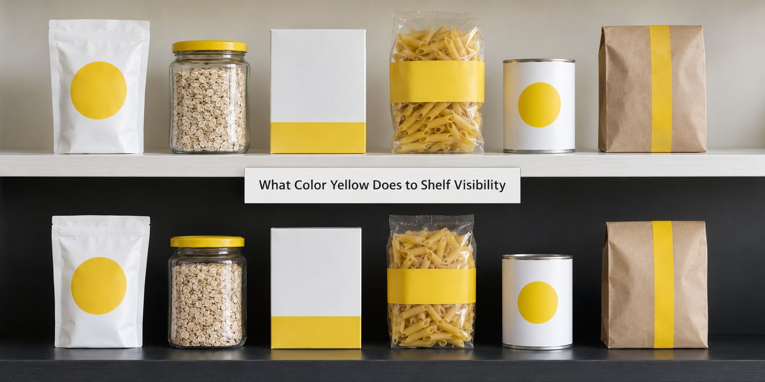
What color yellow does to shelf visibility depends less on the hue itself than on what sits next to it. Yellow carries high relative luminance, so it registers faster than most colours and tends to pull the eye earlier in the aisle. But it has almost no contrast against white, cream or pale packaging, so the same yellow can vanish into a bright shelf set while commanding a dark one.
In practice that makes yellow a strong attention colour and a weak information colour. It earns the first look. Whether the pack keeps that look depends on contrast, lighting, viewing distance, shelf height and how many rivals are shouting the same thing.
Table of Contents
- What Color Yellow Does to Shelf Visibility
- Why Yellow Can Stand Out on a Shelf
- Does Yellow Actually Improve Packaging Visibility?
- How Contrast Changes What Color Yellow Does
- Lighting, Distance, and Shelf Position
- When Yellow Helps Most and When It Does Not
- How to Use Yellow Without Overusing It
- How to Test Yellow Packaging in a Realistic Environment
- Frequently Asked Questions
- Is yellow always the most visible packaging color?
- What color background makes yellow packaging most noticeable?
- Does a small yellow accent make a product easier to find?
- Can yellow packaging colors fade or change on a shelf?
- How far away should shoppers be able to recognize yellow packaging?
- Should a brand use yellow for the whole package or only as an accent?
- Conclusion: Start with Contrast, Not Color Alone
What Color Yellow Does to Shelf Visibility
Yellow is one of the most detectable packaging colours a brand can use, and one of the easiest to waste. The mechanism is physical: yellow sits near the eye’s peak sensitivity region, so it sends a strong signal at low light levels and from further away than a mid-tone colour would.
That strength has a matching weakness. Yellow is bright, so it is also low-contrast against anything bright. A pale cream pack and a butter-yellow pack read as the same object from six feet away, and the yellow disappears into the block.
The designers I have spoken to about this keep landing on the same framing: colour is not the variable, contrast is. In shelf-set reviews I have read, the packs that got noticed were the high-contrast ones rather than simply the most colourful ones.
So the honest answer is that yellow improves detection when its neighbours are neutral, dark, cool or earthy. Against more brights, and against pale backgrounds under flat lighting, it can be among the least visible options on the shelf.
Why Yellow Can Stand Out on a Shelf
Three mechanisms do most of the work, and they are worth keeping separate because they pull in different directions.
Luminance is the first. Yellow reflects a large share of the light that hits it, which means it stays legible in dim aisles and at the back of a deep shelf where darker packs lose their edges. In a warehouse club or a big-box store with tall racks, that headroom matters.
Sensitivity is the second. Human vision is most responsive in the yellow-green region, so a yellow element tends to earn a first fixation sooner than an equally bright blue or red, particularly in peripheral vision. That is why yellow works so well for shelf talkers, end caps and signage meant to be caught at the edge of the eye.
Learned category cues are the third, and these are commercial rather than physical. Yellow carries associations that vary by market and by shopper: energy, optimism, caution, value pricing, fast food, banana and lemon flavour. A shopper may read yellow as “this is the cheap own-brand one” before they have read a single word.
None of that is the same thing as visibility. Conspicuity is a mechanical event. Meaning is an interpretation, and it can work against you. A yellow field that says promotional to one shopper says budget to another and warning label to a third.
Does Yellow Actually Improve Packaging Visibility?
Partly. The research supports a narrower claim than the trade blogs tend to make.
Eye-tracking studies consistently find that high-contrast elements and colour blocks drive first fixations, and that shoppers sort packs into coarse groups by colour before they read anything. Yellow performs well inside that sort, particularly in food, confectionery and kids’ categories where yellow-dominant packs are already the category norm.
What that research does not give you is a number saying “yellow lifts sales by X percent.” Lab and screen studies use stimuli that are cleaner and more static than a real aisle, where facings are uneven, lighting shifts, and a shopper is walking. Results from a controlled task translate to a store floor only loosely, and any figure quoted as a direct sales lift should be treated with suspicion unless the retailer counted the transaction.
Practitioners reading this kind of work usually land in the same place: use the research to pick candidates, then validate on a real shelf.
How Contrast Changes What Color Yellow Does
Contrast is the whole variable. The same yellow behaves completely differently depending on the colour behind and beside it.
| Background or neighbour | What yellow looks like against it | Shelf visibility result |
|---|---|---|
| White or pale cream | Edges blur, both read as light surfaces | Weak. Text needs dark-on-yellow inversion to survive. |
| Black or deep navy | Sharp boundary, maximum apparent brightness | Strong. The most reliable pairing for an accent. |
| Blue | Complementary contrast on the colour wheel | Strong. Common in confectionery and energy. |
| Green | Yellow-green packs can visually merge | Mixed to weak. Separate them with a dark line. |
| Red | Bright and bright; distinct outlines only | Mixed. Fine as two adjacent blocks, poor as small accents. |
| Brown, kraft, beige | Clear luminance step against the earthy neutral | Strong. Good for coffee, bakery and craft ranges. |
| Neutral grey or white fixtures | Yellow pops against grey, fades against white | Depends entirely on the fixture colour. |
One practical note from the table: white fixtures are the hard case. A yellow accent on a white shelf rail will disappear at any distance, which is worth knowing before you spec a yellow shelf strip.
Lighting, Distance, and Shelf Position
Same pack, same shelf, different conditions, different result. These are the variables most often left out of colour arguments.
Store lighting skews the problem. Fluorescent and LED tubes in older stores lean green, which dulls yellow and pulls it toward olive. Warm LEDs do the opposite and can blow out a bright yellow until it flattens into a white shape with no detail. Test under the lighting in the specific store, not under studio lights.
Gloss and metallisation change everything. A reflective yellow panel throws glare back at the viewer and reads as white; a matte yellow keeps its hue and its legibility. Metallic gold reads yellow enough to be part of the family, but it is much weaker on a shelf than flat colour.
Distance sets the job. At three feet you can read a small yellow seal. At twelve feet, you need a colour block spanning a decent share of the front panel. At thirty feet down an aisle, only a large field of colour survives, and hue stops mattering while value contrast takes over.
Shelf height matters for the opposite reason. Eye-level packs are already found; a yellow accent there has little left to add. Yellow earns its budget on lower shelves, where the shopper’s gaze is angled down and the pack has to fight a crowd of neighbouring bottoms.
| Test condition | What it measures well | What it misses |
|---|---|---|
| Controlled lab or screen test | First fixation, time to fixation, relative salience between two designs | Aisle clutter, uneven facings, walking speed, glare |
| Store shelf-set review | How the pack reads among its real category rivals | Why it worked; no causal link to sales |
| Timed recognition field test | Detection time and correct identification from realistic distance | Purchase intent and repeat purchase |
| Retail sales data | Actual rate of sale, the only real verdict | Isolating colour from price, promotion and position |
Notice that each row answers a different question. Shoppers will tell you which pack they saw first. Only the till tells you whether it sold.
When Yellow Helps Most and When It Does Not
Yellow works best where three conditions hold at once: the category neighbours are neutral or dark, the product benefits from a warm or appetising read, and the pack needs to be found rather than admired.
Strong fits include confectionery, where yellow is a category convention shoppers use to navigate, and snack and bakery packs sitting against kraft and brown ranges. It also does real work on new product launches, where the job is to trigger a look that an unfamiliar pack otherwise would not get, and on promotional shelf strips and end-cap signage read at the edge of vision.
Kids’ and family ranges are a natural home, with the caveat that you need contrast in the block colour itself so the logo and the product name stay readable at speed.
Yellow is a poor fit for premium and luxury positioning. Warm, bright, high-chroma fields read as accessible and promotional, and shoppers often use the two as opposites. A premium range with a dark ground and a small yellow seal can hold both signals; a full yellow pack cannot.
It also struggles in crowded sets where every competitor has adopted the same yellow. When six packs on the same shelf are all lemon-coloured, the yellow block stops differentiating and the pack needs a different lever, usually an unusual shape, a strong logo silhouette or an unexpected accent hue.
Muted, natural brands are another risk. A palette built on sage, clay and oat has a specific voice, and a saturated yellow block beside it looks pasted in. A dusty or mustard tone harmonises better than a bright one.
How to Use Yellow Without Overusing It
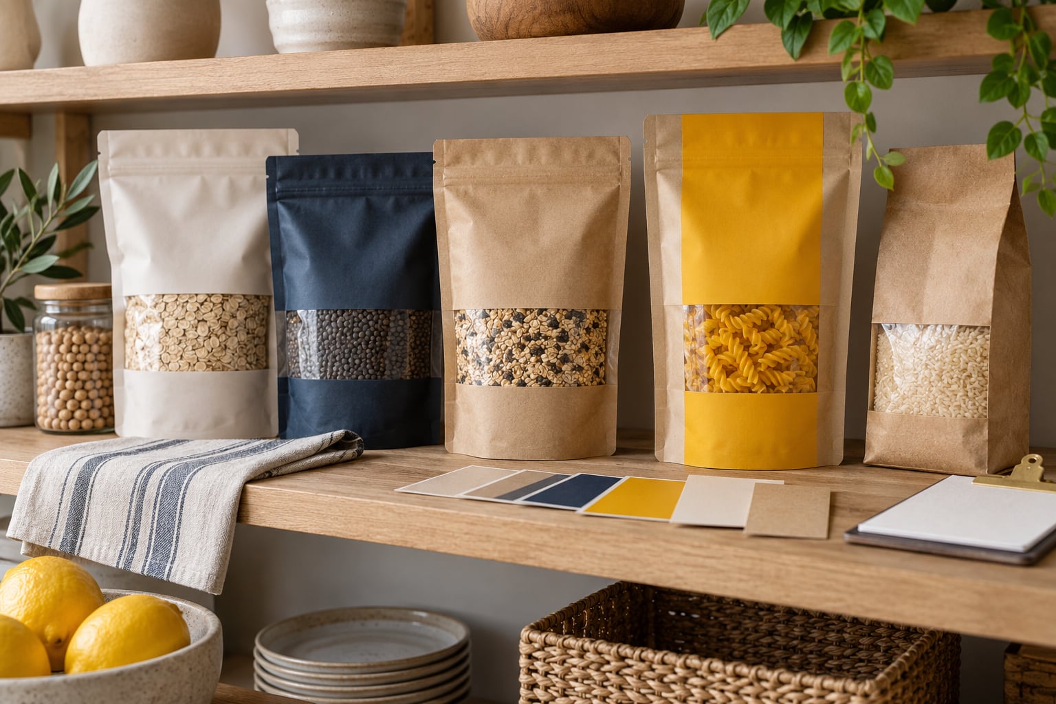
Pick the hue for the job, not the mood board. A bright lemon reads as energetic and sweet and is at its most useful in confectionery and kids’ products. Golden yellow sits closer to warmth and appetite and works across food, drink and bakery. Mustard is quieter, reads slightly vintage or craft, and holds up better against muted palettes.
Then check contrast before anything else. Put the pack next to its actual neighbours, not on a white studio background. If the boundary between pack and neighbour is hard to trace at arm’s length, the yellow is not doing its job.
Keep the proportion deliberate. A yellow accent that occupies roughly a quarter of the front panel gives you a colour block to notice and a dark or neutral field for the words. A full-yellow panel gives you a bright object with nowhere to put small type, because white-on-yellow fails badly and black-on-yellow only works at heavy weights and large sizes.
Protect the hierarchy. The eye should hit the brand first, then the product, then the reason to buy. Test whether the yellow band is pulling attention away from the logo, which is the most common thing I see go wrong with yellow-accented redesigns.
Finally, check that the yellow still works when the pack is in shade and when it is under a phone camera at low resolution. Retailers and shoppers both find products through images, and a yellow that reads as beige in a dim thumbnail is not doing much for you.
How to Test Yellow Packaging in a Realistic Environment
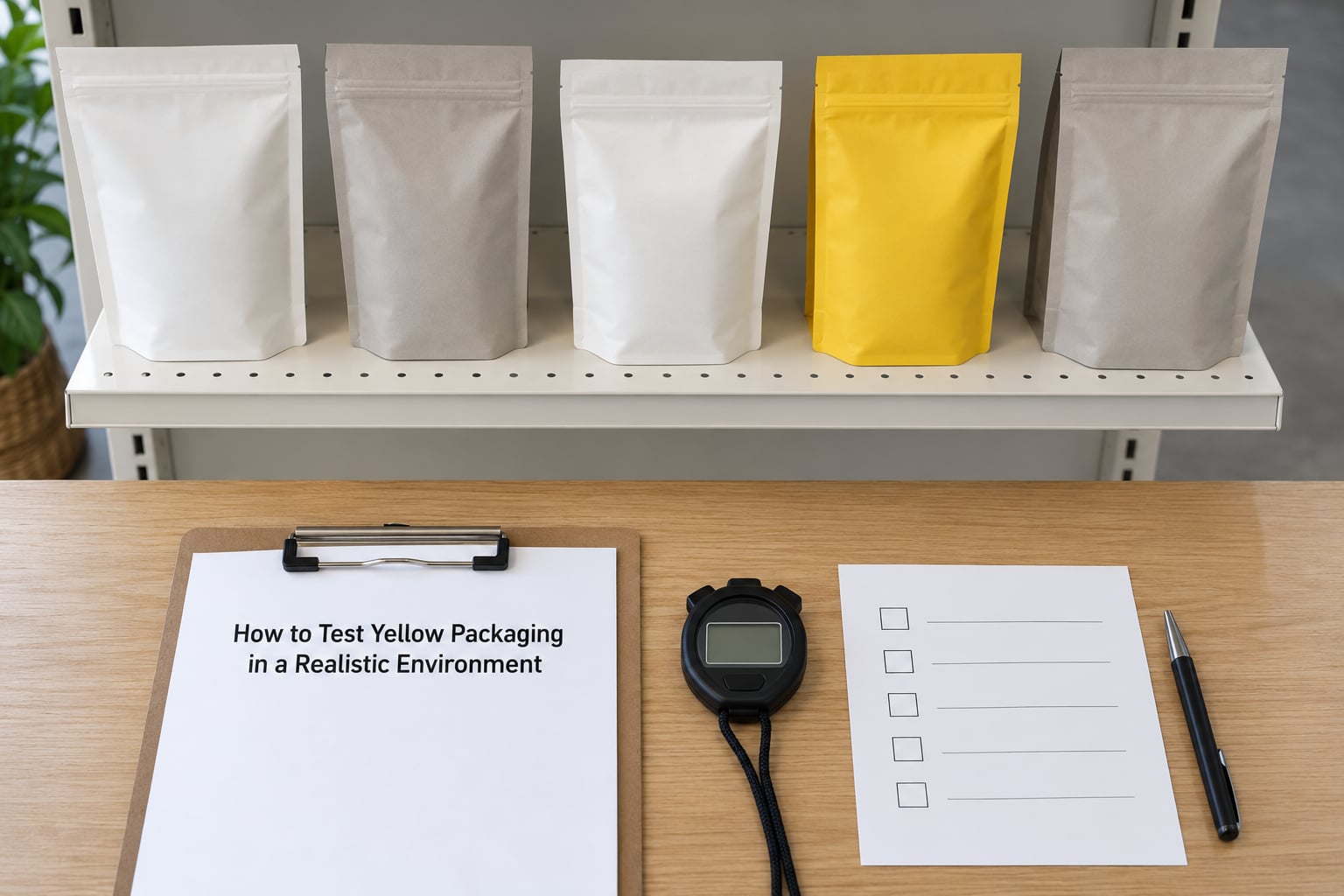
You do not need eye-tracking equipment to get a useful answer. You need competing packs, honest lighting and a stopwatch.
Build the shelf. Print or procure your design plus five to eight competitor packs from the same category, including at least two with strong yellow. Set them on a shelf at the height your product actually ships at, with a realistic number of facings. A single centred pack is the classic mistake, because it looks good to everybody.
Fix the conditions. Use the lighting in the actual store or aisle if you can. Stand at the distance the shopper approaches from, typically six to ten feet. Ask ten people who are not on the project to walk the aisle once and stop at the product they would pick up.
Then measure four things:
- Detection time, from entering the aisle to stopping at a pack.
- Correct identification, whether they can name the brand or variant they stopped at.
- First look, which element drew the eye first: logo, product photo, yellow band, price.
- Recall after five minutes, whether they can describe the pack without seeing it again.
Run the same test on your current design. The difference between the two sets is the only number that matters, and it is a number you can defend in a review meeting.
Two failure modes to watch for. If nobody stops anywhere, your test aisle was too empty and the pack did not need to stand out. If they all stop, you have not replicated a real set and should add more facings and more yellow rivals.
Frequently Asked Questions
Is yellow always the most visible packaging color?
No. Yellow has high luminance and near-peak eye sensitivity, so it detects quickly, but it has little contrast against white, cream and pale packaging. On a bright or all-yellow category set it can be among the least visible options. Visibility depends on the contrast between your pack and its neighbours, not on the hue in isolation.
What color background makes yellow packaging most noticeable?
Dark and cool backgrounds. Black, deep navy and dark brown give yellow a sharp boundary and let it read at distance. Blue also works well because it sits opposite yellow on the colour wheel. White and cream are the worst case, where both surfaces read as light and the edge between them disappears.
Does a small yellow accent make a product easier to find?
Usually yes, provided the accent has real contrast and covers enough of the front panel to survive viewing distance. A narrow yellow band on a pale pack is invisible from six feet. If the accent works, reserve the rest of the panel in a dark or saturated colour so the logo and product name stay legible at speed.
Can yellow packaging colors fade or change on a shelf?
Yes. Yellow pigments are among the more light-sensitive in packaging, and prolonged exposure to bright fixtures and daylight can shift a lemon tone toward olive or grey. Metallic and glossy yellows can also blow out under warm LEDs, reading as white. Check a pack that has spent weeks in store rather than trusting the freshly printed sample.
How far away should shoppers be able to recognize yellow packaging?
Set your own threshold and test against it rather than trusting a rule of thumb. A useful starting point is that a brand name should be readable from six feet and the pack should be identifiable as a shape from fifteen. Beyond about thirty feet down an aisle, only large fields of colour and clear value contrast survive, so hue matters much less than lightness.
Should a brand use yellow for the whole package or only as an accent?
Use it as an accent unless yellow is the category convention, as it is in much of confectionery. A full-yellow field has nowhere to put small text, because white-on-yellow fails and black-on-yellow only works in heavy weights. Accent use also keeps yellow as a signal rather than a background, and it protects the perceived premium quality of the pack.
Conclusion: Start with Contrast, Not Color Alone
Yellow is a fast detector and a poor carrier of information. It wins the first look against neutral, dark and earthy neighbours, and it loses that advantage against pale or all-yellow shelf sets.
So do the first thing that matters, and it is not picking a shade. Put your intended yellow next to the packs it will actually sit beside, in the lighting of the store it will actually ship to, and check whether you can trace the edge between the two from ten feet away. If you cannot, the contrast is wrong, and no amount of hue selection will rescue it.
As of 2026, that test is still the most reliable answer to what color yellow does to shelf visibility that anyone can give you without a research budget.