What color red means in branding and packaging depends on category, shade and context. It signals energy, urgency, passion, appetite and warning all at once, and it carries no fixed dictionary entry: what a shopper reads off a red pack is decided by what sits next to it, what the product is, and what red already means in that aisle.
The color is everywhere. 99designs analysed 14,000 logos, including more than 600 from retail clients, and found red in 59 percent of the largest retail brands, with black and white appearing as secondary colours in 40 percent. That makes red both the highest-leverage and the most crowded choice available to you.
Table of Contents
- What Color Red Means in Branding and Packaging
- How Does Red Affect Attention and Perception?
- What Color Red Means in Different Brand Categories
- Which Shades of Red Communicate Different Messages?
- How Do Food and Drink Brands Use Red on Packaging?
- Does red actually make people hungrier?
- What color attracts people to food?
- When Does Red Signal Luxury, Passion, or Danger?
- Does Red Mean the Same Thing Across Cultures?
- How Can a Brand Test Whether Red Is Right?
- What Are the Most Common Red Branding Mistakes?
- Frequently Asked Questions
- Is red always a good color for branding?
- What shade of red is best for packaging?
- Does red packaging make food look more appetizing?
- Is red associated with luxury or budget brands?
- How do you know if a red package is culturally appropriate?
- Conclusion: Start with the Message, Not the Color
What Color Red Means in Branding and Packaging
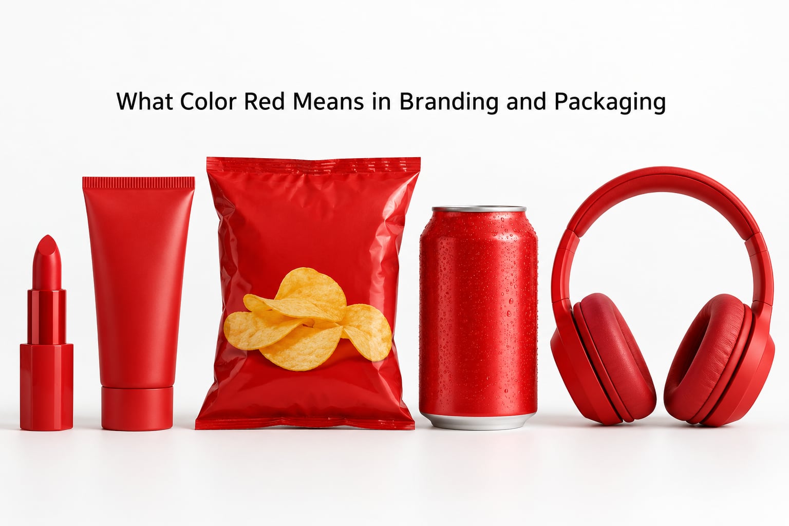
Read a red package as a sentence with the colour acting as the verb. It pushes something forward: buy this, hurry, feel something, this is hot, this is dangerous. The six readings below cover almost every case you will meet.
| Core meaning | What it triggers | Where you meet it |
|---|---|---|
| Energy and speed | Motion, fast reactions, physical action | Quick-service food, sportswear, delivery apps, sale banners |
| Appetite | Warmth, ripeness, sweetness, indulgence | Sauces, soft drinks, confectionery, red meat |
| Passion and connection | Warmth, intimacy, celebration, affection | Chocolate, florists, cosmetics, seasonal gifting |
| Power and confidence | Authority, boldness, decisiveness | Spirits, automotive, credit cards, team kit |
| Warning and danger | Hazard, error, loss, stop | Safety labelling, system alerts, clearance messaging |
| Luck and prosperity | Good fortune, celebration, new beginnings | Lunar New Year packaging, festival retail, gifting |
Two of those readings can fire on the same pack, which is why red is such a hard colour to place well. A bright scarlet on a hot sauce sells heat and speed and danger at once, and that is fine if the product delivers it.
The mistake I see most often is treating the table above as a dictionary. The same hue that means celebration in one market means mourning in another, and the same hue that means appetising on a food pack means clearance sale on a retail endcap.
How Does Red Affect Attention and Perception?
Red is a long-wavelength warm colour, and the human eye picks it up quickly among other hues. In shelf tests it tends to be detected faster and fixated on slightly longer than most competing colours, which makes it the fastest way to win a first glance.
That noticing is the biological half, and it is the part with the strongest support. The interpretation layered on top is learned. Urgency is a convention we picked up from sale signage; appetite is a convention reinforced by years of fruit, meat and candy.
Where it breaks down is volume. A wall of saturated red reads as noise, and once several packs compete for the same attention, red stops ranking them. Packaging practitioners report this constantly: the food aisle is already so red that a pack needs blocking, contrast or a non-red secondary colour to be noticed at all.
Red on a layout works best as an accent against a neutral field. Full-bleed red across every surface tends to flatten the hierarchy and make the type fight the background.
What Color Red Means in Different Brand Categories
Category convention does most of the interpretive work. The table gives the likely reading and an honest fit verdict for each sector.
| Category | What red signals | Fit |
|---|---|---|
| Quick service and fast food | Speed, indulgence, familiarity | Strong, but the aisle is saturated |
| Food and beverage | Appetite, flavour intensity, warmth | Strong with discipline on shade |
| Beauty and cosmetics | Passion, confidence, luxury | Works as deep accent, risky as full field |
| Fashion | Boldness, statement dressing | Good for hero pieces, tiring in large blocks |
| Technology and telecom | Energy, connection, action | Good for action states, poor for corporate calm |
| Sports | Energy, aggression, team pride | Strong |
| Entertainment and streaming | Excitement, discovery, personal taste | Strong for discovery surfaces |
| Luxury | Confidence and exclusivity, in dark shades only | Only as oxblood, burgundy or rust |
| Finance and insurance | Urgency, and debt or loss | Use as accent for warnings, not as brand field |
| Healthcare and wellness | Urgency and clinical alarm | Mostly avoid except in alerts |
| Children’s products | Excitement and energy | Works, temper the saturation |
| B2B and professional services | Aggression, sales pressure | Rarely fits |
Which Shades of Red Communicate Different Messages?
Choosing crimson over scarlet changes the job the colour is doing, and practitioners agonise over this more than any other colour decision. The hue names below are common industry shorthand rather than a fixed standard.
| Shade | Tone | Best fit | Risk |
|---|---|---|---|
| Warm red | Balanced, classic | General retail, food, everyday identity | Can read generic if undifferentiated |
| Bright scarlet | Loud, immediate | Entertainment, sports, kids, promotions | Aggressive and tiring in bulk |
| Crimson | Confident, serious | Beauty, editorial, mid-premium | Reads slightly formal |
| Cherry red | Sweet, fruity | Confectionery, bakery, juice | Too juvenile for some categories |
| Brick red | Grounded, hand-made | Craft food, heritage, artisan goods | Can look dated |
| Burgundy | Rich, restrained | Wine, premium food, finance | Muddy on low-contrast backgrounds |
| Oxblood | Deep, old-world luxury | Leather, spirits, couture, hospitality | Poor legibility in small type |
| Rust | Earthy, warm | Outdoor, coffee, farm and craft brands | Low contrast against kraft |
| Coral | Soft, friendly | Wellness, family, non-alcoholic drinks | Too gentle where danger is the message |
| Pinkish red | Playful, youthful | Beauty, lifestyle, subscription boxes | Weakens authority signals |
Red is also one of the hardest colours to reproduce consistently. A CMYK build will not match a screen Pantone 186, gloss laminate pushes a red further towards orange and saturation, and uncoated kraft board absorbs ink and dulls it. Approve a physical drawdown before you sign off artwork.
How Do Food and Drink Brands Use Red on Packaging?
Food is where red does the most reliable commercial work, because red sits next to cross-modal associations shoppers already hold: ripe fruit, cooked meat, spice, sweetness. It marks the hero product, names a flavour, signals heat, or simply buys shelf impact.
The maraschino cherry on a cocktail glass is the cleanest example of red as ingredient signal. It tells you sweetness, colour and garnish in one red object, with no text needed.
Does red actually make people hungrier?
Partly, and the honest version is narrower than the marketing claim. Red is associated with ripe, edible, sweet things, and colour-taste research supports that pairing as a real cross-modal correspondence. What is not well supported is the widely repeated statistic that colour alone drives a fixed share of a purchase decision; that figure circulates widely with no traceable methodology.
What color attracts people to food?
Warm, saturated hues that read as ripe or cooked pull attention fastest, and red is the loudest of them. Red and yellow together often signal fried, baked or fast food, while green signals fresh and natural. In a crowded aisle, contrast against the surrounding packs matters as much as the hue itself.
Dark and muted reds change the promise. Burgundy and oxblood suggest richness, wine, aged and expensive, which works for a dark chocolate or a cellar-aged sauce and fails badly for a fresh juice.
When Does Red Signal Luxury, Passion, or Danger?
The same hue slides between these meanings depending on what surrounds it. Passion and human connection usually come with warm skin tones, florals, rounded serif lettering or script. Luxury arrives with dark shades such as oxblood and burgundy, generous space, minimal type and gold or cream neighbours.
Power and confidence read through blocky sans-serif lettering, hard geometry and black pairings. Celebration arrives with confetti shapes, gift cues and holiday gold. Danger and warning are the ones designers often forget: in safety labelling, system interfaces, finance and medicine, red is the colour of hazard, error, loss and stop.
| Brand and sector | Role red plays | What it reads as |
|---|---|---|
| Coca-Cola | Primary field, held for decades | Refreshment, appetite, familiarity |
| Target | Primary field | Energy, accessibility, mass appeal |
| Netflix | Primary field across interface and packaging | Personal taste, discovery |
| YouTube | Primary play icon | Action, watch now |
| KFC and Wendy’s | Primary field | Speed, indulgence, recognition at distance |
| Nintendo | Primary field | Play, energy, family |
Note what these have in common: each one owns a distinctive shade, not the generic bright red. The crowd problem is solved by owning a specific red rather than avoiding red.
Does Red Mean the Same Thing Across Cultures?
No, and the variation is regional rather than national. Interpretations differ inside countries as much as between them, so any table like this is a starting point, not a rule.
| Market | Common reading | Watch for |
|---|---|---|
| China and much of the Chinese-speaking market | Luck, prosperity, celebration | Pair with gold and festive cues for gifting |
| India and parts of South Asia | Mourning and loss in some contexts, auspicious in others | Context and regional language decide which |
| Korea | Boldness and intensity | Traditionally read as a passionate, intense colour |
| Thailand | Saturday-born red, a day colour | Avoid for Monday-born customers |
| South Africa | Commemoration and sacrifice | Load-bearing political association |
| Brazil | Enthusiasm, national identity | Check sport and political uses |
| Middle East | Boldness, with some markets avoiding it on religious goods | Verify per product category |
| Western Europe and North America | Energy, appetite, danger, sales urgency | Sale red is often read as discount |
If you are launching across markets, get the interpretation tested in the target language with people from that market. A native speaker is cheaper than a print mistake across a production run.
How Can a Brand Test Whether Red Is Right?
Start by naming the message you want, then work outward. The order matters, because most red decisions fail when the colour is picked first and the message is reverse-engineered afterwards. It is a familiar pattern: 99designs found 65 percent of small business owners chose their brand colour on personal taste.
- Define the message. Write the single association you want a stranger to hold after three seconds, such as fast, festive, dangerous, generous.
- Audit the category. Photograph the shelf. Note where red already sits, how saturated it is and how much space it takes.
- Pick a specific shade. Test two or three candidates at real size, not as small swatches, since context changes perception.
- Review the whole composition. Red with gold reads luxury, with black reads power, with green reads festive and with white reads clean. Change the neighbour and the reading changes.
- Check the market list. Run the shade past the cultural table above for every country you sell into.
- Test with your audience. Use shelf simulation, an A/B landing page, a blind taste test with red removed, or eye tracking. Measure comprehension, attention, appeal, trust, purchase intent and unaided recall.
- Compare against a neutral alternative. A restrained palette often lifts trust more than another shade of red.
Never let red be the only carrier of meaning. Around 1 in 12 men has some form of red-green colour blindness, and a red-only warning label fails for them and for anyone printing in grayscale.
Finally, sign off on the physical artefact. A red that works on a laptop screen frequently prints duller on uncoated board, and the version shoppers see is the one on the shelf.
What Are the Most Common Red Branding Mistakes?
Every mistake below comes back to the same problem, treating a general meaning as if it were a design specification.
Overusing it. Red everywhere leaves nowhere to put emphasis. Fix: cap it at roughly a fifth of the visible surface and let it mark the thing that matters.
Choosing generic bright red. The most available red is the least ownable. Fix: shift hue, saturation or lightness until the colour belongs to you and still prints.
Ignoring contrast and accessibility. Red on white at small sizes disappears for many eyes. Fix: check contrast ratios and pair red with a second cue, never alone.
Relying on cultural stereotypes. Assuming every market reads red as passion or luck. Fix: research per market, and treat national averages as starting points.
Letting the shade fight the typography and imagery. A soft serif on fire-engine red looks accidental. Fix: pick one voice and let the red match it.
Contradicting the product promise. A calm wellness brand that suddenly ships bright red confuses buyers who chose it for calm. Fix: red should support the promise, not introduce a second one.
Treating a competitor’s red as category truth. If the whole aisle is red, blending in guarantees you are compared only on price. Fix: pair red with a distinctive secondary colour or an unusual shade.
Frequently Asked Questions
Is red always a good color for branding?
No. Red suits brands that need attention, appetite, speed, celebration or a warning. It works poorly for brands built on calm, clinical trust or understated craft, where it reads as pressure. The safer play in those categories is a deep red used as an accent, or a neutral palette with red reserved for actions and alerts.
What shade of red is best for packaging?
It depends on the promise. Warm red suits everyday food and retail. Scarlet suits entertainment, sports and kids. Burgundy or oxblood suits wine, spirits and premium food. Brick and rust suit craft and heritage goods. Always approve a physical drawdown, because uncoated board dulls red and gloss laminate shifts it towards orange.
Does red packaging make food look more appetizing?
Often, and the mechanism is association rather than magic. Red sits next to ripe fruit, cooked meat, spice and candy, so shoppers read it as edible and sweet. The widely repeated claim that colour alone decides a large share of purchase judgement is not well sourced. Treat red as an appetite cue you support with imagery, not as a substitute for showing the product.
Is red associated with luxury or budget brands?
Both, depending on shade. Bright saturated red leans mass market, speed and sale energy. Deep oxblood and burgundy lean luxury, age and exclusivity. The shade does most of this work: the same hue family reads as premium or as clearance depending on depth, saturation and how much empty space sits beside it.
How do you know if a red package is culturally appropriate?
Research the specific market rather than relying on a general rule. Red means luck and celebration in much of the Chinese-speaking market, mourning in some South Asian contexts, boldness in Korea, and commemoration in South Africa. Variations exist inside countries as well as between them, so test with people from that market before approving artwork.
Conclusion: Start with the Message, Not the Color
Red works when its shade and treatment support a specific message, and it fails when it is picked for its general reputation. Start by naming the association you want, check the shelf for how crowded the category already is, rule out markets where the reading flips, then test your strongest red against a neutral alternative.
What color red means in branding and packaging is decided at the point of use, not in a dictionary. Own a specific shade of it, use it where the message lives, and let the rest of the pack do the explaining.