A brand refresh updates the parts of your identity that have stopped working, colours, typography, photography, messaging and touchpoint consistency, while leaving the name, positioning and core assets customers already recognize intact. Knowing how to refresh a brand identity without a full rebrand is mostly a sequencing problem: audit what you have, change only what failed a test, and roll it out in phases so customers adjust gradually instead of reacting to one big reveal.
The most common version of this question comes from owners and marketing leads who can already feel the drift. The site looks a decade behind the category, the logo no longer scales down to a favicon, three departments describe the company three different ways, and the founder wants something fixed this quarter. A full rebrand would solve all of that and cost them the recognition they spent years building, so they want the narrower path.
Here is that path, stage by stage. Most teams run the core work over four to six months, and a small business can do the first three stages in-house without a design retainer.
Table of Contents
- What You Need
- How to Refresh a Brand Identity Without a Full Rebrand: Step-by-Step
- How to Diagnose What Is Not Working
- How to Refine the Brand Positioning
- How to Update the Messaging System
- How to Evolve the Visual Identity Selectively
- How to Test and Roll Out the Refresh
- How to Measure Whether the Refresh Worked
- Common Mistakes
- Frequently Asked Questions
- What is the difference between refreshing a brand identity and doing a full rebrand?
- How much does it cost to refresh a brand identity without changing the logo?
- How long does a partial brand identity refresh usually take?
- Do we need to change the logo when refreshing a brand identity?
- How do you know when a brand refresh has become a full rebrand?
- Conclusion: Start With the Research
What You Need
You need six inputs before anyone opens a design file. Teams that skip them end up paying for a solution to a symptom.
An asset inventory. Every logo variant, colour value, typeface, photograph, icon, template and document, written down in one place. Most teams are surprised by how many near-duplicate logos and off-brand shades are already circulating.
Customer and competitor research. What people associate with your brand unprompted, where they meet you first, and what the two or three brands you get compared against look and sound like right now.
Business priorities for the next 18 months. A refresh that serves next year’s plan beats one that serves an aesthetic instinct. If you are entering a new market, launching a second product line or moving upmarket, the identity work has a job description.
Performance evidence. Recognition and recall numbers if you have them, plus the commercial data that actually worries you: conversion on the site, direct traffic share, win rates on competitive deals, cost of paid acquisition.
Decision criteria agreed in advance. What “better” means numerically, which assets are off limits, and who signs off. Written down before the creative work, this prevents the endless loop where every stakeholder’s favourite element gets defended.
A small cross-functional review group. Three to five people covering marketing, product or operations, and someone who talks to customers daily. Give them a deadline and a written brief, not a group chat.
One useful discipline at this stage: decide which category of problem you have, because refresh and rebrand fix different failures.
| Dimension | Brand refresh | Full rebrand |
|---|---|---|
| Scope | Selected elements of the identity and its applications | Strategy, name, positioning and identity together |
| Timeline | Four to six months for most teams | Nine to twelve months in larger organisations |
| Relative cost | Usually a low single-digit share of annual revenue | Often a mid-teens share, before rollout costs |
| Risk to recognition | Low to moderate, especially with a phased rollout | High, and it lasts longer than the launch quarter |
| Best fit | Sound positioning, dated execution | Changed audience, changed category, damaged trust |
| Main deliverable | An updated system plus updated guidelines | A new brand platform, name and identity |
Read that table before anything else. If your positioning is sound and only the execution looks dated, a refresh is the right call. If customers no longer buy what you sell, or your name actively misleads, no amount of colour work will fix it.
How to Refresh a Brand Identity Without a Full Rebrand: Step-by-Step
How to Diagnose What Is Not Working
Start by separating what people think about your brand from what you intended. Run a quick association survey with existing customers and lapsed customers, asking what comes to mind unprompted, what the brand is for, and who it is for.
Then audit five things against the asset inventory: recognition (do people find you easily), associations (are the words they use the ones you want), behaviour (does the identity support conversion rather than decorate it), message clarity (can a new visitor describe you in one sentence), and distinctiveness (would your logo be recognisable with the name removed).
The last test is the sharpest. Show ten people your logo without your name and ask which brand it belongs to. If nobody gets it, distinctiveness is your problem, and that is a logo-level issue rather than a palette issue.
Now sort every asset into three buckets. Keep means it still performs and carries recognition. Change means it fails a specific test and has a workable replacement. Retire means it is redundant, duplicated or actively confusing, and it should simply stop existing. Retire is the bucket owners skip, and it is often the highest-value one because it costs nothing.
How to Refine the Brand Positioning
Positioning is the sentence a competitor cannot copy. Refreshing it means removing vagueness, not rewriting the promise.
Fill in six blanks: for [target customer] who [need], [brand] is the [category] that [benefit], because [reason to believe]. Write it, then read it to five customers and ask them to repeat the benefit back to you. If they paraphrase it into something generic, the sentence is not doing work.
Most refreshes here involve an outdated category description. A company founded as a print shop that now sells managed print to mid-market operations might describe itself as “a print services company”, which positions it against other print shops rather than against the buying problem. Narrowing the frame of reference changes who compares you to whom, without touching a single visual asset.
Protect what still earns recognition. If the existing promise is accurate and the audience still wants it, keep the equity and sharpen the language around it.
How to Update the Messaging System
Messaging fails when everything is a priority. Build a hierarchy of three tiers: one core message that appears everywhere, three to five supporting proof points, and a layer of tone guidance for how everything gets said.
Rewrite the value proposition in customer language, not internal language. Then check the proof behind it. Claims about reliability, speed or expertise need evidence customers can see: a number, a guarantee, a named case, a dated fact.
Tone of voice is where the cheapest gains sit. Write three rules and three examples of what the brand does not sound like, then apply them across the touchpoints that matter most: the homepage headline, the first line of your email, product descriptions and support replies. Read them aloud. Anything you would not say out loud gets rewritten.
To test, show the new messaging to people outside the team and ask what the company does and who it is for. Clarity is the only measure that matters here, not approval.
How to Evolve the Visual Identity Selectively

This is the stage where refreshes go wrong, usually because people treat visual work as the main event. It is the last stage that changes anything, not the first.
Work through the elements one at a time, changing only the ones that failed a test:
- Colour. Test recognition with your current palette desaturated and in greyscale. If it collapses into nothing, you need contrast work before new hues.
- Typography. The most common refresh change, and often the safest. Retype the whole system on a contemporary pairing while keeping weights and hierarchy recognisable.
- Photography. Replace generic library imagery and dated stock conventions with real work, real spaces or real people. This is often the single biggest lift in perceived quality.
- Graphic devices. Patterns, illustration rules, iconography and data visualisation styles. These are invisible individually and obvious when they are inconsistent.
- Logo usage. Keep the mark, refine its construction only where it genuinely fails at small sizes, and update clear-space rules, minimum sizes and the surrounding lockup.
Change aversion is real and well documented: people distrust something familiar that has been altered without reason. Recognisable shapes and colours carry inherited meaning, which is precisely why they still work. Evolve elements because recognition data tells you to, never because a trend cycle says something newer exists.
How to Test and Roll Out the Refresh
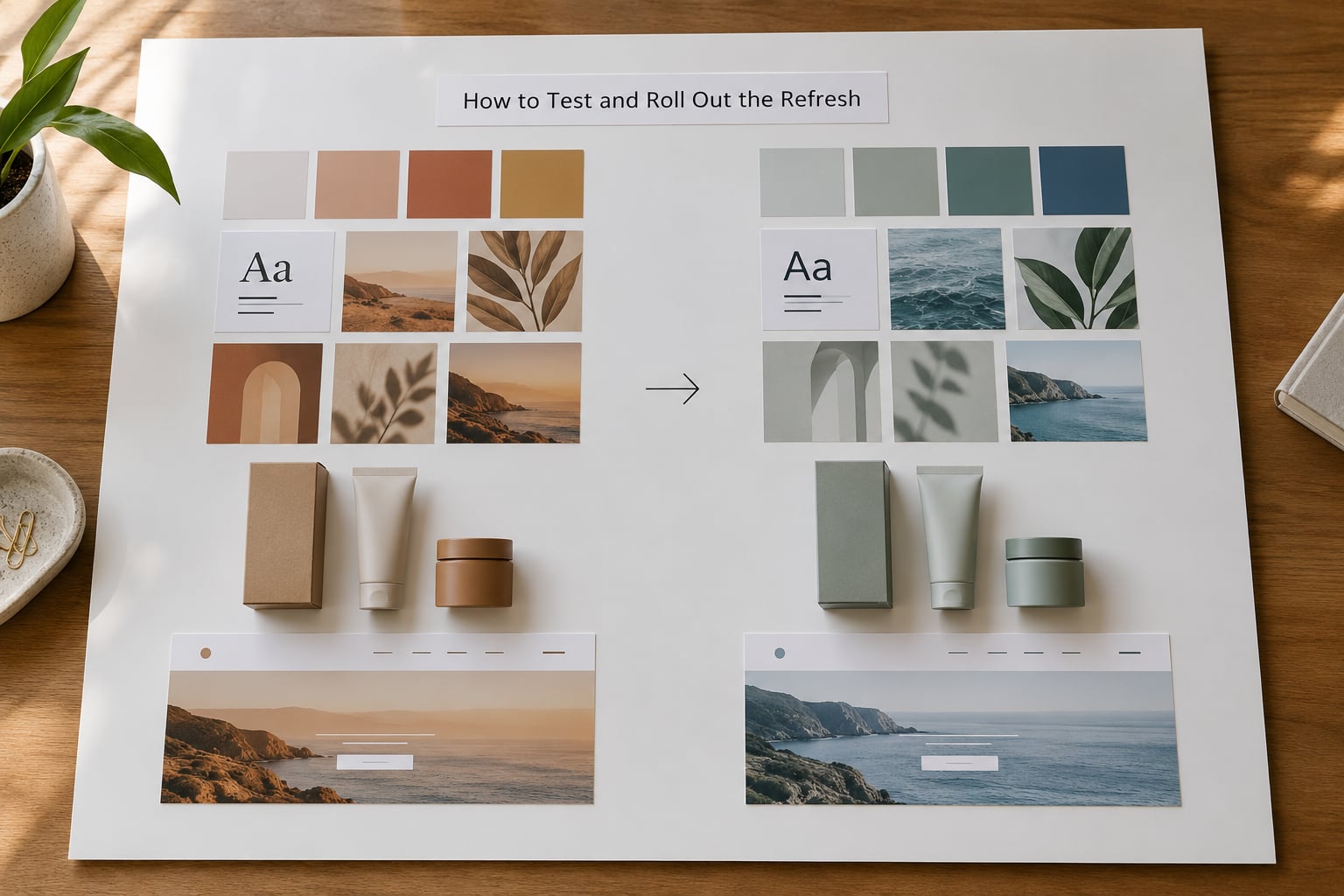
Prototype before you commit. Apply the update to three real touchpoints, not a mood board, and test with customers who have no idea a refresh is happening.
Watch for confusion first, then preference. Confusion means the change broke recognition, and it is the more serious finding because it costs you existing customers rather than failing to win new ones.
Sequence the rollout by risk and by frequency. Start with the digital touchpoints you control completely, then owned surfaces such as email and social, then physical materials, then anything printed in large quantities or with a long lead time. Announce the change to staff before customers meet it, and explain why it happened, since people read a refresh as a signal about the company’s stability.
A short note from leadership stating what is staying the same, what is changing and when, prevents most of the confusion that shows up in comment sections. Owners on small-business forums describe the refresh as a haircut rather than a makeover, and that framing works because it is true and because customers can verify it themselves.
How to Measure Whether the Refresh Worked
Capture your baseline before you launch, because without it you cannot claim credit or accept blame later.
Recognition. Aided and unaided recognition rate, plus the nameless-logo test from the audit, repeated three and six months after launch.
Distinctiveness. Share of associations that belong to you rather than to the category in general. If this does not move, the refresh was cosmetic.
Message clarity. The share of people who can describe the company accurately in one sentence after a week of exposure.
Preference and engagement. Consideration in tracking studies, direct traffic share, email open and reply rates, time on site and repeat visits.
Commercial effect. Conversion rate, cost per acquisition, win rate on competitive deals, average order value.
Consistency. An audit score for how many live surfaces still use retired assets. This number matters more than teams expect, since stale applications quietly undo the work.
Decide your correction triggers in writing before launch. If recognition drops more than a small amount in the first quarter, fix the specific failing element rather than retreating. If distinctiveness and clarity both stay flat after two quarters while the commercial numbers also stay flat, you have evidence that the problem sits below the identity, and that is the moment to consider whether a rebrand is the honest call.
Common Mistakes
Changing too many familiar cues at once. When logo, palette, typography and photography all shift together, customers cannot tell what carried over, so they feel they lost something. Fix it: change one system at a time, and hold the logo steady unless it fails a specific test.
Treating visual style as strategy. A beautiful identity cannot rescue a weak offer, poor service or unclear positioning. Practitioners are blunt about this one, because a rebrand that only changes the surface is the most common way companies spend a year and gain nothing. Fix it: fix the positioning statement first and let the visuals follow it.
Updating without research. Teams fall for whatever looks current, then discover their regulars no longer recognise the brand. Fix it: run the association survey and the nameless-logo test before design begins, and write down what must not change.
Confusing a campaign with an identity refresh. A seasonal campaign or a new product’s look can raise short-term attention while leaving the underlying system untouched. Fix it: ask whether the change lasts past the campaign window. If it does not, it is marketing.
Rolling out all at once. A single big reveal concentrates every reaction on one day, including reactions you could have caught quietly. Fix it: phase by touchpoint, and give yourself months rather than weeks.
Leaving retired assets in circulation. Old templates and files keep propagating after launch, so the identity drifts back within two quarters. Fix it: purge shared drives and design tools, set expiry dates on templates, and assign an owner for the system.
A few tips worth keeping. Keep the recognition cues that customers can name, and change the ones nobody could describe anyway. Update the small screens first, since most first impressions now happen there. Write the reason for the refresh before you announce it. And if your team cannot name the specific problem in one sentence, you are not ready to refresh, you are still diagnosing.
Frequently Asked Questions
What is the difference between refreshing a brand identity and doing a full rebrand?
A refresh updates selected parts of an existing identity, such as colour, typography, photography, messaging and touchpoint consistency, while keeping the name, positioning and core assets intact. A full rebrand changes strategy, name, positioning and identity together. Refresh suits a sound business with dated execution; rebrand suits a changed audience, a changed category, or damaged trust.
How much does it cost to refresh a brand identity without changing the logo?
A refresh is usually budgeted as a low single-digit share of annual revenue for a mid-sized organisation, against a mid-teens share for a full rebrand, and it needs no name research or trademark work. Small owners often spend almost nothing by changing palette, typefaces, photography and templates in-house over four to six months, reserving paid help for guidelines.
How long does a partial brand identity refresh usually take?
Four to six months is the usual range for a refresh that covers messaging plus the visual system and a phased rollout. A colour-and-type refresh alone can finish in six to eight weeks, while a staged rollout across packaging, print and digital often runs past a quarter because of supplier lead times. Set the baseline research before the schedule starts.
Do we need to change the logo when refreshing a brand identity?
Usually not. If your logo still tests well in recognition studies and is recognisable without the name, keep it and spend the effort on typography, palette, photography and messaging instead. Change the mark only when it fails at small sizes, looks dated to core customers, cannot be protected legally, or no one identifies it without the company name.
How do you know when a brand refresh has become a full rebrand?
Treat it as a rebrand when the problem sits below the identity: customers no longer want what you sell, your name misdescribes the business, a merger made the current brand untrue, or the category has moved so far that your associations now hurt you. If distinctiveness, clarity and commercial results stay flat after two quarters of focused refresh work, that is evidence the foundation needs replacing.
Conclusion: Start With the Research
Whether you learn how to refresh a brand identity without a full rebrand from a guide or from an agency deck, the sequence is the same, and the first step is evidence rather than aesthetics. Document what you have, name the specific problem in one sentence, and test the smallest change that could plausibly fix it.
That test could be as simple as a new typeface pair, a rebuilt colour palette, or a rewritten homepage headline, run for one quarter with baseline numbers captured beforehand. If it moves recognition, clarity and commercial results, you have your refresh. If it does not, you have your evidence for a bigger decision, and you will make that one with data rather than frustration.