Designing marketing for fast intuitive decisions comes down to three moves: cut the number of options a buyer has to weigh, make the next step unmistakable, and put the proof exactly where doubt shows up. Everything else, the colour of the button and the length of the manifesto, is decoration around those three decisions. Get them right and a stranger recognises the offer in seconds and acts on it; get them wrong and no amount of persuasion copy will rescue the funnel.
This guide turns that into a process you can run on a landing page, a pricing page, an email sequence, an ad or a checkout flow. Budget about half a day for the analysis and a day for the rebuild if the page is small, and treat it as ongoing work rather than a launch project.
Table of Contents
- The five terms this process relies on
- What You Need to Design Marketing for Fast Intuitive Decisions
- Step-by-Step: How to Design Marketing for Fast Intuitive Decisions
- 1. Identify the Decision Someone Must Make
- 2. Find the Intuitive Triggers
- 3. Remove Friction and Uncertainty
- 4. Make the Choice Feel Safe and Worthwhile
- 5. Design One Memorable Path
- 6. Test What People Understand Instantly
- What each design principle buys you
- Common Mistakes in Designing for Fast Intuitive Decisions
- Frequently Asked Questions
- What are some strategies to reduce cognitive load in marketing?
- What psychological tactics are used in advertising and marketing?
- How do you measure how fast customers decide?
- Is reducing the number of options always good for conversion?
- How do I know if a decision should be fast or deliberate?
- Should marketing decisions be data-driven or based on intuition?
- Conclusion
The five terms this process relies on
- Intuition vs deliberate reasoning. Daniel Kahneman’s dual-process framing splits thinking into fast, automatic, associative processing and slow, effortful, rule-checking processing. Marketing mainly has to win the first one, then survive the second.
- Cognitive load. The mental work a screen demands at one moment. Every option, unanswered question and vague phrase spends part of the buyer’s limited working memory.
- Friction. Any step between intent and action that exists for no reason the buyer cares about. Forms asking for information nobody uses, navigation that resets state, surprise fees at the last click.
- Decision fatigue. The depletion that builds across a long session of small unresolved choices. By the end of it, people stop choosing carefully and start choosing whatever ends the session fastest.
- Choice architecture. The arrangement itself as a persuasion tool: what is shown first, what is preselected, what is compared and what is hidden.
What You Need to Design Marketing for Fast Intuitive Decisions
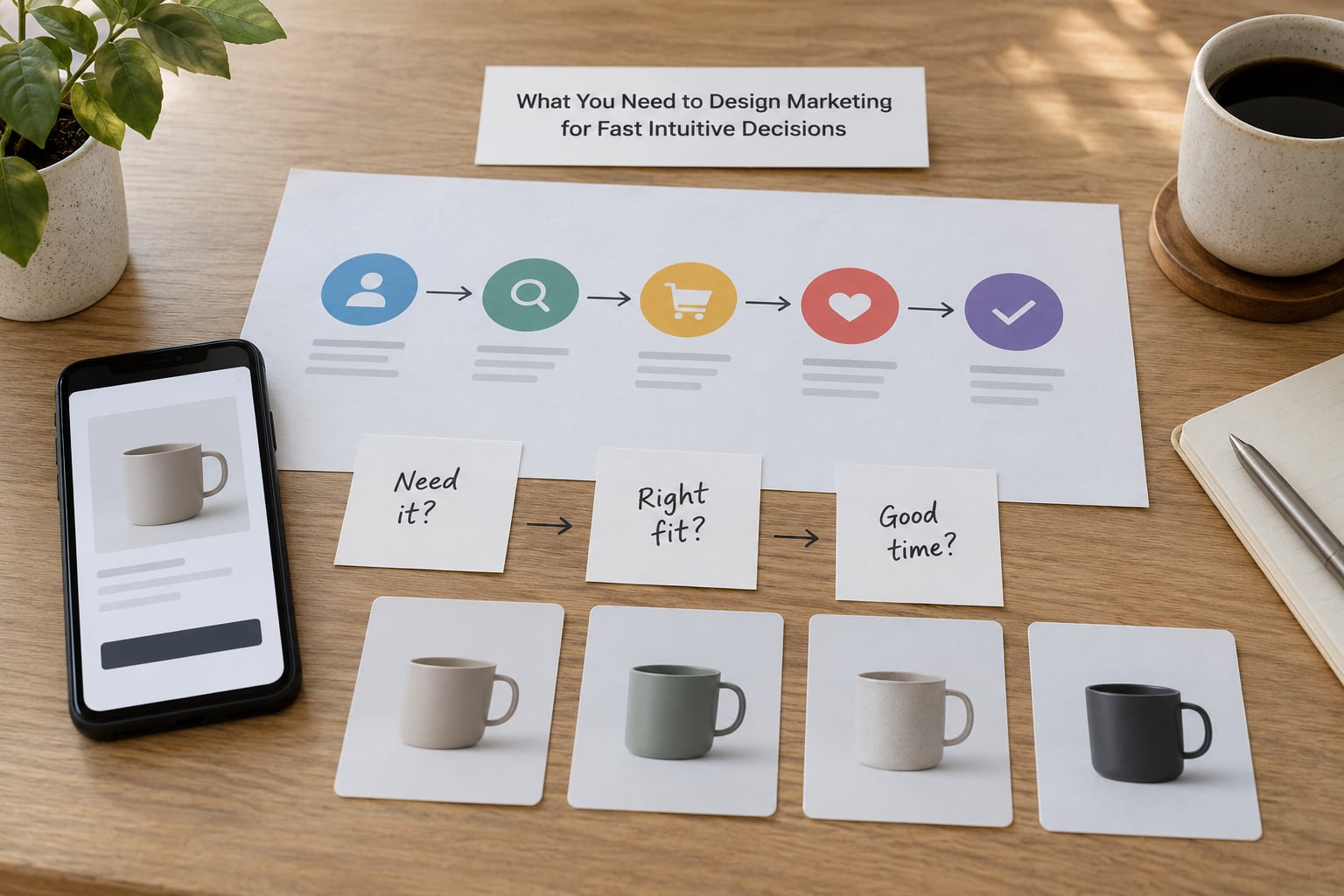
You need six inputs, and four of them are decisions rather than documents.
- One named decision. Not “increase conversions” but “a first-time visitor decides whether to book a demo or walk away.” You cannot design a fast path for a decision you have not written down.
- Audience evidence. The words your buyers use for the problem, gathered from sales calls, support tickets and review sites. Intuitive triggers only work if they come from the buyer’s language, not the brand’s.
- Category norms. What the decision already looks like in this market, because familiarity is the fastest shortcut available. A pricing page that reads like the three comparable pages beside it converts faster than a clever one.
- Proof assets. Real numbers, named customers, before-and-after evidence, a recognisable logo wall. Invented proof is worse than none, because the second look is where it collapses.
- An instrumented baseline. Where people enter, where they stall and where they leave, measured before you change anything. Without a baseline you cannot claim the change did the work.
- Testing capacity. A way to put two versions in front of a real audience, even if that audience is fifteen customers on a call.
If the proof assets are the missing item, that is the thing to fix first. A fast path into an unclear offer just delivers doubt sooner.
Step-by-Step: How to Design Marketing for Fast Intuitive Decisions
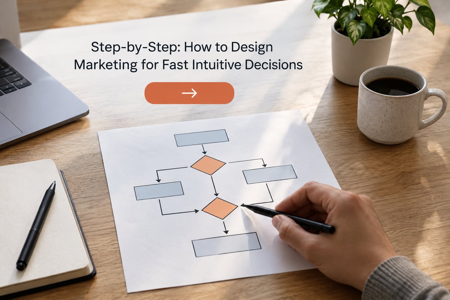
The process runs in six steps, and each one produces something you can check. If a step produces no checkable change, it is a conversation, not a step.
1. Identify the Decision Someone Must Make
Name the exact decision, the person making it, the moment they make it and how hard it is to undo. A reversible, low-cost, familiar-category decision should be fast: book a call, add an item, start a trial. A high-cost, hard-to-reverse decision in an unfamiliar category should stay slow, because compressing it produces buyers who regret rather than buyers who buy.
You can tell which one you have by asking what happens if the buyer is wrong. If the answer is an email apology, design for speed. If the answer is a migration, a contract or a headcount, design for confidence and let the decision take the time it needs.
It worked when your team can finish the sentence “at this moment, this person decides whether to…” without adding “and maybe”.
2. Find the Intuitive Triggers
Fast choices run on recognition, so your job is to be recognised. Look for cues that register in a second: a familiar layout shape, a concrete benefit instead of an adjective, a category-standard symbol such as a padlock or a checkmark, social proof sitting at the point of hesitation rather than in a footer, and words that carry weight for this buyer.
Symbols do more work here than adjectives do. A colour, an icon or a shape that repeats across every touchpoint becomes a shortcut your audience learns without being taught, and repetition is what turns a symbol into recognition rather than decoration.
It worked when a five-second glance at the page tells someone what you sell and who it is for, before they read a word.
3. Remove Friction and Uncertainty
Cut the options, then cut the reading. Hick’s law holds that decision time grows with the number of choices, and Barry Schwartz’s paradox of choice research shows that added choice does not add confidence, it adds regret and delay. So a pricing page with three plans beats one with nine, and a single dominant call to action beats three equally weighted ones.
Then work on the load itself. Chunk long copy into scannable blocks, use progressive disclosure so detail waits until someone asks for it, keep one visual focal point per screen, and match the offer to the words the buyer already uses. Recognition beats recall every time, because recall asks the buyer to do work you could have done for them.
It worked when every screen has one thing you want done, and the path from there to done is a single click or a single field.
4. Make the Choice Feel Safe and Worthwhile
Speed without reassurance produces abandonment, because a fast yes still has to survive a second look. Put proof where the doubt appears rather than at the end, be specific about what happens after the click, reduce the cost of being wrong (a cancellation path, a guarantee, a pilot), and make the value legible through contrast: what the choice replaces, not only what it adds.
Framing does quiet work here. Naming the realistic cost of doing nothing, and showing what a year of the status quo costs, gives the buyer an anchor they can evaluate quickly without doing arithmetic in their head. Two or three well-placed signals are enough. Ten trust badges are noise, and noise reads as insecurity.
It worked when the questions your sales team hears most often on the first call stop appearing on the page at all.
5. Design One Memorable Path
Build one coherent sequence and stop competing with yourself: attention, recognition, relevance, confidence, action. Each touchpoint should carry the same core message in different words, and each should hand the buyer to the next one cleanly without resetting their progress.
Most journeys lose people not at the walls but at the seams. A form that loses entries on the next page, an email that restarts the story from zero, an ad whose promise the landing page does not confirm. Fixing seams usually produces a bigger gain than rewriting any single message.
It worked when a buyer can tell you which page they saw, in which email, in their own words.
6. Test What People Understand Instantly
Test comprehension before you test clicks. Show the page for five seconds and ask what it is and who it is for; if people describe the category correctly, your hierarchy is working. Then instrument time-to-decision, drop-off at each choice point, and the rate at which the primary action gets used per screenful rather than per visit.
Watch decision quality too, not just volume. Refunds, early cancellations and support tickets that mention surprise tell you a fast decision was the wrong decision, and those signals arrive weeks after the conversion spike you were celebrating. For gut calls, keep a decision journal: what you expected, what happened, and by how much. Twenty logged entries will tell you more about your judgement than any framework can.
It worked when your hypothesis is written before the test runs and the result is recorded either way, including the ones you were wrong about.
What each design principle buys you
- Name one decision. Removes the need to work out what is wanted.
- Recognisable cues and symbols. Turns recall effort into recognition in a glance.
- Fewer, curated options. Shortens the choice phase and cuts regret.
- Defaults and presets. Give a usable starting point instead of an empty form.
- One dominant next step. Leaves a single action per screen instead of competing calls to action.
- Proof at the hesitation point. Reduces exits after the click.
- Chunked copy and progressive disclosure. Cut reading load so people comprehend instead of skimming past.
- Risk reduction on the decision. Produces a faster yes and far fewer reversals.
Common Mistakes in Designing for Fast Intuitive Decisions
- Cutting options when the real problem was unclear value. Three options with a fuzzy promise still stall; buyers postpone decisions they cannot evaluate. Fix: write the value in one sentence a stranger would repeat back, then reduce options.
- Adding persuasion copy to a page with too much on it. Extra words compete with each other and dilute the focal point. Fix: delete until something dominates, then test that version first.
- Making every decision fast. Compressing a considered purchase produces buyers who churn in month two, and the churn shows up as a problem in the product team’s inbox rather than in your funnel report. Fix: segment decisions by reversibility and let the expensive ones stay deliberate.
- Hiding defaults instead of setting them. Defaults are the strongest single lever in choice architecture, and most teams leave every field blank. Fix: preselect the option that suits the majority, and show clearly that it can be changed.
- Optimising clicks and calling it decision speed. A click is a step, not a decision. Fix: pair click metrics with time-to-decision and reversal rates so speed and quality stay in view together.
- Letting the test calendar replace judgement. Small variable tests feel safe and rarely change an outcome; the positioning bet that would change everything gets deferred. Fix: run a small number of big structural tests with a written hypothesis, and log the calls you make between them.
Frequently Asked Questions
What are some strategies to reduce cognitive load in marketing?
The five that pay off fastest: cut the option count, chunk long copy into scannable blocks, keep one visual focal point per screen, hide detail behind progressive disclosure, and give every form a default or preset so nobody faces a blank page. Together they reduce the mental work a screen asks for at any one moment, which is what frees working memory for the actual decision. Remove them one at a time and measure time-to-decision after each change.
What psychological tactics are used in advertising and marketing?
The most common are social proof, the default effect, anchoring, loss aversion, the framing effect, scarcity and familiarity or repetition effects. Used well, each gives a fast reader a shortcut to a judgement they were going to make anyway. Used badly, they read as pressure, and pressure raises the very doubt the tactic was meant to remove. Pick two that suit your buyer, place them where hesitation happens, and skip the rest.
How do you measure how fast customers decide?
Track three things. Time-to-decision, measured from first touch to completed action. Drop-off rate at each choice point, which shows where the stall actually happens. And decision quality, meaning refunds, early cancellations and surprise-related tickets weeks later. Add a five-second comprehension test during research: describe what the page is and who it is for. Speed without comprehension just moves the drop-off earlier.
Is reducing the number of options always good for conversion?
No. It works when the remaining options span the real range of buyer needs and the differences between them are clear. It backfires when you cut down to options that suit your top segment and quietly force everyone else into a poor fit, or when the extra choice was doing real work in a considered purchase. Curate, do not amputate, and check that each surviving option still has a customer who wants it.
How do I know if a decision should be fast or deliberate?
Ask what happens if the buyer is wrong. If the answer is a small cost and an easy undo, design for speed: fewer options, a clear next step, proof at the point of hesitation. If the answer is a contract, a migration or a headcount, keep the decision deliberate and spend your effort on clarity and proof instead of speed. Compressing an expensive choice tends to produce buyers who reverse later rather than buyers who do not hesitate.
Should marketing decisions be data-driven or based on intuition?
Both, in a specific order. Intuition picks the bet worth making, usually the one too large for a test to catch; data tells you whether the instrument is working and whether the bet paid off. Keep a decision journal of predictions and outcomes so your judgement gets a track record instead of staying a feeling. Teams that skip the journal argue about instinct for years without ever finding out which instinct was reliable.
Conclusion
Fast intuitive decisions are designed, not wished for. Knowing how to design marketing for fast intuitive decisions means naming the one decision your audience is actually making, finding the cue that makes it recognisable in a second, and removing one source of friction at the exact point where people stall.
Start with the page that gets the most traffic and the least action, and run the six steps on it end to end. Whatever the result, you end up with a measured decision speed instead of an opinion about it, which is the only version of this work that compounds.