
To design an ethical nudge, start from a decision someone actually struggles with, name the barrier blocking it, and run an autonomy check before you touch a single interface element. Then pick the mildest intervention that could work, pilot it, and watch for regret and complaint as closely as you watch conversion. Most of the work sits in the first two steps; the interface change itself takes an afternoon.
That sequence sounds obvious, but the failure pattern I keep seeing in product teams is different. Someone gets assigned a metric, picks a mechanism they liked in a talk, ships it, and then argues about ethics after launch. When ethics arrives as a legal patch instead of a design constraint, there is nothing left to negotiate.
What follows is the process I use when a team wants influence without coercion: eight steps, each with the action, the test that keeps it honest, and the signal that tells you it worked. It borrows the parts of nudge theory that survive scrutiny and drops the parts that are marketing language.
Table of Contents
- What You Need
- Step-by-Step
- 1. Start with a legitimate outcome
- 2. Understand the real decision barrier
- 3. Check autonomy and fairness
- 4. Choose the least manipulative intervention
- 5. Test for effects and unintended consequences
- 6. Make the nudge transparent and easy to undo
- 7. Review the evidence and revise the design
- 8. Monitor, document, and scale responsibly
- Common Mistakes
- Frequently Asked Questions
- When is a nudge ethical rather than manipulation?
- Is an ethical nudge still a form of manipulation?
- How do I keep a nudge away from dark patterns?
- When is setting a default option the right choice?
- How do I test whether a nudge actually worked?
- How do you review a nudge after it has launched?
- Conclusion
What You Need
Before any design work, four things need to be on paper. Skipping any one of them is how teams end up testing the wrong instrument.
A decision, not an outcome. People make decisions; outcomes are what you measure afterwards. “Increase organ donor registration” is an outcome. “Complete the consent form at the DMV counter” is a decision. You can only design around the second kind.
The audience and the context. Who is choosing, in what setting, under what time pressure, with what prior beliefs? A reminder that works on a desktop browser at a desk behaves differently on a phone in a queue at 6pm.
Reliable evidence about the barrier. Session recordings, support tickets, drop-off analysis, interviews. You want to know where the decision stalls, not just that it stalls.
Someone who can say no. A named owner for the intervention, ideally with the authority to pause it. Someone in research, compliance or a senior product role who is not measured on the metric being nudged.
You also need the ability to run a comparison condition and to revert a change quickly. If rollback takes a release cycle, your pilot plan is fiction.
Step-by-Step
1. Start with a legitimate outcome
Define the outcome in the nudged party’s language, not yours. The test is simple: would this person still endorse the result if you explained the whole intervention to them, out loud, and asked whether they got a good deal?
Write down three things before you go further: who benefits, what harm is possible, and what result would be unacceptable even if the primary metric improved. That third line is the one teams skip, and it is the one that catches a bad brief six weeks later.
The ethical test: if the benefit accrues mainly to the organisation and the person carries the cost or the risk, you do not have a nudge. You have a transfer of burden dressed as a favour. The Yale Journal on Regulation framing is useful here: welfare of the nudged party, autonomy of the nudged party, and their dignity are all in scope, and a metric win does not offset a dignity loss.
How you know it worked: the outcome definition you wrote in step one is written before you look at any baseline. That is the whole point.
2. Understand the real decision barrier
Watch the decision happen before you theorise about it. Watch three or four people, or read ten support transcripts, and mark where the behaviour changes.
Barriers cluster into a handful of types, and each one points at a different intervention:
- Knowledge gap — people do not know a rule, fee or consequence exists.
- Attention — they know and mean to act, then forget.
- Friction — the intended path takes more steps, typing or waiting than the alternative.
- Habit and present bias — they intend to do it later and the later never arrives.
- Uncertainty — they cannot predict what will happen, so they decline to act.
- Social context — nobody around them does it either.
One caution that matters more than teams expect: a difference in average behaviour between two groups is not evidence that a particular psychological mechanism caused it. Practitioners in the r/BehavioralEconomics discussions keep circling this, because inferring a mechanism from an aggregate is how teams justify a tactic they have already picked.
How you know it worked: you can state the barrier in one sentence, backed by something you observed rather than something you assumed.
3. Check autonomy and fairness
This is the pre-design gate. Run it before drafting, because the answer is hard to change later without redoing the work.
Ask: is there a real alternative? Is opt-out as visible and as easy as opt-in? Can the person reverse the decision without penalty? Did they get told, in plain language, that influence was being attempted? Would this design be defensible if the person with the least power in the room read it?
Designs that fail this gate are easy to recognise once you look. A newsletter pre-ticked at signup with an opt-out buried three clicks into account settings. A cancellation path that requires a phone call while the subscription took four seconds. A “no thanks” button in a lighter grey than “accept”. Urgency that is not real. A confirmation that flashes a false warning about a limited window.
Fairness extends to who bears the friction. Adding friction to one path is legitimate only when the path you are slowing is the one that harms the chooser. Adding friction to the refund request because refunds reduce margin fails on both counts.
How you know it worked: you have a written pass or fail from someone outside the team, with the failure modes written down in plain words.
4. Choose the least manipulative intervention
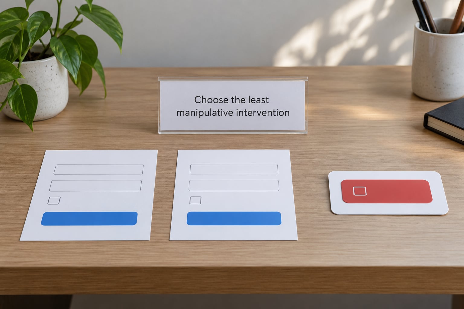
Once you know the barrier, rank interventions from mildest to harshest and take the mildest one you can live with. A nudge that barely moves the metric but keeps trust is usually worth more than one that doubles signups and generates a support queue.
| Intervention | Use it when | Ethical guardrail |
|---|---|---|
| Transparent default | Most people should take one path | The default is the outcome you would defend as the person’s own interest; changing it takes seconds |
| Removing friction | The intended action is needlessly hard | You reduce effort for the desired path without adding any new effort elsewhere |
| Salient reminder | Attention is the barrier | Timing follows a stated commitment, not a usage pattern designed to re-engage |
| Descriptive norm | Social context is the barrier | The number is real, current, verifiable and typical, not the most flattering subset |
| Adding friction | Someone is about to do something they later regret | Only slows the harmful path, with a cooling-off step and a clear skip |
| Framing or message | Wording causes misunderstanding | Accurate in every reading; no shame, no scare tactics, no invented urgency |
Reject anything that depends on the person not noticing. Hidden pre-ticks, confirmshaming button copy, disguised decline links, countdown timers that reset, fake scarcity, and roach motel cancellation flows are not nudge variants. They are dark patterns, the term Harry Brignull coined for interface designs built to trick rather than inform.
The scale is worth knowing. Mathur and colleagues crawled roughly 11,000 shopping sites and identified 1,818 dark patterns across them. In a field experiment by Luguri and Strahilevitz, mild dark patterns roughly doubled subscription acceptance at checkout and aggressive ones pushed it to about four times the honest rate, with measurable increases in anger and complaints. The regulatory picture has tightened alongside it: the EU Digital Services Act now constrains several interface patterns directly.
How you know it worked: you can write a one-sentence description of the intervention that you would be comfortable putting in a blog post with your name on it.
5. Test for effects and unintended consequences
Pilot small. Use a comparison condition where you can, even if it is a staggered rollout, because without one you cannot distinguish your intervention from a seasonal shift or a paid campaign that happened to land at the same time.
Measure two families of outcomes. The first is the behavioural change you intended: completion rate, take-up, time to decision. The second is everything that usually follows it: refund requests, cancellations, complaint volume, support contacts, repeat usage at 30 and 90 days, and a short well-being question where the stakes justify it.
Check subgroups rather than trusting the average. An intervention that raises sign-up among people who already read the page may be lowering it among people on slow connections. Report effect size honestly, including the runs where nothing happened: in the published evidence base, roughly six in ten tested nudge effects reached statistical significance, which is a good reason to plan for the null result.
How you know it worked: the intended metric moved, and the secondary metrics did not move against you.
6. Make the nudge transparent and easy to undo
Disclosure does not have to be a legal footer. A short line at the point of decision beats a paragraph in the terms. Say what changed, why, and how to reverse it.
Reversibility is the part teams skip after launch. Set a date or usage threshold at which the person chose the nudged path automatically, remind them before anything is charged or committed, and let them change course in the same number of clicks it took to accept. If undoing is harder than doing, you have moved the friction rather than removed it.
How you know it worked: a real person who hits the notice can complete the reversal without contacting support.
7. Review the evidence and revise the design
Read the pilot results as a practitioner, not as a growth team. Effectiveness and efficiency are different questions: a nudge can be effective at moving behaviour and still a bad design if it only works on people who had already decided.
Document the reasoning while it is fresh. A short record of the barrier hypothesis, the intervention chosen, the alternatives rejected and the result gives you something defensible months later, when the person who designed it has moved on and someone asks why the default is set that way.
Involve people who bear the effect. Front-line staff, support leads and the compliance reviewer will often spot a barrier you cannot see from the analytics dashboard. If the evidence is weak or the ethical trade-offs look unfavourable, stop. Stopping is a normal, respectable outcome of a pilot, and writing that in advance makes it easier to do.
How you know it worked: you have a decision recorded with reasons, not just a number on a slide.
8. Monitor, document, and scale responsibly
Put the intervention on a calendar before launch. Set a monitoring interval, a named owner, an escalation threshold and a review date. Decide in advance what result triggers a rollback, and write it down while nobody is arguing.
Watch for effects that change across populations. A nudge validated on one demographic, one device class or one language can behave completely differently elsewhere, and rolling it out globally on the strength of the first test is one of the most common scaling mistakes in this field.
Also decide whether the experiment becomes permanent. Pilots quietly harden into permanent defaults because nobody owns the sunset. If the intervention is still running, it needs a reason to keep existing, on the record.
How you know it worked: six months on, someone other than the original designer can explain what the nudge does, why it exists and when it will be reviewed.
Common Mistakes
These are the errors that show up repeatedly in my review of nudge programmes, with the correction that has worked each time.
| Mistake | What it looks like | Correction |
|---|---|---|
| Confusing engagement with welfare | The metric is time on site or add-to-cart rate | Write the benefit in the person’s words and test it against that sentence |
| Testing a non-nudge | A discount, a headline rewrite or a notification is called a nudge | A nudge changes choice architecture. Copy and pricing are a different instrument with different evidence |
| Hiding the intervention | The change is never disclosed | Add a plain-language notice at the point of decision |
| Treating the pilot as permanent | Nobody can say why it still runs | Set a review date and a rollback threshold before launch |
| Using one metric | Only the primary outcome is reported | Pair every behavioural measure with a welfare or complaint measure |
| Assuming the average applies to everyone | A result from one group is rolled out everywhere | Report by subgroup and check the weakest before scaling |
| Decorative social proof | “12,000 people signed up” with no basis | Use a verifiable, current, typical number or drop the claim |
A few implementation habits worth building in. Keep an ethics review gate in the design cycle rather than bolting it on before launch, and give the reviewer the power to send work back. Write the nudge description in the same document as the design spec, so it is reviewed alongside the pixels. Keep a running inventory of every nudge live in your product, with its owner and start date, because most teams lose track after the third release.
And treat trust as a measured outcome, not a slogan. Slow trust damage rarely shows up in week-one analytics, which is exactly why it belongs on the dashboard next to conversion.
Frequently Asked Questions
When is a nudge ethical rather than manipulation?
A nudge is ethical when the outcome serves the person being nudged, the alternative option stays genuinely available, the change is reversible without penalty, and you would be comfortable disclosing it publicly. Manipulation begins where deception does: hidden pre-ticks, false scarcity, shaming button copy or a cancellation path harder than the purchase. The practical test is whether the person would still endorse the result after being told exactly what you did and why.
Is an ethical nudge still a form of manipulation?
All nudges involve influence, so some describe the whole category as manipulation. That reading makes the term useless for design work. The useful distinction is between influence a person would welcome once understood and influence that depends on them not understanding it. Legitimate paternalism accepts that people want help making good choices and are sometimes unreliable judges of their own interests, which is why a transparent default is usually defended and a hidden one is not.
How do I keep a nudge away from dark patterns?
Audit for the known families: fake scarcity and false urgency, confirmshaming, hidden costs revealed late, pre-ticked consent, disguised decline links, and cancellation flows that are harder than sign-up. Ask whether the design would still work if every claim were literally true today, in this region, on this device. If removing the deception collapses the effect entirely, you were measuring the trick rather than the outcome.
When is setting a default option the right choice?
Defaults are the strongest and most legitimate instrument because they respect the status quo bias instead of fighting it, which makes them right when most people genuinely should take one path. That case weakens when preferences vary widely across the population or when the default serves the organisation more than the chooser. Whatever you choose, changing it should take seconds, and the alternative must stay visible rather than hidden behind a settings page.
How do I test whether a nudge actually worked?
Run a small pilot with a comparison condition, ideally a staggered rollout. Track the intended behavioural change plus refunds, cancellations, complaints, support contacts and repeat behaviour at 30 and 90 days. Break results out by subgroup rather than trusting the average, and record the runs where nothing happened. Roughly six in ten tested nudge effects in the published literature reach statistical significance, so plan for a null result before you start.
How do you review a nudge after it has launched?
Give it a named owner, a fixed review date and a written rollback threshold set before launch rather than after a bad quarter. At each review, check whether the behaviour change persists, whether secondary metrics like complaints or refunds have drifted, and whether the effect looks different across populations or devices. If nobody can explain why the intervention is still running, that is the finding.
Conclusion
How to design an ethical nudge comes down to sequence: define a legitimate outcome in the nudged party’s words, find the real barrier by watching the decision rather than theorising about it, then run the autonomy and fairness check before drafting anything. Only after that do you choose the mildest intervention, pilot it with welfare metrics alongside behavioural ones, disclose it in plain language, and give it an owner and a rollback threshold.
Start with the first three steps this week. They take an afternoon, and they will save you the argument you would otherwise have after launch.