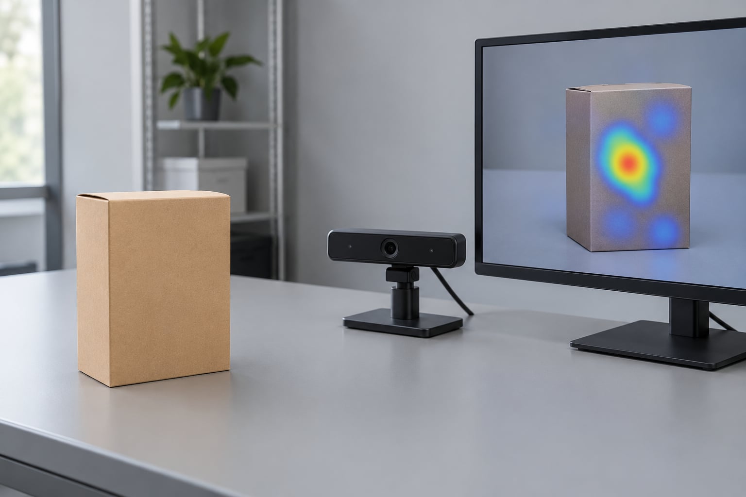
Eye tracking reveals packaging problems by recording exactly where a shopper looks on a pack, how long they stay there, and what they skip entirely. That replayable attention record exposes design faults that self-reported research routinely misses, because people describe what they remember noticing rather than what their eyes actually landed on.
It does one thing well, though: it shows you attention, not understanding. The rest of this guide covers the metrics, the faults they flag, and the comprehension work you pair them with.
Table of Contents
- What Eye Tracking Can Reveal About Packaging Design
- How Eye Tracking Data Is Collected and Interpreted
- Set the task before you show the pack
- Choose the viewing context deliberately
- Define areas of interest before the session
- Read the four measures that matter most
- Common Packaging Problems Eye Tracking Can Expose
- How to Turn Attention Patterns into Packaging Fixes
- Eye Tracking Metrics and the Packaging Problems They Signal
- When Eye Tracking Is Useful and What It Cannot Tell You
- Frequently Asked Questions
- What packaging problems does eye tracking actually reveal?
- How many participants do I need for a packaging eye tracking study?
- Should I test a pack on its own or in a competitive shelf set?
- Can I run packaging eye tracking remotely or on a phone?
- What is the difference between dwell time and time to first fixation?
- What are the main downsides of eye tracking for packaging research?
- Conclusion
What Eye Tracking Can Reveal About Packaging Design
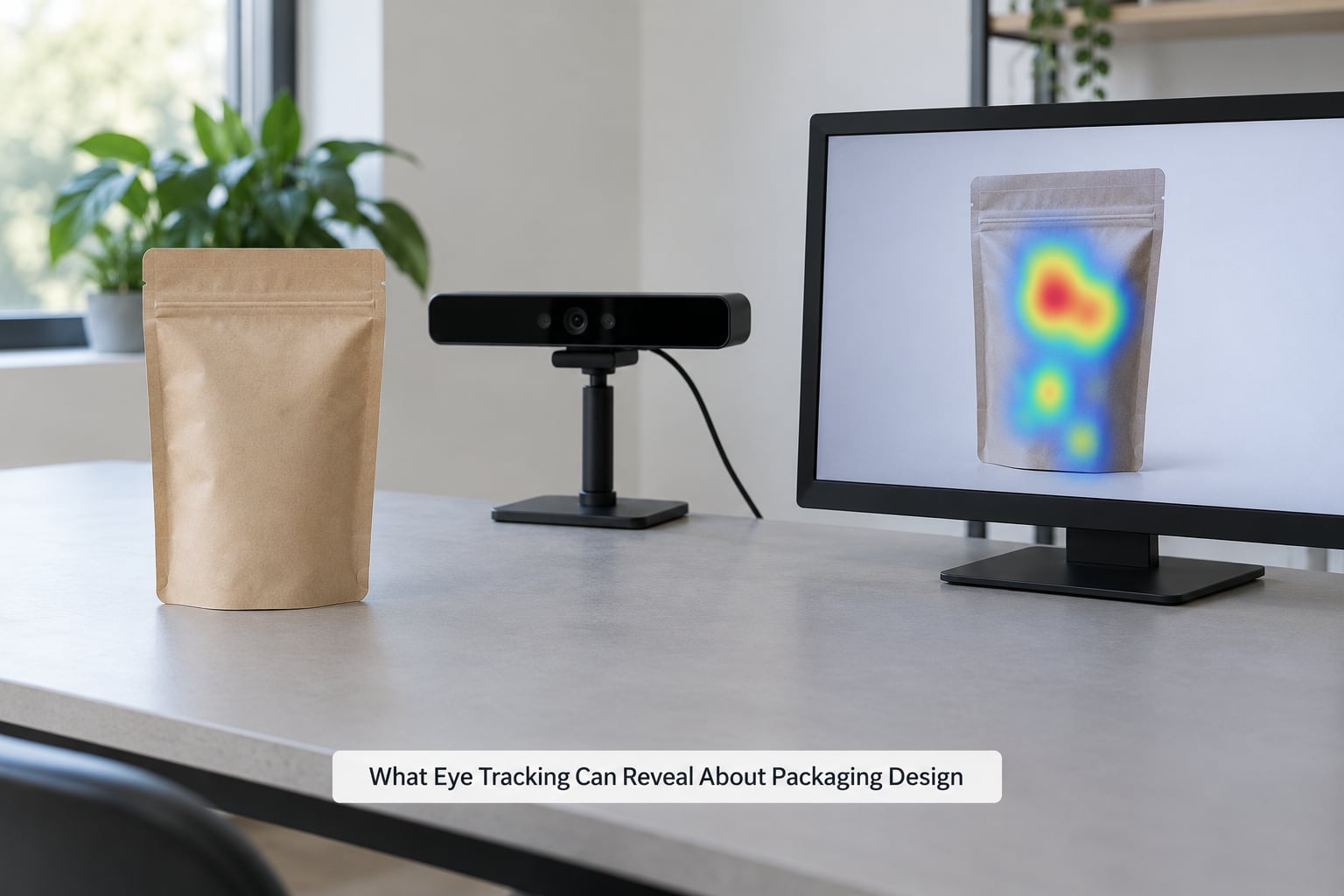
An eye-tracking study records where a participant looks on a shelf, on a pack or on a screen, at a sampling rate high enough to separate a moment of genuine focus from a flick of the eye. For packaging work, that record answers a narrow question well: which elements of the design earn visual attention, in what order, and how heavily.
Everything else people ask eye tracking to do sits downstream of that question. The useful framing is a three-part one borrowed from shelf-impact research: impact (did the pack get noticed at all), findability (once noticed, could the right variant be located among competitors) and imagery (what the pack communicates once it has been picked up).
That framing matters because the three fail independently. A pack can be noticed and still be unfindable, which usually points at orientation and colour blocking rather than at the logo. Fixing the wrong one is the most common way packaging tests end up inconclusive.
Where the method genuinely beats a focus group is in failure. Ask someone which claims they read on a cereal box and they will list four. Hand them a pack with twelve claims and a small ingredient panel and the eye data will show a cluster of attention on the front, a fast pass across the back, and nothing at all on the panel.
How Eye Tracking Data Is Collected and Interpreted
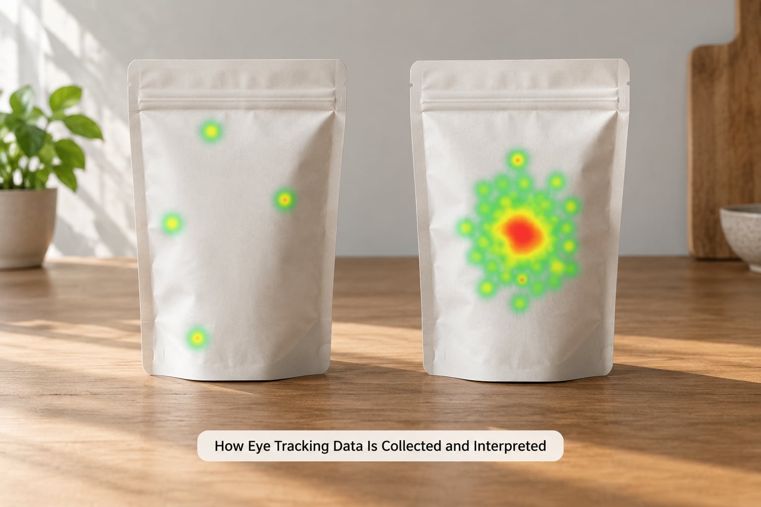
A practical packaging test runs in six moves: set the task, build the viewing context, define the areas of interest, run the trial, read the metrics, then write down what the data cannot tell you. Most flawed studies skip the third step, and it is the one that decides whether the numbers mean anything.
Set the task before you show the pack
Participants need a stated goal, otherwise their scan path is an accident of curiosity. The instruction that produces the cleanest shelf data is a realistic one: find the product you normally buy in this category, then tell us why you picked it. Everything the eye does afterwards is measured against that instruction.
Choose the viewing context deliberately
The same pack produces different numbers in three settings. Shown alone, almost any design scores well. Shown in a facings block of eight competing packs on a shelf mock-up, it competes for the same fixations as everything beside it. Shown as a screen-based thumbnail on a phone, it competes with nothing and the result tells you almost nothing about physical shelves.
Practitioners working in this space tend to insist on multiple shelf configurations rather than a single centre-of-shelf placement, because that placement flatters everything equally and hides real differences.
Define areas of interest before the session
An area of interest is a labelled region on the pack: logo, brand name, benefit claim, certification mark, ingredient panel, price, variant descriptor. You draw these boxes up front and the software counts fixations inside them automatically. Without them you get a pretty heat map and no numbers you can put in a report.
Give your regions the specificity of the decision you are trying to make. A box labelled “front of pack” tells you nothing; boxes for each individual claim tell you which one is working.
Read the four measures that matter most
Time to first fixation is how long before the eyes land on that area at all, and it is your noticeability measure. Dwell time is the total seconds spent inside the area across the trial, and it is your engagement measure. Total viewing time for the pack as a whole covers how much of the three-second, five-second or unlimited look the design commands.
Scan path is the order areas were visited, which is where hierarchy problems become obvious. If the certification mark is reached before the brand name on a shelf set, the eye is reading the pack as a commodity.
None of these prove comprehension. A long dwell on a claim can mean interest, confusion, or a participant hunting for the reading glasses, and only follow-up questioning separates those.
Common Packaging Problems Eye Tracking Can Expose
Seven faults account for most of what a packaging eye-tracking study uncovers. Each one leaves a recognisable pattern in the gaze data.
- Low shelf noticeability. Long time to first fixation across the whole pack, or a first fixation landing on the pack’s neighbour. This is the classic facings and orientation problem.
- Poor findability in a competitive set. Good notice, then a wandering scan path with several returns to the shelf edge as the shopper re-searches. The pack drew attention and then lost the shopper mid-decision.
- Weak brand and logo recognition. The logo area is either never fixated or gets a single short pass, while an illustration or a colour block absorbs the looking. The pack reads as a category, not as a brand.
- Missed information. Required or commercially vital text is never reached. Certification marks, origin statements, ingredient and nutrition panels, and variant descriptors are the usual casualties.
- Confusing visual hierarchy. Scan-path order contradicts the intended reading order, so the pack’s most important element is reached last or only after a correction saccade back.
- Colour and contrast failure. Attention clusters on some elements and skips others of equal importance. Certification badges set in low-contrast colours are the classic case, and dark-on-dark claims lose out to a photograph every time.
- The attention-intent disconnect. Strong dwell on the front of pack and near-zero fixations on the elements that justify the price, while purchase-intent scores sit unchanged. People looked and were not persuaded, which is a very different problem from people who never looked.
How to Turn Attention Patterns into Packaging Fixes
Turning gaze data into a design change takes five steps, and the order matters. Teams that skip to the heat map and redesign whatever looks ignored tend to ship changes that fix a number and not a problem.
First, write down the intended viewing sequence as a short list. Brand, then variant, then the primary benefit, then the supporting claim. This takes five minutes and it is the benchmark you are about to measure against, so doing it first is what makes the rest of the work specific.
Second, compare that list with actual scan-path order and mark each divergence. Every gap is a candidate problem, and the size of the gap tells you how much of the pack’s message is being lost.
Third, rank the gaps by consequence rather than by visibility in the data. A brand logo that is missed on 30 percent of trials outranks a missed secondary claim every time for most categories.
Fourth, prototype revisions that change one thing at a time. If you move the logo and re-colour the badge in the same pass, you will not know which one moved the number.
Fifth, validate. Ask participants what the pack said, what variant they thought it was, and why they would or would not buy it. Those comprehension answers are what turn a fix from a guess into evidence.
Two habits from experienced practitioners are worth adopting from day one. Compare the current pack against the proposed one rather than comparing two new concepts against each other, because the only fair baseline is what is on shelf now. And retest after a revision rather than assuming the first change worked.
Eye Tracking Metrics and the Packaging Problems They Signal
This table maps each measure to the packaging fault it usually points at, with a follow-up question worth asking when the number surprises you.
| Metric | What it measures | Likely packaging problem | Ask next |
|---|---|---|---|
| Time to first fixation | Seconds before the eyes reach an area | Low noticeability, poor shelf position or orientation | What did you look at first, and what did you expect to see? |
| First fixation pass rate | Share of participants who reach the area in the first look | Element is invisible at shelf viewing distance | Can you point to where the product name is? |
| Dwell time | Total seconds spent inside an area | Either strong interest or unresolved confusion | What were you reading in that section? |
| Total viewing time | Seconds spent on the pack overall | Design earns too little of the available look | What is the one thing you remember about it? |
| Scan-path order | Sequence areas were visited | Visual hierarchy contradicts intent | What did you think this product was before you picked it up? |
| Revisit rate | How often an area is returned to | Information too small, buried or illegible | Was there something you needed and could not find? |
| Pupil response | Change in pupil size while fixating | Arousal from imagery, contrast or an unexpected element | What drew your attention there first? |
Read those numbers comparatively, not absolutely. A pass rate of 40 percent against a competing concept tells you more than the same number measured on a different category, and a real difference on time to first fixation usually shows up before a difference in dwell time does.
When Eye Tracking Is Useful and What It Cannot Tell You
The honest summary is that this method gives you where and for how long, and everything else needs another method. Knowing which boundary you have hit saves you from the most common misreading in the field, which is treating attention as a verdict.
- It cannot show comprehension. Long dwell means the eyes stopped. Reading, decoding and believing are three different events and only the last two show up in your follow-up questions.
- It cannot show preference or intent. Attention and purchase decision are weakly linked on their own. Combine it with a choice task or an incentive-compatible selection if the business question is about conversion.
- Participants behave differently when they know they are watched. Reviewers running these studies regularly flag the Hawthorne effect. Front-panel performance in a lab tends to be better than real-world behaviour, which is one more argument for pairing gaze with observed in-store behaviour.
- Small samples mislead. Academic packaging studies often run 20 to 70 participants, which is enough to flag a problem and rarely enough to certify a small difference. Treat a two-point gap as noise unless the sample supports it.
- Results do not transfer automatically. A lab shelf mock is not a lit store aisle at 5pm on a Saturday. Where the decision is high stakes, validate with in-store observation or a controlled choice test.
- Interpretation needs a second skill. Reading gaze data well is a specialist job, and the people best at it are usually not the people who commissioned the study.
On cost, the honest answer is that the range is wide and mostly reflects hardware and sample size. A single-region study with a screen-based setup sits at the low end; multi-market fieldwork with mobile eye-tracking glasses and a full competitive shelf set sits well above it. What justifies the spend is not the study itself but whether it changes a tooling decision that would be expensive to reverse.
Cheaper options exist and they answer narrower questions. Attention prediction algorithms that infer likely gaze from images of a design, sold as a fast pre-screen before a full study, are useful for ranking many concepts in a day rather than understanding why one of them works.
The complementary methods matter as much as the instrument. Interviews and open-ended recall explain the why behind a fixation pattern. Surveys and choice tests carry preference and trade-off. Shelf audits and sales data tell you whether the design holds up when the shopper is hurrying, lit badly and holding a basket. Good packaging research in 2026 pairs them rather than picking a side.
Frequently Asked Questions
What packaging problems does eye tracking actually reveal?
It reliably surfaces low shelf noticeability, poor findability among competing packs, weak logo recognition, missed required or benefit text, visual hierarchy that runs against the intended reading order, and colour or contrast failures that make important elements invisible. It cannot, on its own, show comprehension, preference or purchase intent, so pair it with questioning or a choice task.
How many participants do I need for a packaging eye tracking study?
Most academic packaging studies run between 20 and 70 participants, which is enough to identify a clear problem and rarely enough to certify a small difference between two concepts. If you are deciding between tooling options that cost real money to reverse, treat anything under a two-point gap in time to first fixation or pass rate as noise unless your statistical power supports it.
Should I test a pack on its own or in a competitive shelf set?
Test it in a realistic shelf set. A pack shown alone will score well on almost every measure, which tells you nothing about how it performs beside competitors. Build facings with realistic neighbours, test more than one planogram position, and expect the centre-of-shelf placement to flatter every design equally.
Can I run packaging eye tracking remotely or on a phone?
Screen-based setups run remotely, and they work well for comparing many concepts quickly at the level of noticeability and first-impression attention. They do not reproduce a physical shelf, so they cannot measure findability among competing packs, and phone-based setups are better treated as a screening tool than as shelf evidence.
What is the difference between dwell time and time to first fixation?
Time to first fixation measures how long before the eyes reach an element at all, which is your noticeability measure. Dwell time measures the total seconds spent inside that area across the whole trial, which tells you whether attention was sustained. A long delay with short dwell means the element was found late and barely used.
What are the main downsides of eye tracking for packaging research?
The method shows where people look but not why, participants behave differently when they know they are observed, lab shelves do not match real stores, and small samples produce differences that will not replicate. Interpretation also takes a specialist skill that the commissioning team often lacks. Treat the data as strong evidence about attention and weak evidence about decision-making.
Conclusion
Start by writing down the shelf-reading task you expect: brand first, variant second, primary benefit third. Run the pack in a realistic competitive set, define your areas of interest before the session, then find where the actual scan path departs from that plan.
Fix the single most consequential departure, and validate it with evidence about what people understood rather than what they looked at. That is how eye tracking reveals packaging problems in a way a redesign can actually use.