
Cognitive load is the mental effort a visitor spends taking in a page and working out what to do next. When a page asks for more of that effort than a person can spare, the visitor stalls, hesitates and leaves. That is how cognitive load reduces conversion rates: it eats the same limited attention that the buying decision needs, so traffic arrives with intent and leaves without acting.
Most pages with healthy traffic and a flat conversion rate are not broken because of the offer, the price or the traffic mix. They are broken because the page asks the visitor to do too much work at the wrong moment. The fix is rarely a redesign. It is removing specific demands: one call to action instead of four, five form fields instead of eleven, a choice that comes with a recommendation attached.
What follows is the mechanism first, then the diagnosis, then the fixes you can ship this month. I have kept the numbers checkable, and where a figure comes from a vendor case rather than research I say so.
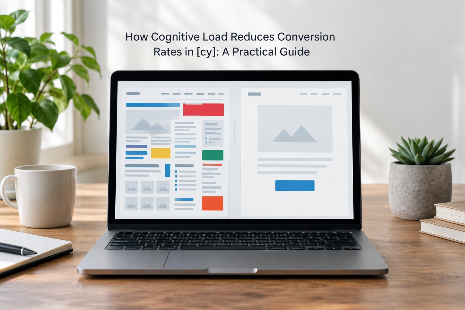
Table of Contents
- What Is Cognitive Load, and Why Does It Cost You Conversions?
- How Cognitive Load Reduces Conversion Rates
- The Conversion Effects of Mental Effort
- What Creates Cognitive Load on Websites and Forms?
- How Do You Know a Page Has Too Much Cognitive Load?
- How Can You Reduce Cognitive Load Without Removing Important Information?
- Where simplification backfires
- Load is amplified for some visitors
- How Do You Measure Whether Simplification Improves Conversion?
- Frequently Asked Questions
- What is the difference between useful and harmful cognitive load?
- Does reducing cognitive load mean removing every choice?
- How does cognitive load affect mobile conversion rates more?
- Should every website be simplified to improve conversion rates?
- What is the fastest way to identify a page with too much cognitive load?
- Can A/B testing prove that a page has too much cognitive load?
- Conclusion: Start With the Biggest Source of Friction
What Is Cognitive Load, and Why Does It Cost You Conversions?
Cognitive load theory comes from educational psychology. It describes how much working memory a task consumes. Working memory is the mental desk where you hold a handful of things at once — long enough to compare two options, notice a price, and decide. The widely repeated figure is roughly four chunks at once, and that number matters more for web design than its origin suggests, because a page can easily ask for eight.
Here is the definition in one line, if that is all you came for: cognitive load is the total mental effort a person spends processing information on a page at one moment, and when it exceeds what working memory can hold, the visitor stops deciding instead of deciding badly.
It helps to separate three types, because only one of them is yours to fix.
- Intrinsic load — the effort built into the material itself. Buying a mortgage is intrinsically hard. Nobody can make that easy.
- Extraneous load — effort the design adds on top. Twelve competing buttons, jargon in the button label, a nav with nine top-level items. This is the only type you fully control.
- Germane load — effort that builds understanding and makes a decision easier. A comparison table that helps someone choose the right plan is germane. Removing it removes value.
| Load type | What it is | Example on a product page | Can you reduce it? |
|---|---|---|---|
| Intrinsic | Complexity inherent in the offer | A configure-your-own system with 40 valid combinations | Only by narrowing what you sell |
| Extraneous | Effort your design adds | Colour swatches, size chart, reviews, comparison tool and four CTAs on the same screen | Yes — this is the main target |
| Germane | Effort that aids understanding | Dimensions, materials, delivery times, a plain-English returns summary | No — protect it, restructure it |
That third row is where most advice goes wrong. Deleting the specifications table because “less is more” strips out the information a considered buyer needs, and they leave for the same reason: the page no longer supported a decision.
Working memory also runs on borrowed time. It holds less when a person is distracted, rushed, on a phone in bad light, or already worried about the purchase. Online shopping adds load on top of the intrinsic kind, because there are no physical cues to hold the product and no one nearby to ask a question.
How Cognitive Load Reduces Conversion Rates
The mechanism is short: load consumes working memory, depleted working memory produces hesitation, hesitation ends in abandonment. High load does not make people choose your competitor. In my experience reading session recordings, it makes them choose nothing, which is why the same traffic keeps producing the same flat number.
| What the visitor experiences | Behaviour that follows | Funnel metric that moves | Revenue effect |
|---|---|---|---|
| Cannot find the main action on arrival | Hunting, scanning, re-reading | Bounce rate up, time to first action up | Lost sessions at the top of the funnel |
| Too many variants, sizes or tiers | Comparison stalls, tab switching, exit | Add-to-cart rate down | Fewer items in the funnel |
| Form asks for details they have not got | Partial completion, field errors | Form completion rate down | Fewer leads per visitor |
| Costs appear late or stay unclear | Abandonment at the payment step | Checkout abandonment up | Highest-value loss in the funnel |
| Trust answers are missing or scattered | Support contact instead of purchase | Conversion rate down, tickets up | Lost orders plus support cost |
| Every step is re-read and re-checked | Slower completion, more backtracking | Time to convert up | Slower recovery when something goes wrong |
The Conversion Effects of Mental Effort
Here is what happens when cognitive load is too high, in the order it usually shows up. First, attention fragments: the eye moves between competing elements and commits to none of them. Then interpretation stalls, because the visitor has to work out what a label means before they can act on it. Hesitation follows, and hesitation creates doubt. Doubt produces a check — another tab, a phone call, a revisit later. And finally the session ends without a decision.
Not all effort is harmful. Useful effort is effort that helps someone decide. Comparing two real product specifications, reading what is actually in the delivery, or checking the returns window are all demands the buyer wants to meet, because they reduce the risk of buying wrong.
Harmful effort is work the buyer never asked to do. Decoding an unclear button label, hunting for the total cost, closing three popups before reaching checkout. The distinction is simple to state and hard to hold in practice: remove effort that serves the interface, keep effort that serves the decision.
Decision fatigue is the later stage of the same problem. By the time someone reaches checkout they may have already made twenty small choices, and each one costs a little of the same fixed budget. That is why a checkout that re-asks for information the buyer already gave converts worse than an identical checkout that does not ask again.
What Creates Cognitive Load on Websites and Forms?
Causes repeat across sites, which is useful, because a repeated cause has a repeated fix. These are the ones I see most.
- Competing calls to action. Buy now, subscribe, book a demo, chat, download the guide. Every one is a decision competing for the same working memory.
- Too many form fields. Practitioners cluster around five or fewer for initial capture. Each extra field is a chance to stop.
- Vague labels. “Submit”, “Learn more”, “Continue” force the visitor to work out what happens next before they can find out.
- Weak visual hierarchy. When the price, the image and the button carry the same visual weight, the visitor has to decide which one matters first.
- Navigation that keeps moving. Menus that expand on hover, mega-menus with dozens of entries and inconsistent labels all force re-reading.
- Unexpected navigation. A new tab for checkout, a redirect to a login, a step back after entering details.
- Information overload. Dense blocks of body copy, spec sheets with no structure, and reviews placed above the decision-relevant facts.
- Distracting media. Auto-playing video, chat widgets that expand over the CTA, review-app scripts that shift the layout after load.
- Pricing and policy anxiety. Costs that only appear at the last step, or a returns policy written in a way nobody can interpret.
Mobile multiplies most of these. A smaller screen, a thumb instead of a cursor, and a worse connection all reduce the budget available for the task, so the same page that strains a desktop visitor can overwhelm a phone user outright. Add a distracted context — a queue, a commute, a child — and load climbs again.
How Do You Know a Page Has Too Much Cognitive Load?
Analytics show you where people left. They rarely tell you what confused them, so you diagnose by combining a metric with a behaviour you can watch.
| Symptom you observe | Metric that reveals it | Likely cause | First fix to try |
|---|---|---|---|
| High traffic, low conversion | Bounce rate after 10 seconds | No clear primary action above the fold | One dominant CTA, everything else demoted |
| Scrolling with no clicks | Scroll depth with low click rate | Value proposition buried, page too long | Move proof and price up, cut repeated claims |
| Many add-to-carts, few checkouts | Add-to-cart rate vs checkout starts | Surprise costs or a forced account | Show total cost early, allow guest checkout |
| Steps abandoned mid-form | Field-level completion and errors | Field count too high, labels unclear | Cut to essential fields, explain why you ask |
| Same questions in support | Ticket volume per 100 orders | Missing decision-supporting detail | Answer it on the page in plain words |
| Repeated clicks, no progress | Click count on a button, rage clicks | Unclear label or a dead-end link | Say what the button does, fix the target |
Heatmaps show scattered attention. Scroll depth tells you whether people reach the part of the page that matters. Session recordings are the most direct evidence, because you can watch someone go back three times to find the size chart. Watch ten recordings from high-traffic, non-converting sessions and the pattern is obvious.
Useful engagement and harmful engagement look different. Dwell time on a specification table is a good sign: someone is reading to decide. Dwell time on a page with no clicks and no scroll is a warning. Long sessions are not automatically good sessions.
One quick self-audit you can run in ten minutes: open your key page on a phone, hand it to someone who has never seen it, and ask them to say out loud what the page wants them to do and then do it. If they hesitate, look away, or ask what a word means, you have found extraneous load without touching a single analytics report.
How Can You Reduce Cognitive Load Without Removing Important Information?
The goal is not an empty page. It is a page where every remaining demand helps the buyer. Work in this order.
1. Pick one primary action. Everything else is secondary. Repeat the primary action at natural decision points, but never more than two visual variants of it. Label it with the outcome, not the mechanism: “Get my free quote” beats “Submit”.
2. Cut fields to what you need now. Five or fewer for an initial lead form. If you genuinely need more, stage it — capture the essentials first, ask for the rest after the commitment. And ask only for information you will actually use, because every unjustified field reads as suspicion.
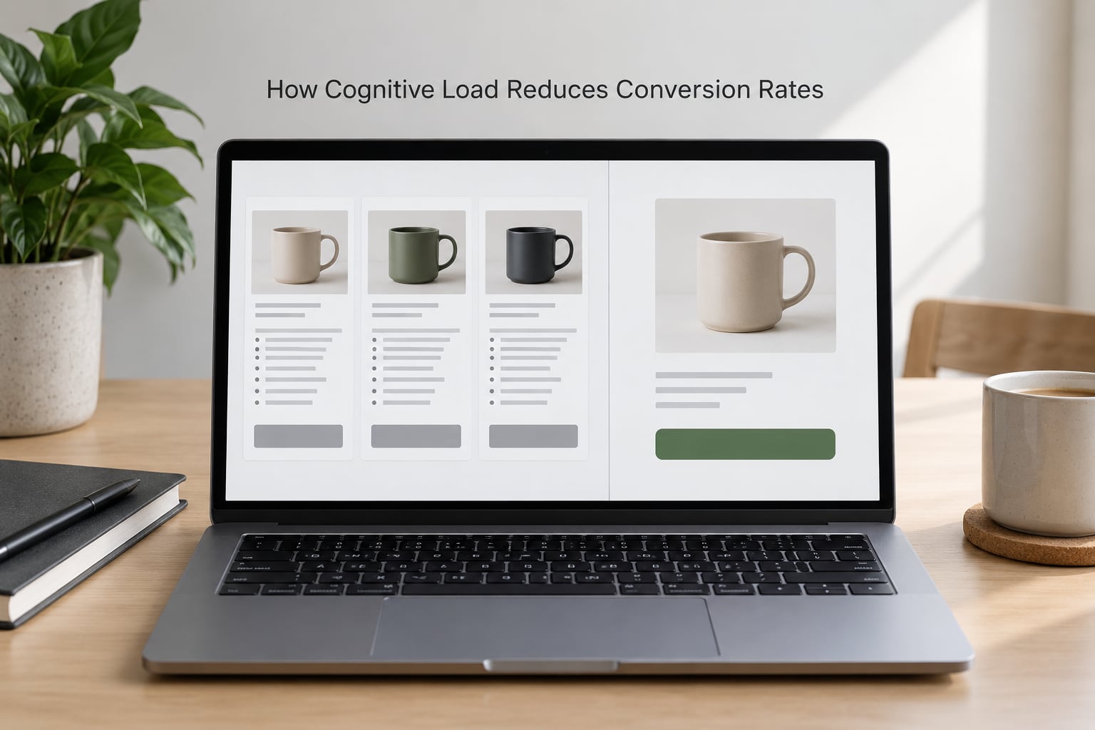
3. Make the choice the page is asking for. Three pricing tiers at most. On product pages with many variants, show a small number of popular ones and put the rest behind a link. A recommendation attached to a choice does more for conversion than an unranked grid of twenty.
4. Sequence rather than stack. Progressive disclosure: show the summary first, the detail on demand. If someone must know twelve specifications to be confident, that is fine — they just should not have to read twelve specifications before they can see the price and the primary button.
5. Show the cost early. Total price, delivery charge and the timing, visible before checkout. Most checkout abandonment is not rejection of the price. It is the shock of meeting it at step four.
6. Keep the path short and reversible. Guest checkout, a progress indicator on multi-step flows, and no forced account creation. If the buyer has to backtrack, confirm what they entered rather than clearing it.
7. Write at a reading level your buyer can process at speed. Grade 8 to 9 is a reasonable target for most commercial copy. Short sentences, concrete nouns, no internal jargon. Test it with a readability checker rather than by eye.
8. Cut the noise. Audit your scripts and widgets quarterly. Chat boxes, popups and app badges accumulate quietly and rarely get removed.
Where simplification backfires
Over-simplification is a real failure mode and it costs the same thing under-simplification does. A B2B buyer comparing an enterprise licence needs the security documentation. A patient choosing a medical device needs the clinical detail. Strip both out and you have removed germane load, and the person leaves because the page stopped supporting a real decision.
So simplify presentation, not substance. Move the technical detail one click away and label it clearly rather than deleting it. If a page earns more trust when it shows its workings, showing them is not clutter.
Load is amplified for some visitors
People with ADHD, anxiety, or who are browsing under stress have less spare capacity, not more. The same page that is merely busy for one visitor is genuinely hard for another. That is why clear labels, one action per screen and short forms help more than any accessibility retrofit you can bolt on later.
How Do You Measure Whether Simplification Improves Conversion?
Start with a baseline you can defend. Conversion rate is completed conversions divided by the sessions or visitors that were eligible to convert — the definition matters, because comparing a checkout conversion rate against a landing page view rate produces numbers nobody trusts.
Then instrument the points where you expect load to bite: add-to-cart rate, checkout start rate, form completion rate, field-level errors, and the abandonment step where most sessions end. Watch one window of time rather than comparing this week to a launch week.
Use heatmaps and scroll depth to find candidate pages, then session recordings to confirm. A page where attention never reaches the primary CTA is a stronger candidate than one where people simply do not buy.
Test one change at a time in an A/B test with enough traffic and a pre-agreed sample size. Judging a test on a hunch is how teams ship changes that were never better. Set your decision rule before you start: for example, a 10% relative lift in completed conversions with no drop in average order value keeps the change; anything short of that, you revert.
Watch average order value alongside conversion rate. Removing options and simplifying the page often lifts completion while cutting what people buy, and a conversion rate alone will hide that trade until the quarter closes.
Load also shows up in engagement signals such as scroll depth, pages per session and dwell time, and those feed how search engines read a page. That is a secondary benefit, not the goal. The goal is completed conversions from traffic you already have.
Frequently Asked Questions
What is the difference between useful and harmful cognitive load?
Useful cognitive load is effort a buyer wants to spend because it supports the decision, such as comparing real specifications or checking delivery times. Harmful cognitive load is effort your interface creates for its own sake, such as decoding a vague button label or hunting for the total price. Useful load tends to sit in detail the buyer came for. Harmful load sits in navigation, layout and unclear microcopy. When deciding what to cut, ask which side a demand sits on rather than counting elements.
Does reducing cognitive load mean removing every choice?
No. It means removing choices that carry no meaningful difference for the buyer, and giving the ones that remain a clear order or a recommendation. A visitor given twenty equally weighted options has to do the ranking work themselves. The same visitor given three options, with the middle one marked as most popular, does far less. The detail behind each choice still belongs on the page, just one click away rather than in front of the decision.
How does cognitive load affect mobile conversion rates more?
A phone removes capacity before your page loads anything. The screen is smaller, navigation is thumb-driven, and the connection is less reliable, so each interaction costs more working memory than the same interaction on a desktop. The context adds to it: a phone is usually used standing up, on the move, or between other tasks. In practice, mobile pages lose more from competing CTAs, long forms and late-revealed costs than desktop pages do, because there is less margin to absorb a moment of hesitation.
Should every website be simplified to improve conversion rates?
No. Pages whose offer is genuinely complex, such as enterprise software, insurance, or medical products, carry intrinsic load that simplification cannot remove, and the buyers may be comparing carefully before committing. Those pages need clearer structure and better decision support rather than fewer words. Simplification pays where the page is adding effort on top of the offer. Where the effort is the offer, restructuring helps and deleting hurts, and a test is the only reliable way to tell the two apart.
What is the fastest way to identify a page with too much cognitive load?
Open it on a phone, hand it to someone unfamiliar with the page, and ask them to say what the page wants them to do and then do it. Ten minutes of watching will surface the problems that analytics hide: unclear labels, competing buttons, a total cost that only appears late, and navigation that moves under the finger. Sessions from high-traffic, non-converting visitors confirm the pattern before you commit engineering time to a fix.
Can A/B testing prove that a page has too much cognitive load?
An A/B test can show that a change improves conversions. It cannot tell you the change worked because cognitive load fell, since any edit to a page moves several variables at once. To test the load hypothesis specifically, change one thing that only affects effort, such as the number of form fields or the count of competing calls to action, and leave everything else identical. If conversion moves with a targeted change and not with cosmetic ones, the load diagnosis is holding up.
Conclusion: Start With the Biggest Source of Friction
Cognitive load reduces conversion rates by spending the visitor’s working memory before the decision happens, so intent arrives and never converts. You do not need a redesign to fix that. Find the step where sessions end, remove one demand from it, and measure the result against a baseline you set before you started.
One change, one test, one honest read of the number. That is how the theory turns into revenue.