What color blue signals to consumers? Blue signals trust, stability, professionalism and calm, which is why banks, insurers, healthcare providers and software companies keep reaching for it. It is not one fixed message, though. Shade, contrast, category and culture all change what a blue actually says, and the useful version of this question is more specific than the slogan version.
Most posts answering this recycle one unsourced statistic about how much of a buyer’s judgment comes from color, then stop. I have read enough of them to distrust the number. Color research in marketing is real, but the measured effects are modest and heavily conditioned by context. What a marketer actually needs is not a magic percentage. It is a way to choose a shade, place it, and check whether it does anything for the brand.
Here is what the evidence reasonably supports, how five shades differ, what each industry should do with the color, and the places where blue quietly works against you.
Table of Contents
- What Color Blue Signals to Consumers at a Glance
- Blue against the other trust colors
- Why Blue Often Communicates Trust and Reliability
- The association chain that makes blue read as safe
- Where the evidence runs out
- How Blue Shade Changes the Consumer Message
- What color blue signals to consumers, shade by shade
- What Color Blue Signals to Consumers by Industry
- How Culture, Context and Audience Shape Blue’s Meaning
- How to Use Blue Effectively in Brand Design
- Pairings that hold up
- Testing it properly
- What Color Blue Signals to Consumers: Common Misinterpretations
- Mistake one: treating blue as automatically trustworthy
- Mistake two: assuming every audience reads blue the same way
- Mistake three: confusing blue with teal
- Mistake four: using color without supporting design
- Frequently Asked Questions
- Does the color blue represent trust?
- Why is blue the color of trust?
- What shade of blue should my brand use?
- Is blue overused in branding?
- Does blue mean different things in different cultures?
- What colors go well with a blue brand?
- Conclusion: Start With the Message You Want Blue to Support
What Color Blue Signals to Consumers at a Glance
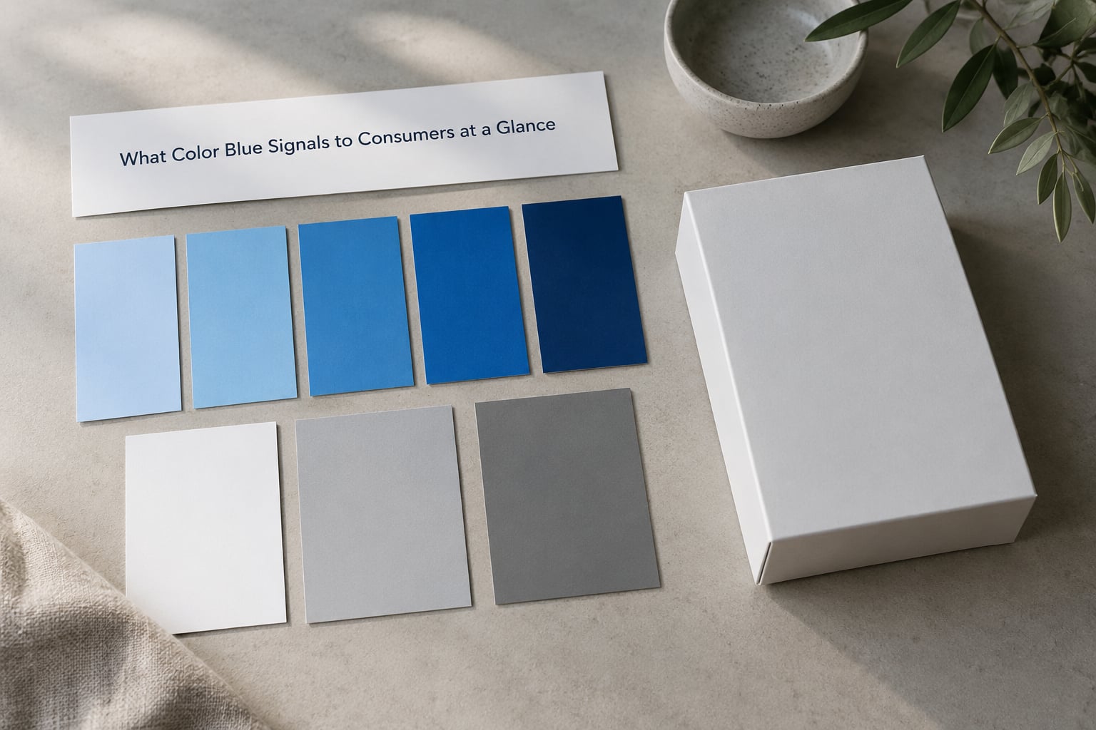
Blue reads as trustworthy, calm, competent and institutional. It lowers the perceived risk of a purchase because it borrows from things people already treat as safe: clean water, open sky, uniformed services and established institutions.
That is the short answer. The associations most often attached to it are:
- Trust and dependability — the most consistent finding across studies.
- Calm and emotional restraint — cool hues sit at the low-arousal end of the palette.
- Competence and authority — especially when paired with white space and a serif or neutral sans typeface.
- Cleanliness and safety — a visual echo of water, hygiene and clinical settings.
- Institutional formality — suits B2B and regulated categories, less so categories built on spontaneity.
- Convention — in tech and finance it is now the default, which means it signals familiarity more than distinctiveness.
Blue is not automatically the safest choice. Read it as a prior that category and context either reinforce or cancel out.
Blue against the other trust colors
Blue is not the only color that signals reliability, and each one leans on a different association.
| Color | Primary signal | Energy | Category fit | Distinctiveness today |
|---|---|---|---|---|
| Blue | Competence, safety, stability | Low to moderate | Finance, tech, healthcare, B2B | Low — heavily used |
| Green | Growth, health, sustainability | Moderate | Food, wellness, climate, agriculture | Moderate, crowded too |
| Gray | Neutrality, precision, sobriety | Very low | Premium goods, industrial, editorial | Moderate |
| White | Cleanliness, simplicity, openness | Moderate | Wellness, retail, minimal brands | High, but undifferentiated |
| Black | Authority, luxury, seriousness | High despite the color | Fashion, automotive, premium tech | High |
Why Blue Often Communicates Trust and Reliability
Two things happen at once: the color carries inherited biological associations, and then a century of institutions reinforced them. Neither alone would be enough, which is why the effect survives even though it is now largely cultural.
The association chain that makes blue read as safe
- Water and open sky. Blue maps to potable water, clear weather and open horizon, none of which historically threatened a group. Color researchers call this an ecological reference: the palette maps onto survival-relevant things.
- Low arousal. Warm saturated hues read as urgent and energetic. Cool hues sit at the opposite end, and low arousal reads as controlled, measured and unhurried — the emotional profile buyers want from someone holding their money or their health data.
- Uniforms. Police, medical staff, pilots and military have all worn blue-based uniforms, so the color carries institutional competence in layers that most marketing copy never had to state.
- Early corporate adoption. Insurance, utilities and banking chose blue for letterhead, uniforms and signage before mass advertising existed. Repetition at that scale turned a preference into a convention.
- The caution default. Categories with real downside risk pick the least exciting color on the wheel. Buyers learn to read restraint as carefulness.
Then the loop closes: every new company in a risky category copies the incumbents, which adds more exposure, which reinforces the reading. Blue is trusted partly because so many trusted things are blue.
Where the evidence runs out
Effect sizes in this area are usually small, and they shrink as categories get more familiar. A blue button will not rescue a confusing checkout, and in categories where buyers already expect blue, the color adds almost nothing to trust. It reduces perceived risk; it does not create a reason to buy.
The other limit worth naming: lighting changes everything. The same paint reads noticeably cooler under fluorescent light and warmer under LED, and cheap inks shift hue between screen and print. Designers call this metamerism, and it is the reason a color that passed on a laptop screen can look wrong on a painted wall.
How Blue Shade Changes the Consumer Message
Navy and sky blue are not variations on a theme. Different lightness, saturation and temperature shift the perceived personality more than most brands assume, and the same brand name can feel like two different companies across that range.
What color blue signals to consumers, shade by shade
| Shade | Typical starting hex | Likely impression | Works well for | Watch out for |
|---|---|---|---|---|
| Navy | #1F3A5F | Authority, restraint, heritage, seriousness | Finance, legal, insurance, government | Reads cold and distant on small touchpoints |
| Royal blue | #2A5CAA | Confidence, energy, corporate competence | B2B software, consulting, logistics | Very common, so little differentiation |
| Cobalt | #0047AB | Bold, modern, energetic, creative | Agencies, media, consumer tech, events | Aggressive for clinical or caring categories |
| Sky blue | #7FB3E0 | Friendly, open, light, non-threatening | Healthcare, childcare, wellness, education | Weak on white backgrounds, low contrast |
| Teal | #0E7C7B | Modern, balanced, technical, calm | Health tech, fintech, climate, SaaS | Often mistaken for a blue brand by buyers |
Three levers drive most of that difference. Lightness sets formality: darker reads as more institutional, lighter as more approachable. Saturation sets energy: a muted blue with grey mixed in looks considered, a vivid one looks louder and less conservative. Temperature decides whether the color feels clinical or friendly, and whether it competes with or sits beside the greens and teals already in the category.
If a brand needs both authority and warmth, mixing two blues in the palette usually works better than picking one compromise shade. A dark navy paired with a light sky blue gives you a serious brand color and a friendly interface color without asking one hue to do both jobs.
What Color Blue Signals to Consumers by Industry
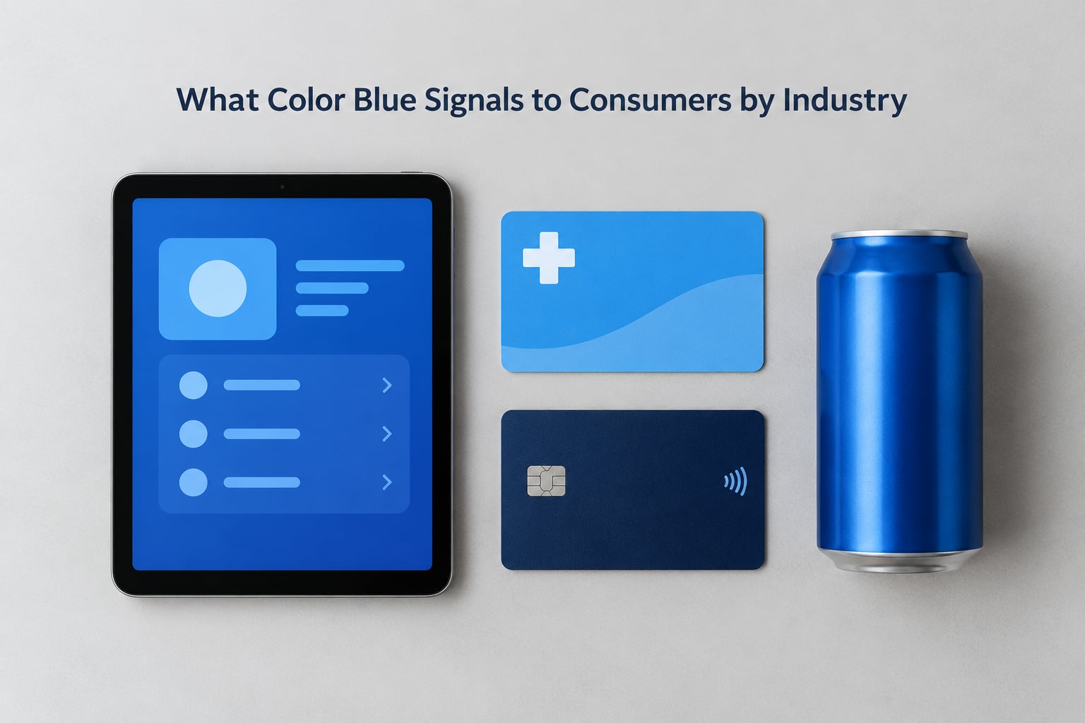
Category expectations beat general color psychology every time. The same navy that reads as trustworthy on a pension fund reads as bureaucratic on a food delivery app, because that is what buyers have been trained to expect in each setting.
| Industry | Preferred shade | Accent pairings | Primary caution |
|---|---|---|---|
| Technology / SaaS | Royal, indigo or teal | Violet, coral, lime | Invisible in a saturated category |
| Financial services | Navy | White, muted gold, warm grey | Dread rather than confidence if overdone |
| Healthcare | Sky or clean mid-blue | Soft white, mint, pale teal | Too much saturation starts to look clinical-cold |
| B2B services | Navy with a warmer secondary | Charcoal, tan, rust | Looking like an enterprise default |
| Food and beverage | Deep blue on label | Warm yellow, red, cream | Supermarket aisle fatigue |
| Fashion | Black-leaning navy or vivid cobalt | White, metallic, seasonal accent | Reads generic outside premium styling |
| Automotive | Navy or a metallic blue | Black, silver, graphite | Blue is a default paint choice, low distinctiveness |
| Climate / AI | Teal, indigo, or blue with a green accent | Green, off-white, deep charcoal | Greenwashing expectations around the blue |
In technology, blue is table stakes. The interesting question is no longer whether to use it but where to break from it, and most brands that manage to look distinct in software do it with a single warm accent rather than by abandoning blue entirely.
In finance, navy still works because the category rewards looking institutional, but it now has to carry more. A generation of fintech brands uses teal or a warm secondary to signal that the company is approachable, and buyers respond to that split. In healthcare, the risk runs the other way: light blues signal cleanliness but thin out fast on white backgrounds, so contrast matters more than hue.
Food brands use blue deliberately because it is rare on a shelf, and scarcity works in their favor. Fashion and automotive usually bury blue inside a broader neutral system, where it does less signaling work and looks more expensive.
How Culture, Context and Audience Shape Blue’s Meaning
Treating color meaning as universal is the most common modeling error in brand strategy, and blue is where it shows up most often. Across markets it also carries readings that have nothing to do with trust.
Blue has spiritual and protective associations in several traditions, including a strong presence in Islamic contexts and in parts of Hindu iconography, where it sits close to divine imagery. It is one of the most common mourning colors in several East Asian markets, which matters for campaign timing and packaging rather than for logo design. Blue also skews masculine in several Western markets and reads more neutral elsewhere, which affects how it interacts with typography and imagery.
Context changes the message as much as culture does. A blue used for a compliance document reads as sober and official. The same blue on a sports drink reads as cold and refreshing. Neither reading is about the pigment.
Audience composition matters more than nationality. A blue that reads as trustworthy to an enterprise buyer can read as impersonal to a consumer audience buying for identity and self-expression, and the same brand cannot assume both at once.
The practical conclusion is simple enough to state: test with the audience you actually have, not with a general population panel. Ask what the color reminds them of and what they expect it to mean, rather than asking whether they like it, which mostly measures aesthetics.
How to Use Blue Effectively in Brand Design
Blue works best when it is doing one job inside a system that already supports it. A four-step sequence gets you most of the way.
- Name the job first. Write one sentence describing what the color has to make the audience feel or do. Reduce perceived risk in a financial product, feel safe opening a health record, signal technical competence. If the sentence needs two verbs, the palette is doing too much.
- Pick the shade from that sentence, not from a trend. Authority points to navy or a desaturated royal. Friendliness points to sky or a lightened tint. Modern technical credibility points to teal or indigo. Choose the hue that matches the job, then build tints and shades from it rather than inventing a second unrelated color.
- Check contrast and accessibility before anything else. Body text on a background needs a contrast ratio of at least 4.5:1, and 3:1 for large text and interface boundaries. Run it through a contrast checker rather than eyeballing it, because screen brightness, projector gamma and print all shift the result.
- Test it against the real category set. Put your blue next to the five brands a buyer would compare you with. If the palette merges, differentiate through the accent color, typography, photography or layout instead of fighting for another blue.
Pairings that hold up
Blue carries neutral partners well. White and warm grey keep it open and readable. Charcoal adds weight without raising saturation. Warm accents such as coral, amber, rust or ochre create the contrast that stops a blue brand from going flat, and they work especially well in interfaces where a single blue CTA needs to compete with everything around it.
Avoid pairing blue with another mid-light cool color at similar lightness. Two blues of equal value produce weak hierarchy and muddy boundaries, particularly on small screens.
Testing it properly
Three methods cover most cases. A category-level eye-tracking or heuristic review tells you whether the blue is even noticed among competitors. A simple A/B test swapping your current color for a candidate tells you whether it moves a specific metric, though single-step tests on low-traffic pages rarely reach significance, so run them on enough volume to be sure.
Qualitative testing adds something numbers miss: ask unprompted associations before you tell people what the color is meant to mean. If nobody mentions trust unprompted, your design is doing the work through typography and photography, not through hue, and no amount of shade selection will change that.
What Color Blue Signals to Consumers: Common Misinterpretations
Mistake one: treating blue as automatically trustworthy
Blue supports a trust message; it does not deliver one on its own. Brands running on thin evidence, poor service or a confusing interface lose the reading within a single interaction, and buyers are quite good at noticing when a calm color is covering a difficult experience. The color lowers perceived risk, it does not remove it.
Mistake two: assuming every audience reads blue the same way
Assumptions built on North American corporate convention travel badly. Cultural associations shift the reading, and audience segment shifts it again. Test the color with the buyers you have, and treat any single-number claim about color meaning across all markets as a convenience rather than a finding.
Mistake three: confusing blue with teal
Teal sits between blue and green, and in practice it does not read as a blue to everybody. In health technology and fintech it reads as modern and technical; in sustainability contexts it can be read as green and trigger greenwashing expectations. If you choose teal, expect to defend what it means rather than borrow blue’s trust associations by association.
Mistake four: using color without supporting design
A blue logo on a cluttered layout signals nothing. Color carries meaning through repetition, hierarchy and contrast with everything around it, and it inherits the associations of the typography and photography next to it. Teams often over-invest in shade selection and under-invest in the system that makes the shade legible.
Frequently Asked Questions
Does the color blue represent trust?
Blue supports perceptions of trust, dependability and competence, which is why it dominates finance, insurance, healthcare and B2B branding. The association is a prior built from clear water, open sky and institutional uniforms, reinforced by decades of corporate use. It lowers perceived risk rather than creating a reason to buy, and it disappears the moment the service experience contradicts it.
Why is blue the color of trust?
Three forces combine. Blue maps onto survival-relevant things such as clean water and open sky. Cool hues sit at the low-arousal end of the palette, and low arousal reads as careful and measured. Then police, medical and corporate uniforms repeated the color at scale for over a century, turning a preference into a convention that new companies inherit by copying the biggest names in their category.
What shade of blue should my brand use?
Match the shade to the job the color has to do. Navy and desaturated royal blue signal authority and restraint for finance, legal and government. Sky blue signals friendliness and cleanliness for healthcare, education and wellness. Cobalt adds energy for agencies and consumer tech. Teal reads modern and technical for health tech, fintech and climate. Pick one hue, then build tints and shades from it rather than combining several blues.
Is blue overused in branding?
In technology and financial services, yes. Blue is the category default, so it communicates familiarity and category fit but very little distinction. Brands competing in those fields usually differentiate with a warm accent color, unusual typography or a distinctive accent shade rather than by abandoning blue. In food, fashion and automotive, blue stays relatively scarce and keeps more of its signaling power.
Does blue mean different things in different cultures?
Yes. Blue carries spiritual and protective associations in several traditions, and it is one of the most common mourning colors in a number of East Asian markets, which affects packaging and campaign timing. It also reads as more masculine in some Western markets and more neutral in others. Any color assumption should be checked with the specific audience rather than assumed to transfer globally.
What colors go well with a blue brand?
White and warm grey keep a blue open and readable, while charcoal adds weight without raising saturation. Warm accents such as coral, amber, rust and ochre give a blue brand the contrast it needs to stand out, and work well for making a single call to action visible. The pairing to avoid is a second mid-light cool color at similar lightness, which produces weak hierarchy and muddy boundaries.
Conclusion: Start With the Message You Want Blue to Support
What color blue signals to consumers depends on what you are trying to say. Blue communicates trust, calm and competence, and it is a strong default for anything risky or technical. It also signals category convention, which is a liability where everyone else already looks the same.
Define the positioning first, pick the shade that matches it, check the cultural read with the audience you actually have, verify contrast before you fall in love with a swatch, and then test it against real competitors and real traffic. The color works best as one part of a system that says the same thing. When the typography, imagery and messaging agree, you do not need the shade to carry the message alone.