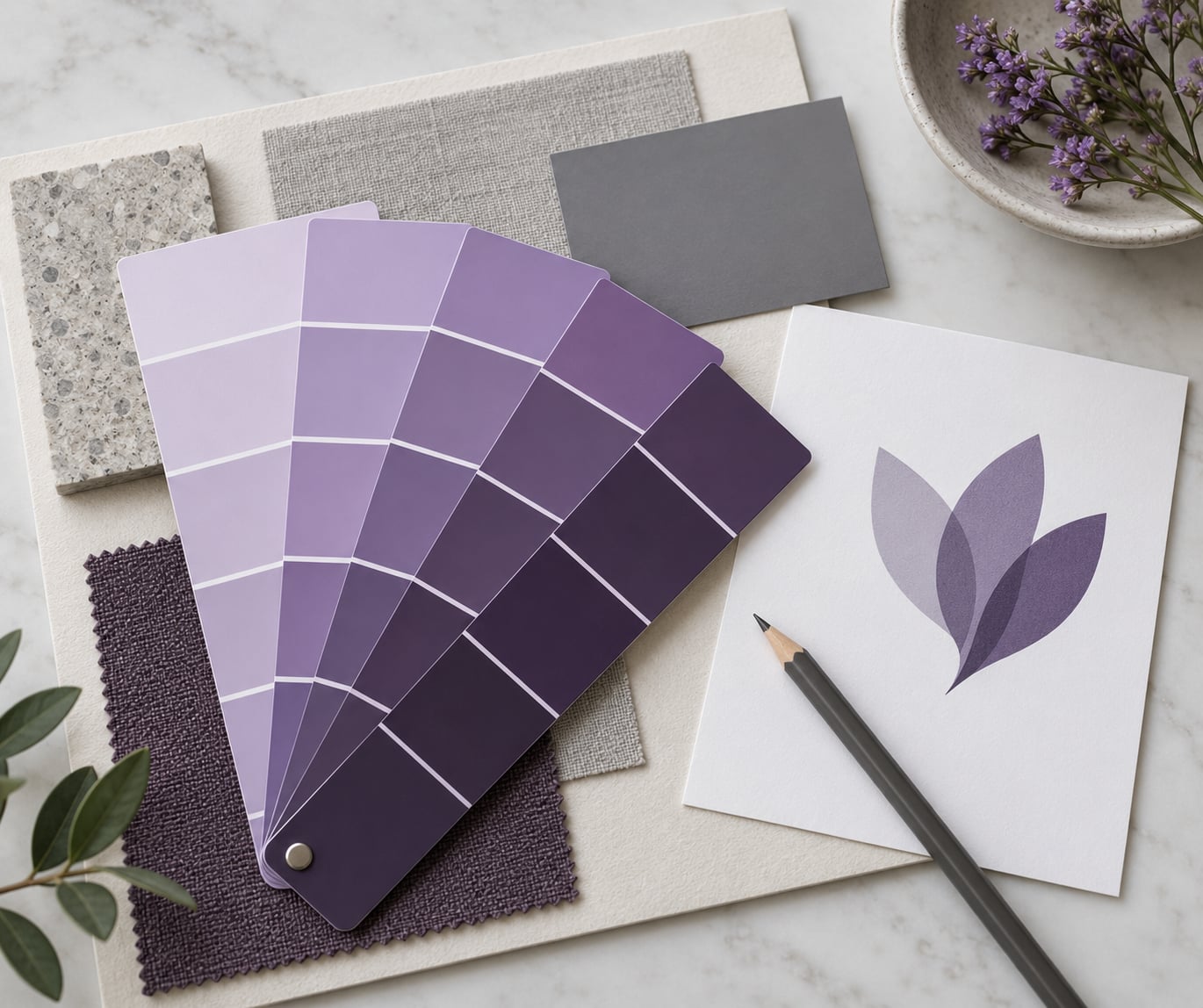
What color purple signals in brand design is not a fixed answer, and that is the useful part. Purple reads as rarity, imagination and distinction; it lands as luxury when it is dark and restrained, and as a stock trend template the moment it turns into a bright purple-to-blue gradient. Shade, neighbors, type and category decide which message gets delivered.
Most of the color psychology charts online treat purple as a fixed entry in a lookup table. That is the part that misleads people. Two brands can both use purple and land on completely opposite impressions, and the difference is almost never the hue itself.
Table of Contents
- What Purple Communicates in Brand Design
- How Purple Gets Its Associations
- How the Shade of Purple Changes the Message
- Choosing between violet, royal purple and indigo
- What Cultural and Audience Contexts Add
- Where Purple Works Best by Brand Category
- How to Use Purple Without Overlooking the Rest of the Palette
- How to Test Whether Purple Fits Your Brand
- Frequently Asked Questions
- What does purple usually symbolize in branding?
- Is purple an appropriate color for every type of brand?
- Which shade of purple is best for a luxury brand?
- What colors look good alongside purple in a brand palette?
- Does purple have the same meaning in every country?
- How do I check whether purple fits my target audience?
- Conclusion: Choose Purple for the Message You Need
What Purple Communicates in Brand Design
Purple signals rarity first and luxury second. Because the hue sits between red (energy, blood, appetite) and blue (calm, trust, coldness), it inherits a bit of both, and that middle position is why it keeps showing up in brands that want to feel cultivated rather than loud.
In practice, when designers ask what color purple signals in brand design, they land on a cluster of seven meanings: luxury and royalty, creativity and imagination, mystery and spirituality, distinction and scarcity, indulgence and sensuality, transformation and non-conformity, and ceremony. Which one a viewer actually notices depends on how much of the identity is purple.
Here is the same hue read three different ways in practice. On a perfume box, a deep violet with gold foil says expensive and ceremonial. On a streaming app’s login screen, a mid violet with white type says friendly and modern. On a gradient SaaS hero banner, violet fading into blue says template.
My rule of thumb: purple works as a signal when something in the brand can back it up, and it starts to sound hollow when the color is doing work the product cannot prove. A meditation app that is genuinely calm can wear pale lavender without anyone calling it fake. A currency exchange with the same palette gets read as trying too hard.
How Purple Gets Its Associations
The royalty story is a materials story. Tyrian purple, a dye made from thousands of crushed sea snails, was so expensive that Roman sumptuary law restricted who could wear it, and porphyry — a purple stone quarried in Egypt — was reserved for imperial statues. The color was expensive before it was symbolic, and the symbolism stuck.
Later layers reinforced it. Bishops and monarchs wore purple vestments in religious ceremony, and in Western art purple has long coded twilight, the cosmos and the divine, which is where the spirituality and mystery readings come from.
The creative reading is younger and more modern. Purple shows up in counterculture and music from the late 1960s onward, and it later became a default for anything trying to signal imagination, because it sits outside the warm-primary and cool-corporate sets most competitors are drawing from. It reads unconventional by contrast rather than by content.
How the Shade of Purple Changes the Message
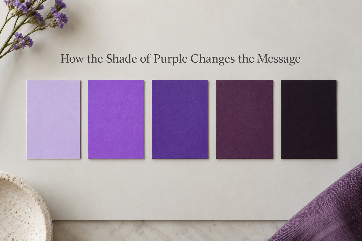
Lightness and saturation do most of the work here. A tint moves toward white and softens the hue into something calm and approachable. A shade moves toward black and pushes it toward gravity and expense. Saturation decides whether the color announces itself or stays in the background.
| Shade | Likely read | Fits best | Risk |
|---|---|---|---|
| Pale lavender | Calm, gentle, care, sleep | Wellness, skincare, sleep, childcare, calm SaaS | Weak on text, washes out under bright light |
| Bright violet | Playful, energetic, youthful | Gaming, streaming, events, kids and education | Reads cheap without dark support |
| Royal purple | Confident, ceremonial, bold | Beauty, sports franchises, media, premium retail | Can feel formal or dated |
| Deep plum | Sensual, mature, distinctive | Luxury beauty, hospitality, wine and spirits | Reads feminine-coded to some audiences |
| Near-black purple | Exclusive, modern, expensive | Luxury retail, premium tech, editorial | Hard to distinguish from black on cheap screens |
Choosing between violet, royal purple and indigo
Violet sits on the magenta side of purple and leans playful. Indigo sits on the blue side and leans corporate, which is why so many financial and enterprise products drift toward it without meaning to.
If your brand has to look different from a blue competitor, move toward violet. If it has to look established next to blue competitors, move toward plum or a near-black purple. And if you want the pure premium read, darken it; the recurring note from designers is that purple looks expensive only while it stays dark and restrained.
What Cultural and Audience Contexts Add
There is no universal dictionary, and treating one as authoritative is the fastest way to embarrass a brand in a new market. Meanings shift by region, religion, age and category, so the sensible move is to test locally rather than assume.
Purple carries mourning and grief associations in several places, including Thailand, where it is a traditional color for widow’s clothing, and in parts of Brazil, where it is associated with mourning and religious observance. In Japan, purple has long signalled status and elegance in dress. In Hindu contexts the color connects with devotion and spirituality, while in Islamic contexts purple is often used to denote spiritual significance and nobility. None of these readings makes purple unusable, but each one shifts what a first-time viewer feels.
Age and gender perception matter too. Bright violets skew young, which helps a streaming or gaming product and hurts a retirement or mortgage brand. Deep plum skews mature, which reads well for a beauty line aimed at adults and awkwardly for a children’s product.
Test it where you are actually selling. A ten-person read in the target market will tell you more than any chart written in another country.
Where Purple Works Best by Brand Category
Category convention does most of the heavy lifting. Purple is common in beauty, streaming and gaming, so it carries no particular charge there; it is unusual in utilities, logistics and elder care, which is exactly why a purple interface in those fields tends to read as artificial.
| Category | Why it helps | What must support it |
|---|---|---|
| Beauty and personal care | Indulgence, creativity, a sense of treatment | Real formulation story, photography, restrained neutrals |
| SaaS and creative tools | Imagination, non-corporate posture | A distinctive second color and real product depth |
| Finance and fintech | Marks a challenger against blue incumbents | Trust signals elsewhere; purple alone reads flimsy |
| Gaming and streaming | Energy, night-time use, community codes | A deeper anchor shade so it is not just bright |
| Education | Approachable, imaginative, less institutional | Legibility on dense pages and printed materials |
| Hospitality and ceremony | Matches weddings, awards, premium service | Materials and service detail that match the promise |
| Food and confectionery | Indulgence, seasonal and festive use | A warmer support color so it does not look artificial |
| Wellness and spirituality | Calm, intuition, evening and rest | Soft contrast; avoid high-saturation accents |
The failure pattern is consistent. When purple shows up in a category where buyers expect calm, plain reliability, the color reads as decoration rather than evidence, and it drags the perceived quality of everything else down with it.
How to Use Purple Without Overlooking the Rest of the Palette
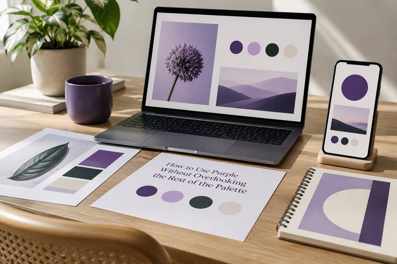
Pick the job before you pick the swatch. As an accent on a neutral base, purple marks buttons, links and highlights without making a promise about the whole company. As a dominant field, it becomes the brand’s personality whether or not you meant it that way.
Pairs do more work than the purple itself. Purple with gold or brass reads ceremonial and expensive. Purple with black reads exclusive and modern. Purple with white reads clean and clinical, which suits skincare and medical-adjacent work. Purple with warm grey or a deep navy reads considered and restrained. Purple with a neon accent reads tech-forward and loud.
Type changes the read too. A serif in purple leans editorial and heritage. A rounded sans in the same hue leans friendly and youthful. The pairing, not the hue, does the deciding.
Check contrast before you commit. Purple text on white fails more often than designers expect, and light lavender backgrounds wash out body copy. The WCAG 2.1 minimums are 4.5:1 for normal body text and 3:1 for large text; run a contrast checker on your primary purple against every neutral you plan to use, including the greys.
Keep the same purple across screen and print. Screens add glow and shift saturated colors brighter, so a purple approved on a printed proof can look lighter and more vivid on a display, and the gap is large enough to break brand recognition across touchpoints.
How to Test Whether Purple Fits Your Brand
Four checks will tell you more than any meaning chart. Run them before the palette is locked, not after launch.
1. Contrast and legibility check. Run your purple against white, black and your supporting grey through a WCAG contrast checker, then print a page at actual size and read a paragraph of body text on it. Most failures happen here, not in the mood board.
2. Five-second recall test. Show five people the finished identity for five seconds, cover it, and ask which brand it belonged to and what it does. Ambiguity in the first answer usually means purple is drowning out your name and category.
3. Competitor scan. Search your category and look at the color band across the first two pages of results. If every competitor is already purple-blue, a different shade or a purple-plus-warm-neutral pairing is doing more work for you than the hue alone.
4. Landing page A/B test. Swap purple in for your current primary on one page, hold everything else constant, and measure click-through and scroll depth. This is the only test that tells you whether the signal helped in your market rather than in the abstract.
A designer working on a ticket-resale brand named PURPL asked a design forum whether a purple-only palette would carry the identity. The community answer leaned toward purple plus a neutral support palette, red and white and grey, or blue and grey and white. That is the general rule: one purple plus a neutral that does real work.
Frequently Asked Questions
What does purple usually symbolize in branding?
Purple usually symbolizes rarity, imagination and distinction. In brand design it is read as luxury, creativity, spirituality and ceremony, depending mostly on the shade. Dark, desaturated purples lean expensive and exclusive; pale tints lean calm and caring; bright violets lean playful and youthful. The pairing with your second color decides as much as the hue itself.
Is purple an appropriate color for every type of brand?
No. Purple fits brands that can back the promise it makes: beauty, entertainment, wellness, creative software, premium hospitality and challenger finance. It struggles in categories where buyers expect plain reliability, such as utilities, logistics and elder care, where it reads as decoration rather than evidence. The safer move is to use purple as an accent on a neutral base until the palette proves itself.
Which shade of purple is best for a luxury brand?
A dark, desaturated purple near black is the most reliable luxury read. Royal purple with gold or brass supports ceremonial and beauty work, while a plum tone suits hospitality, wine and spirits. Designers consistently report that purple only looks expensive while it stays dark and restrained. Bright violet and purple-to-blue gradients are the fastest way to lose the premium impression.
What colors look good alongside purple in a brand palette?
Gold or brass gives a ceremonial, expensive combination. Black reads exclusive and modern, white reads clean and clinical, and warm grey or deep navy keeps the palette considered. A neon accent pushes the pairing toward tech and gaming. The most common mistake is using purple alone; one purple plus a neutral that carries real work is far more reliable.
Does purple have the same meaning in every country?
No. Purple carries mourning and grief associations in Thailand and parts of Brazil, long signals status and elegance in Japan, and appears in Hindu devotional and Islamic contexts with spiritual and noble meanings. Age and gender perception also shift by market. Test palettes in the market you are actually selling to rather than relying on a single global chart.
How do I check whether purple fits my target audience?
Run four checks. Verify WCAG contrast against every neutral you plan to use, then print a page and read body copy on it. Show the finished identity to five people for five seconds and ask what brand it was and what it does. Scan the first two pages of search results for competing purples. Then A/B test the purple against your current primary on a landing page.
Conclusion: Choose Purple for the Message You Need
Purple is not a universal signal and no chart will tell you the right one for your brand. Its strongest, most durable qualities are rarity, imagination and cultivated taste, and they survive only when the shade, the second color and the product itself all agree.
Start by writing the impression you want in one sentence, then test the closest purple against a neutral and your real audience. If the sentence cannot be defended by something you actually do, a different hue will serve the brand better.