Short version: black in luxury branding signals sophistication, exclusivity, authority and restraint. It became the default because a near-monochrome identity is hard to pull off, so the confidence it takes to leave almost nothing on the page reads as status. What that signal is worth depends on the category, the culture and the craft behind it.
There is a version of this advice floating around that stops at “black equals elegance” and moves on. That version is useless when you are sitting in a client meeting trying to defend a palette. So this piece goes further: what the signal actually is, why luxury houses keep returning to it, where it breaks, and how to test whether it works for your brand before you commit a year of identity to it.
A word on the method first, since the whole field is sloppier than it looks. Color psychology is the study of how colour affects perception and emotion. Its general direction is not in dispute, but the specific colour-to-meaning charts that circulate online are mostly unsourced summaries, not research findings. Designers on Graphic Design Stack Exchange say the black-and-white look of perfume sites comes down to restraint and high-contrast product photography, not some universal psychological law. I lean the same way: treat association lists as hypotheses worth testing, and read the evidence-versus-myth section below before you repeat them to a client as science.
Table of Contents
- What Does Black Mean in Luxury Branding?
- Why Luxury Brands Use Black
- Why black became the default luxury color
- The Main Psychological Signals of Black
- Where the signal is genuinely useful
- Where the popular claims go too far
- How Black Works Across Luxury Categories
- What Color Black Means for Luxury Brand Identity
- How to Use Black Without Making a Brand Look Generic
- What color black means when every competitor uses it too
- When Black Does Not Signal Luxury
- Where the reading turns negative
- How to Test Black in a Luxury Brand Concept
- Frequently Asked Questions
- Why is black a luxury color?
- What color symbolizes luxury?
- What does the color black mean in business?
- What brands use the color black?
- What does black mean in color psychology?
- Is black a good color for a premium brand?
What Does Black Mean in Luxury Branding?
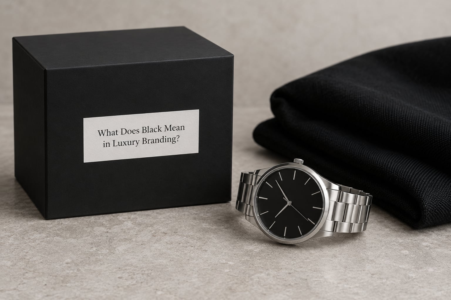
Black in luxury branding carries a cluster of meanings that usually travel together: restraint, authority, permanence, exclusivity and seriousness. It tells a viewer that the brand is confident enough to hold still. Because colour is processed before a logo is read, that message lands first, and in a category where price is justified emotionally rather than functionally, the first signal carries more weight than it would in a functional purchase.
The core associations luxury brands lean on:
- Sophistication — the sense that a choice was made rather than defaulted to.
- Exclusivity — a private club look, reinforced by limited palettes and low contrast pairings.
- Authority — seriousness and control, useful for brands that should not seem casual.
- Permanence — black reads as established and durable, which suits heritage and craft claims.
- Mystery — what a black box hides invites curiosity, which supports premium pricing on contents.
- Modernity — associated with minimalism and technology, notably in design-led categories.
- Timelessness — a colour that has survived many trend cycles, which reduces rebranding pressure.
None of that is automatic. The same black that signals control in a watch brand can signal mourning at a funeral, coldness at a wellness startup, or bargain-bin manufacturing at a fast-fashion label. Category, culture, materials and how consistently the colour is executed decide which reading a viewer lands on.
Why Luxury Brands Use Black
Luxury did not settle on black because it looks expensive. It settled on black because decoration is the easiest way to appear expensive, and the most established houses can afford to skip it. Black works as a status shortcut precisely because most brands cannot pull it off.
Why black became the default luxury color
Five reasons show up consistently when you look at how luxury identities are built:
- Restraint as a status marker. Visible wealth has shifted from showing goods to controlling access to them. A palette with nothing left to remove signals that judgement, and judgement is what a buyer is being sold.
- High contrast puts the product in charge. A black or near-black ground makes metal, leather, glass and skin tones read as more luminous. In a category where the goods are the argument, a loud brand colour is an argument about something else.
- It forgives photography and print variation. Compared with a saturated corporate red, a black ground is unusually stable across coated stock, uncoated stock, fabric, glass and screen.
- It shifts the burden onto craft. When colour is removed, buyers notice the stitching, the weight, the closure and the finish. That is exactly the detail a premium price needs to justify.
- It is grammatically neutral. Black supports almost any supporting colour, so a brand can change campaign, season or category without breaking the system.
There is a commercial side too. Black-led identities are memorable partly because they are unusual at the top of any category. The top-down reading is reservedness; the bottom-up reading is that the brand looked expensive and is therefore worth the price. That inference is doing the pricing work for you.
The Main Psychological Signals of Black
Black is unusual among the major colours in that people tend to describe it in terms of control rather than feeling. The associations reported in both design communities and consumer research tend to cluster around authority, sophistication, comfort, and a sense of composure under pressure. That combination is unusually well matched to luxury, where the buyer wants to feel capable rather than delighted.
Where the signal is genuinely useful
Exclusivity, authority and permanence are the working parts. Black tells a viewer the brand has made a decision, that the decision is not up for negotiation, and that the company expects to still exist in ten years. For watches, spirits, fine jewellery and automotive interiors, that is close to the literal value proposition.
Where the popular claims go too far
Three claims come up constantly and deserve less confidence than they get. The first is that black is inherently more elegant than other colours; elegance is a property of a whole system, and an awkward black layout is still awkward. The second is that black always increases perceived value; research on price and colour tends to find small, category-dependent effects that shrink or disappear once participants learn the brand. The third is the fixed personality chart, which treats every viewer as carrying the same dictionary.
What that leaves is more useful. If the response is context-dependent, then your job is to control the context: the material, the lighting, the neighbouring colour, the type of photography and the consistency of the whole system.
How Black Works Across Luxury Categories
The same colour behaves differently depending on what the buyer is paying for, which is why comparing categories is more instructive than comparing brands. In fragrance, black is the frame that stops the liquid from being judged on price alone. In horology, black dials exist because legibility under low light and a sense of instrument precision matter more than decoration. In hospitality, black is used sparingly in ground floors and generously in lighting schemes at night.
| Category | What black signals there | Watch out for |
|---|---|---|
| Fashion | Timelessness, heritage, evening formality | Reads as generic when a fifth monochrome label launches |
| Fragrance and packaging | Mystery, price protection, focus on the bottle | Overuse; a black box no longer feels rare |
| Watches | Precision, instrument credibility, restraint | Legibility; dials need contrast, not mood |
| Automotive and interiors | Weight, engineering seriousness, calm | Cabin legibility and reflection glare |
| Fine jewellery | Understated wealth, permanence | Detail disappears against dark stone and velvet |
| Beauty | Clinical credibility, intensity | Impurity associations in some categories |
| Hospitality | Night-time intimacy, discretion | Dark lobbies read as unlit to first-time visitors |
| Technology and audio | Engineering precision, modernity | Conflates with hardware and gaming |
| Premium food and spirits | Rarity, aged depth, seriousness | Reads as bitter, burnt or medicinal if the palette goes monochrome |
Food and spirits are the clearest outlier. Appetite is the selling point, and a black identity is working against the cues that signal flavour. Several spirits brands still use black for aged and reserve expressions specifically because it reads as the darker, older, more serious end of the range.
What Color Black Means for Luxury Brand Identity
Turning the colour psychology into a decision takes four steps, in this order. Start with the positioning you are actually claiming, not the one you wish you could claim. A heritage house, a contemporary gallery brand and a next-generation jewellery label all want “premium” and all need black for different reasons.
Second, test fit against the category code. Luxury has an established colour vocabulary, and readers know it. Black, gold, deep navy, ivory, oxblood and grey are the code; a deliberate break out of it works when it is clearly intentional and consistently defended.
Third, decide how much of the identity is black. A black-dominant identity says one thing. A black-accent identity, where black appears on packaging, floor and typography while the primary field is cream, says something warmer and usually reaches more people. The ratio is a positioning decision, not a taste decision.
Fourth, make the colour legible. Black only reads as intentional when something is set against it. That means typography with enough weight to hold, photography with a clear light source, and a specified black rather than a default hex value left over from a template.
Specifications matter more here than in most identity systems, because black is deceptively hard to reproduce consistently. Print and screen black are different colours: rich or process black uses a combination of inks and can look flat or greenish if the balance is wrong, while a flat single-ink black can read deeper on screen. Brands that specify one black and then let printers improvise end up with a different brand on every box. On screen, pure black is heavier than most designers expect, and a full-black interface needs text and imagery tested for contrast, not assumed to pass.
How to Use Black Without Making a Brand Look Generic
What color black means when every competitor uses it too
The common complaint from designers is that black feels safe but generic. That is a fair criticism, but it is aimed at the wrong thing. Black is not generic; a default black with no decisions attached to it is generic. The escape route is specificity, and there are several of them.
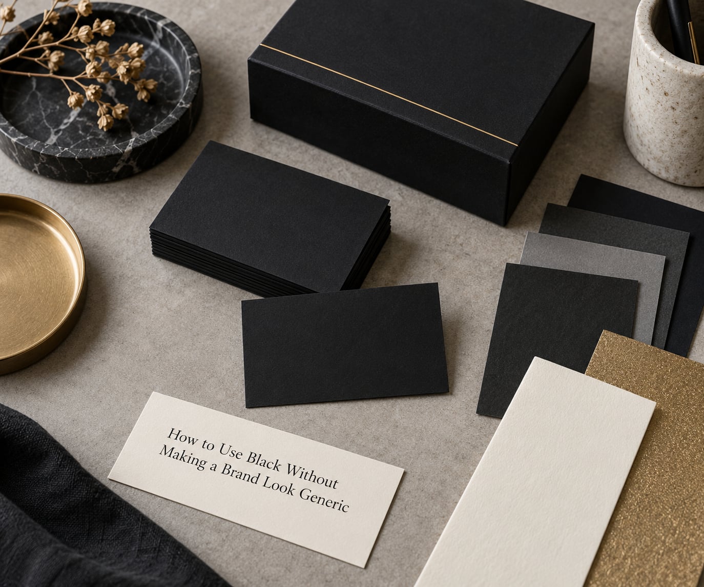
- Choose a shade and name it. True black, ink black, charcoal and obsidian read differently to designers and to buyers, and they change the perceived price point.
- Control the proportion. A 60/30/10 split with one supporting colour looks composed. An even blend of three neutrals looks unresolved.
- Let materials carry the interest. Embossing, foil, uncoated stock, anodised metal and lacquer do what extra colours would do, but with a quieter signal.
- Build contrast into the type. Weight, spacing and scale matter more than colour once the palette is monochrome.
- Give black a job. Background, packaging, or product. A brand where black is the background everywhere has no contrast left.
- Keep one counterweight. A single ivory, warm grey or metal accent prevents the palette reading as an absence of thought.
Shade choice is where most of the differentiation is available, and it is the step most systems skip.
| Shade | How it reads | Best suited to |
|---|---|---|
| True black | Formal, absolute, high drama | Fragrance, eveningwear, editorial |
| Ink or rich black | Dense, printed, substantial | Packaging, paper, bookbinding |
| Charcoal | Approachable, modern, still expensive | Interiors, hospitality, digital UI |
| Obsidian | Cool, near-black, jewel-like | Jewellery, automotive, technology |
Pairings follow the same logic. Black with gold reads as ceremonial and is now common enough to need careful execution. Black with ivory reads as editorial and expensive without being loud. Black with a single deep neutral reads as contemporary. What fails is a monochrome palette with no hierarchy, where the eye has nowhere to land.
When Black Does Not Signal Luxury
Black fails as a luxury signal in five situations, and they are worth naming early rather than after the identity ships.
Where the reading turns negative
Mass-market and fast fashion. Black reads as low-cost manufacturing when the product is undifferentiated, because shoppers use black as a shortcut for “standard” as often as for “premium”. The colour cannot outrun the product.
Appetite-led categories. Food, hospitality and drink sell desire. Black suppresses it, and a fully monochrome food identity is a genuine misfit.
Warm, high-emotion categories. Brands built on energy, play, family or community lose their register in black. A nursery or a children’s brand that goes monochrome reads as austere.
Some cultural contexts. Black is the principal colour of mourning across much of East Asia, South Asia and parts of the Middle East and Europe. For a brand entering those markets, the associations travel with the packaging, and framing matters.
Grief-adjacent moments. In safety, health, financial loss and service recovery, black can read as ominous. A black interface with a red alert is a hard combination to justify.
Two more practical failure modes. Black retail spaces lose legibility, because shoppers need to see the product and each other, and a dark room can read as closed. And in the current climate, black has become a default in AI-assisted design output, which pushes the risk toward looking generated rather than considered.
How to Test Black in a Luxury Brand Concept
You do not need a research budget to get a useful answer. You need to stop asking whether black means luxury in the abstract and start asking whether it means luxury to your specific buyer, in your specific category, on your specific touchpoints.
- Run the audit. Collect every touchpoint a competitor uses, then rank how much black is already present in your category. If five of the top eight luxury brands are already black-dominant, black is table stakes, not differentiation.
- Interview past customers. Ask buyers of the category what they assume about a brand from its packaging alone, then ask what they would assume about yours. The gap between the two is your actual position.
- Test preference and association separately. A design can win a preference test and still communicate the wrong thing. Show the same layouts with the black replaced by charcoal, navy and cream, and ask which one the audience reads as most expensive and why.
- Run a forced-choice association survey. Present the identity against a defined set of attributes, premium, modern, established, warm, discreet, and check where black actually scores against your positioning.
- Prototype under real conditions. Print it, light it, and view it on a phone in daylight and at night. Most identity failures show up at the size the system is actually seen.
- Re-test at launch and at scale. The palette that read as rare when you were the only black label in the category may read as common once three competitors copy it. Revisit the ratio, not the colour.
If black wins on association but loses on preference, the fix is usually execution rather than colour. Adjust the shade, the proportion and the typography before you abandon the strategy.
Frequently Asked Questions
Why is black a luxury color?
Black reads as luxury because it is difficult to use well. A monochrome identity has no decoration to hide behind, so the product, typography and photography have to carry the quality themselves. Luxury categories sell emotion rather than function, and black supplies seriousness, composure and permanence, which is the emotional register those prices ask for.
What color symbolizes luxury?
Luxury has no single colour, and any brand claiming one is overselling. Black, gold, deep navy, ivory and oxblood all sit inside the luxury code, and the strongest identities use one dominant colour with a quiet counterweight. The colour that signals luxury is the one your category already expects, executed with more care than your competitors manage.
What does the color black mean in business?
In business branding, black communicates authority, seriousness and control. It suits companies that want to read as established, confident and hard to categorise, and it makes adjacent colours and imagery look richer by contrast. The same restraint carries risk: it can also read as cold, as mourning, or as a company with nothing to say.
What brands use the color black?
Black anchors some of the most recognisable luxury identities: Chanel, Prada, Dior, Tom Ford, Yves Saint Laurent, Balenciaga, Rolex, Cartier, Jo Malone, Bang and Olufsen and Nespresso. Most use it as a frame rather than the whole story, setting off metal, leather, cream or one signature accent.
What does black mean in color psychology?
In color psychology, black is usually described as sophisticated, powerful, mysterious and formal, but evidence for a fixed, universal effect is weak. Response shifts with context, culture, category and the company using it. Treat published association lists as hypotheses to test on your own audience, not as rules a customer absorbs unconsciously.
Is black a good color for a premium brand?
Usually yes, if your product photographs well against it and your audience expects restraint. It is a poor fit when you need warmth, when the category is tied to appetite or celebration, or when you compete on approachability. Test it in a prototype across real touchpoints, and check contrast and legibility in dark retail and dark mode before committing.
Start with the audit, not the palette. Count how much black your category already runs, then decide whether you are using it as a position or as a default. If you are using it as a position, the work is in the shade, the proportion and the material finish, because that is where a black identity either becomes recognisable or becomes background.