White on a package says the product is pure, clean, uncomplicated and restrained. That is the short answer to what color white signals in packaging design, and it is also the least useful part of it. A shopper standing in an aisle reads white alongside everything else on the shelf: the bottle next to it, the finish of the board, the weight of the type, the colour of the logo. Change any of those and the same white means something else entirely, from clinical to cheap.
Most writing on packaging colour treats white as one row in a chart of six or seven swatches. That framing breaks down fast, because white is the one colour on a pack with no inherent emotion attached to it. It borrows meaning from its neighbours. Getting that right matters more than memorising a definition, because most of the widely quoted colour-psychology research does not isolate white at all, and the specific statistics floating around about packaging colour tend to be far weaker than the confidence attached to them.
Table of Contents
- What Color White Signals in Packaging Design
- The Main Meanings Associated with White
- Cleanliness and hygiene
- Simplicity and focus
- Purity and honesty
- Neutrality and honesty about what is inside
- Premium restraint
- Space, and the amplification of one accent colour
- What the famous colour statistics actually support
- How Context Changes the Signal
- The category around it
- The colours beside and on it
- Typography
- Finish, substrate and shape
- How White Differs Across Cultures and Markets
- Does What Color White Signals in Packaging Design?
- When White Works Well
- When White Can Create Problems
- How to Use White Effectively in Packaging
- 1. Name the association you want, in one sentence
- 2. Choose undertone before you choose value
- 3. Build contrast on purpose
- 4. Test the real thing, at real distance
- 5. Test the meaning, not the preference
- White Packaging Examples by Product Type
- Frequently Asked Questions
- What does white usually mean on product packaging?
- Does white packaging always look premium or minimal?
- Is white the best color for environmentally friendly packaging?
- How can I stop white packaging from disappearing on the shelf?
- What colors work best with white packaging?
- Conclusion
What Color White Signals in Packaging Design
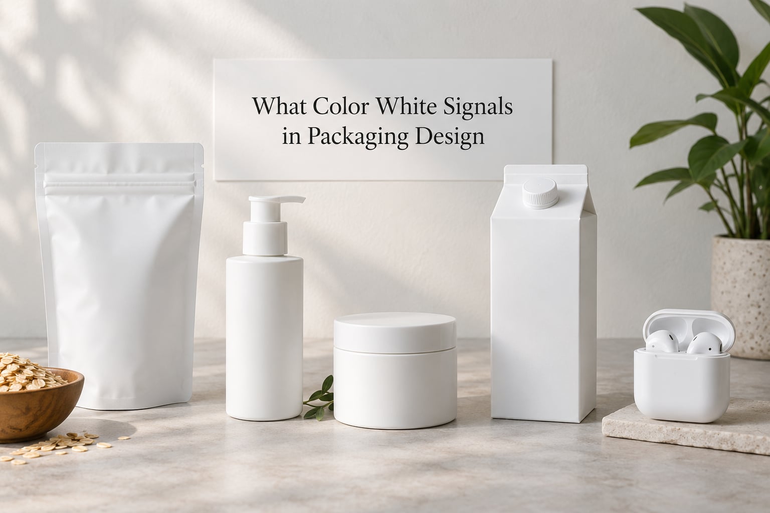
White commonly communicates cleanliness, simplicity, purity, neutrality and premium minimalism. What it signals in any given pack, though, depends on the category, the contrast around it, the typography, the material and finish, and who is holding it. White is a cue, not a message.
The practical version: white is the background that lets one other decision do the work. Put a thin serif wordmark on bright white board and you have made an editorial object. Put the same wordmark on a soft off-white with a matte film and you have made a skincare brand. Put it on glossy bright white with a clinical sans and you may have made a laboratory.
The Main Meanings Associated with White
Six meanings carry most of the work, and they rarely appear alone. A clinical white pack can be clean, cold and high-ethical-purity all at once.
Cleanliness and hygiene
This is the first association most people report, and it is why white dominates hand sanitiser, toothpaste, detergent, kitchen roll and first aid. The link is learned rather than biological, which is why it is reinforced constantly by these categories.
The caveat: cleanliness and sterilisation sit very close together. A pack with clinical typography, a lot of small text, and no warm accent can read as a hospital product, which is reassuring for a wound spray and completely wrong for a chocolate bar.
Simplicity and focus
White removes visual competition. With one colour on the pack, the product name or the photograph becomes the loudest thing, and shoppers read it faster. This is why so much minimal skincare, supplement and audio packaging uses a white ground with a single accent.
Simplicity is not the same as minimalism though. Simplicity is what white can achieve; minimalism is a style decision layered on top, and the two pull apart when the pack has no structural idea behind it.
Purity and honesty
White reads as unadulterated, which is why it is the default ground for organic, plant-based, vegan and ingredient-led brands. If your product is a single-origin olive oil, a fragrance-free cleanser or a dairy-free spread, white says nothing has been added, literally or rhetorically.
The risk here is the obvious one: a competitor with a worse formula can buy the same look in an afternoon. Purity is a claim, not a differentiator, unless something else on the pack backs it up.
Neutrality and honesty about what is inside
A white ground with no imagery lets the product show itself. That works for hardware, glass, produce, refill concentrates and anything where the material quality is the argument. It also signals that the brand has nothing to hide behind graphics, which shoppers in some categories read as transparency and others read as a lack of brand personality.
Premium restraint
White is the most-used ground in premium categories simply because expensive brands can afford restraint. Perfume, jewellery, spirits, ceramics and high-end audio all use it, which trains shoppers to read white as quiet confidence.
The catch is that the association is expensive. White on a rigid box with a foil-blocked logo and a soft-touch film says premium; the same colour on a thin, flexible pouch with a slightly bluish cast says discount, because the substrate and finish are giving away the production budget.
Space, and the amplification of one accent colour
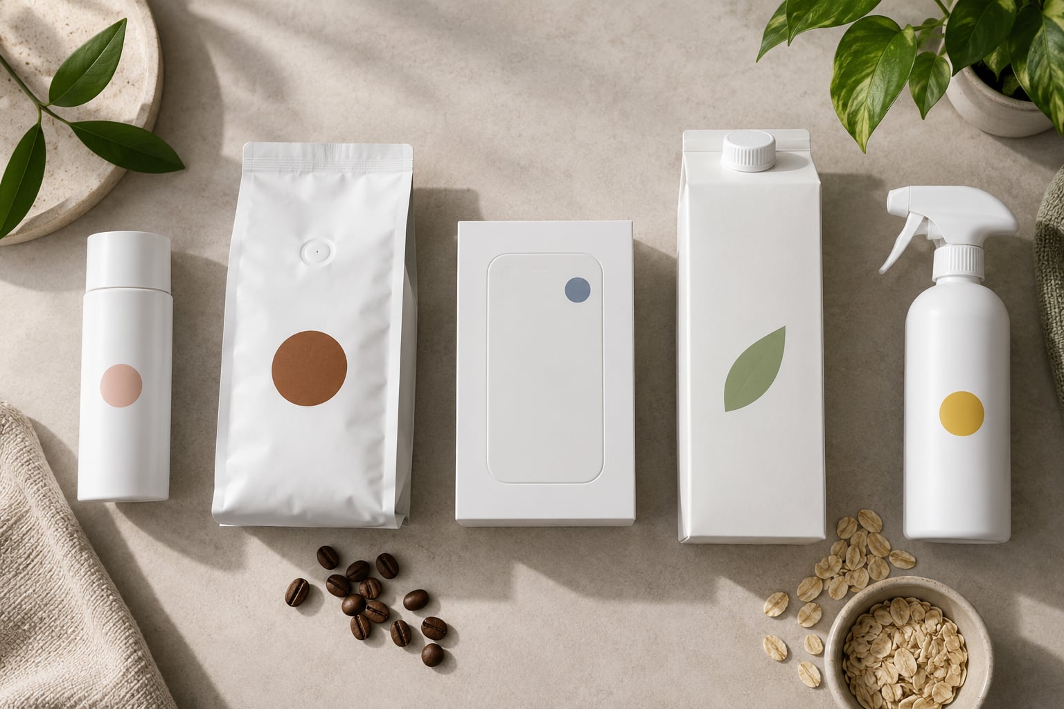
White as negative space is the most underused function of the colour. A single saturated accent against a large white field appears more intense than the same accent against a busy background, so white raises the effective saturation of whatever sits on it. If you have one strong brand colour, white is the cheapest way to make it louder without printing more of it.
Two more readings complete the set: white suggests newness and launch, because a clean white pack looks freshly produced, and white suggests calm and quiet, which is why it turns up so often in sleep, meditation and wellness products.
What the famous colour statistics actually support
You will see claims that 85% of purchase decisions are made within 90 seconds of seeing a package, or that colour accounts for 90% of a consumer’s judgement. Both are repeated so often in agency copy that they have become common knowledge. Neither figure comes from a study that isolates packaging, and the 90-second research is several decades old, small, and about general environments rather than product evaluation.
What the research does support is weaker but real: shoppers form fast impressions from packaging, colour is part of those impressions, and context and category conventions matter enormously. That is a good reason to test your pack. It is not a good reason to trust a specific percentage, and quoting one in a pitch deck is a fast way to be asked where it came from.
How Context Changes the Signal
The same white that reads luxurious on a shelf of perfumes reads like a pharmacy refill in an aisle of cleaning products. Four variables do most of that work.
The category around it
Category sets the prior. White next to red and yellow fast-food packaging reads clinical and health-led; the same white next to silver and black beauty packaging reads premium and modern. A shopper arrives with an expectation and colour confirms or fights it.
The colours beside and on it
Contrast changes the message more than the white does. A cool white with a single saturated blue reads technical and trustworthy. Warm white with terracotta reads natural and handmade. White with soft pastels reads gentle or child-focused. If you cannot change the white, changing the accent is a cheaper and often stronger fix.
Typography
Type does the tone-setting. A light-weight sans on white reads modern, calm and clinical. A high-contrast serif reads editorial and considered. A heavy condensed sans on white reads loud, which is why bold type on white often feels cheaper than the same type in ink on a coloured ground.
Legibility is the practical trap here. Thin, pale, low-contrast type on white fails in glare, on a phone screen in daylight, and for the large share of shoppers with reduced contrast sensitivity. If the type is doing the selling, it needs a contrast ratio you have actually checked, not an impression of it.
Finish, substrate and shape
White is unusually sensitive to what it is printed on. A true white on uncoated kraft reads warm and slightly yellow because the board shows through. A bright white on coated gloss stock can look plastic and hard. A matte white with a soft-touch film reads expensive; the same colour with a gloss varnish reads like a pharmaceutical leaflet.
Structure reinforces the read too. Rigid, weighted and square implies value. A light, flexible pouch implies refill, convenience or value-for-money. Shoppers trust the hand-feel of a pack before they read a word of it.
How White Differs Across Cultures and Markets
White carries the heaviest cultural load of any neutral. In most Western markets it signals purity, new beginnings, weddings and clinical cleanliness. Across much of East Asia it is the colour of mourning and death, and it is worn by the bereaved in several countries. In some East Asian contexts white also carries an association with ghostly or spiritual presence.
This is not a fixed rule, and treating it as one is its own kind of error. Urban consumers in Tokyo, Seoul or Singapore encounter white product packaging every day and do not read mourning into a serum bottle. What changes is the strength of the association, not its presence. Brands entering these markets generally add red, gold, black or a warmer off-white to shift the balance, and they do it for practical reasons rather than because shoppers refuse to buy white things.
Does What Color White Signals in Packaging Design?
It signals whatever the surrounding design and the audience have been trained to read into it, which is why the question has no single correct answer. Designers usually work with a set of defaults: clean, simple, honest, premium, new. In export packaging, those defaults need checking against local convention, and the safest move is usually a warm off-white or an added accent colour rather than abandoning white.
When White Works Well
White is strong when the pack has something to show and the category reads it correctly. That is the practical side of what color white signals in packaging design, and it is where the successful examples live.
- Premium minimalism. When the product itself is the proof and the brand has the budget for substrate, foil and fit. The restraint is the luxury signal.
- Hygiene-sensitive categories. Cleaning, first aid, sanitiser, oral care and baby products, where the expectation is sterility and legibility.
- Ingredient-led brands. Plant-based, vegan, fragrance-free and additive-free ranges, where nothing-added is the claim and white carries it.
- Launch and rebranding moments. A blank white pack reads as new, which is genuinely useful when you want attention without noise.
- Contrast-led shelf standout. In a category where every competitor is saturated, red or black, one white pack reads as a deliberate signal rather than more of the same.
- Single-accent amplification. When you have one strong hue, white gives it more room and makes it look more intense.
When White Can Create Problems
The failure modes are less discussed and more useful than the success list.
- Sterile and clinical. In food, confectionery and plant-based categories, too much white with no warmth can read as untouchable, processed or medicinal. Consumers often describe it as feeling like the product is not for them.
- Cheap. White printed on thin, light board with slightly yellowing stock tone is the classic discount read. Bright, flat, hard-gloss white has the same problem in the opposite direction, because it looks plastic.
- Invisible on shelf. Against white shelving, white fixtures or pale adjacent packs, a white pack with pale type disappears at two metres. Impact falls off fast with distance, and most decisions happen at distance.
- No category cue. If a shopper cannot tell from the front whether it is food, cosmetic or household, white did not do its job. Blank is not the same as premium.
- Weak legibility. Reversed-out logos on a very bright white, thin grey type, and light text over a photograph on a white pack all fail in glare and on cheap screens.
- Sustainability confusion. Bright white plastic and white-coated carton increasingly read as over-packaging. Some shoppers infer the opposite of what you intended, especially for refill and eco ranges.
- Production reality. True white on kraft, metallised film or recycled board is hard and expensive. Most supply-chain disappointment with white packs happens on the substrate, not in the artwork.
On that last point, a quick practical note. Getting a stable white is harder on uncoated, unbleached and recycled substrates because the board tone reads through the ink. Bright white pigments are denser and costlier than tints, need better ink coverage, and can show dot gain, set-off and banding on large solid areas. Metamerism means the pack will look slightly different under store lighting than it did in your studio, which is why proofs on the real substrate belong before the print run, not after it.
How to Use White Effectively in Packaging
A five-step process keeps the decision from becoming taste.
1. Name the association you want, in one sentence
Not “clean and modern”. Pick one: clinical, minimal, ingredient-led, technical, calm, new. Every later decision can be judged against it, and you will notice immediately when a shade or a typeface pulls somewhere else.
2. Choose undertone before you choose value
| Shade or undertone | What it tends to signal | Fits well |
|---|---|---|
| Optical white / brilliant white | Maximum brightness, maximum clinical or newness; can feel hard | Technology, pharma, launch packaging |
| Cool white / blue-leaning white | Clean, clinical, trustworthy, slightly cold | Oral care, hygiene, medical, fintech |
| Warm white / cream / ecru / bone | Natural, hand-finished, gentle, sustainable-leaning | Food, plant-based, bakery, organic |
| Neutral white (untinted) | Honest, transparent, gallery-like; shows the product | Refill, glass packaging, hardware, minimal skincare |
| Stark, high-contrast white | Forceful, graphic, modern; risks shouting | Youth brands, electronics, editorial-led ranges |
The same five words, cream and stark, carry assumptions, so check them against your category rather than picking on instinct. Warm white is not a compromise version of white; it is a different message that costs no more to print.
3. Build contrast on purpose
Decide whether the pack competes through brightness, through colour or through form. White plus one saturated accent is reliable. White plus five accents is a mess. If the shelf is white, add a strong edge, a deep band or a distinctive silhouette.
4. Test the real thing, at real distance
Print a proof on the actual substrate, then look at it from two metres under store lighting and on a phone screen in daylight. This catches every failure that a screen mockup hides, which is most of them. Check contrast ratios on reversed type rather than trusting the artboard.
5. Test the meaning, not the preference
Put competing white options in front of people from your target market with no context and ask what the product is and how much it costs. If they read the wrong price, the association you intended is not landing. Preference questions tell you what people like; those two questions tell you what the pack is saying.
White Packaging Examples by Product Type
| Category | What white signals | Main risk | Recommended approach |
|---|---|---|---|
| Food and beverage | Purity, freshness, nothing added | Sterile or institutional; reads as processed | Warm white or ecru, with a natural accent and visible product |
| Beauty and skincare | Clinical testing, restraint, formula honesty | Every competitor uses it; lost differentiation | Crisp white plus one accent, strong typographic hierarchy |
| Health and supplements | Evidence, safety, standards | Confusing a supplement with a medicine | Cool white, clear dosage hierarchy, honest claims |
| Technology | Newness, precision, engineering | Insulation, fingerprints, glare on screen | Bright white on rigid board with matte finish |
| Household and cleaning | Hygiene, sterility, power | Harsh or chemical-feeling | Cool white with a strong accent and a clear format cue |
| Luxury and premium goods | Restraint, confidence, high price | Cheap read if substrate and fit are poor | Soft-touch white, foil or emboss, rigid structure |
| Baby and infant | Purity, safety, gentleness | Cold or hospital-like | Warm white or off-white with rounded form |
| Plant-based and vegan | Clean label, additives free | Sustainability contradiction, no shelf voice | Off-white with green or earth accent, uncoated board |
The pattern is simple. Where the product is the proof, white works. Where the pack has to do persuading on its own, white needs help from typography, structure or an accent colour, because a white ground gives you no emotional momentum by itself.
Frequently Asked Questions
What does white usually mean on product packaging?
White usually signals cleanliness, simplicity, purity, neutrality and premium restraint. In practice it reads as a background cue rather than a fixed message, so the shopper completes the meaning from the category, the accent colour, the type and the material. A clean white with a clinical sans in pharma says laboratory-tested; the same white in warm cream with a serif on food says natural and considered.
Does white packaging always look premium or minimal?
No. White looks premium only when the production budget backs it up: rigid board, accurate colour, soft-touch or matte finish, tight fit and a foil or emboss detail. The same colour on thin light board with yellowing tone, or glossy and slightly bluish, reads as discount or plastic. Premium comes from substrate, fit and restraint together, and white is only the surface that makes restraint visible.
Is white the best color for environmentally friendly packaging?
Not by default. White often requires an extra white pigment pass for ink coverage, and bright white plastic or heavily coated board can read as over-packaging to eco-minded shoppers. Uncoated kraft and warm off-white usually carry a more natural read at similar quality. If sustainability is the message, let the substrate, material claims and refill format carry it, and treat white as a background, not the proof.
How can I stop white packaging from disappearing on the shelf?
Add contrast the eye can grab at two metres: a deep colour band, a saturated accent, a strong edge or a distinctive silhouette, and keep type dark and heavy enough to read from a distance. Against white shelving and pale neighbouring packs, a white pack needs structure and colour to survive. Test the proof in store lighting and from arm’s length, not on a bright studio desk.
What colors work best with white packaging?
One strong accent beats three supporting ones. Deep navy or charcoal give a technical, premium read; saturated blue reads clean and trustworthy; forest green reads natural and ingredient-led; black reads high-end and editorial; red reads bold and urgent, which suits limited launches more than everyday ranges. Warm tones such as terracotta, ochre or clay are the easiest way to take the clinical edge off a white pack.
Conclusion
White is the most borrowed signal on the shelf precisely because it is empty. That is its usefulness and its trap. If you are still deciding what color white signals in packaging design for your own range, start by writing down the single association you want, pick the undertone that carries it, give it contrast and structure to survive next to its competitors, and then check what shoppers actually read rather than what you intended. Define the intended association first; everything else on the pack is an argument for it.