How texture and weight signal product value is really a question about speed. A hand picks up an object and registers its mass and its surface before the eye has finished reading the label, and those two sensations set expectations about durability, craft and price that every later judgement inherits.
For brand and insight teams, that makes weight and texture the cheapest and the riskiest signals in packaging. Get them right and a budget-tier product reads as considered. Get them wrong and a genuinely well-made item reads as a gimmick.
Table of Contents
- Why Do Texture and Weight Matter to Shoppers?
- How Texture and Weight Signal Product Value
- What Does Surface Texture Tell Customers?
- What Does Product Weight Tell Customers?
- How Do Texture and Weight Work Together?
- Why Can Lightweight or Rough Products Still Feel High-Value?
- How Can Brands Apply These Cues Ethically?
- How Can Marketers Test Texture and Weight Perceptions?
- Which Product Categories Are Most Affected?
- Frequently Asked Questions
- Does heavier packaging make a product seem more valuable?
- Can a smooth texture make a product appear more expensive?
- Should brands make products heavier to signal higher quality?
- Which sensory cue matters most for product quality?
- How can a company test whether packaging feels premium?
- Can texture and weight signals mislead customers?
- Conclusion: Start With One Honest Product Cue
Why Do Texture and Weight Matter to Shoppers?
Shoppers judge value using everything available at once: what it costs, what the brand says about itself, how it looks, and what they remember about the last one they bought. Touch sits inside that bundle rather than beside it, and it runs earlier.
Lederman and Klatzky’s work on tactile perception established that people extract a surprising amount of accurate information about an object from touch alone: its material, its temperature, whether it is soft or firm, how heavy it is. That processing is largely automatic, which is precisely why it is powerful and why it is easy to overplay.
There is a useful split here that gets ignored in most brand decks. Hassenzahl and Tractinsky separate pragmatic quality, which is whether the product works, from hedonic quality, which is how it feels to interact with. Texture and weight speak almost entirely to hedonic quality, so a perfectly engineered kettle can still feel cheap if the handle is hollow and the lid rattles.
That is also the honest reason shoppers reach for a lighter option: hedonic and pragmatic quality point in opposite directions more often than the industry admits.
How Texture and Weight Signal Product Value
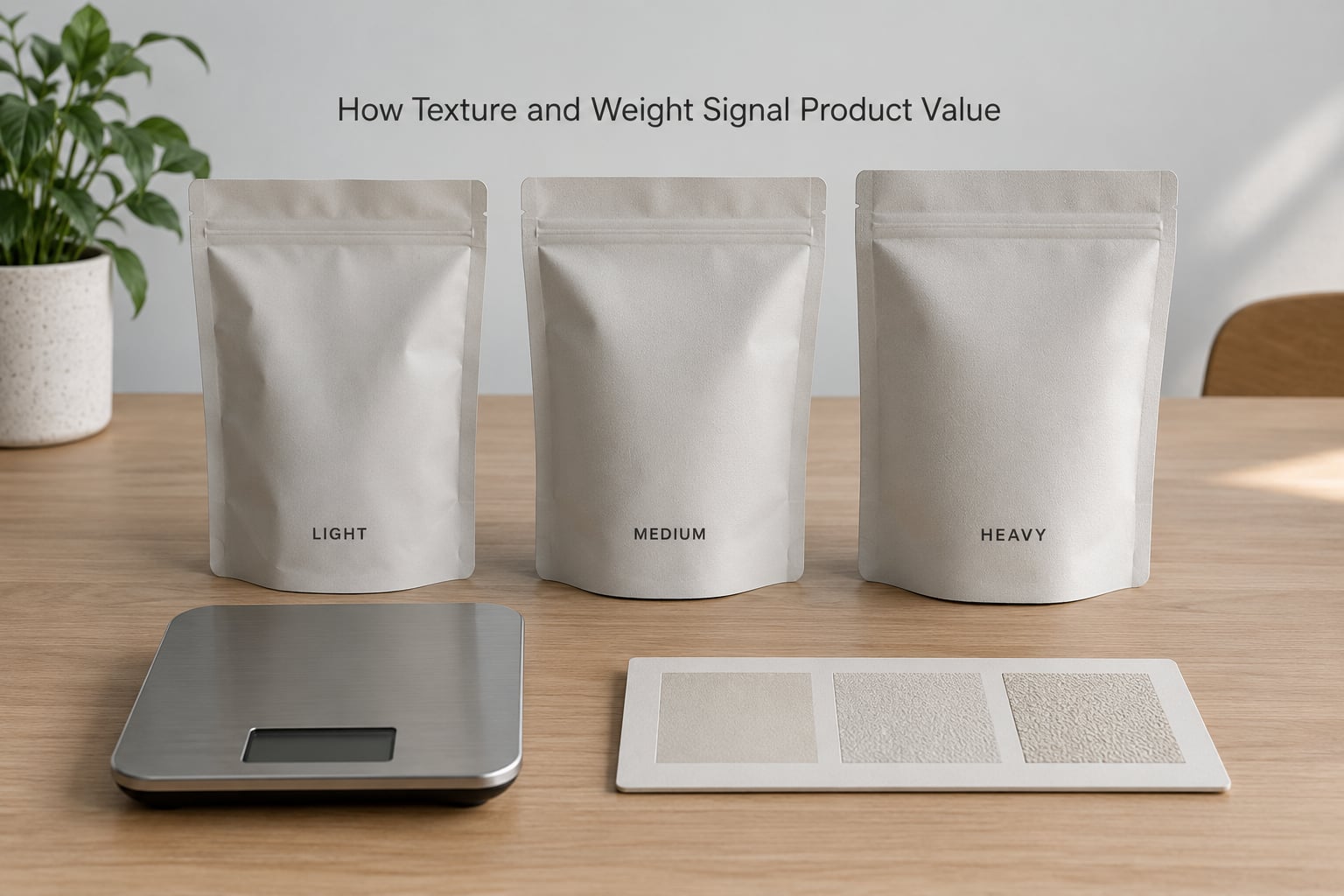
The mechanism is simple enough to state in one line: physical cues become expectations. The buyer feels resistance, temperature or mass and infers effort, then effort becomes cost, and cost becomes value. Research on cross-modal perception, sometimes described as perceptual transfer, shows the same effect running in reverse, which matters enormously online.
A buyer cannot verify material or build quality before buying, so the hand stands in for the specification sheet. Brands that understand this stop treating packaging as a container and start treating it as the only physical proof a shopper will ever hold.
What Does Surface Texture Tell Customers?
Surface texture does four jobs at once, and they pull in different directions. A soft-touch coating reads as modern, matte and expensive, and it also hides fingerprints, which protects the perceived quality of the object over time. A deep emboss tells the hand that somebody paid for a die, and it tells the eye the same thing from across a shelf.
Roughness sends a different message again. Uncoated kraft board and visible paper fibre read as natural, honest and often artisanal, which works well in coffee and craft categories and badly in a category where buyers expect clinical smoothness. Exposed weave, grain and stone surfaces work the same way: they signal that material was chosen rather than applied.
Gloss is the most transferable cue of the group. Because shininess is easy to reproduce in a photograph and a screen, buyers learn to infer texture from glossiness before they ever hold anything. Brands now deliberately use a light-catching surface to simulate a hand-feel that buyers will only meet after purchase.
What Does Product Weight Tell Customers?
Weight is read as substance and as evidence that materials were not economised on. It is why a heavy fragrance bottle, a weighted glass base and a pen with real metal in the barrel all communicate before any copy does. The inference is rarely conscious, which is exactly what makes it durable.
Balance matters as much as mass. A bottle that is bottom-heavy feels stable and deliberate, a tool with a poor centre of mass feels dangerous, and a thin lid on a heavy body reads as an assembly shortcut. Handlers notice distribution of weight far more precisely than they notice total weight.
There are costs to leaning on mass. Shipping and material use rise, and a heavy pack now carries an extra burden: buyers read it as waste unless the brand says otherwise. Buyers with reduced grip strength are also excluded, which is a real design constraint rather than a footnote.
How Do Texture and Weight Work Together?
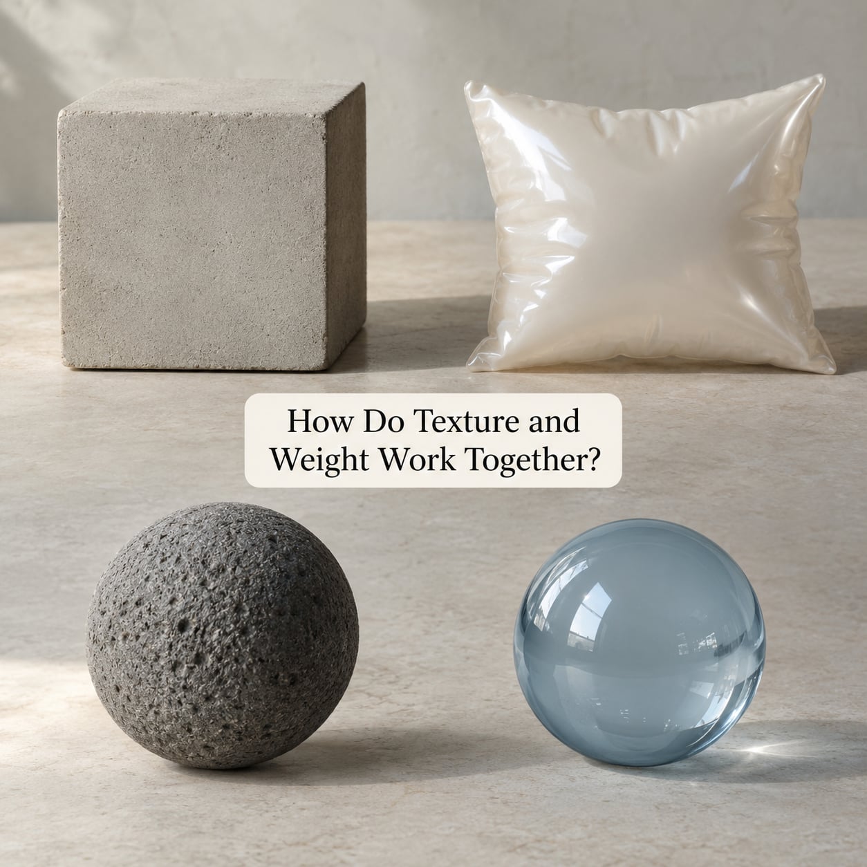
Congruence is what makes the signal stick. A rigid, matte, heavy board and a thick, unpolished closure say the same thing twice, and a buyer reads that repetition as confidence. The table below maps each cue to the inference it creates, the specification that produces it, and the way it typically fails.
| Signal | Consumer inference | Spec lever | Failure mode |
|---|---|---|---|
| Mass in the hand | Substance, durability, generosity of materials | Board weight in gsm, glass base mass, closure mass | Reads as wasteful filler once shipping cost is mentioned |
| Surface roughness | Craft, honesty, natural materials | Surface roughness (Ra), uncoated stock, visible fibre | Grimy or damaged after a week of handling |
| Gloss level | Polish, modernity, precision | Matte, gloss or soft-touch coating choice | Shows fingerprints and micro-scratches immediately |
| Closure resistance | Craftsmanship, precision engineering | Snap or torque force at the lid | Too stiff reads as cheap jamming to older hands |
| Temperature on contact | Material honesty, technical intent | Metal versus coated plastic surface area | Reads as luxury coldness in a warm category |
| Sound on open | Considered design, sealed protection | Foam insert density, seal geometry | Loud or hollow sound cancels the premium read |
Mismatch is where trust breaks. A light, floppy, soft-touch pack styled as a luxury gift reads as a costume, and a rough, splintery board on a weighty bottle reads as unfinished. Both failures are visible in the hand within two seconds.
Cross-category habits make this sharper. Buyers carry expectations from the shelf they know, so a metal package that signals precision in electronics can signal low value in a food category where metal has long meant economy. The same material cannot be judged outside its category.
Why Can Lightweight or Rough Products Still Feel High-Value?
Because the meaning attached to a cue changes with context, and a lower mass has its own set of readings: efficient, portable, minimal, considered, modern. An aluminium travel mug or a slim refillable bottle can feel more advanced than a heavy plastic equivalent precisely because the lightness implies engineering rather than shortfall.
Unexpected textures can carry the same lift. A visibly coarse, hand-finished surface reads as artisanal in bread, coffee and ceramics, where irregularity is evidence of hand involvement rather than a defect. Buyers who would reject the same roughness on a laptop will pay more for it on a mug.
The deciding factor is usually whether the brand explains itself. Weight and texture carry no inherent meaning. What they carry is whatever story surrounds them, and a brand that says nothing lets the buyer supply a story that is often unkind.
How Can Brands Apply These Cues Ethically?
The line between craft signalling and manipulation is thin, and it is drawn by whether the physical promise matches the physical reality. A package that feels substantial and contains a thin refill is not communicating quality, it is confusing the hand.
Four rules keep this honest. Align the cue with the product, so weight reflects actual material use and texture reflects the actual substrate. State the material plainly, since undisclosed weight invites the assumption that something is being hidden. Do not inflate the vessel to move weight perception, which is a straightforward deception and, where net weight rules apply, a legal problem as well as an ethical one. And treat accessibility as a design constraint from the start: grip strength, dexterity and reduced tactile sensitivity vary widely, and a closure that needs real force to open excludes a segment that most brands never think about.
There is a sustainability tension worth naming. Consumers now read heavy packaging as waste unless the brand frames it as protection or longevity. A heavy recycled-board pack that survives shipping and refill cycles can defend its weight; a heavy plastic shell around a small bottle cannot.
Where the cue has to be simulated rather than real, say so. Photography can imply texture and product listings can state weight, and honesty there costs very little.
How Can Marketers Test Texture and Weight Perceptions?
Good testing is unglamorous and mostly blind. The aim is to find out whether the cue moves perceived value independently of price and brand familiarity before anyone signs off on tooling.
A workable process runs in six steps.
- Pick one cue. Test weight or texture, not both, or you cannot attribute the result.
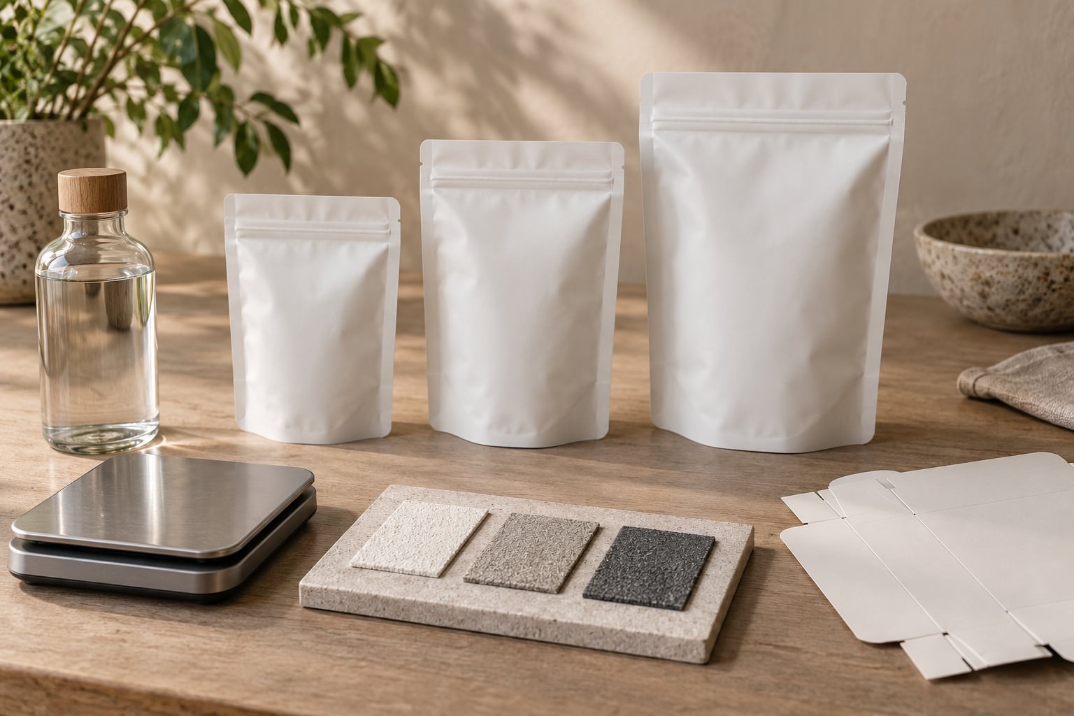
- Build prototypes that differ only in the cue. Same artwork, same colours, same closure mechanism, three mass levels or three surface finishes.
- Run a blind tactile comparison. Participants handle coded samples without seeing the brand. If they can guess the price tier from feel alone, the cue is doing work.
- Measure the physical specification. Record board weight in gsm, surface roughness (Ra) where relevant, and closure force in newtons, so the winning sample can actually be specified and re-ordered.
- Collect ratings on semantic scales. Ask for perceived quality, durability, authenticity and expected price, plus purchase intent. Semantic scales separate hedonic reactions from purchase decisions in a way binary questions cannot.
- Benchmark against the category. Compare against two or three competing packs handled in the same session. A cue that only beats your own last version has not earned its cost.
Two supporting tasks are worth the extra time. A perceived-weight matching task, where participants adjust a comparison object until it matches the prototype, gives a physical number rather than a verbal one. And follow-up interviews a week later reveal something a same-day session misses: whether the cue survived contact with the product.
Online testing has grown more useful than in-person shelf work as shopping shifted toward product pages where nothing can be touched. Ask participants to handle a physical sample while viewing the listing, and the gap between what the photo promises and what the hand delivers shows up immediately.
Which Product Categories Are Most Affected?
The influence of texture and weight varies a lot by category, and so does the direction of the read. Food and drink inherit conventions from farming and hospitality. Beauty leans on finish, since the tactile experience continues on the skin. Apparel is judged at the point of contact with the largest area of skin on the body. Electronics inherit from industrial design and precision tooling. Luxury and craft goods read mass as heritage, while home goods sit between them.
| Category | Texture influence | Weight influence | Watch out for |
|---|---|---|---|
| Food and drink | Very high, kraft and matte signal natural | Moderate, mostly on bottles | Touch damages freshness cues if the pack looks worn |
| Beauty and skincare | Very high, finish is the whole point | High, glass base reads as formula value | Soft-touch scuffs and shows wear fastest |
| Apparel and textiles | Very high, hand-feel drives purchase | Low, rarely handled in store | Weight can be read as heavy fabric rather than quality |
| Consumer electronics | Moderate, mostly controls and switches | High, mass means build quality | Metal warmth can read as cheapness in some markets |
| Home goods | High, surface is the visible quality | High, stability and heft | Gloss shows wear on high-touch surfaces |
| Luxury and craft | High, irregularity signals hand work | High, mass signals heritage | Heaviest scrutiny on sustainability claims |
Apparel is the clearest exception to the general rule. Buyers rarely feel the weight of a garment before buying, so brands there lean almost entirely on texture, and they usually have to earn the texture in fabric weight and weave rather than packaging.
Frequently Asked Questions
Does heavier packaging make a product seem more valuable?
Often yes, within limits. Buyers read mass as evidence that materials were not economised on, and the inference happens automatically in the hand. It stops working when the extra weight adds nothing: once a brand explains that the shell exists mainly to move perception rather than to protect the product, the same cue reads as waste. Buyers also increasingly read heavy packaging as an environmental problem, so the cue now needs a stated reason attached to it.
Can a smooth texture make a product appear more expensive?
Yes, and it is one of the most reliable cues in beauty and skincare. A uniformly smooth surface with no abrupt transitions signals precision and control, because unevenness is what a less careful manufacturing process leaves behind. Buyers also cannot see surface finish on a screen, so a slick, evenly lit photograph becomes the stand-in for smoothness online. The limit is durability: high-gloss surfaces show fingerprints and fine scratches within days.
Should brands make products heavier to signal higher quality?
Only where the extra mass is real material doing real work, such as a weighted glass base that keeps a bottle upright, or board weight that resists puncturing in transit. Added mass with no functional purpose reads as filler, raises shipping cost, and lands badly with buyers who weigh sustainability. The better question is what the extra mass is for, and whether you can say that out loud in one sentence without sounding defensive.
Which sensory cue matters most for product quality?
It depends on how the product is used and where it is judged. For anything handled for more than a few seconds, texture and surface finish usually win, because they are judged continuously rather than once. Weight matters most for objects meant to sit still on a desk or a shelf, where heft reads as stability. In categories judged online, glossiness in imagery tends to carry more of the load than any physical cue, because it is the only texture the buyer can see.
How can a company test whether packaging feels premium?
Run a blind tactile comparison with coded samples that differ only in the cue you are testing. Measure what you changed, such as board weight in gsm, surface roughness (Ra) or closure force in newtons, so the winner can be specified for production. Collect semantic scale ratings for perceived quality, durability and expected price, then benchmark against competing packs handled in the same session. A follow-up interview a week later tells you whether the cue survived contact with the actual product.
Can texture and weight signals mislead customers?
They can, and they do so more often through omission than through exaggeration. A heavy shell that feels substantial while holding less product than a competitor misleads the hand without making a single false claim in writing. Deliberately inflating packaging to shift perceived weight also raises net weight disclosure issues in some markets. The safeguard is simple: every tactile promise a package makes should be true about what is inside it.
Conclusion: Start With One Honest Product Cue
Weight and texture work because the hand answers questions the buyer cannot yet ask on paper. They only keep working when the sensation matches the substance, and they fail the moment the brand asks them to carry a promise the product does not keep.
So pick the single cue your category rewards most, build three versions that differ only in that cue, and run one blind session against a competitor’s pack. Change what the evidence supports, write down the specification, and leave the rest alone.