Packaging shape signals product quality through two separate channels: literal structural proof, such as rigidity, symmetry, weight and a tight closure, and symbolic associations, where rounded forms read as gentle and angular forms read as precise and strong. Shoppers weigh both within a second of seeing the package, and they weigh them before reading a single word of copy.
That first judgement is hard to argue with later. A shopper who has already decided a package feels solid reads the rest of the label through that lens, which is why the silhouette is worth more attention than most brands give it. The category you sell in matters enormously, too, because shoppers hold a default expectation for what a medicine box or a spirits bottle is supposed to look like, and a shape that fights that expectation has to work harder to earn the same trust.
Researchers keep finding the same sequence, still the standard explanation in 2026: people judge a package in milliseconds, largely before conscious reasoning, and the resulting expectation filters everything read afterwards.
Table of Contents
- How Packaging Shape Signals Product Quality
- What makes one package look more premium?
- Which packaging shapes suggest higher quality?
- How do symmetry, proportion, and visual balance work?
- Does package structure communicate durability and reliability?
- How does expected category shape influence judgment?
- Why can unusual packaging shapes backfire?
- How can marketers test whether a package signals quality?
- Frequently Asked Questions
- Does packaging shape really affect perceived product quality?
- What package shape looks the most premium?
- Is a rigid package always better than a flexible one?
- How do different product categories change shape expectations?
- Should packaging shape be chosen before materials and color?
- Conclusion: Start With the Expected Quality Signal
How Packaging Shape Signals Product Quality
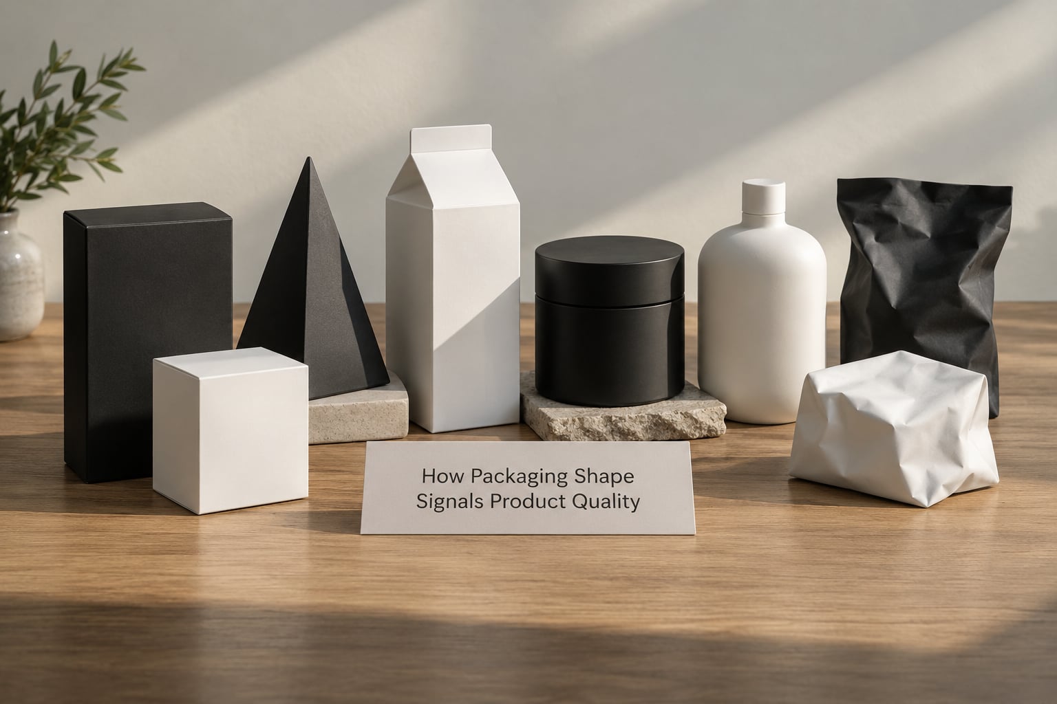
The cues that carry the most weight are symmetry, the complexity of the form, the apparent solidity of the structure, the proportions of the package, and how closely it matches the shape the shopper expects in that category. None of them are about decoration. They are all about whether the object in front of you looks like somebody measured it.
Three mechanisms explain most of it. Cross-modal correspondence links a shape to a sense or an emotion, so an angular profile borrows hardness and a rounded profile borrows softness. Processing fluency explains why clean, regular, easy-to-process forms get rated as more pleasant and more trustworthy. Diagnostic cues explain why a box that resists bending reads as a sign that the product inside was built with care too.
What makes one package look more premium?
Premium perception comes down to execution more than expense. A rigid box with tight corners, consistent margins, clean panel alignment and a base that sits flat reads as premium. The same box with warped board, visible glue, a crushed corner or a lid that rattles reads as cheap no matter what it is printed with.
Work by van Ooijen and Verhallen, published in 2015, found that package shape works as a healthiness cue in food and drink, with taller and more slender profiles leaning healthier than squatter ones. Raghubir and Greenleaf, in 2006, linked symmetry and slender proportions to preference in product design, partly because people read them as evidence of design effort. The pattern holds well beyond those two papers.
So a package can look expensive and still signal poor quality. Those are separate signals, and the second one only gets harder to correct once the shopper’s hand is on the product.
Which packaging shapes suggest higher quality?
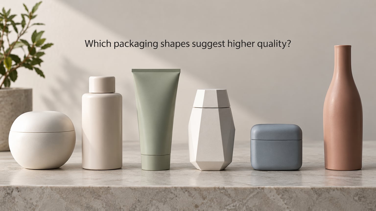
There is no universally premium shape, but a few forms carry a consistent reading, and it changes with the category. Rounded and tapered forms tend to be read as considered and gentle. Sharp, faceted and compact forms tend to be read as precise, technical and tough. Elongated and slender forms carry a health or premium lean in food, drink and beauty.
The table below is the working version of what a shopper infers from each form, and where each one tends to break down.
| Shape form | Likely reading | Where it fits | Failure risk |
|---|---|---|---|
| Rounded, soft-cornered | Considered, gentle, friendly, finished | Skincare, confectionery, family goods, gifting | Reads weak for tools, industrial or heavy products |
| Symmetrical, centred | Controlled, precise, trustworthy | Almost every category; especially supplements and electronics | Reads generic or mass-market when overused |
| Tapered or narrow profile | Refined, light, health-oriented | Beverages, snacks, personal care, slim hardware | Bad grip, poor shelf stability, higher unit cost |
| Faceted or angular | Technical, strong, high-performance | Energy, performance, tech accessories, spirits | Reads harsh, cheap or damaged when corners chip |
| Compact, square, block-like | Dense, solid, reliable, value | Refill, bulk, cleaning, pet supplies | Low shelf presence, poor online thumbnail legibility |
| Elongated and slim | Premium, restrained, health halo | Prestige beauty, spirits, minimalist ranges | Unstable, easily knocked over, wasted air fill |
| Asymmetrical or irregular | Distinctive, novel, worth a second look | Crowded shelves, small brands with no recognition | Awkward to hold, store and ship; memorable but annoying |
One more pattern is worth naming because practitioners see it constantly: slim and narrow packaging is read as healthier than squat packaging. That is why so many wellness ranges moved to tall slim bottles, and why a wide, stable base on a bulk or refill format reads as dependable rather than premium.
How do symmetry, proportion, and visual balance work?
Symmetry reads as control. People infer that a designer measured the panel widths, matched the margins and checked the alignment, and they transfer that inference to the product. Bilateral balance, where a package carries roughly equal visual weight on each side, signals the same thing, and a centred logo block strengthens it further.
Consistent margins matter more than most teams expect. A single element that sits tighter to an edge than its neighbours breaks the balance even when each element on its own looks fine. The effect is a faint sense of something being off, and shoppers rarely name it, which is exactly why it erodes trust without producing a comment.
Proportion works the same way. A package whose height, width and depth sit in a stable relationship looks resolved. One where a single dimension has been stretched past what the structure can carry looks like a packaging engineer gave up somewhere.
You can run a quick check yourself. Put three packages of the same product on a table, step back two metres, and ask which one looks most carefully made. Usually the answer matches the one with the cleanest alignment, and it is the same answer most shoppers in the aisle will give you.
Does package structure communicate durability and reliability?
This is the literal half of the question, and it is the half that carries the most trust. Shoppers draw conclusions from how the object behaves in the hand, often before they register that they are doing it. Rigidity, a fitted closure, reinforced corners, a tight seal and a base that sits flat all read as evidence that somebody thought about what happens to this in transit and on a shelf.
Weight matters too, though it is easy to fake badly. A package that feels noticeably heavy for its contents sends a quality message, but a package that feels padded with filler air sends the opposite one. The useful test is whether the weight comes from the structure or from wasted space inside it.
Forum complaints about packaging cluster around exactly these points: cartons that crush at the corners, lids that do not close properly, warped board, visible glue, and boxes where the contents shift in transit. None of those are aesthetic issues. They are the reason people stop trusting a brand’s claim that a product is built well.
How does expected category shape influence judgment?
Shoppers do not evaluate a package against an absolute standard. They evaluate it against a category default, and those defaults are built from decades of familiar packs. A medicine pack in a plain, tall, rigid carton reassures. A confectionery pack in a squishy, oddly shaped bag reassures nobody, and a beverage bottle with a dented shoulder reads as a storage problem rather than a design choice.
The conventions are strong enough to work against you. Spirits and fragrance expect heavy, weighted glass and tight, deliberate closures. Cosmetics and skincare expect slim, smooth, often glossy forms with generous shoulder curves. Electronics expect a squared, tight-fitting box where the internal mould holds the product dead still. Household and cleaning supplies expect a wide, stable, often handled grip. Supplements expect a plain, tall, sober carton with a flat face that takes a long list of small print.
Break a category convention deliberately and you can win attention, but you spend credibility you had for free. The distinctive pack is described in practitioner discussions as memorable on shelf, awkward in use and easy to knock over. Both halves of that are true at once.
Why can unusual packaging shapes backfire?
Most backfiring comes from one of five things: the shape fights the category, the shape is hard to use, the shape wastes material, the shape ships badly, or the shape promises a quality level the product cannot deliver.
Usability failures are the most common. A beautiful bottle that slips in a wet hand, a carton lid that needs two hands, a refill pouch that will not stand up, and none of that is forgiven because the graphics were nice. Storage is the quiet one, since an awkward footprint does not stack and a shopper who has to fight the cupboard decides against you.
Empty space is another one. A package substantially larger than its contents reads as wastefulness, and shoppers have become good at spotting slack fill. It also inflates shipping cost, which is one reason the psychological benefit of a showy shape sometimes does not pay for itself.
The mismatch case is the most damaging, and it is the one nobody designs for. When the shape says luxury and the product inside says average, the first review tends to be about the packaging, and it is rarely kind. If you cannot keep quality where the promise is, lower the promise instead of raising the silhouette.
How can marketers test whether a package signals quality?
Six checks cover most of it, and none require a research budget to run the first pass.
Start with category comparison. Lay out three or four competitors on a table and put your candidate in the middle. Any difference that reads as a step change in value is a risk, because shoppers will read the step in your direction rather than the brand’s intent.
Then test at shelf-view distance. Show the pack at the size it will be seen from two to three metres away and for a few seconds only. If the silhouette alone does not separate it from the pack next to it, colour and typography are carrying the whole job.
Run a silhouette test next, by printing the outline only. If the shape still communicates the right category and the right level of seriousness, you have a strong form. If it becomes unidentifiable, the recognisability was coming from artwork rather than structure.
Blind quality ratings are the direct measurement. Show people the shapes with no logos, no colour and no copy, and ask which three they would expect to be the most expensive and the best made. Repeat with the full pack and compare the two sets. A large gap means your graphics are fighting the form.
Inspect the structure with the same care a buyer would. Flex the corners, check the closure, look for warp and slack, and check whether the pack stands on its own on a flat surface. Fail here and nothing you fix in the design will help.
Last, check expectation against product. Take the top three associations your shape creates and confirm that the product behind it can carry them. That last step is the one that prevents the disappointment reviews.
Frequently Asked Questions
Does packaging shape really affect perceived product quality?
Yes, and it happens early. Shoppers form a quality judgement from a package’s silhouette in well under a second, before reading labels. Shape works through cross-modal correspondence, where a form borrows an attribute such as softness or hardness, and through diagnostic cues, where rigidity, symmetry and weight read as evidence of build quality. The resulting expectation then shapes how everything else on the pack is received.
What package shape looks the most premium?
There is no single answer, because premium reads differently per category. In practice, the most consistently premium-looking packages combine a controlled, symmetrical structure with tight, deliberate construction and balanced proportions. Rounded and tapered forms skew gentle and considered, faceted forms skew technical and strong, and slender forms skew restrained and health-oriented. Execution decides the outcome more than the form itself.
Is a rigid package always better than a flexible one?
No. A rigid pack suits fragile, heavy, technical or giftable products, and for those it is a genuine quality signal. For food, produce, snacks and soft goods, a flexible pack can be the better engineering choice and the better read, since a soft package signals freshness and hand contact. The test is whether the structure matches what the product needs and what the category expects.
How do different product categories change shape expectations?
Categories carry their own shape conventions, and shoppers judge against them. Medicine and supplements expect plain, tall, rigid cartons. Spirits and fragrance expect weight and tight closures. Cosmetics expect slim, smooth forms. Electronics expect a squared box with a fitted internal mould. Household supplies expect a wide, stable grip. Departing from these defaults buys attention and costs credibility at the same time.
Should packaging shape be chosen before materials and color?
Work the other way round. Materials constrain what a structure can do, since a rigid board, a flexible film and glass support very different forms. Choose the material, then the structure it can carry honestly, then colour and artwork. Settling the silhouette first often produces a shape the material has to imitate, and imitation is visible in weight, sound and feel.
Conclusion: Start With the Expected Quality Signal
Start by writing down the quality attributes your category already promises, then choose a shape that supports those attributes through fit, balance and clean execution. A tall slim carton for a wellness range, a heavy angular bottle for a spirit, a squared fitted box for a fragile device, each follows the same logic.
Judge the result on three things: does the silhouette read correctly at shelf distance, does the structure hold up in the hand, and can the product behind it live up to what the shape promises. Get those three right and packaging shape does the quiet work of making the rest of your brand easier to believe.