Semiotics explains luxury cues by studying how design signs acquire shared meanings and how viewers turn them into judgments about rarity, quality, status and belonging. A serif wordmark, a heavy glass bottle, a monogram repeated to the edge of a pattern — none of these are expensive in themselves. They read as luxury because an audience has already learned what they mean.
That is the whole argument, and it is more useful than it first sounds. Once you accept that luxury is a sign system rather than a material fact, you can read any design the way a reader reads a headline: for what it says, what it implies, and what it leaves out.
The rest of this guide breaks the system down. It covers what luxury actually means in semiotic terms, where those meanings come from, which specific design cues carry them, and how to use that without ending up in costume.
Table of Contents
- How Semiotics Explains Luxury Cues in Design
- What Is the Meaning of Luxury in Semiotics?
- How Do Luxury Design Cues Gain Their Meanings?
- Repeated exposure
- Category convention
- Social context
- Contrast with what is common
- What the three types of sign mean here
- Which Design Cues Signal Luxury?
- How Typography Creates a Perception of Exclusivity
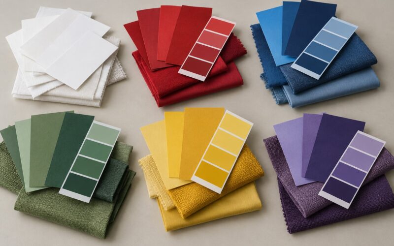
- How Color Communicates Luxury Without Guaranteeing It
- Why Materials and Craftsmanship Function as Signs
- How Rarity, Space and Restraint Signal Exclusivity
- How Can Designers Use Luxury Cues Without Creating a Costume?
- What Are Common Misinterpretations of Luxury Semiotics?
- Frequently Asked Questions
- What design elements most commonly signal luxury?
- Are luxury signs universal across cultures?
- Does minimalism always make a brand look expensive?
- Is gold a reliable sign of luxury design?
- Can semiotic analysis predict whether consumers will perceive a brand as luxurious?
- How should a designer avoid copying luxury clichés?
- Conclusion: Start with Meaning, Then Appearance
How Semiotics Explains Luxury Cues in Design
Semiotics is the study of signs — anything that stands for something else. Applied to design, it separates what a cue literally is from what an audience reads into it. A gold border is ink on card. What it signifies is wealth, permanence and old money, because viewers share a cultural code that links that border to those ideas. Luxury design works by borrowing codes an audience already recognizes and applying them consistently enough that the reading holds.
Here is how semiotics explains luxury cues in design in practical terms: every visual element is a sign, every sign carries a conventional meaning, and luxury brands win by being legible within a code the audience already owns.
What Is the Meaning of Luxury in Semiotics?
Start with the simplest split. Denotation is what a sign literally depicts. Connotation is the cultural meaning attached to it by a particular audience at a particular time. A crown denotates a piece of jewellery shaped like a crown; it connotes sovereignty, which is exactly why nobody puts one on a bottle of everyday gin.
The Swiss linguist Ferdinand de Saussure gave this a workable vocabulary. A signifier is the form — the letters, the colour, the weight. A signified is the concept the form points at. Nobody has ever agreed where one ends and the other begins, and that instability is the useful part. It means meaning is not locked inside the object; it lives in the relationship the object sets up with its viewer.
Roland Barthes pushed this into two orders of meaning. First order is the literal image, the thing shown. Second order is the myth, the cultural story the image imports — French sophistication in a perfume ad, dynastic continuity in a watch campaign, artisan tradition in a leather goods photograph. The Fashion System, his 1967 study, is where he works through clothing and dress most directly, and it remains the reference most brand teams reach for.
Umberto Eco added the ceiling: meaning has no natural resting place. Words drift, slogans get reused until they invert, and a sign that read as exclusive in one decade reads as tired in the next. Any semiotic read is therefore a snapshot with a timestamp, not a fact about an object.
So luxury, defined semiotically, is not a property of a thing. It is the residue left when a design choice aligns with what an audience already expects a luxury object to look like — and the cost of getting that alignment wrong is higher than most brands assume.
How Do Luxury Design Cues Gain Their Meanings?
No cue is born meaningful. Serifs are shapes. Navy is a pigment. Negative space is an absence. They acquire value through four mechanisms, and it helps to keep them separate when you are auditing a brand.
Repeated exposure
A sign becomes meaningful when it recurs. One navy box proves nothing. The same navy box, the same ribbon, the same tissue paper, seen two hundred times across a decade, turns a colour into a brand asset. This is why trademark filings on colours exist at all — Tiffany has held rights to its specific shade of blue since 1998, which is legal recognition that a colour carries meaning independent of any logo.
Category convention
Luxury sign systems are collective, not proprietary. Fine watch dials are legibly thin. Leather goods get stitching that looks slightly excessive. Spirits come in thick glass with a heavy base. Each brand invented its own version of these conventions, and each copied them from the category at the same time. When a new entrant follows the convention closely, they inherit its meaning cheaply. That is the single most useful thing to know about this topic.
Social context
The same sign reads differently depending on who holds it. A hand-stitched leather tote is a purchase for one person and an act of parody for another. Interpretation is social before it is personal, which is why luxury codes tend to be enforced through context — the store, the packaging, the invitation — rather than through the object alone.
Contrast with what is common
Luxury meaning is defined against its opposite. Rare reads as luxury because mass production exists. Permanence reads as luxury because disposability exists. Restraint reads as luxury because over-ornament is cheap and easy. A semiotician’s useful question is always: what is this sign contrasted against?
That structure also explains why luxury codes drift. When a code becomes common, it stops marking luxury and starts marking affordability — which is precisely how the minimal look that once signalled refinement ended up reading as a discount.
What the three types of sign mean here
Classification matters because a designer can lean on the wrong one. The categories were set out by the American philosopher Charles Sanders Peirce, and they are routinely blurred in marketing writing, so it is worth stating them plainly:
- Icon — meaning through resemblance. A photograph of a craftsperson’s hands at work resembles hands at work, so it points to labour and skill. Icons are the most fragile of the three, because a stylised version can quickly read as costume.
- Index — meaning through physical connection. Patina on a strap, a slightly uneven stitch, hand-applied edge paint on a card: these are traces of an actual process. Indices are the strongest luxury signs because they are difficult to fake convincingly, which is exactly why counterfeiters spend their effort on them.
- Symbol — meaning through agreement alone. A monogram, a crown, a wordmark: nothing in the shape connects it to the idea, so the meaning lives entirely in shared convention. Symbols are the most portable and the most easily borrowed, which makes them both the most valuable and the most exposed.
These categories overlap, and the overlap is where the interesting cases sit. A monogram is a symbol; a heavily embossed monogram is also an index, because the pressure required to emboss leaves a physical record of effort.
Which Design Cues Signal Luxury?
The cue groups below cover most of what luxury design actually does. Their power depends on three things: consistency across every touchpoint, fit with category expectations, and whether the audience for the brand already speaks the code. A cue in isolation is decoration.
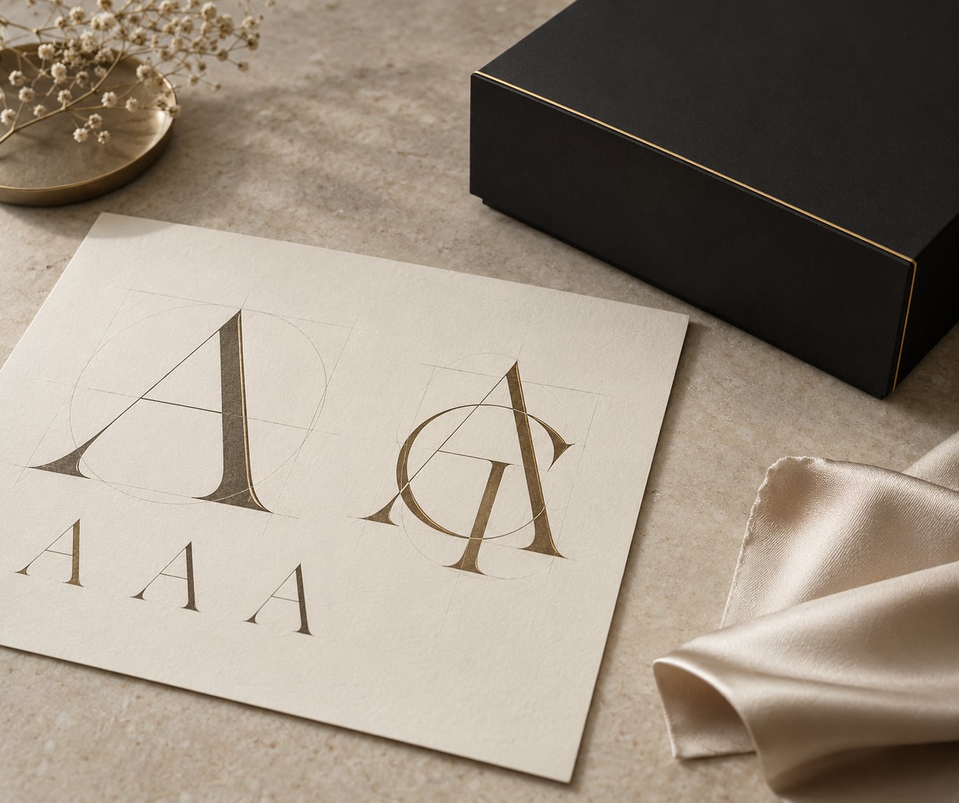
How Typography Creates a Perception of Exclusivity
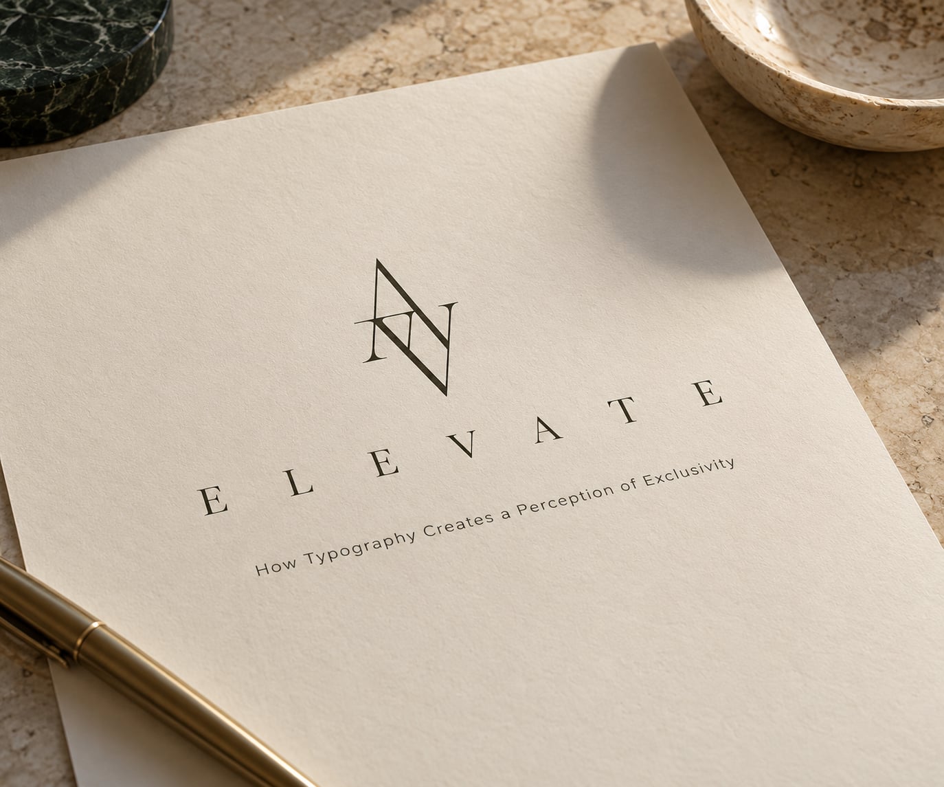
Typography is the cue most often described loosely and used badly. Three things tend to read as expensive: rarity of the typeface, generous letterspacing, and restraint in how many styles appear at once. Set a name in a widely drawn serif with wide tracking and it reads as institution — the visual grammar of engraved stationery and bank paperwork. Set the same name in a friendly rounded sans and it reads as approachable, which is a legitimate choice and a different market position entirely.
Custom lettering carries a further signal. A commissioned wordmark means a foundry time that a template cannot buy, and audiences read that time as care. The cost lands in the design before anyone sees the product.
Where semiotics changes the advice: a luxury typeface is not one that looks beautiful. It is one that is unfamiliar enough to signal a distinct world, familiar enough to stay readable. There is a window there, and it moves. The same letterforms that read as rare in one category read as derivative in another, because codes are category-specific.
How Color Communicates Luxury Without Guaranteeing It
Colour carries some of the heaviest meaning in the whole system, and it is the cue most damaged by blanket advice. The usual list — black, gold, cream, deep navy — is a description of what luxury has historically used, not a recipe.
Theo van Leeuwen’s work on colour in social semiotics separates physiological response from associative meaning. Warm colours tend to read as active and close, cool colours as distant and calm; but the learned associations sit on top of that and they travel with the audience. Gold reads as wealth in most markets and as a wedding colour in parts of South Asia. Navy carries authority in Western finance and very little at all in some markets where it has no established history.
Restraint does more work than any specific hue. Luxury palettes tend to be narrow — a primary, a ground, an accent — because a broad palette reads as abundance of choice rather than abundance of value. Saturation matters too: deep, slightly muted tones carry more weight than bright ones, since brightness is cheap to reproduce.
The trap is the themed imitation. Gold foil, black card and a serif script on a mass-produced package reproduce the denotation of luxury while skipping every index that supports it. The cues say one thing, the object says another, and audiences tend to trust the object.
Why Materials and Craftsmanship Function as Signs
Materials are where luxury becomes indexical, and that is why they carry the most weight. Weight is the clearest case. A bottle that feels heavy in the hand is making a claim you can verify without reading anything, and it does so before the label is visible. The same applies to the sound of a closure, the drag of a drawer, the temperature of a surface.
Texture and patina extend the claim over time. Leather that darkens, metal that dulls at the edges and fabric that softens through use all point to an object that will persist — which is a semiotic claim about permanence, not a decorative one.
Visible effort completes the chain. Hand-stitching, hand-applied varnish, a small irregularity that could not be produced by a machine reads as index because it is evidence of a process. That evidence is expensive to counterfeit convincingly, and the counterfeit industry is organised around manufacturing it badly — which is why machine-perfect “hand-stitched” goods so often read as cheap.
How Rarity, Space and Restraint Signal Exclusivity
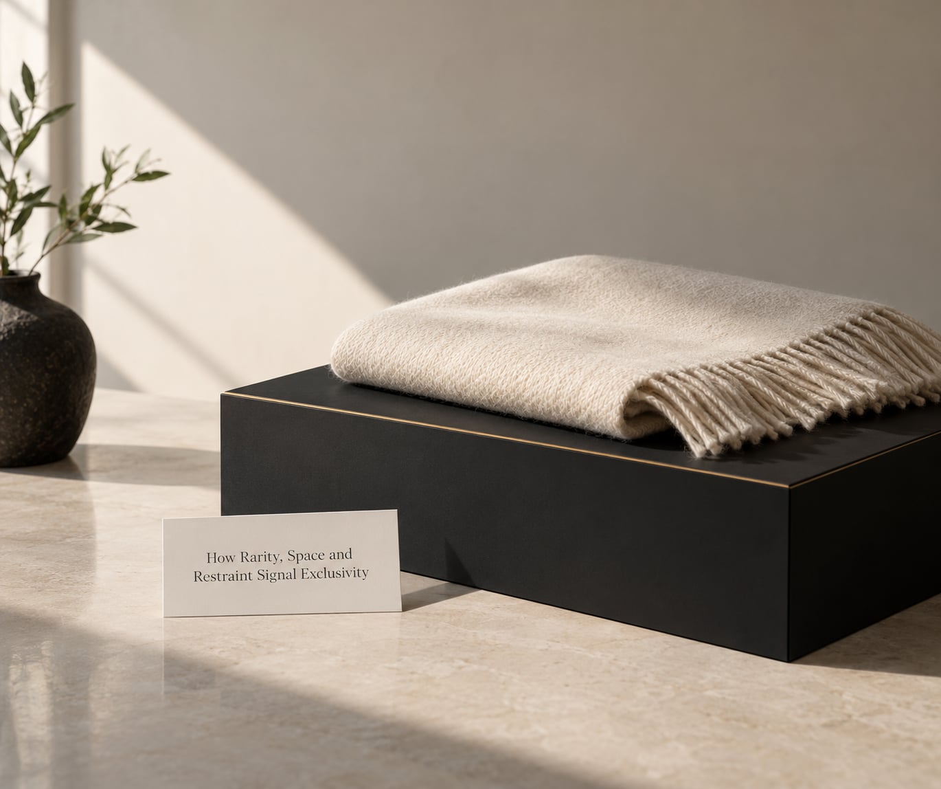
Negative space is a cue with a clear logic. Empty space implies that the thing placed in it did not need help. Crowded layouts read as persuasion; spacious ones read as assurance. Margin works the same way around type: wide margins say the text does not have to shout.
Rarity is the most direct signal available and the hardest to fake honestly. Limited runs, numbered editions and invitation-only distribution all index scarcity, but they only carry meaning if the scarcity is real. Manufactured scarcity is legible to audiences now, and a limited edition that anyone can buy is read as an attempt at a cue rather than the thing itself.
Restraint is spacing, colour, ornament and volume used sparingly. It works because it demands confidence from the designer: leaving something out is a decision that can be reversed, and reversing it is cheap. Minimalism is not a luxury code by itself — a bare white box reads as premium in a skincare category and as unfinished in a spirits category, because the surrounding conventions differ. Quiet luxury is better understood as restraint applied inside a set of luxury conventions, not as an alternative to them.
How Can Designers Use Luxury Cues Without Creating a Costume?
The practical version of all this is a discipline of selection. A workable sequence runs in five moves:
- Name one authentic quality. Not an aspiration — something the product or service genuinely is. Durability, repairability, a made-in-one-place supply chain, a service commitment. This is the signified your cues must point at, and if it is not real, no amount of signage will carry it.
- Choose three cues, not ten. Cue families are a menu, not a checklist. Pick the two or three that index your chosen quality and let the rest stay ordinary.
- Test the reading, not the taste. Show the work to people outside the project and ask what they assume. What they infer matters; whether they like it does not.
- Check the cultural fit. Ask whether the cue carries its intended meaning in every market you sell into. Colour, script and colour associations shift sharply across borders.
- Look for mismatch. Any place where a cue contradicts the product’s actual qualities is the place the design will be rejected, and usually at the worst moment — after the money is committed.
One honest caution. Semiotics is exploratory, not evaluative. It gives you a language for what a design already says and a way to spot contradictions before launch. It does not tell you what buyers will pay, and it does not replace research with people who hold the wallet.
What Are Common Misinterpretations of Luxury Semiotics?
Six mistakes come up constantly, and each one produces expensive work.
Confusing expensive-looking with trustworthy. Ornament, gold and heraldry read as wealth, but they rarely read as honesty. Codes of restraint and legibility do that work better. A design can be lavish and still feel like a sales pitch.
Treating luxury symbols as universal. They are not. The same monogram style, colour and script produce different readings across markets, and assuming a code is global is one of the most expensive errors a brand can make. Semiotics is the study of signs within a cultural context, and removing the context removes the meaning.
Confusing icon, index and symbol in practice. Marketing copy regularly calls a logo an icon while describing a symbol. The distinction has consequences: if your only cue is a symbol, you are one rebrand away from having nothing left, because symbols depend entirely on shared agreement.
Adding ornament where restraint was intended. The instinct to add another flourish to make something feel richer is almost always wrong. Luxury categories punish density, and extra decoration reads as compensation.
Mixing cue families from different categories. Borrowing the packaging cues of one category for a product in another can produce a design that is legible in neither. Audit a brand page where several established competitors sit and you will usually find them converging on the same codes.
Assuming a code is permanent. Because meaning drifts, the last thing a rebrand should do is treat today’s conventions as fixed. Cues that marked exclusivity a decade ago now mark availability in several categories. The question is never “is this a luxury cue?” but “is this still reading as one to this audience?”
Diagnostically, this is also how counterfeits and failed luxury cues get caught. A design that claims indices — hand-finishing, irregular stitching, patina — but shows machine-perfect repetition is signalling in two directions at once. The gap between the claimed process and the visible one is the evidence.
Frequently Asked Questions
What design elements most commonly signal luxury?
The most common signals fall into four families: typography that is rare, well-spaced and restrained; colour used in a narrow, low-saturation palette; materials with visible weight, texture and evidence of hand-finishing; and space used generously around whatever carries the message. The cue alone is not enough. Its power depends on consistency across every touchpoint and on whether the audience already understands the category convention it draws on.
Are luxury signs universal across cultures?
No. Luxury codes are learned within specific markets and change over time. Gold, monograms and deep navy carry strong associations in some regions and weak or contradictory ones in others, which is why colour and script meanings shift across borders. A semiotic read is only valid for the audience and moment it was conducted for. Before entering a new market, check what the cue actually signifies there rather than assuming the home market reading travels.
Does minimalism always make a brand look expensive?
Not on its own. Restraint reads as confidence because leaving something out is a reversible decision, but only when it sits inside the conventions of its category. A bare white box can read as premium in skincare and as unfinished in spirits. Minimalism is best understood as restraint applied alongside other luxury cues — materiality, typographic care, controlled spacing — rather than as a substitute for them.
Is gold a reliable sign of luxury design?
Gold works because most audiences have learned to associate it with wealth, permanence and old money, but it is denotation rather than evidence. A gold finish on mass-produced packaging reproduces the symbol while skipping the indices that support it, and audiences usually notice the gap. Used alone it dates quickly and reads as costume. Used sparingly next to genuine material and craft cues, it still does real work.
Can semiotic analysis predict whether consumers will perceive a brand as luxurious?
It predicts readings, not behaviour. Semiotics shows you what a design is already saying, where the cues contradict each other and how different audiences would interpret them. It cannot tell you willingness to pay or whether a campaign succeeds. Practitioners treat it as a pre-research diagnostic that runs before consumer testing, catching mismatches while they are still cheap to fix.
How should a designer avoid copying luxury clichés?
Start from a real quality of the product rather than from the look of a competitor. Choose two or three cue families that index that quality, test whether people outside the project read them as intended, and check the meaning holds in every market you sell into. Clichés come from borrowing the surface without the substance. A design built on something genuinely true is far harder to copy than one built on familiar signals.
Conclusion: Start with Meaning, Then Appearance
Luxury is not a look. It is a reading, produced when a design choice matches what an audience already expects and then backs that expectation up with something real.
So begin with two questions rather than a moodboard. Who exactly is meant to read this design as luxurious, and what single genuine quality of the product or service do you want them to infer? Name the audience, name the quality, and the cue choices follow from those two answers instead of from a borrowed palette.