Panel fatigue skews consumer research because repeated survey participation lowers how much effort a person puts into each answer, and the shortcuts they switch to — straight-lining, speeding, low-effort open-ends — push findings in one consistent direction rather than scattering at random. It is systematic error, not noise, so adding respondents does not cancel it out.
The mechanism matters more than the word suggests. Fatigue does not randomly damage some answers and spare others; it changes the behaviour of a whole group of participants in a way that is repeatable from one wave to the next. That is why a brand tracker can show a steady six-point rise in satisfaction that is nothing but drift.
Below is what the bias looks like, how to spot it in data you already have, and which fixes actually move the needle.
Table of Contents
- Why Panel Fatigue Skews Consumer Research
- How Repeated Survey Participation Causes Fatigue
- What Forms of Bias Does Panel Fatigue Create?
- How to Recognize Signs of Panel Fatigue
- How to Measure Fatigue and Response Quality
- Does Panel Fatigue Affect Every Research Method Equally?
- How Much New Data Can a Panelist Provide?
- How often can you survey the same person without panel fatigue?
- How to Reduce Panel Fatigue Without Biasing the Sample
- How Can Researchers Recover a Fatigued Sample?
- Frequently Asked Questions
- How can researchers tell the difference between panel fatigue and a genuinely difficult question?
- How many surveys should a consumer research panelist complete each month?
- Do attention checks reliably identify fatigued respondents?
- Should fatigued respondents be excluded or replaced?
- Can weighting correct the bias caused by panel fatigue?
- When is a study too fatigued to trust?
- What to Do First
Why Panel Fatigue Skews Consumer Research
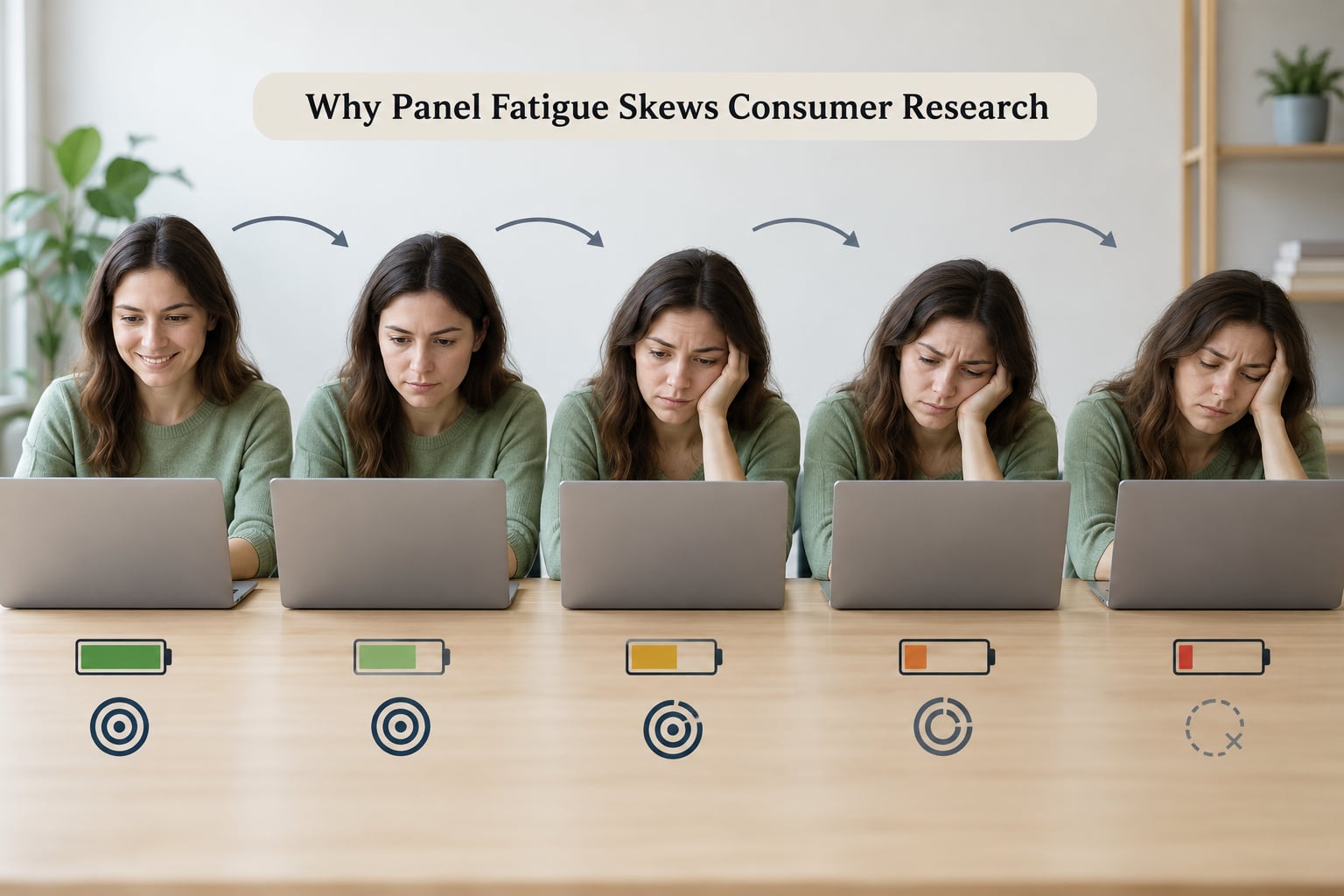
Panel fatigue is the progressive decline in data quality that follows repeated contact. A consumer who answers their tenth survey of the year is no longer the same respondent as on day one. Attention narrows, the perceived value of each survey thins, and the answers stop being a considered report of belief and start being a way to get through the questionnaire.
It is worth separating panel fatigue from three things it is regularly confused with, because each has a different fix:
- Ordinary survey noise. Random variation in how people answer on a given day. It moves in no consistent direction and shrinks as the sample grows.
- A hard question. A single item that legitimately slows everyone down. Panel fatigue is a pattern across sessions, not one item.
- Low interest in the topic. Some topics bore people from the first invitation. Fatigue builds through contact history.
Respondent fatigue within one long questionnaire is a related but separate effect. Twenty minutes of grids can tire someone who has only taken two surveys ever. The two problems overlap in the symptoms and diverge in the remedy, which is why length reduction and frequency capping are separate fixes.
How Repeated Survey Participation Causes Fatigue
Fatigue builds through five mechanisms, and they usually arrive in this order:
- Stimulus repetition. The same grids, scales and brand logos start to blur together. A consumer who saw a competitor’s ad pack last week reads it faster and with less attention this week.
- Accumulated time burden. Ten minutes a month sounds trivial until it stacks into an evening of form-filling. Total burden, not per-survey burden, drives the perceived cost.
- Monotony. Similar topics in identical formats create a rut. Variation in format restores a small amount of attention that length reduction alone cannot.
- Perceived irrelevance. Once the studies stop connecting to anything the respondent cares about, motivation shifts from answering well to answering at all.
- Efficient but unreflective strategies. This is the important one. Respondents learn to finish quickly: pick the middle option, agree with the statement, type three words. They are not lying. They are producing answers that are cheap to produce.
That last mechanism is why fatigue is so hard to catch. Nothing in the file looks broken. The data is complete, internally consistent and clean — just less considered.
What Forms of Bias Does Panel Fatigue Create?
Fatigue bias has a direction, and that is what makes it more dangerous than random measurement error. It shows up in a handful of recognisable forms:
- Straight-lining across a matrix, giving one response to an entire grid.
- Speeding — median completion time collapsing on waves the respondent has seen before, usually on skip logic and open-ends.
- Satisficing more broadly, choosing the first acceptable answer rather than the accurate one.
- Primacy and recency effects, where a fatigued respondent defaults to the first or last option presented.
- Acquiescence and social desirability drift, pushing agreement scores up as the respondent stops engaging with what the question actually asks.
- Mid-scale drift, where uncertain respondents cluster on neutral options because picking a number requires thought.
- Reduced thoughtful choice in concept tests and choice exercises, where respondents pick the option that seems safest or most familiar instead of the one they would buy.
- Selective dropout. The bored leave, the conscientious stay, and the surviving sample tilts toward people who enjoy being surveyed.
The practical direction is a pull toward the easy and the acceptable: toward agreement, toward the middle of the scale, toward socially presentable answers. E. Lee’s work in the Journal of Marketing Research (2000, volume 37, issue 1, “Are Consumer Survey Results Distorted? Systematic Examination of Question Anchoring”) established that systematic error in self-report runs in knowable directions tied to how people actually answer, not in random directions.
That is the danger. Random error averages out. Systematic error compounds: the same drift appears in wave 3 and wave 4, and the trend line reads as movement.
Fatigue also bites unevenly. Frequent participants skew more than occasional ones, and the skew is differential rather than uniform — a tracker question about overall category satisfaction degrades less than a question about whether you would consider switching, because the first has a genuinely accessible answer and the second demands deliberation.
Chmielewski and Kucker (2020) documented a steady decline in respondent data quality from roughly 2015 onward across probability-based and non-probability online samples. Panel fatigue is one plausible contributor among several, and the direction of their finding matches what field teams report anecdotally: more completing, less considering.
How to Recognize Signs of Panel Fatigue
Fatigue rarely announces itself in a single metric. Look for it across three groups of signals, because the individual indicators all have innocent explanations and the combination does not.
Response behaviour signals
- Median completion time dropping sharply from earlier waves of the same tracker.
- Rising straight-lining rates, especially on grids the respondent has answered before.
- Open-ends shrinking from sentences to single words, or repeating near-identical phrasing across waves.
- Attention checks passed at a rate that stops discriminating — everyone passing, or the same small set failing every time.
Survey completion signals
- Item nonresponse climbing on open-ended and grid items while binary items hold steady.
- Breakoff concentrating late in the questionnaire, at the point where effort cost overtakes interest.
- Shortened behaviour in later sessions: faster skips, more “no opinion”, fewer substantive comments.
Panel participation signals
- Falling survey starts among members with the longest tenure.
- Lower acceptance of repeat invitations from the same sponsor, especially after several in a short window.
- Panel composition drifting toward members who join new studies and disappear, while veterans thin out.
Practitioners on research forums describe panel fatigue as a silent problem, because by the time a pattern is visible in the output the wave has already been fielded. That is the argument for watching these signals during fielding rather than after.
One honest caveat: over-filtering is a real failure mode. Aggressive exclusion on speeding or straightlining removes genuine respondents, shrinks an already tight sample, and introduces a new bias in the name of removing one.
How to Measure Fatigue and Response Quality
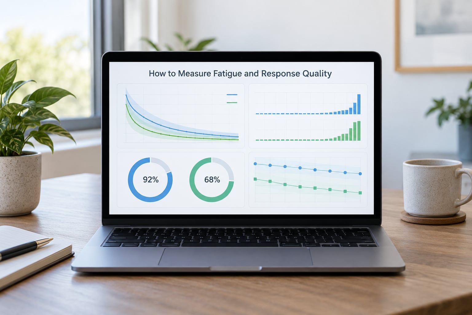
No single measure proves fatigue. Treat any one indicator as a prompt to look further, and score fatigue on a panel that combines behaviour, burden and history.
The practical set: attention check performance, the response-time distribution rather than its mean, item nonresponse by position, straight-lining counts, total completion time, questionnaire length, panel tenure, invitation frequency in a rolling window, open-text length and repetition, and how a member’s answers move from one wave to the next.
Cross-tabulate by tenure and exposure rather than looking at the whole sample. If quality indicators degrade monotonically with the number of surveys a member has completed, you are looking at fatigue rather than a bad week.
That table mapping signals to outcomes is the one I keep beside the analysis script:
| Fatigue signal | Likely bias direction | First remedy to try |
|---|---|---|
| Completion time falls versus wave 1 | Toward neutral and agreeable answers | Shorten the questionnaire and re-time |
| Straight-lining on repeated grids | No real opinion expressed; mean pulled to grid midpoint | Rotate or cut the grid items |
| Open-ends collapse to one word | Toward safe, generic choice in later items | Reduce open-ends in fatigued segments |
| Acquiescence scores rise across waves | Overstated agreement and satisfaction | Re-balance agree-disagree item wording |
| Tenure cohorts diverge | Sample skews toward engaged veterans or fresh joiners | Refresh panel composition and weight |
| Invitation acceptance falls with contact count | Survivor bias in who stays in the panel | Cap contact frequency per sponsor |
| Breakoff rises late in long surveys | Loss of hard-question answers only | Shorten; split into two sessions if needed |
| Concept choice clusters on one option | Habit response instead of genuine preference | Re-test with fresh, unexposed respondents |
| Accuracy against behavioural data drops | Self-report becomes less predictive of action | Triangulate with CRM or sales records |
Accuracy against behaviour is the check most teams skip. Research practitioners writing about synthetic panels make a related argument: that human respondents should be validated against what people actually do, because behaviour is hard to fake in bulk. The same logic applies to fatigue, since a tired respondent’s stated preference and their purchase record can drift apart.
Does Panel Fatigue Affect Every Research Method Equally?
No. Fatigue exposure depends on how often a design asks the same person for the same kind of effort. Compact comparison of how the methods differ:
| Method | How fatigue shows up | Exposure | Validity check that helps |
|---|---|---|---|
| Long questionnaire (20+ minutes) | Late-session straight-lining, breakoff | High | Response time by item block, nonresponse by position |
| Repeated brand tracker | Cumulative drift across waves, familiarity with stimuli | High | Tenure-cohort comparison, split-sample rotation |
| Concept test | Habitual choice, reduced consideration of alternatives | Medium-high | Choice consistency versus stated intent |
| Pulse survey | Low per-survey load, but high cumulative contact | Medium | Rolling contact-count monitoring |
| Online community | Core members carry disproportionate load | Medium-high | Per-member participation frequency, regular refresh |
| Observational panel (wearables, receipts) | Reporting burden leads to gaps and stale entries | Medium | Data recency and gap distribution |
| Depth interviews | Less repetition, more interviewer-side drift | Lower | Coder notes on shortened, less specific accounts |
The pattern: exposure tracks repetition and burden, not method label. A ten-minute pulse asked weekly can be more damaging than a single long concept test.
One design choice does carry across formats. Community practitioners report that moving from portal-based surveys to mobile-first conversational formats raised completion into the high eighties and visibly reduced straightlining, largely because shorter screens lower the effort cost of each item.
How Much New Data Can a Panelist Provide?
There is no defensible universal number of surveys per month or per year. Practitioners asked this question on research forums keep arriving at the same answer: nobody has an agreed threshold, and any figure quoted as a rule is a vendor preference dressed up as a standard.
What you can say is that acceptable burden depends on six things:
- Questionnaire length. Two seven-minute studies cost less attention than one fifteen-minute study.
- Topic interest. A category the respondent follows is far cheaper than one they have no stake in.
- Incentive. Higher rewards attract participants who are present for the reward and disengaged from the questions. Attendance is not attention.
- Device and setting. A five-minute survey in a queue is a different task from twenty minutes at a desk.
- Panel tenure. Long-serving members tolerate more before fatigue, but they also carry more accumulated conditioning.
- Time since the last invitation. Spacing buys more than shortening, at the same total burden.
How often can you survey the same person without panel fatigue?
Measure it for your own panel instead of adopting someone else’s number. Track a rolling contact count per member, then chart your own quality indicators against it. The inflection point where straight-lining and completion time start moving is your threshold, and it will sit in a different place for a beverage tracker than for a B2B satisfaction programme.
How to Reduce Panel Fatigue Without Biasing the Sample
Ordered roughly by impact per unit of effort, starting with the design decisions that cost nothing at field time:
- Shorten the questionnaire. Delete duplicate and low-information items first. Fatigue concentrates late in long sessions, so trimming the tail pays off more than trimming the middle.
- Space invitations. A rolling cap per sponsor preserves more quality than any single study’s redesign, though it costs sample size.
- Rotate samples within the tracker. Bringing in fresh faces each wave controls cumulative drift without abandoning the longitudinal design.
- Vary format where validity allows. Mixed modes and conversational mobile layouts reduce monotony and recover some attention.
- Cut redundant questions. Repeated grids on the same attributes are the straight-lining trap in its purest form.
- Segment by engagement. Treat high-frequency members as a different population, with their own contact rules and their own baseline.
- Calibrate incentives proportionately. Enough to motivate, not enough to convert participation into a transaction.
- Monitor quality continuously during field. A pattern caught mid-wave can still be corrected with a quota change.
- Exclude suspect cases with transparent rules. Publish the thresholds before you look at the outcomes.
- Refresh the panel. Regular member refresh is the structural fix practitioners rate most highly for over-familiarity, particularly in branded communities.
Steps one to three cost you sample or continuity. Steps four to ten cost effort and judgement. That trade-off is unavoidable, and it is better made deliberately than discovered later.
How Can Researchers Recover a Fatigued Sample?
Sometimes data can be salvaged, sometimes it cannot. The honest options, in rough order of preference:
- Segment and compare. Re-weight or re-analyse by tenure and exposure. If low-exposure members give materially different answers from high-exposure ones on the same items, you have a quantified problem rather than an argument about one.
- Apply quality exclusions. Remove cases that fail pre-set speeding and straightlining rules, then check whether conclusions move. If conclusions survive, the fatigue was concentrated rather than systemic.
- Run sensitivity analysis. Re-read key metrics with and without the fatigued cohorts. Wide swings mean the finding was never safe to act on.
- Recontact with a shorter instrument. A trimmed version of the failed instrument often recovers usable responses from willing members.
- Weight toward fresh cohorts. Helps only where you have enough fresh respondents to weight to, and only if the bias is a level shift rather than a distortion of question meaning.
- Rerun with a fresh sample. The right answer when the drift is on a headline metric. A tracker reading plus six points on satisfaction that nobody can explain is worth less than no reading at all.
One limit is worth stating plainly. Weighting and exclusion can correct the composition of a sample; they cannot restore attention a respondent no longer has. If the answers themselves were produced by satisficing, the measurement instrument was already compromised before any weighting touch.
Frequently Asked Questions
How can researchers tell the difference between panel fatigue and a genuinely difficult question?
Look at the pattern across waves, not the single item. A difficult question slows specific respondents on specific items and shows up in item-level response times. Panel fatigue shows up as declining quality indicators that worsen with panel tenure and cumulative contact count. If straight-lining and completion time degrade monotonically with exposure, you are looking at fatigue.
How many surveys should a consumer research panelist complete each month?
There is no widely agreed threshold, and any fixed number is a vendor preference rather than a standard. Burden depends on questionnaire length, topic interest, incentive, device, tenure and time since the last invitation. Derive your own threshold by tracking a rolling contact count per member and charting your quality indicators against it.
Do attention checks reliably identify fatigued respondents?
Not on their own. Attention checks detect disengagement at the moment they appear, while fatigue is a gradual condition affecting how the rest of the questionnaire is answered. A fatigued respondent can pass a check and still straight-line a grid afterwards. Use checks as one signal alongside completion time, tenure and open-text quality rather than as an exclusion rule.
Should fatigued respondents be excluded or replaced?
Exclude only on pre-set, transparent thresholds, and never by tenure alone, since veteran members are also your best longitudinal data. Check whether your headline conclusions survive the exclusions; if they do not, the sample was structurally fatigued and the answer is replacement with fresh recruits rather than heavier filtering.
Can weighting correct the bias caused by panel fatigue?
Only partially. Weighting can adjust who is in the sample, so it can address attrition and selection effects that leave a tired or over-surveyed group underrepresented. It cannot restore attention a respondent has already lost, so it does nothing for satisficing within the remaining sample. Change the collection design rather than re-weighting the same responses.
When is a study too fatigued to trust?
Treat a study as unreliable when quality indicators degrade sharply with panel tenure or contact count and your headline metrics move with them, or when a reading appears only in heavily exposed cohorts and vanishes in fresh ones. Also treat it as unreliable when stated preference stops tracking behavioural data. In those cases, rerun with a fresh sample.
What to Do First
Cross-tabulate your last four to six waves by panel tenure and rolling contact count, and look at completion time, straight-lining and open-text length side by side. If those indicators slope against exposure, panel fatigue is in your data, and the size of that slope tells you whether any current findings survive.
Then fix the largest source of burden before you field another survey to the same people. Usually that is questionnaire length or invitation spacing, and both are cheaper to change now than to repair later.