A cultural misstep in packaging design is any word, color, symbol, image, or label on a pack that carries a different or unacceptable meaning in a target market than the brand intended. The way to avoid one is a structured pre-flight check run before artwork is approved: define who the pack is for, research meanings market by market, bring in people with real cultural knowledge, test with consumers who live there, then write down what you decided and why.
It takes roughly two to four weeks of calendar time for a single market, and the hardest part is rarely the design. It’s getting the review structure right so that a designer’s instinct, a translator’s word choice, and a local consumer’s actual reaction all get compared on the same page.
Table of Contents
- What You Need
- Step-by-Step: How to Avoid Cultural Missteps in Packaging Design
- How to define the audience and cultural context
- How to research symbols, colors, language, and customs
- How to involve people with relevant cultural knowledge
- How to test the packaging before launch
- How to document decisions and monitor the market
- Common Mistakes
- Frequently Asked Questions
- How can a packaging designer check whether a cultural symbol is appropriate?
- Is it possible to create packaging that works across multiple cultures?
- Should cultural sensitivity be checked by one person from that culture?
- How do you localize packaging without redesigning the entire product?
- What should a brand do if customers say packaging is culturally offensive?
- Are color meanings universal or do they change by market?
- Conclusion
What You Need
Gather these before the concept review, not during it. Each one answers a different question, and the gaps tend to show up as expensive surprises later.
- A written audience and market brief. Who buys this, where, in what occasion, and who sees it but never buys it.
- Market-specific reference sources. Local news archives, retailer listings from that market, published ethnographies, and existing packs competing on the same shelf.
- Two to three reviewers with cultural knowledge of the target market. People who live in it now, not consultants who studied it.
- A linguistic resource beyond machine translation. Back-translation by a second linguist who did not write the copy.
- A color and symbol audit sheet. Every hue, icon, gesture, animal, garment, and religious reference in the artwork, listed with its intended meaning.
- Legal and regulatory checkpoints for the market. Ingredient language, allergen and certification marks, recycling notation, mandatory label copy.
- A small recruitment budget. Enough to run a short concept test with 20 to 30 people from the market, or a paid session with a cultural consultancy.
- A decision log. A shared document where each flagged item gets an owner, evidence, decision, and date.
If you only have two of these, spend them on the audience brief and on paying a local reviewer. Free advice from colleagues who happen to speak the language is the most common failure point in this process.
Step-by-Step: How to Avoid Cultural Missteps in Packaging Design
How to define the audience and cultural context
Write down the intended buyer and the incidental audience separately, because they read the pack differently. The person who chooses the product at the point of sale cares about price, format, and trust marks. The person who lives with it at home cares about language, imagery, and whether the pack feels respectful.
Then list the specific occasions. A pack that works for an everyday family purchase may fail completely as a festival or wedding gift, because gifting conventions, auspicious colors, and what counts as a respectful gift all shift.
Write the brief as market plus city plus occasion, not just country. A country of many languages and dozens of distinct regional cultures will not give you a single answer, and treating it as one is the assumption that produces most of the failures you’ll read about later.
You’ll know this step worked when a designer who has never visited the market can say who the pack is talking to and what it is asking that person to do.
How to research symbols, colors, language, and customs
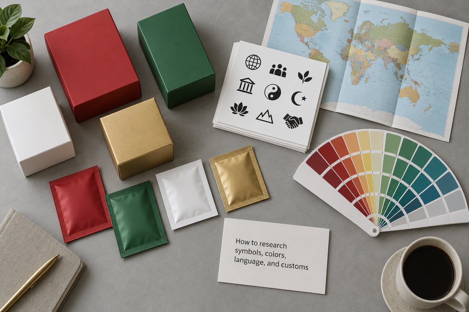
Start from semiotics rather than opinion. Every mark on a pack does two things at once: it points at something literal, and it carries a second layer of association. A white dove is a bird and it is also peace, purity, or a funeral, depending on where it’s printed.
Designers encode meaning from their own cultural context. Consumers in another market decode using theirs, instantly, usually without noticing they’re doing it. When the two encodings diverge, the pack is communicating something the brand never wrote.
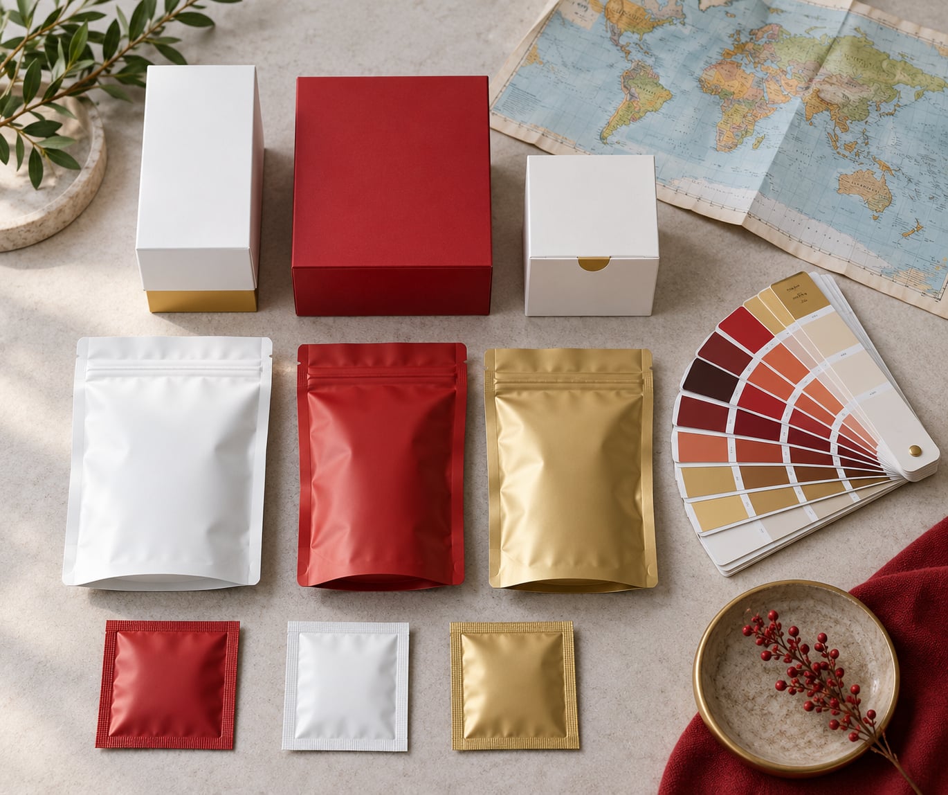
Generic color-psychology infographics are where teams go wrong. They flatten a market into a stereotype and then get surprised. Use evidence gathered inside the market instead: what that market’s retailers are currently using, what its own brands did and whether it worked, and what people there say about the colors you have chosen.
| Color | Common association in Western markets | Reading in parts of East and Southeast Asia | Reading in parts of the Middle East | Risk note |
|---|---|---|---|---|
| White | Purity, simplicity, weddings | Mourning and funerals in some markets | Purity in several Gulf markets | Funeral associations make white dominant packaging risky for celebratory products |
| Purple | Luxury, creativity, spirituality | Reserved for the monarchy in Thailand | Associated with mourning in some markets | Royal protocol and mourning readings both apply; verify locally before use |
| Red | Energy, appetite, urgency | Good fortune and celebration | Strong positive, widely used | Usually low risk, but check religious contexts where red carries other meanings |
| Green | Nature, health, sustainability | Generally positive | Religious significance in some Muslim-majority markets | Halal and religious contexts need specific checks, not assumptions |
| Yellow | Optimism, warmth, caution | Imported-brand caution signal in some markets | Mourning in some markets | Two of the three readings are negative; treat yellow as high-risk |
| Black | Elegance, formality, mourning | Generally premium | Neutral to positive for premium goods | Mourning in several African and South Asian contexts; verify before mass use |
Apply the same method to language. Translate for meaning, not word-for-word, then have a second linguist translate the translation back into the source language. If the back-translation does not return the original intent, the copy has drifted. Slang, idiom, and humor break first; a joke that lands well at home can read as arrogant or faintly insulting abroad.
Two surfaces get missed by most teams. Typography: right-to-left scripts need mirrored layouts, repositioned logos, and numerals that still read correctly, while scripts without spaces need line-breaking rules the designer must set deliberately. And mandatory labeling: the legal requirements for a market are the most common real-world pack failure, because teams treat compliance as a separate department’s problem and approve artwork that cannot legally ship.
How to involve people with relevant cultural knowledge
One reviewer is a sample of one. Practitioners are consistent on this point: what a project needs is cultural insiders, not just translators. Someone who speaks the language can tell you the copy is grammatical. Someone who lives the culture can tell you that the word is a slur in the wrong context, that the hand gesture means something obscene in that country, or that the dish pictured is eaten only on specific days.
Brief reviewers properly. Send the brief, the artwork, the intended meaning of each element, your deadline, and three specific questions. Do not send “does this look okay.” Open-ended questions produce taste feedback, and taste is not the thing you are testing.
Pay them, credit them, and keep their name attached to the feedback in the decision log. Unpaid, unattributed review gets treated as an optional courtesy and gets skipped when the schedule tightens, which is exactly when you needed it.
You will know this step worked when reviewers disagree with each other, because that tells you the market has genuine internal variation and you now know where the risk sits.
How to test the packaging before launch

Start light. Put five to eight competing or proposed packs in front of eight to twelve people from the market and ask them to sort, describe, and choose, without telling them which one is yours. Where does their eye go first, what do they think it contains, what words do they read, and what does the pack make them feel? Silence and hesitation are findings.
Run a concept test next. Show the revised pack alongside the original and ask about meaning, trust, and purchase. A semantic differential, rating concepts across paired adjectives like trustworthy versus cheap or modern versus traditional, turns a vague impression into something you can compare between versions.
Go quantitative only when the decision is worth the money. If the change affects shelf impact in a large market, a proper concept test with a few hundred respondents can tell you whether the new front-of-pack hierarchy actually lifts comprehension. Otherwise a moderator session with 20 to 30 people is faster and more honest.
Test the version that will ship, at actual size, with the mandatory label copy in place. Compressed artwork on a laptop hides exactly the legibility problems you are looking for, and the thumbnail on a marketplace listing is a different design from the pack in the hand.
How to document decisions and monitor the market
Keep a decision log with six fields per item: the element, the intended meaning, the risk raised, the evidence used, the decision, and who signed it. This is the artifact that survives a schedule change, a team move, or a disagreement six months later.
Put two gates in the process. Nothing goes to print without a cultural sign-off and a legal or compliance sign-off, and neither reviewer is the person who designed it. Self-review by the designer who made the pack is the least reliable check in the whole chain.
After launch, watch retailer complaints, social mentions, and customer service contacts for a few weeks, and set an owner for reading them. Also schedule a re-review for seasonal and festival packs, because the calendar changes what a pack needs to say.
Log the outcome, not just the decision. Six months later, knowing that the yellow was changed to deep blue because two reviewers read it as mourning is the single most useful thing your team will have when the next market comes up.
Common Mistakes
Treating culture as decoration. Borrowing a motif because it looked good in a mood board, with no relationship to the market and no local contributor. Fix: work with an artist from the market, credit them, and compensate them. If nobody in the market made it, it is a costume.
Relying on one insider as the whole answer. One colleague’s verdict gets treated as approval for an entire region. Fix: get three reviewers from different cities or communities, and record where they disagree.
Using generic color-psychology charts. These rank colors by Western association and present the result as universal. Fix: source evidence from the market’s own retailers, its brands, and its consumers.
Translating literally and late. Copy is the last thing that happens, after artwork is locked. Fix: bring the transcreator in at concept stage so meaning drives layout, not the other way round.
Ignoring context. An image that is respectful in a supermarket can be read very differently in a shrine, a school, or a place of worship. Fix: ask where the pack will physically be seen and used, not just who buys it.
Using stereotypes or borrowed sacred imagery. Using religious figures, sacred animals, or traditional dress as a shortcut for authenticity. Fix: keep sacred imagery out unless there is a genuine relationship with the community that produced it.
Forcing one global template everywhere. The template gets applied to markets that cannot use it, and local teams end up resenting the asset. Fix: define which elements are fixed for brand recognition and which are free to change per market, then write that rule down.
Assuming AI imagery is culturally neutral. Generated visuals reproduce the biases of the training data and produce stereotyped faces, gestures, and dress at a speed review cannot match. Fix: treat every generated image as a draft, and check faces, hands, garments, and objects against the same audit as any other element.
The rule underneath all eight: if the brand cannot explain where an element came from, it does not belong on the pack.
Frequently Asked Questions
How can a packaging designer check whether a cultural symbol is appropriate?
Start with the element itself, not the design. List what it depicts, then research how it is read in the specific market rather than in general. Check the market’s own media, retailer listings, and existing brands for precedent, then ask two or three people who live there what the symbol signals. If the reading is contested, treat it as contested and avoid it. Document the source for every element you keep.
Is it possible to create packaging that works across multiple cultures?
You can design a system that travels, but not a pack that reads identically everywhere. Fix the elements that carry brand recognition, such as the logo shape, the pack architecture, and the product name, then make color, imagery, script, and label copy flexible per market. The shared asset is the framework, not the finished artwork. Testing with consumers in each market still happens, even when the template looks identical.
Should cultural sensitivity be checked by one person from that culture?
No. One reviewer is a sample of one, and every market has internal variation that a single person will not represent. Use at least three reviewers from different cities or communities and pay them. Where they disagree, that disagreement tells you where the risk sits. Record the disagreement in your decision log rather than averaging it away, because the people most likely to be misread are usually in the minority group.
How do you localize packaging without redesigning the entire product?
Separate the fixed elements from the flexible ones before you start. Keep the logo, pack structure, and product naming system consistent, then localize the things that carry meaning: the copy, the color palette, imagery, script and reading direction, portion format, and all mandatory label text. Localize copy with a transcreator rather than a translator, and re-run the cultural audit on the changed elements only. Version the artwork so each market has a tracked, approved file.
What should a brand do if customers say packaging is culturally offensive?
Acknowledge it quickly and specifically, without explaining intent as a defense. Pull the pack and pause the run or listing if the complaint names a factual error, and explain what you are doing and by when. Then find out why it passed review, which is usually a missing reviewer or a skipped gate, and fix the process rather than the artwork alone. Follow up publicly with what changed, not just a withdrawal.
Are color meanings universal or do they change by market?
They change by market, and often within one market by occasion, age, and community. White can signal purity in a Western supermarket and mourning at a funeral in several East Asian markets. Purple reads as luxury in Europe and carries royal protocol restrictions in Thailand. Treat color and symbol meaning as market-specific evidence, gathered from that market’s own retailers, brands, and consumers, rather than from general charts that rank colors by Western association.
Conclusion
Start with the audience brief for one market and get three paid reviewers from that market looking at the same artwork with the same three questions. Everything after that, the audit sheet, the testing, the decision log, follows from that one step.
That is how to avoid cultural missteps in packaging design: treat meaning as a design input with an owner and a sign-off, not as a courtesy check someone performs if the schedule allows. Re-check your reference sources each year, because color meanings, protocol rules, and what consumers read as respectful all move.