Queue design changes perceived wait time without changing the actual wait. A nine-minute wait can feel like fifteen or feel like four, and the difference comes down to whether a person can see progress, understand the rules, and predict what happens next. That is the whole subject of how queue design changes perceived wait time: the layout, the information and the ending of the wait, treated as design variables rather than as software features.
The evidence base here is service research rather than neuroscience. The principles were set out by David Maister in The Psychology of Waiting Lines (1985) and have been replicated across retail, healthcare, transport and call centres ever since. Below I set out the mechanisms first, then the physical and digital design moves that follow from them, and finally a way to test changes in your own operation.
Table of Contents
- Perceived Wait Time vs. Actual Wait Time
- How Queue Design Changes Perceived Wait Time
- How Queue Design Changes Perceived Wait Time
- Why Physical Layouts Feel Faster
- Which Design Features Make Waiting Feel Fairer?
- Single-line vs Multiple Lines
- Does Distraction Reduce Perceived Waiting?
- What Design Choices Work for Different Queues?
- How Can You Test Changes to Queue Design?
- What Mistakes Make a Queue Feel Slower?
- Frequently Asked Questions
- Can a longer queue feel faster than a shorter one?
- Does music or a television screen make a queue feel shorter?
- Is a zigzag queue faster than a straight queue?
- Should queues use numbered tickets or a first-come-first-served line?
- How do you measure perceived wait time accurately?
- What to Do First
Perceived Wait Time vs. Actual Wait Time
Actual wait time is measurable: the minutes between arriving and reaching service. Perceived wait time is the duration the customer believes they spent, and the two rarely match. Most of the gap comes from uncertainty rather than from the clock.
Three things inflate the felt number. An unoccupied wait with no visible progress, a wait that runs longer than the estimate a person formed in their head, and a wait that looks unfair to the person standing in it. Take any one of those away and the same number of minutes reads as shorter.
Here is the useful part for anyone responsible for a queue: only two things shorten the actual wait. More service capacity, and a lower arrival rate. Everything else on this page is a perception lever, and perception levers are cheap, reversible and often faster to implement than a staffing change.
How Queue Design Changes Perceived Wait Time
Six mechanisms explain most of what happens when a wait changes from tolerable to maddening. Each one has a design lever attached to it, and each lever works in physical queues, on hold music and in virtual waiting systems alike.
- Uncertainty. A person who does not know how long the wait is cannot decide how to feel about it, so the minutes stretch. Show a range or an estimate and the stretch stops.
- Visible progress. Movement you can watch, a line advancing or a number ticking up, converts dead time into progress. Nothing on a blank wall equals nothing happening.
- Fairness. A wait that looks impartial is judged more quickly than an identical wait that looks rigged. Perceived unfairness adds more felt time than the wait itself does.
- Occupation. Attention given to something else shortens the experience. The same minutes pass faster while someone is reading than while they are staring at a stanchion.
- Expected versus unexpected. A wait of twelve minutes that you expected to be twenty feels short. A five-minute wait you expected to be two feels endless.
- The ending. The last moments of a wait carry disproportionate weight in the memory afterwards, which is why the hand-off to service is worth designing on its own.
Physical and virtual queues use the same mechanisms with different hardware. A physical queue delivers progress through sightlines and markers. A virtual queue has no line to look at, so it has to deliver progress by number, message or app notification, and it risks losing the visible fairness cues people rely on when they can see who is ahead of them.
How Queue Design Changes Perceived Wait Time
Broken into stages, a wait has five moments, and each one can be shortened by design without shortening anything real.
Arrival. The first five seconds decide whether someone treats this as a queue at all. A marked entrance with a clear sightline to the person giving out tickets says organised. A gap in a wall next to a counter with no signage says guess.
Uncertainty about position. The hardest moment is between joining and getting an answer. A ticket, a numbered marker or a call-forward display ends the guessing. People tolerate an honest wait far better than an unexplained one.
The wait itself. This is where progress visibility does its work. A visible estimate plus something to look at, even a shelf of magazines or a screen showing queue movement, changes the texture of the minutes.
Service. Speed at the counter matters, but so does the transition. Being greeted within a few seconds, being told what happens next, and not being left standing after the transaction ends all affect how long the whole encounter felt.
Departure. People remember how it ended. A clean, immediate hand-off at the end compresses the memory of the entire wait more than any improvement in the middle.
One counterintuitive note: perceived time can briefly rise and the outcome still improve. When you show someone they are being moved for a reason, the moment of adjustment often feels longer, because attention narrows on the change. It is a short-term cost for a better overall judgment, and worth expecting rather than treating as failure.
Why Physical Layouts Feel Faster
A shorter line is not always a faster-feeling one. Length is a proxy for time, and people read several other signals before they read length at all.
Sightlines. If you cannot see the counter from where you stand, every minute is also a minute of not knowing. Open sightlines let people estimate their own position and stop inventing worst cases.
Lane switching. Parallel lines that invite customers to hop between them produce constant small decisions, and every re-decision resets their estimate. People end up feeling longer even when throughput is higher.
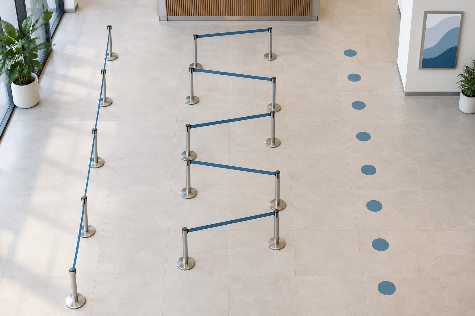
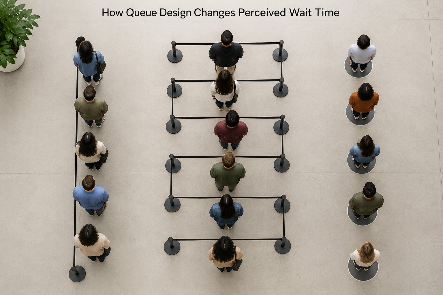
Serpentine routes. Switchback lines fit more people into a small footprint and look compact, which is why operations like them. The cost is a route that is hard to count, so the line looks endless even when it is not.
Entrance definition. Most layout problems are actually entry problems. If it is not obvious where the line begins, people stand in the wrong place, staff reroute them, and the first minute is spent untangling the queue rather than joining it.
Stanchions and markers. Physical markers make position countable, and countable things feel faster than vague ones. Separated numbered waiting spots do this better than rope, because they give each person an address.
The practical lesson: fix the entrance, open the sightlines, and give people a countable position before you change anything else. Those three moves are usually free.
Which Design Features Make Waiting Feel Fairer?
Fairness perceptions depend less on the rule itself than on whether people can understand the rule and see it applied. An impartial system nobody understands reads as an unfair one.
Features that do the job well:
- First-come-first-served, stated plainly at the entrance.
- Numbered tickets or numbered markers, in strict ascending order, with no reused numbers.
- Call-forward displays so people can follow along from a seat.
- Posted rules, including who gets priority and why.
- Priority lanes that are labelled as such, not hidden exceptions.
Fairness complaints in retail and pharmacy queues are rarely about the rule. They are about visible violations: a friend let in ahead, a number called twice, a person who steps away for five minutes and comes back to the same place. Threads on r/TalesFromRetail and r/TalesFromThePharmacy describe exactly this pattern, with heat coming from the ambiguity rather than the delay.
Recurring numbers on r/mildyinteresting and r/PharmacyTechnician describe the same issue from the other side, where duplicate or reused numbers and staff who cannot say why the queue is slow destroy trust in every other number on the system.
Single-line vs Multiple Lines
| Factor | Single serpentine line | Multiple parallel lines |
|---|---|---|
| Fairness perception | High, order is visible to everyone | Low, lane switching reads as jumping |
| Average wait | Longer on average, no lane bias | Shorter on average, penalises unlucky choosers |
| Server utilisation | Pooled servers idle less | Some lines stall, some overflow |
| Stress during the wait | Calm, no decisions to make | Constant re-checking and suspicion |
| Best when | Arrival rate is steady | Arrival rate is bursty and highly variable |
The trade-off is real. Multiple lines usually produce a shorter average wait and a worse felt wait, because people compare themselves to the neighbouring line forever. Single lines win on fairness and calm and lose on average minutes. When arrivals come in bursts, pooling more servers behind one line recovers some of the throughput without giving up the fairness cues.
Does Distraction Reduce Perceived Waiting?
Sometimes, and it is not automatic. Distraction works when it fills the attention that would otherwise sit on the clock. It fails when it adds noise to an already uncertain situation, or when it is clearly a sales pitch wearing a distraction’s clothes.
On-hold music and video do the basic job, because they are neutral and predictable. Promotional messages during a wait tend to backfire: they interrupt, and many customers read them as an admission that the wait is long enough to advertise into.
Estimated waits sit in an odd category. They are information, not distraction, and the research signal is consistent: a roughly accurate estimate beats no estimate. Showing twenty-five minutes and then delivering eighteen feels like competence. Showing ten and then delivering twenty-five feels like a broken system, and the trust loss outlasts the wait itself.
So when you rank your options, progress feedback comes first and entertainment second. A screen showing the line moving does more for perceived wait than a screen showing an advert, because only one of them answers the question the customer is actually asking.
What Design Choices Work for Different Queues?
Retail checkout. Pooled servers behind one line, marked entrance, and a visible next-server indicator. Watch abandonment at the point where people reconsider joining, since that is where perception turns into lost sales.
Restaurants. Ordering and waiting get separated, so the queue is for ordering only and is fast. Take the payment at the table and the perceived queue nearly disappears without adding staff.
Pharmacies and clinics. Ticket numbers plus a call display, seating, and a way to leave and rejoin without losing a place. Staff need a script for the queue being slow, because silence from the counter is read as indifference.
Call centres. Position in queue stated early, callbacks offered instead of holding, and a person reachable when the estimate is wrong. The perceived wait is worse than the actual wait in almost every case, so the estimate is the design.
Virtual support queues. Browser position, a text message with a real range, and permission to leave and come back. The fairness cost is real, so pair it with visible ordering and clear rules rather than relying on the app alone.
Government offices and transport. Numbered tickets, posted priority rules, and a working display. Staff and customer both need to know why the queue is slow, and that information has to be deliberately supplied.
How Can You Test Changes to Queue Design?
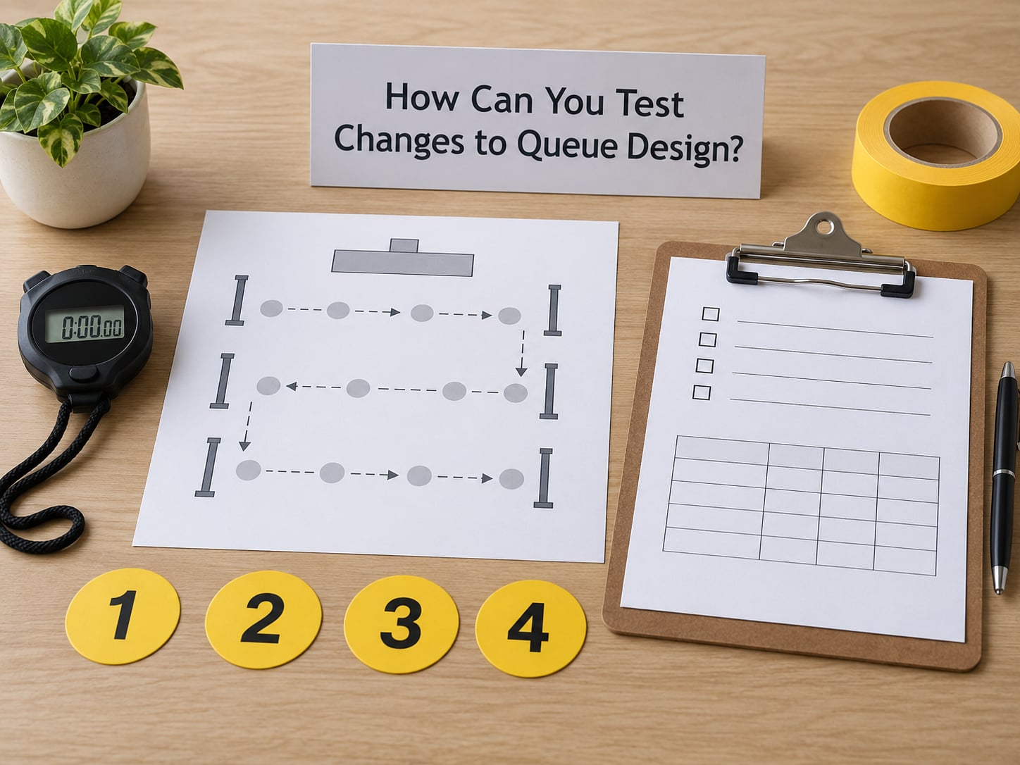
Test one change at a time, or you will learn nothing about which one did the work. Start with a baseline, hold the change for long enough to see both a quiet period and a rush, and ask one short question after service.
The two numbers worth computing are the perceived-to-actual ratio and the abandonment rate. Perceived wait divided by actual wait tells you how distorted the experience is; an actual wait of eight minutes that people report as fourteen is a design problem even though service speed is fine. Abandonment is the conversion version of the same thing.
| Metric | How to capture it | What a good result looks like |
|---|---|---|
| Actual wait | Ticket time and service time from the queue system | Baseline before any change |
| Perceived wait | One question after service, minutes estimated by the customer | Ratio trending toward 1.0 |
| Fairness score | Rate the queue as fair or unfair, plus open comment | Majority fair, comments about progress not order |
| Abandonment | Joined but left before service, counted at the entrance | Falling after a change |
| Completion rate | Served before closing or cutoff time | Stable or rising |
| Observation notes | Ten minutes at peak, note switching and asking questions | Fewer repeated questions |
Ask the wait question in one of two ways: a plain estimate of minutes, or a comparison against a fixed reference such as whether the wait felt longer or shorter than expected. The estimate gives you a number to graph, the comparison gives you a cleaner signal when estimates are noisy.
Do not optimise for speed alone. A layout that shaves two minutes off the average while doubling abandonment has made the operation worse, and it will not show up if you only watch the queue chart.
What Mistakes Make a Queue Feel Slower?
Over-promising an estimate. An estimate that slips violates expectation and costs more trust than no estimate at all. Under-promise modestly and update when the picture changes.
Hidden rules. Priority handling that nobody was told about reads as favouritism. Post the rule and say who it covers.
Too much switching. Multiple lanes with constant hopping turn a wait into a running negotiation. Fewer lanes, clearly numbered, usually wins on felt time.
Silent service periods. When a counter goes quiet with no explanation, everyone assumes something is broken. A short status line, a posted sign or a quick acknowledgement costs almost nothing.
Inaccessible queue information. Estimates on a screen behind a pillar, in tiny type, or spoken only over a buzzer that half the room cannot hear, leave the uncertainty in place. Put the information where the waiting people actually are.
Redesigning without staff. Front-line staff absorb the frustration a layout creates and they are the first to see what a change breaks. Ask them first, and give them something to tell people, because no design can fix a delay nobody can explain.
Frequently Asked Questions
Can a longer queue feel faster than a shorter one?
Yes, and often does. People read sightlines, visible movement and a clear position, not just headcount. A compact serpentine line with a numbered marker and a visible estimate can feel shorter than a straight line with no information, even when the first holds twice as many people. Headcount predicts actual wait; information predicts perceived wait.
Does music or a television screen make a queue feel shorter?
Sometimes, and only as a second-order effect. Distraction works by occupying attention that would otherwise sit on the clock. In practice neutral music and video help slightly, promotional content often adds irritation, and anything showing real queue movement beats all of them. Accurate progress feedback is the stronger lever every time.
Is a zigzag queue faster than a straight queue?
A zigzag or serpentine queue fits more people into a small footprint and pools servers efficiently, so actual throughput is often better. Felt time is the trade-off: a switchback is hard to count, so it looks endless even when it is not. Use it in tight spaces, but pair it with numbered markers or a display so people can see progress.
Should queues use numbered tickets or a first-come-first-served line?
Use a single visible line when you can, since the order is legible to everyone and perceived unfairness stays low. Use numbered tickets when the space is too small for one line, when people need to sit, or when they need to leave and rejoin. Never reuse a number, and publish any priority rule that outranks the ticket order.
How do you measure perceived wait time accurately?
Ask one question right after service: how long do you think you waited, in minutes. Divide it by the actual wait from your queue data and track the ratio over time. Add a fairness rating and a count of people who joined but left before service, since those capture the same problem from two directions. Change one thing at a time so the result means something.
What to Do First
Measure both waits side by side for one week: actual minutes from your queue data, and one estimated-minutes question after service. The gap between those two numbers is the size of the problem.
Then find the biggest source of uncertainty, which in most queues is the minutes between joining and getting any answer at all. Make progress visible, give people a countable position, and test the smallest reversible change you can, one variable at a time.
How queue design changes perceived wait time is a design question, not a staffing one, and that is good news. Physical changes cost little and can be measured within a week.