
A brand usage and attitude (U&A) study is a large survey that measures two things in one instrument: how customers actually use a category, and what they think and feel about the brands in it. Knowing how to read a brand usage and attitude study means working through it in a fixed order, methodology first, percentages last. Set aside 45 minutes for a full report, or 10 minutes if you only have the highlights deck.
The order matters more than the speed. Most readers open the deck at the awareness chart, decide whether the number is good news, and skip the page that tells them who was actually asked. That single skipped page explains most of the bad decisions made on the back of research.
Table of Contents
- What You Need
- Step-by-Step: How to Read a Brand Usage and Attitude Study
- Define the research objective and brand question
- Check the sample, fieldwork, and weighting
- Read definitions and measurement scales
- Separate usage, attitude, and behavior
- Compare segments without overinterpreting gaps
- Turn findings into implications and actions
- Common Mistakes When Reading a U&A Study
- 1. Skipping the methodology page
- 2. Treating correlation as causation
- 3. Reading percentages without bases
- 4. Confusing stated preference with behavior
- 5. Comparing unlike measures
- 6. Generalising from one audience
- Frequently Asked Questions
- How do you know if a U and A study sample is good enough?
- What does top 2 box mean in a research report?
- How is an attitude score calculated?
- What is the difference between awareness and consideration?
- What should I do when a U and A study contradicts what my sales data shows?
- How do I know whether a percentage difference is worth acting on?
- Conclusion
What You Need

Have the full report open, not just the highlights. You need five things in front of you, and it is fine if three of them are appendices.
- The brief or objective page. What was the study commissioned to decide? One or two sentences, usually buried at the front.
- The methodology page. Sample size, coverage, quotas, fieldwork mode and dates, weighting, quality checks.
- The questionnaire. Even a partial one. The wording of a question determines what its answer means.
- The base sizes for every table you care about. They are printed in a footnote, not the heading.
- The definitions page. How this study defines usage, awareness, consideration, importance and the attitude scale.
If the definitions page is missing, write to the research lead before reading anything else. A study that never defines its own terms leaves you guessing, and guessing is how a 40 percent figure ends up quoted in a board pack as a market share.
Step-by-Step: How to Read a Brand Usage and Attitude Study
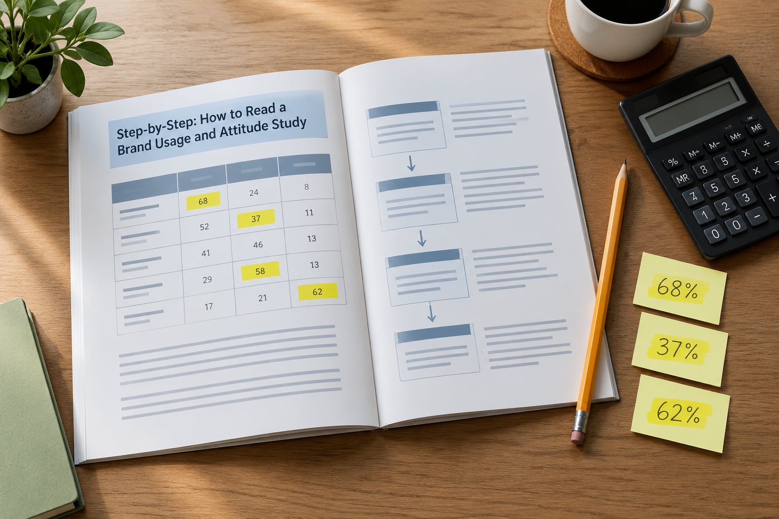
Six passes, in this order. Each pass tells you what to examine, what a useful result looks like, and how to judge whether it holds up.
Define the research objective and brand question
Start with the objective, because it tells you which findings were designed to be reliable and which were incidental. A study commissioned to size a market behaves very differently from one commissioned to justify a repositioning, and the sampling will show it.
The check is simple: does the evidence match the decision the report claims to inform? Brand usage research asks what people buy and why. Broad market research asks how big the category is and who is in it. If your team needs a decision about media investment but you have a category-entry study, you are reading the wrong document, however interesting the numbers are.
Check the sample, fieldwork, and weighting
Now read the methodology page properly. You are looking for who was eligible, how many completed interviews there were, which quotas were set, whether the fieldwork was face-to-face, by telephone or online, and how long it ran. A field period of ten days tells you something about seasonality that no amount of weighting fixes.
Watch for non-probability recruitment, especially online panels recruited from ad placements. Those samples skew toward people with strong opinions about the category, which inflates both enthusiasm and complaint. Weighting corrects for known demographics like age, gender and region. It does not correct for the fact that an enthusiast volunteered.
| Check | Good sign | Red flag |
|---|---|---|
| Sample source | Probability-based panel or face-to-face recruitment with a clear frame | Respondents recruited from the brand’s own site, an ad, or a rewards site |
| Quotas | Set on behaviour relevant to the category, such as purchase frequency | Demographic quotas only, with no category screening |
| Fieldwork length | Spread across normal purchase cycles for the category | A few days in a peak or trough week |
| Weighting | Stated factors, the size of the adjustment, and the effective sample size after weighting | No weighting factors disclosed, or heavy weights on small cells |
| Data quality | Speeders, straight-lining and duplicates removed and reported | No mention of any cleaning step |
The most useful line on many methodology pages is the effective sample size after weighting. A nominal 2,000 interviews with heavy weights can behave like a much smaller sample, and the margin of error attached to it will be wider than the chart implies.
Read definitions and measurement scales
Brands sound alike and mean different things. Usage frequency, purchase frequency and penetration get used loosely in conversation and precisely in the questionnaire, and only one of those is what the reader assumes.
Awareness usually comes in two versions. Unaided awareness is the brand a respondent names first when asked what brands come to mind, and it measures mental availability. Aided awareness is recognition after the brand is read out or shown, and it measures familiarity. Unaided awareness sitting far below aided awareness is the signature of a brand that is known but not top of mind, which is a different problem from a brand nobody has heard of.
Attitude questions run on a Likert scale, usually five or seven points from strongly disagree to strongly agree. Results get condensed into summary scores, and the two you will meet most are top 2 box and Net Promoter Score.
Top 2 box is the share of respondents choosing one of the two most favourable points. It is easy to read and it hides the middle: a 45 percent top 2 box could sit on a pile of mildly positive answers or a genuine split of committed and hostile opinions. Ask for the full distribution before you celebrate.
Net Promoter Score is calculated as the share of promoters (9 or 10 out of 10) minus the share of detractors (0 to 6), so it runs from minus 100 to plus 100. It is a relative measure, not a percentage, and the absolute number means little without a prior wave or a competitor’s score on the same instrument.
Always check three things on a scale: the direction, so you know whether higher is better; the base, so you know who answered; and whether the wording changed since the last wave. A tracker that asks the same five brands in a different order is not the same question asked again.
Separate usage, attitude, and behavior
What people do, what they report thinking, and what they intend to do are three different things, and a U&A study reports all three. Conflating them is the most expensive mistake in brand research.
A brand can post a 78 percent aided awareness, a strong quality top 2 box, and low switching numbers, and still lose share to a competitor that most respondents have never heard of. That is not a contradiction. Awareness measures presence, attitude measures warmth, and switching measures revealed behaviour in the last purchase. Warmth does not stop a shopper buying whatever was on the shelf.
The same logic runs the other way. Purchase intention in a concept test is a statement about a product that does not exist yet, reported to a stranger, in a survey. It is worth reading. It is not evidence of sales.
Compare segments without overinterpreting gaps
Cross tabs are where a U&A study earns its cost, and where it most often gets over-read. Look first at the base size under the segment. A segment of 40 respondents carrying a 30-point gap from the total sample is a hypothesis, not a finding.
A rough rule of thumb: treat a difference as real when the subgroup base is comfortably over 100 and the gap clears what random variation would produce at your confidence level. Below that, describe the direction and move on.
Then check overlap. Heavy users of a category are often younger, urban and higher income at the same time, so a “young urban” segment and a “heavy user” segment may be the same people counted twice. Two findings that share an explanation are one finding, and treating them as independent is how a plan ends up funding the same audience twice.
Segment the way the business is organised where you can. A gap that maps onto a channel, a region or a product line gets funded. A gap that maps onto a mid-life stage nobody sells to gets a polite nod.
Turn findings into implications and actions
Write each finding through four lines: the finding, what it means, what you would do about it, and how you would know it worked. Anything that cannot complete those four lines either needs more evidence or belongs in an appendix rather than a deck.
The fourth line is where most read-outs stop. If you cannot say what would make the number move, the action was probably not an action but a description. And keep two columns in your notes: one for what the study directly supports, one for hypotheses you are generating. Conflating them is how a correlation turns into a strategy.
Two useful additions: check whether panel or sales data supports the survey story, and check whether qualitative work explains it. Surveys tell you the size of a pattern. They rarely tell you the mechanism.
Common Mistakes When Reading a U&A Study
These six errors account for most of the bad conclusions I have seen pulled out of good studies. Each has a straightforward correction.
1. Skipping the methodology page
Reading the highlights deck before the methodology page. The deck was designed to persuade, not to inform.
The fix: method page first, every time, even when someone briefs you on the deck. Ten minutes there saves a quarter of brand budget later.
2. Treating correlation as causation
Brand loyalty and household size move together in the data, so a strategy gets built on household size. The link may be real, or it may be that larger households buy more of everything.
The fix: ask what else could produce the pattern, and whether any cut of the data isolates the mechanism. Absence of an explanation is not evidence of one.
3. Reading percentages without bases
A 60 percent satisfaction score means something different at a base of 1,800 than at a base of 45, and the report will not tell you unless you look.
The fix: find the base before you repeat the number. If you cannot find it, do not repeat the number.
4. Confusing stated preference with behavior
People say they value quality and buy the cheapest option they have seen. Stated preference is a report about how someone would like to be seen choosing.
The fix: weight revealed behaviour, such as recalled last purchase and switching, above stated intention when the two disagree.
5. Comparing unlike measures
Your aided awareness from an online survey against a competitor’s unaided figure from a face-to-face study. The gap you are celebrating is a method gap.
The fix: only compare numbers collected the same way, on the same base definition, in the same field period.
6. Generalising from one audience
A finding among heavy category buyers gets applied to everyone, including the light buyers who make up most of the volume.
The fix: write down the population the finding applies to before you put it in a deck.
Three habits sharpen all of this. Read the base before the percentage, read the wording before the chart, and read one competitor row before your own. Reading your brand in isolation makes every number look like good news, which is exactly what a commissioned study is built to produce.
Frequently Asked Questions
How do you know if a U and A study sample is good enough?
Check three things: where respondents came from, whether quotas filtered for category behaviour, and how much weighting was applied. A probability-based panel or face-to-face frame with behavioural quotas and modest weights is broadly trustworthy. An online panel recruited from the brand’s own advertising is not, whatever the sample size says.
What does top 2 box mean in a research report?
Top 2 box is the percentage of respondents who chose one of the two most favourable answers on a scale question. On a five-point agree scale it is strongly agree plus agree. It is easy to read and easy to misread, because it merges committed fans with the mildly positive and hides everyone in the middle.
How is an attitude score calculated?
Attitude scores are usually condensed from a multi-point scale. For top 2 box, add the two most favourable response percentages. For Net Promoter Score, subtract the share scoring 0 to 6 from the share scoring 9 or 10. Index scores express each brand’s result against a stated benchmark, usually 100, so check which benchmark is named.
What is the difference between awareness and consideration?
Awareness measures whether a brand is in the respondent’s mental set at all, either spontaneously or after being prompted. Consideration measures whether the brand made the shortlist for a real purchase. A brand can be widely aware and never considered, which is why the two are reported separately rather than combined into a single health score.
What should I do when a U and A study contradicts what my sales data shows?
Do not pick a winner. Check whether the two measured the same thing, the same period and the same population. If they still disagree, the most common causes are different category definitions, different timeframes, or a survey sample that over-represents the brand’s fans. Run the cross tab that isolates the segment where both sources agree.
How do I know whether a percentage difference is worth acting on?
Check the base size of each group first, then ask whether the gap is larger than random variation would produce. As a working rule, be cautious with subgroups under 100 respondents. A difference also needs commercial meaning: a five-point move on a metric nobody buys on is real but not worth funding.
Conclusion
Start at the front, not the charts. Read the objective, the sample and the fieldwork, then the definitions and the scale direction, and only then the headline percentages. Ten minutes in the front matter decides whether the rest of the deck is worth acting on.
Before you send a finding onward, check that you can answer six questions in one line each: what was measured, who was asked, how big the base was, how the score was calculated, what else could explain it, and what would change if you were right. Any finding you cannot complete is a hypothesis, and hypotheses belong in the next study rather than in the budget.