
End cap displays drive impulse sales because they interrupt a shopper’s planned path, put a small set of products face-on in front of them, and attach a price or urgency message at the exact moment attention peaks. The fixture at the end of an aisle turns a walking shopper into a stopping shopper, and a stopping shopper is where unplanned purchases happen.
Store teams treat those fixtures as some of the most valuable square footage in the building, and the instinct is broadly right. Trade sources consistently rank end cap placement well above a mid-aisle position for visibility, and retailers regularly report noticeable unit swings when bestsellers and seasonal items move onto a cap. Specific lift figures vary too much between stores to quote as a rule, so treat any single number you hear as a starting point for your own measurement rather than a promise.
What follows is the mechanism behind the effect, the product and design decisions that feed it, and a measurement protocol that separates a real display effect from a discount.
Table of Contents
- What Is an End Cap Display?
- How End Cap Displays Drive Impulse Sales
- The seven mechanisms, one by one
- Why Shoppers Notice End Caps More Often
- The Psychology Behind an Effective End Cap
- How to Choose Products for an End Cap
- How to Design an End Cap That Converts
- How to Measure Whether an End Cap Is Working
- Common End Cap Mistakes and How to Fix Them
- Frequently Asked Questions
- What are the five P’s of visual merchandising?
- What is the top impulse purchase people make?
- What is the best example of impulse buying in a supermarket?
- Why do shoppers walk past end cap displays?
- How often should end cap displays be rotated?
- Do end caps work for a small store with a limited budget?
- Conclusion
What Is an End Cap Display?
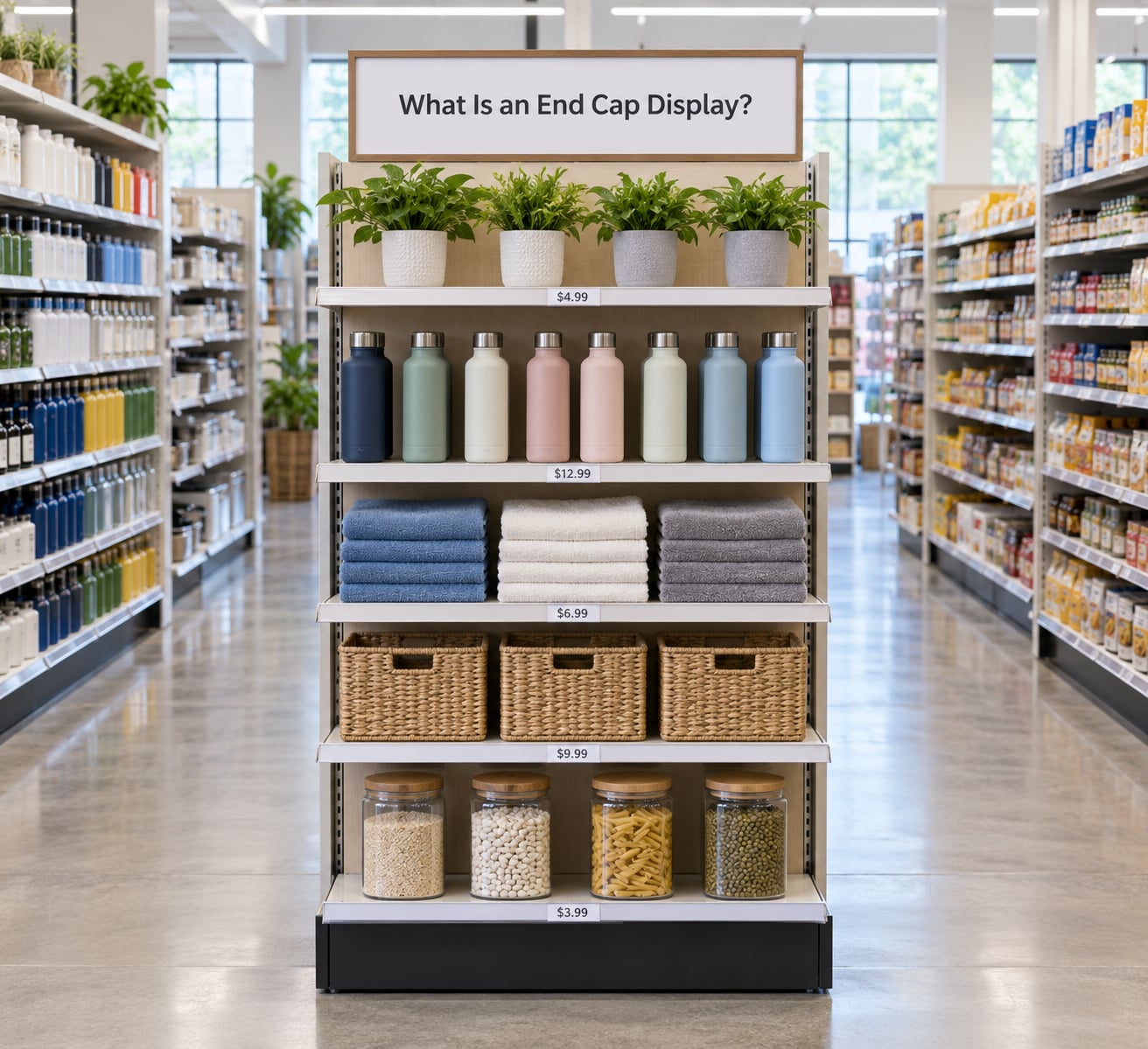
An end cap display is the merchandising fixture at the end of a store aisle, facing the main shopper traffic path. It holds a small, curated set of products and exists to stop browsing shoppers, orient them to a promotion, and convert that stop into an add-to-cart.
It differs from a freestanding display, which sits in open floor space and competes with carts and other traffic, and from a register-side display, which sits behind the shopper at the till. An end cap works because the shopper approaches it head-on while still moving with purpose.
Position is the whole trick. A product halfway down a gondola is seen in fragments, between carts and other shoppers. The same product on the cap is seen once, fully, at close range, with nobody blocking it.
How End Cap Displays Drive Impulse Sales
End caps drive impulse sales through a chain of short steps: the fixture interrupts a planned path, presents a few products face-on, reduces the number of comparisons a shopper has to make, anchors price against whatever they were already buying, and adds a time or quantity limit that turns interest into action. Remove any link and the chain weakens.
The seven mechanisms, one by one
Attention capture. The end of an aisle forces a physical decision: turn, walk past, or stop. A shopper moving at walking pace has to actively choose to pass it, which is different from glancing at a shelf face while searching for something.
Visual availability. Products on a cap face the shopper, sit above the sightline of a cart, and are not blocked by stock in front of them. Nothing is hidden, so nothing has to be dug out.
Product adjacency. Two or three related items placed together suggest a bundle the shopper would never have assembled alone.
Category cues. A cap tells you what the store wants you to consider before you have decided what you want. That framing follows you down the aisle.
Reduced decision effort. Impulse buying needs low friction. A cap with one hero item and two supporting items asks for a smaller decision than a full aisle comparison.
Perceived scarcity. Limited counts, seasonal framing, or a dated sign make the window feel finite.
A prompt to purchase. Clear price signage turns interest into a transaction. A cap with no visible pricing sends shoppers away to find out the cost elsewhere, and many of them never come back.
| Mechanism | What it changes for the shopper | What to watch in store |
|---|---|---|
| Attention capture | Walking pace becomes a stop | Dwell time near the fixture |
| Visual availability | Product is seen fully, not in fragments | Empty facings mid-day |
| Product adjacency | Suggests a bundle or pairing | Attachment rate at the till |
| Category cues | Frames what matters in this aisle | Whether the cap matches the aisle |
| Reduced decision effort | Fewer comparisons to make | Number of facings on the cap |
| Perceived scarcity | Feels time-limited | Sell-through before the end date |
| Purchase prompt | Price is visible at the stop | Signage present and readable |
Why Shoppers Notice End Caps More Often
Shoppers notice end caps more often than shelves because the aisle forces a turn, and the turn is the one moment in a store trip where the shopper is already changing direction.
Store layouts amplify this. In a grid layout, shoppers move down one side of a gondola and up the next, so every cap sits directly in the path. Many shoppers also turn right on entering a store, which means the caps on the entry run get disproportionate traffic. The first stretch of a store is called the decompression zone, where shoppers adjust to the environment; a display placed there competes with that adjustment, which is why the entry run and mid-aisle caps behave differently.
Peripheral scanning does the rest. Moving shoppers read the edges of their visual field well and the centre poorly. A cap is edge-of-field content that is also unusually large and uncluttered, so it registers.
Planned and unplanned buying mix here. The shopper with a list comes down the aisle for one item and meets a cap offering three things they did not write down. That is the impulse sale, and it depends on the products on the cap matching something the shopper already has a reason to want.
The Psychology Behind an Effective End Cap
The psychology behind an effective end cap rests on salience, choice architecture, processing fluency, and a small set of triggers that push a stopped shopper into a buyer.
Salience is the noticing part. Size, contrast, and isolation make one thing stand out from a busy field.
Choice architecture is the arranging part. Fewer facings, one hero item, and a clear order reduce the number of comparisons a shopper has to run.
Processing fluency is the understanding part. Easy-to-read labels, familiar units, and obvious value make the offer feel safe, and things that feel easy to judge feel more attractive.
Social proof shows up as bestseller marks, review counts, and “chosen by shoppers like you”. It answers the question a stranger would answer for the shopper if they were buying something unfamiliar.
Scarcity and loss aversion push the opposite of a loss. A shopper who walks past a limited offer feels they gave something up, which is why end caps that clear quickly can keep selling.
Curiosity comes from an open question on the signage rather than a closed promise.
Emotional relevance does the heaviest lifting in seasonal and treat categories, where the purchase is about the moment rather than the item.
Keep the line clear here. Salience, fluency, and scarcity are well-supported in the behavioral literature. Claims about dopamine-driven shopping or a specific “impulse gene” circulate widely and should be treated as marketing language, not evidence. Test the specific design element you want to change rather than assuming it works everywhere.
How to Choose Products for an End Cap
Choose products for an end cap by testing five criteria: fit with the surrounding aisle, a reason to buy now, low decision effort, a margin that justifies the space, and a supply chain that can keep the fixture full for the length of the run.
Complementary purchases are the safest bet. Tortilla chips beside salsa and a mild dip reads as a meal rather than three separate purchases. Seasonality works when the timing is real: a drink mix before summer, a heating product before a cold snap, school supplies before term starts.
High margin alone is a weak reason. An item nobody is shopping for will sit on a cap collecting dust, and a shopper who feels pushed toward an irrelevant product discounts everything else on the fixture.
Weak pairings share a few traits: products from unrelated categories, an item next to its own substitutes so the shopper has to choose between them, and seasonal goods displayed off-season. A frozen-meal cap that mixes frozen and shelf-stable items draws criticism precisely because it muddies the choice rather than sharpening it.
Shoppers also report that end caps turn into background noise when the assortment has no connection to a need they already have. Relevance is what pulls a display out of that noise.
How to Design an End Cap That Converts
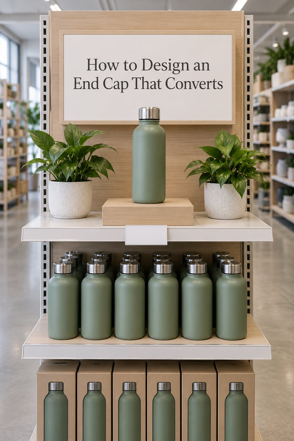
Design an end cap that converts by controlling height, facing, grouping, signage, price visibility, and choice count, then measuring the result instead of assuming.
To display products for sale effectively, work through seven moves. First, put the hero item at eye level, roughly waist to shoulder height, where the shopper’s gaze already lands. Second, face every product forward so nothing is hidden behind a neighbour. Third, group two or three related items rather than filling the whole fixture with one product’s facings.
Fourth, use one sign with one message. A sign trying to say three things gets read for none of them. Fifth, make the price visible from the aisle without walking up to it. Sixth, keep the brand and layout consistent with the rest of the store so the cap reads as a curated choice rather than a vendor insertion.
Seventh, check accessibility and navigation. Carts and mobility devices need clearance, and the cap must not block sightlines to the aisle beyond it.
On rotation, most store layout guides suggest refreshing caps every two to four weeks. Faster than that and shoppers never build familiarity; slower and the fixture goes stale. Shoppers tend to be suspicious of stores that rotate too quickly to be worth learning.
Finally, treat any design element as a hypothesis rather than a rule. Warm colors, spot lighting, odd pricing, and digital signage all have advocates and all behave differently by category. Change one thing at a time so you know which change moved the number.
How to Measure Whether an End Cap Is Working
Measure an end cap by comparing it with a baseline, not with last month’s opinion. Unit sales alone cannot tell you whether the fixture worked or whether you simply ran a promotion.
| Metric | What it tells you | Watch for |
|---|---|---|
| Unit sales per day | Raw throughput of the fixture | A spike that ends when the sign comes down |
| Lift vs. baseline or control cap | Whether the placement itself did the work | Comparing against a discount week |
| Conversion rate | Share of passers who buy | Needs traffic counts, which most stores lack |
| Average transaction value | Whether the cap lifted the whole basket | Mix shifts from other categories |
| Attachment rate | How often the paired item is added | Low rate means poor adjacency |
| Gross margin per fixture | Return on the space | Deep discounts can erase the gain |
| Sell-through rate | Whether supply kept up | Early clearing reads as success and isn’t |
A workable protocol runs two to four weeks. Record the current weekly unit sales for the candidate SKUs at their existing position. Install the cap. Hold price, promotion, and stock levels steady so the display is the only variable. Then compare.
One honest limitation: brands rarely know how many shoppers passed a given cap, which is why even fixture analytics tools treat passer-by counts as an estimate. Build in a manual count on a sample day if the number matters enough to fund a decision.
To keep the read clean, avoid reading a cap during a price change, a seasonal peak, or a category-wide promotion. Those periods tell you about the promotion, not the fixture.
Common End Cap Mistakes and How to Fix Them
Overcrowding. Too many SKUs and facings turn a decision into a project. Fix: cut to one hero item plus two or three supporting products.
No visible price. If the cost is hidden, the shopper leaves the stop. Fix: put the price on the shelf lip or the sign, readable from the aisle.
Unrelated products. A mixed cap reads as noise. Fix: match the cap to the aisle it serves, or move it to an entry position where mixed messaging is expected.
Blocked access. Stacks above head height and overfull shelves stop the stop. Fix: keep the top shelf light and leave clearance for carts.
Weak signage. A blank shelf face gives no reason to buy. Fix: one sign, one benefit, one legible message at reading height.
Too many choices. Choice overload pushes shoppers back to the aisle. Fix: lead with a hero and let the rest support it.
Stale rotation. The same cap for months trains shoppers to walk past. Fix: change the message or the assortment every two to four weeks.
Inconsistent replenishment. A half-empty cap looks abandoned. Fix: set a refill trigger tied to daily sell-through rather than a fixed weekly visit.
Changing displays without recording results. Teams rotate constantly and remember nothing. Fix: log the dates, the assortment, the sign, and the numbers in one place.
Frequently Asked Questions
What are the five P’s of visual merchandising?
The five P’s are planning, placement, presentation, pricing, and promotion. Planning sets the goal and the assortment for a fixture. Placement decides where the product sits in the store and on the shelf. Presentation covers the visual treatment of the display. Pricing covers the offer shown to the shopper. Promotion covers the message that pushes the sale.
What is the top impulse purchase people make?
Small consumable items near the till, most often candy, gum, chocolate, or a drink, tend to top impulse lists because the price is low and the decision takes seconds. Category varies by store type and shopper, but the pattern holds: the most common impulse purchase is a low-cost, immediately consumable add-on that fits the basket already in hand.
What is the best example of impulse buying in a supermarket?
A seasonal or stacked display of snacks, candy, or a bundled meal kit placed at the end of an aisle is the classic example. The shopper had no plan for it, the display is face-on and priced clearly, and the items are low-effort to add. Front-of-store tables and checkout displays work the same way with a shorter dwell time.
Why do shoppers walk past end cap displays?
Most often because the display does not match anything they already want, or because it looks like clutter or a paid insertion. Shoppers in retail forums describe end caps becoming background noise after the same vendor-funded arrangement runs for months. Relevance, clear pricing, and a rotation that stays readable for a few weeks all reduce the skipping.
How often should end cap displays be rotated?
Most store layout guidance suggests refreshing every two to four weeks. That is long enough for shoppers to recognize the fixture and short enough that it does not look neglected. Rotate sooner when the message is time-sensitive, and slower when a new product needs several weeks of exposure before shoppers consider it.
Do end caps work for a small store with a limited budget?
They do, and the same psychology applies without paid placement fees. What matters is one hero product, a clear price, a relevant pairing, and weekly unit sales tracked against the item’s normal shelf position. Small stores often beat chains here because the person who builds the cap also restocks it and notices when nothing is selling.
Conclusion
End cap displays create impulse sales by stacking three things in one place: visibility, relevance, and a low-friction choice. The fixture gets noticed because shoppers have to turn toward it, the products earn a second look because they match something already on the shopper’s mind, and the purchase happens because the price is visible and the decision is small.
Start with one measurable hypothesis. Pick a single SKU, move it from the aisle to a cap for two to four weeks, hold price and stock steady, and compare weekly unit sales against its baseline. Record what you did, because a display nobody documented is the same as a display nobody ran.
And keep the shopper in the frame. An end cap that helps someone build a sensible basket converts. One that pushes an irrelevant product at them teaches the aisle to ignore you. That is how end cap displays drive impulse sales, and how they lose it.