The default effect increases plan upgrades because a preselected option turns an active decision into passive acceptance. Most people will not spend the effort to override something that is already ticked, so whatever plan your pricing page, checkout or billing settings preselect is the plan many customers keep. That makes the default one of the highest-leverage settings in a subscription business, and one of the easiest to abuse.
Thaler and Sunstein made the case popular in Nudge, but the finding is older and better tested than the book. Samuelson and Zeckhauser wrote about status quo bias in 1988, Johnson and Goldstein documented the default effect in 2003, and a 2019 meta-analysis by Jachimowicz and colleagues pooled studies across domains to find that preselected options are chosen at higher rates nearly everywhere the question has been studied.
Table of Contents
- Key takeaways
- What Is the Default Effect?
- A short glossary
- How the Default Effect Increases Plan Upgrades
- 1. Effort reduction
- 2. Implied endorsement
- 3. Status quo inertia
- 4. Implied norm
- Why Do People Accept the Default?
- Examples of Default Effects in Subscription Plans
- Designing Defaults That Encourage Upgrades
- Pick the plan most customers would choose
- Show the preselected state plainly
- Explain the trade-off in one line
- Make reversal a single step
- Time the default to the decision, not to the payment
- Use the free tier as an invitation, not a trap
- Default Plan Design: A Quick Comparison
- How to Measure Whether Defaults Increase Upgrades
- Set up the holdout
- Choose one primary metric
- Track the guardrails too
- Give it a full billing cycle
- Read results by segment
- Pre-register your decision rule
- Ethical Questions and Common Design Mistakes
- Common mistakes and safer alternatives
- Frequently Asked Questions
- What is the default effect in plan upgrades?
- Does setting a higher plan as the default always increase upgrades?
- Should a free or basic plan be the default?
- How can a company make a default plan more ethical?
- What metrics show whether a default is effective?
- Can default-effect designs hurt customer trust?
- Conclusion
- Further reading
Key takeaways
- A default works because doing nothing is free, not because people love the option you preselected.
- Four mechanisms drive it: effort reduction, implied endorsement, status quo inertia and implied norm.
- Placement matters more than which plan you pick. The pricing page, the checkout auto-renew toggle and the in-app upgrade prompt are three different decisions.
- Test the default against a no-default holdout, and watch retention and refund rate alongside upgrade rate.
- If a customer cannot see the preselected state, reverse it in one step, or get a reminder before a charge, it stops being choice architecture and starts being a dark pattern.
What Is the Default Effect?
The default effect is a psychological tendency where people accept whatever option is already selected instead of changing it. Doing nothing costs no effort, carries no risk of picking the wrong option, and quietly signals that the preselected choice is the one the designer considers normal or recommended. William Samuelson and Richard Zeckhauser described this inertia in 1988; Eric Johnson and Daniel Goldstein showed how much it moves real behavior in 2003, comparing countries where organ donation was opt-in against those where it was opt-out.
Johnson and Goldstein found that presumed-consent countries report organ donor agreement above 90 percent, while explicit-consent countries sit below 30 percent. The behavior gap was enormous, and it came from where the preselected answer sat rather than from any argument about which system was better.
One thing worth separating early: a default is not the same as a recommendation. A recommendation tells you which option suits most people. A default decides what happens if you do nothing at all. They often sit together, but they are different tools with different ethical weight.
A short glossary
| Term | What it means in a pricing product |
|---|---|
| Default option | The choice that stays selected when someone takes no action |
| Status quo bias | The tendency to prefer leaving things as they are, even when switching is easy |
| Choice architecture | The arrangement of options, order and defaults around a decision |
| Nudge | A change to that arrangement that makes one outcome more likely without removing other options |
| Negative option | A selling method where consent to a recurring charge is inferred from silence rather than given actively |
| Trial-to-paid conversion | The share of trial accounts that end up on a paying plan |
How the Default Effect Increases Plan Upgrades
The question of how the default effect increases plan upgrades comes down to four mechanisms that stack on top of each other. Remove any one of them and the others still do work, which is why defaults keep producing measurable lift after a pricing page is already clean and easy to read.
1. Effort reduction
Comparing three tiers is real work. Reading a feature matrix, working out which row matters for your team and checking annual against monthly pricing all take time that a busy evaluator would rather not spend. When a plan is already selected, that work has been pre-done for them. Nobody has argued that the preselected plan is right for them; the point is that nobody has been asked to argue either.
This is why a default helps most where the decision is tedious rather than consequential. Plan upgrades are exactly that on the pricing page, and much more consequential inside a billing settings screen, which is why the same tactic carries a different risk at each surface.
2. Implied endorsement
A preselected option reads as a recommendation, even when nobody recommends it in words. Selecting the same tier that the pricing page highlighted reinforces the reading: the vendor has a view, and this is the view. Buyers on a subscription checklist will lean on that signal more than they would on a paragraph of feature copy, because the highlight does the persuading for them.
3. Status quo inertia
The stickiness of a default outlives the reason it was set. Samuelson and Zeckhauser’s original observation was that people resist change even when the alternatives are better and switching is trivial. Once a plan is set, changing it means opening billing settings, finding the right control and confirming a change that may affect seats, features and invoices. Silence is the cheapest option available, so silence wins.
4. Implied norm
A default also answers a question buyers rarely ask out loud: what do most customers like me choose? When the mid-tier plan is preselected and labeled as the common choice, the selection carries social proof with it. That is why a default without any badge usually outperforms the same tier with no default at all.
Why Do People Accept the Default?
Acceptance is not passive. It is what a tired, interrupted person does when a decision arrives at a bad moment with too many reasonable options and no clear signal about consequences.
Choice overload is the first factor. Pricing research commonly reports that beyond roughly four tiers, conversion falls off, with an average drop cited around 13 percent in studies of B2B pricing pages. More tiers do not produce more considered decisions; they produce more deferrals to whatever looks easiest, which is the selected option.
Decision fatigue is the second. By the time someone reaches checkout or the billing settings screen, they have already spent attention on the part of the product that gave them value. Confirming what is already ticked requires less mental work than researching an alternative, and the alternative has to be clearly better to justify itself.
Loss aversion plays a smaller role than people assume, but it is real. Switching plans carries perceived risk: lost configuration, surprise invoices, feature access changing mid-cycle. Downgrade timing ends up as a recurring support burden for subscription teams for exactly this reason. The status quo carries no perceived loss, so it wins by default.
Satisficing closes the loop. Under cognitive load, people stop searching for the optimal choice and take the first one that clears an acceptable bar. A preselected plan clears that bar before any evaluation starts.
There is also an attention ceiling. Modal windows, banners and pricing tables all compete for the same narrow band of focus. Whatever arrives already marked as decided needs no attention at all, which is why in-product upgrade prompts that default to open convert differently than prompts that require a click to start.
Examples of Default Effects in Subscription Plans
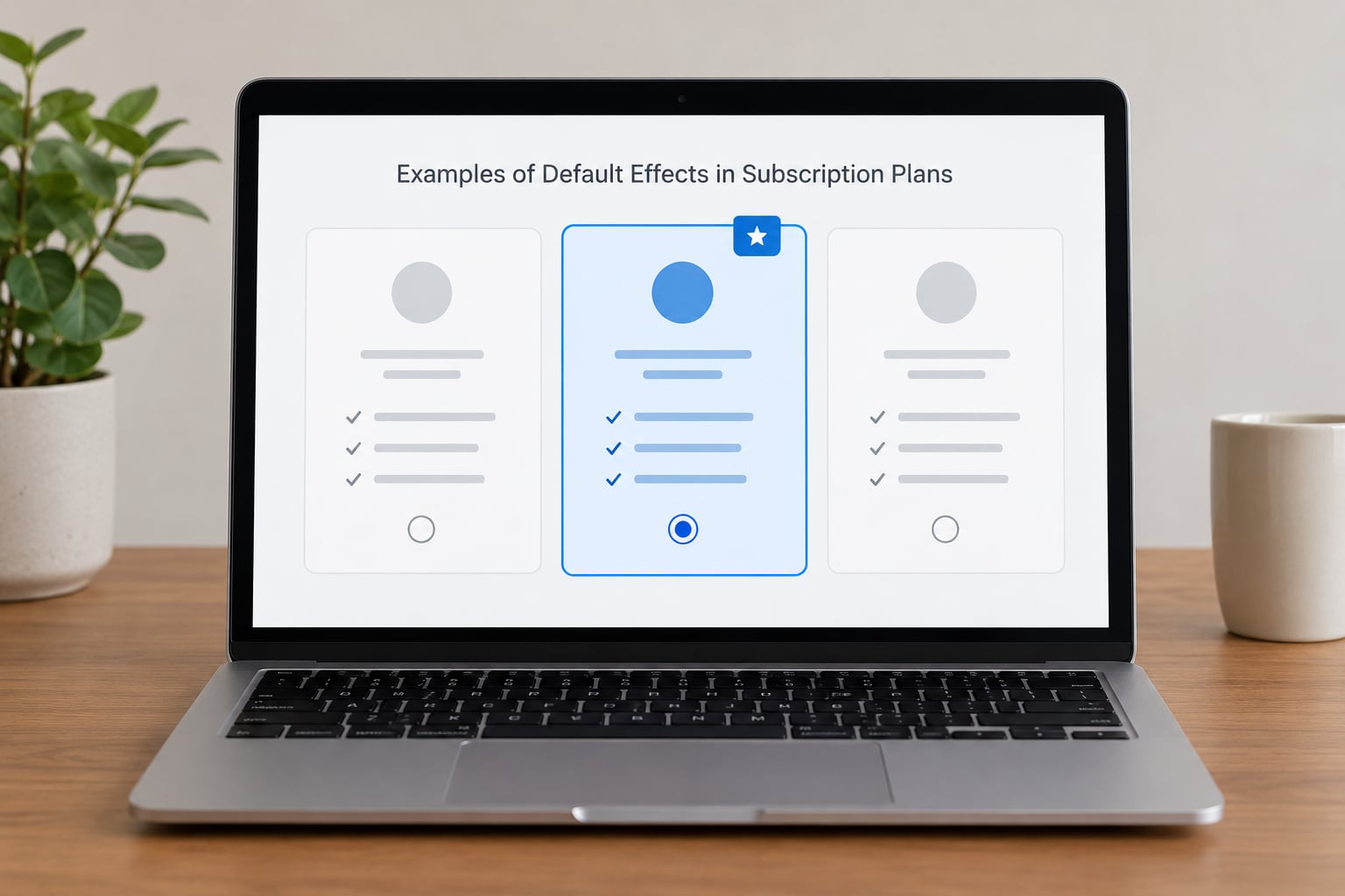
Defaults show up across subscription businesses, and the honest ones work in both directions. A telecom default that saves the customer money, a utility default that is easy to reverse, and a streaming trial that converts silently are all the same mechanism with very different consequences.
| Default pattern | Where it sits | Expected effect on upgrade rate | Risk |
|---|---|---|---|
| Recommended tier preselected on the pricing page | Pricing page plan cards | Increase | Low |
| Mid-tier preselected with a most-popular badge | Pricing page plan cards | Increase | Low |
| Annual billing preselected | Checkout billing toggle | Mixed, raises first-year revenue and can raise early cancellation | Medium |
| Free trial set to convert automatically to a paid plan | Trial end settings and reminders | Increase in conversion, decrease in trust | High |
| Auto-renew left on by default | Billing settings screen | Little effect on upgrade, meaningful effect on complaints | High |
| Free-tier limits set very low from day one | Free plan configuration | Short-term increase, long-term churn | Medium |
| Downgrade flow defaulting to pause rather than cancel | Retention screen | Reduces cancellations, defers the upgrade | Low |
| Paid add-on preselected in checkout | Checkout extras list | Increase | High |
The everyday version of the same question, what a default means when you order something, has the same shape. A delivery window, an insurance line or a warranty that is already ticked will be accepted at a far higher rate than one the customer has to add, and for exactly the same reason: it takes an active click to say no.
Not all of these belong in the same category. Preselecting a tier the customer was going to buy anyway is a clarity device. Preselecting a paid extra they never asked for is closer to selling by silence. Dark-pattern communities draw that line sharply, and reviewers are consistent about where trust breaks.
Designing Defaults That Encourage Upgrades
A good default is easy to describe in one sentence: it is the plan most of the people who land on this page would pick if they read nothing else. Everything after that is about making that honest and keeping the customer in control.
Pick the plan most customers would choose
Not the plan that earns most per account. The plan the median visitor needs. If your mid-tier fits the majority of signups, preselect the mid-tier; preselecting the top tier against the interest of most visitors reads as a bait and switch the moment the invoice arrives.
Show the preselected state plainly
A filled radio button or a ticked box, visible before commitment, not revealed after. The state has to be exposed to screen readers and reachable by keyboard, otherwise part of your audience never sees the default and cannot meaningfully reject it.
Explain the trade-off in one line
Say what the selected tier includes and what the next tier adds. A line of honest framing costs nothing and removes the suspicion that the expensive option was slipped in.
Make reversal a single step
If changing or removing the default takes more clicks than accepting it, the design is steering rather than serving. Users consistently say the same thing about dark patterns: reversibility, visibility and notice are what separate a helpful default from a manipulative one.
Time the default to the decision, not to the payment
A trial that converts silently at the end of the term is where defaults do the most damage. Sending a clear reminder before conversion, with a link that changes the plan in one step, costs a few points of conversion and saves an argument with the customer.
Use the free tier as an invitation, not a trap
Usage limits and feature gates are legitimate upgrade triggers when they reflect a real capacity boundary. When limits are set so tight that the free plan cannot be used for its stated purpose, buyers describe it as being forced rather than invited, and the trust cost outweighs the tier jump.
Default Plan Design: A Quick Comparison
Different defaults suit different products. This table compares the three common choices on the outcomes that actually move.
| Design choice | Likely conversion effect | Customer value | Transparency needs | Best fit |
|---|---|---|---|---|
| Basic or free tier is the default | Lower immediate upgrade rate, higher free-to-paid trust | High, because nothing is charged or locked in | Minimal | Products with a strong top-of-funnel and a wide range of customers |
| Mid-tier recommended tier is the default | Highest upgrade rate in most subscription tests | High when it matches the median visitor’s needs | Moderate: visible state plus a one-line reason | SaaS products with a clear middle of the market |
| Premium tier is the default | Mixed: lifts average order value, raises early cancellation and support load | Low to moderate, since it is rarely what most visitors need | High: visible cost, clear inclusion list, prominent switch-back | Low-volume consultative products where a sales conversation follows |
Segment matters as much as the tier. Self-serve buyers respond to a mid-tier default. Procurement-driven enterprise buyers, who must justify spend to someone else, respond to clarity of what is included far more than to a preselected card.
How to Measure Whether Defaults Increase Upgrades
To know whether a default increases upgrades rather than merely hiding the difference, run a controlled test. Most teams land on the same answer: a holdout with no preselection.
Set up the holdout
Keep a slice of visitors on a pricing page with nothing preselected. Everything else about the page, the traffic source and the billing period stays identical. Without a holdout you are comparing your new default against last month’s page, which confounds the default with every other change you shipped.
Choose one primary metric
Pick upgrade rate or trial-to-paid conversion as the headline measure. Everything else is a guardrail so you can tell whether you won the argument by giving something away.
Track the guardrails too
Upgrade rate can improve while the business gets worse. Watch retention at 90 and 180 days, refund and chargeback rate, downgrade volume, support tickets about billing, and revenue per account rather than revenue per signup. A default that lifts upgrades and doubles refunds is not a win.
Give it a full billing cycle
Trial-to-paid conversion on an auto-converting trial tells you almost nothing about satisfaction. Run the test long enough to observe whether the default cohort keeps the plan after the first invoice, which usually means several weeks past the conversion point.
Read results by segment
Split self-serve from sales-assisted, and solo users from procurement teams. An average that hides a strong negative in one segment is not a result you should ship on.
Pre-register your decision rule
Decide in advance what lift you need to keep the change, and what guardrail breach kills it. Teams that pick the threshold after seeing the numbers tend to find a reason to keep the version they liked.
Ethical Questions and Common Design Mistakes
The reason default-effect designs draw complaints is not that defaults are manipulative by nature. It is that a preselected paid choice takes consent away at the exact moment the customer is least able to question it. Complaint threads on r/darkpatterns follow the same arc every time: a trial converted to a paid plan without adequate warning, a charge appeared that nobody expected, and the business answered with a refund instead of an explanation.
That pattern has a regulatory name. The Federal Trade Commission’s Negative Option Rule and the Restore Online Shoppers’ Confidence Act govern how recurring charges may be disclosed and consented to in the United States, and state auto-renewal laws add their own notice requirements on top. Preselected paid extras and hidden trial conversions are the patterns enforcement attention has focused on. Rules vary by country and state and change, so treat this as a design standard to check against current law rather than legal advice.
Common mistakes and safer alternatives
- Hidden preselection. The choice is technically available but visually buried. Make the selected state visible and label it plainly.
- A free trial that converts silently. Send a clear reminder before conversion with a one-step link to change the plan.
- Difficult cancellation. If upgrading takes one click and cancelling takes a phone call, the design is the problem, not the customer.
- A preselected paid add-on nobody asked for. Leave extras unticked and let the customer add them.
- An unsuitable default. Preselecting the top tier for a majority who need the basic plan reads as a bait and switch once the invoice lands.
- Preselection targeted at customers least able to evaluate it. Defaults aimed at users in financial distress or with low literacy are the clearest ethical line in this whole area.
A useful test before shipping anything preselected is the reversibility test. Could a customer who disagrees understand that they can change it, find how, and do it in under a minute, without contacting support? If not, the design is steering rather than serving.
Frequently Asked Questions
What is the default effect in plan upgrades?
It is the tendency for customers to keep whatever option is already selected rather than choose a different one. In a subscription product that means the preselected plan card, the annual billing toggle and the trial conversion setting each decide what many accounts end up on. The mechanism is effort reduction, reinforced by implied endorsement and inertia.
Does setting a higher plan as the default always increase upgrades?
No. It usually raises upgrade rate and average order value in the short run, because most visitors keep the preselected tier. The gain often reverses over time if the chosen tier is above what most customers need. Watch refunds, early cancellation and 90-day retention alongside upgrade rate, since a default that lifts upgrades and doubles chargebacks is not a win.
Should a free or basic plan be the default?
It depends on who visits the page. A free or basic default suits products with a wide range of visitors, where charging the wrong tier creates friction. A mid-tier default works better when most signups genuinely need that middle set of features. The honest test: would the median visitor who reads nothing else choose the plan you preselected?
How can a company make a default plan more ethical?
Show the preselected state plainly before commitment, state in one line what the selected tier includes, and make changing it a single step. Avoid preselecting paid add-ons customers did not ask for. Give explicit notice before any trial converts to a paid plan, and check the design against the FTC Negative Option Rule and applicable state auto-renewal rules.
What metrics show whether a default is effective?
Use upgrade rate or trial-to-paid conversion as the primary measure, tested against a holdout with nothing preselected. Guardrails matter as much: 90 and 180-day retention, refund and chargeback rate, downgrade volume, billing support tickets and revenue per account. Run the test for a full billing cycle so the first invoice and the months after it are both visible.
Can default-effect designs hurt customer trust?
Yes, and the damage usually appears before payment rather than after it. Complaint threads on trial conversions describe a pattern: no clear reminder, a charge nobody expected, a refund instead of an explanation. Trust is lost the moment a customer feels a choice was made for them. Reversibility, visible state and advance notice are what separate a helpful default from a dark pattern.
Conclusion
The default effect increases plan upgrades because it removes the effort of choosing, and most customers will not spend that effort back. Start by auditing every surface where a default governs a plan decision, starting with the pricing page, the checkout billing toggle and the trial conversion setting. Check whether each preselected state is visible, whether the selected plan is one most visitors would genuinely want, and whether changing it takes a single step.
Then change one thing at a time and test it against a no-default holdout. Upgrade rate is the number that gets reported, but retention, refunds and billing support tickets decide whether the change was worth keeping.
Further reading
Samuelson and Zeckhauser, 1988, on status quo bias. Johnson and Goldstein, 2003, on defaults and organ donation consent. Jachimowicz and colleagues, 2019, meta-analysis of default effects across domains. Thaler and Sunstein, Nudge, for the choice architecture framing.