A brand color palette with meaning is a small, deliberate set of colors where every hue has an assigned job: one dominant color, a few supporting colors, neutrals, and a sparing accent. You choose them by naming the personality you want to communicate, checking what those colors already signal in your audience’s culture and category, and confirming they stay legible in real applications.
Most people approach this backwards. They pick a color they like, then hunt for meaning to justify it. The work takes about a week of focused sessions if you have a positioning line and audience notes in hand, and the hard part is not design skill. It is deciding what each color is for.
Table of Contents
- What You Need
- Step-by-Step
- How to Choose a Brand Color Palette With Meaning
- Map Color Meanings to Your Audience and Category
- Test Contrast, Legibility, and Accessibility
- Build and Pressure-Test the Palette
- Document the Rules for Consistent Use
- Common Mistakes
- Tips
- Frequently Asked Questions
- How do I choose the right color palette for my brand?
- What do different brand colors symbolize?
- How many colors should be in a brand palette?
- What is the 60-30-10 rule for creating a color palette?
- How do I check that my brand colors are accessible?
- How do I update an existing brand palette without a full rebrand?
- Conclusion
What You Need

You cannot assess meaning without knowing what the brand is trying to say. Gather these five inputs before you open any color picker.
- A positioning line. One sentence naming what you do, who you do it for, and the belief behind it. If this sentence is vague, colors will be vague with it.
- Audience notes. Age range, sector, geography, and what they already associate with your category. These come from customer interviews, sales calls, or support tickets.
- A category audit. Screenshots of the ten brands a buyer would compare you with, with their dominant colors noted. This tells you which colors are already taken.
- An asset inventory. Your current logo, website, app interface, packaging, and social templates. Existing assets set constraints, especially if you are rebranding.
- A contrast checker and a decision record. Any free WCAG contrast tool will do. The decision record is a single document where each color’s role and code live, so nobody re-litigates it later.
Two optional tools help. A grayscale filter built into any image editor tests whether your palette survives without hue. And five or six index cards beat a mood board for the recall test later, because you can hide them one at a time.
Step-by-Step
How to Choose a Brand Color Palette With Meaning
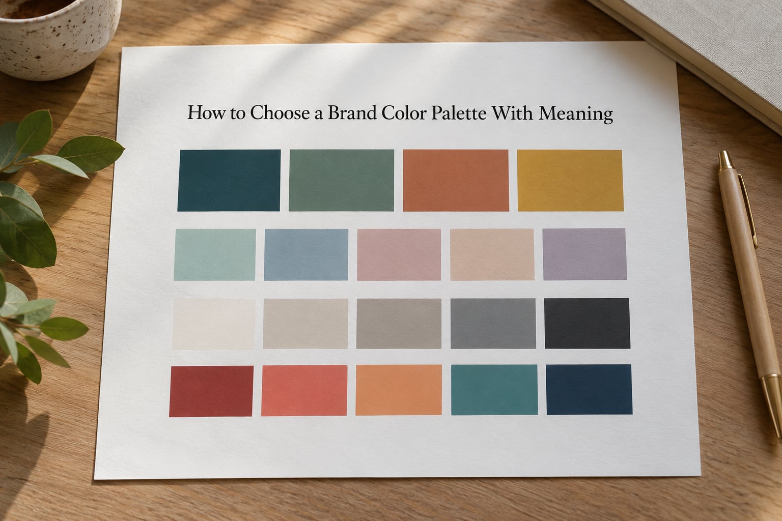
Start by defining the emotional role of the palette before you define any color. Most brands need five roles: a dominant color that carries recognition, supporting colors that add depth, neutrals that carry most of the surface area, functional colors reserved for interface meaning, and one or two accents used sparingly.
Write each role as a sentence before you write a hex code. Something like “dominant color should read as calm and competent, not playful” is a testable statement. “Make the site feel nice” is not.
The roles have shares. A workable starting split is roughly 60 percent dominant, 30 percent supporting and neutrals, 10 percent accent, which is the same logic behind the 60/30/10 rule you will meet in most design guides. The numbers are a starting point, not a law, but they stop you from shipping five equal colors that fight each other.
Keep functional colors separate from the brand palette. Interface red for errors and interface green for confirmations are language your users already know, and a marketing red that means passion will collide with them. Designers on r/branding raise this collision more than almost anything else: decide early whether your product UI gets its own semantic palette, or whether your accent is close enough in hue to be genuinely confusing.
Map Color Meanings to Your Audience and Category
Hue associations are tendencies, not rules, and they come from biology, culture, and personal memory layered on top of each other. Use the table below as a starting map, then test whether the entries match the audience you actually have.
| Color | Common associations | Fits well when the brand is | Overused in |
|---|---|---|---|
| Blue | Trust, competence, calm | Selling to institutions, enterprise buyers, families | Banking, insurance, B2B software |
| Red | Urgency, appetite, strength | Food, sport, sale-driven retail | Q4 retail, discount platforms |
| Orange | Warmth, accessibility, motion | Community, entry-price products, youth | Streaming, delivery apps |
| Yellow | Optimism, visibility, caution | Family brands, utility, caution signage | Construction, kids’ products |
| Green | Growth, health, permission | Wellness, sustainability, agriculture | Banking, eco packaging |
| Purple | Creativity, luxury, imagination | Beauty, premium software, creative tools | Beauty, crypto |
| Pink | Playfulness, care, boldness | Dessert, lifestyle, social-first brands | Beauty, events |
| Black | Authority, precision, restraint | Luxury, editorial, developer tools | Fashion, coffee |
| White | Clarity, simplicity, space | Medical, minimal, clinical products | Healthcare, furniture |
| Brown | Earthiness, craft, honesty | Food, sustainability, handmade goods | Coffee, chocolate |
| Gray | Balance, calm, restraint | Neutral base under any strong accent | Automotive, industrial |
Two cautions belong next to this table. First, the famous statistics about color driving 85 percent of purchase decisions or 90 percent of snap judgments come from marketing sources with unclear methods, and they should not appear in a client pitch as evidence. What survives scrutiny is narrower: people do form fast impressions from color, and they do carry associations between colors and categories across cultures.
Second, overused is not the same as wrong. Tiffany blue, Cadbury purple and McDonald’s yellow are registered or protected color identities, which is exactly why they are so memorable. Pick one of those colors deliberately if you want instant recognition in a familiar category, or pick a different one deliberately so you read as an alternative to the category leader.
Map your palette onto the category audit. If every competitor is blue, the deciding move is not a random hue. It is a shift in the dimensions people use to judge you: temperature, saturation, or the ratio between your dominant and accent colors. A near-black brand with one warm accent reads very differently from a mid-blue one, even though both sit in the same category.
Test Contrast, Legibility, and Accessibility
A palette can carry beautiful meaning and still fail the moment text sits on it. Contrast is a measurement, not a preference, and it is the fastest way to make an otherwise good palette usable.
The WCAG 2.2 standard sets a minimum contrast ratio of 4.5 to 1 for normal-sized body text and 3 to 1 for large text and interface elements like buttons and form borders. Dark saturated colors against white usually clear this comfortably. Mid-tone colors are where palettes break, especially a mid-tone accent used for links on white.
Check four things after you have a draft palette.
- Body text on every background. Your dominant color, your neutrals, and any accent used as a full-bleed section background.
- Links and buttons. A common failure is an accent that reads well as a shape but not as text.
- Color-only signals. If success and error are distinguished only by green and red, roughly one in twelve men with red-green color vision deficiency will not see the difference. Add an icon or a word.
- Physical applications. Screen brightness, print ink, vinyl, embroidery and painted signage all shift hue. A color verified only on a monitor often fails on a box.
Run the numbers before you argue about taste. It settles most of those conversations in about a minute.
Build and Pressure-Test the Palette
Build the smallest system that covers your real touchpoints: one primary, two to four supporting colors, two or three neutrals including a text color, and one or two accents. If a color has no assigned job, it will not survive contact with a real design system.
Then test it four ways.
- Grayscale test. Convert every screen, package and slide to grayscale. If the hierarchy collapses and nothing leads the eye, your palette depends on hue alone and will fail in print, in dark mode, and for readers with low vision.
- Five-second recall. Show five people the logo for five seconds, hide it, and ask what the brand does and how it feels. The answers tell you whether the palette is carrying meaning or just decoration. Five people is enough to catch a palette that means something different from what you intended.
- Competitor swap. Replace your colors with a competitor’s on your own layout. If nothing breaks, your palette is doing no work. This is also the most persuasive slide in a client presentation.
- Monochrome stress test. Force every layout into a single color with varying tint and shade. Strong palettes keep hierarchy here because value and contrast are doing the work, not hue.
Expect at least one revision. The common one is an accent that seemed right on a large swatch and turns shrill at button size.
Document the Rules for Consistent Use
A palette without roles is a mood board, and mood boards drift. Write the rules down where designers, agencies and developers can reach them, and include what not to do.
Define each color in the formats your teams actually use: HEX for screens, RGB for web and app tokens, CMYK for print, and a Pantone reference for packaging and signage, which stops the printer from improvising. Add a tint and shade ramp for each core color so designers can build backgrounds and states without inventing new hues.
Then specify the combinations and the boundaries.
- Which colors may appear together, and in what proportion.
- Which color is text, which is background, which is never used behind body copy.
- How photography is graded to sit with the palette.
- Whether gradients are allowed and between which colors.
- Hover, active, disabled and error states, kept separate from marketing colors.
- Two examples of correct use and two of incorrect use, images rather than sentences.
Keep one neutral as an escape route. When a campaign needs an unusual image, a press mention needs neutrality, or a partner insists on their own colors, a neutral background lets you stay on-system. Without one, every exception turns into an argument.
Common Mistakes
These six failures account for most weak palettes I see, and each has a straightforward fix.
- Choosing from a trend. Pantone’s color of the year is a forecast, not a strategy. Fix: check whether the trend color actually matches your positioning; if not, skip it and keep the palette recognizable.
- Assigning one meaning to every color. Red on a sports brand is aggression and speed; on a supermarket it is appetite and urgency. Fix: treat each association as a hypothesis and validate it with real customers rather than a meaning dictionary.
- Too many competing accents. Three accents means zero accents. Fix: cut to one, and let it carry roughly a tenth of the visual surface.
- Ignoring contrast. The accent looks good on a swatch and fails as link text. Fix: measure, do not eyeball.
- Copying the obvious choice. If your category is blue and you are also blue, you are a substitute. Fix: differentiate on temperature, saturation or proportion instead of hue alone.
- Applying the palette without context. A logo lockup, a hero banner and a dense data table need different proportions of the same colors. Fix: define roles per surface before you hand off to a designer or template.
Tips
A few refinements that consistently help.
- Ask five customers what the palette feels like before telling them what you intended. The gap between those two lists is your real positioning.
- View the palette under a desk lamp and in direct sun, not just on a calibrated monitor. Lighting changes which color reads as dominant.
- Check interpretation with people outside your home market. Red, white, green and purple carry different weight across regions: white signals mourning in parts of East Asia, purple in Thailand, and green holds religious significance in the UAE.
- Keep one neutral permanently reserved so the system has somewhere to go when a campaign pushes the edges.
- Write one sentence per color explaining its role. New team members learn the system in minutes from those sentences.
Frequently Asked Questions
How do I choose the right color palette for my brand?
Start with the positioning line, then assign a role to every color before choosing a hue: dominant, supporting, neutral, functional and accent. Match hue associations to your audience and category, measure contrast for text and interface elements, and test the palette in grayscale and with real customers. The order matters, because choosing colors first leaves you justifying a preference instead of testing a strategy.
What do different brand colors symbolize?
Common Western associations run roughly like this: blue for trust and competence, red for urgency and appetite, orange for warmth and accessibility, yellow for optimism, green for growth and health, purple for creativity and luxury, black for authority and restraint, white for clarity, and brown for craft and earthiness. These are starting tendencies shaped by culture and personal experience, not fixed rules, so test them against your own audience.
How many colors should be in a brand palette?
Most working systems use one primary color, two to four supporting colors, two or three neutrals and one or two accents, with functional interface colors kept separate. Anything beyond that tends to produce a palette nobody applies consistently. If you cannot name the job of a color, it is usually one too many.
What is the 60-30-10 rule for creating a color palette?
It is a proportion guide: roughly 60 percent of the visual surface carries the dominant color, 30 percent carries supporting and neutral colors, and 10 percent is reserved for accents. It is a starting point for balance rather than a strict rule, and it works well because most audiences read a small bright accent as more prominent than its area suggests.
How do I check that my brand colors are accessible?
Measure contrast ratios with any free WCAG checker and aim for at least 4.5 to 1 for normal body text and 3 to 1 for large text and interface elements. Also avoid relying on red and green alone for status, since color vision deficiency affects roughly one in twelve men. Repeat the check on every real surface, including print, packaging and dark mode.
How do I update an existing brand palette without a full rebrand?
Audit what the current colors are doing first, then keep the ones with recognition value and fix the roles. Most legacy palettes have no assigned jobs, which is why they are applied inconsistently. Add roles, contrast specifications and permitted combinations around the colors you keep, and change only what fails a contrast, meaning or differentiation test.
Conclusion
Choose a brand color palette with meaning by giving every color a job first, then checking what those hues already mean to your audience and your category, then proving the smallest usable version on real applications. Write the role of each color in one sentence, measure contrast before anyone debates taste, and test the palette in grayscale and with five people who have never seen it.