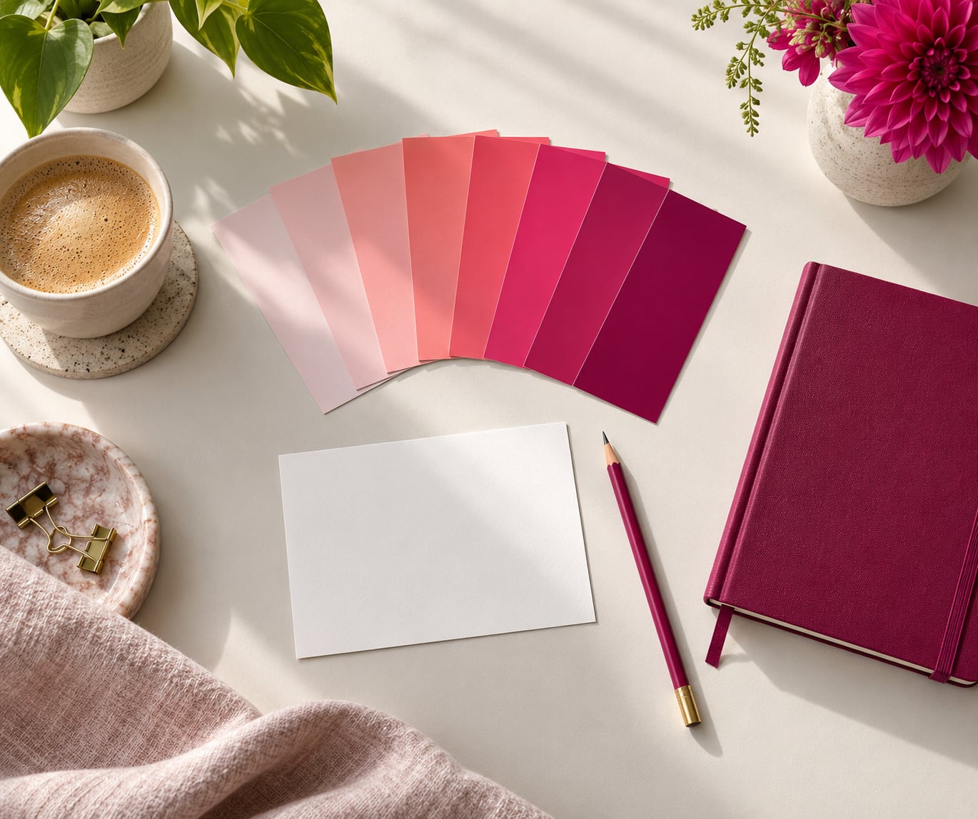
What color pink means in modern branding comes down to warmth, playfulness and a willingness to be noticed — and since 2023, a certain kind of audacity. There is no fixed psychological meaning behind the colour. What pink signals depends on its shade, the category it lands in, and what the audience already associates it with.
That answer sounds softer than the usual colour-psychology lists, which confidently declare that pink makes people feel nurturing and that it raises a product’s perceived value by some fixed percentage. Those claims do not hold up well. But the fact that pink’s meaning is conditional is exactly why it is such a useful colour for a brand team that knows its audience.
Here is the short version before we go shade by shade. In current brand practice, pink gets read in roughly seven ways: as compassion and care, as playfulness and youth, as boldness and disruption, as hyperfemininity worn deliberately, as nostalgia, as premium softness, and as political or cause-led signalling. Which one you get is decided by saturation, warmth, proportion and context, not by the colour alone.
- Care and compassion — the softest register. Blush and dusty rose shades read as nurturing and calm.
- Playfulness and youth — bubblegum and candy pinks read as fun, energetic and unpretentious.
- Confidence and disruption — hot pink and magenta read as bold, loud and willing to take a side.
- Hyperfemininity on purpose — saturated, maximalist pink is now used as a reclaimed statement rather than a stereotype.
- Nostalgia — retro pinks pull on 1950s, 1980s and 1990s pop references.
- Premium softness — rose and muted rose-gold-adjacent tones read as quiet luxury.
- Cause and politics — used in awareness campaigns and identity movements, which carries real risk of conflation.
Table of Contents
- What Does Pink Mean in Modern Branding?
- How Color Psychology Changes the Meaning of Pink
- What Color Pink Means in Modern Branding by Shade
- What Does Pink Signal About a Brand?
- Approability and warmth
- Confidence and disruption
- Care and attention to detail
- Modernity and cultural fluency
- Quiet luxury and restraint
- Rebellion or reclaimed femininity
- How Culture and Audience Change Pink’s Meaning
- When Pink Works Best in a Brand Identity
- How to Use Pink Without Making a Branding Cliché
- What Color Pink Means in Modern Branding: Examples and Takeaways
- Frequently Asked Questions
- What does the color pink symbolize in marketing?
- What does the color pink and gold symbolize?
- Is pink a symbol of love?
- What does the pink logo mean?
- What companies use pink in their logo?
- Can a brand trademark a color such as pink?
- Conclusion
What Does Pink Mean in Modern Branding?
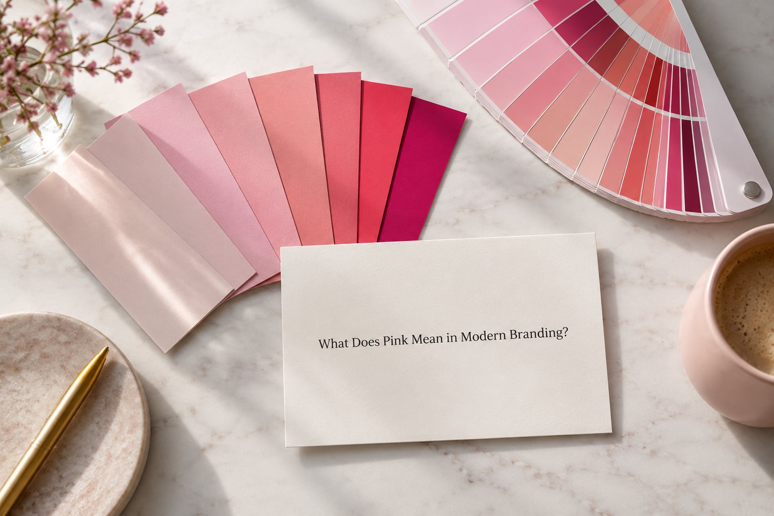
The core meaning of pink in branding today is warmth plus visibility. It is one of the few colours that reads as both friendly and attention-grabbing, which makes it useful for brands that want to look approachable without looking anonymous.
Two things have pushed pink into its current position. The first is the Barbie effect of 2023, which pushed an intensely saturated, hyperfeminine pink into mainstream culture on an enormous scale and made it a deliberate aesthetic choice rather than an accident. The second is a slow shift in how designers and audiences treat gendered colour codes: a pale pink is no longer automatically read as a girls’ colour, and a hot pink is no longer read as naive.
Worth separating here are two different kinds of meaning. Some reactions to pink are broadly shared across audiences, largely because the colour sits in the red family and red-family hues produce measurable physiological arousal. Others are learned: pink means “care” in a lot of Western markets because of decades of nursery, confectionery and beauty advertising, and pink means something entirely different in a market where the same shade carries a memorial or protest association.
Brand decisions mostly live in the second category, the learned one. That is good news for a strategist, because learned associations can be deliberately built and dismantled. It is bad news for anyone who wants a universal “pink means X” rule, because there isn’t one.
How Color Psychology Changes the Meaning of Pink
Colour reaches people through two pathways, and separating them explains most of the confusion in this field. Embodied meaning is the physiological response to the physical stimulus — red-family hues raise arousal, blue-family hues tend to lower it, and this holds across cultures. Referential meaning is everything the viewer has learned about where that colour has appeared before: pink packaging on a baby product, pink lighting in a beauty shop, pink branding on a telecoms billboard.
This two-pathway model comes from the colour research literature reviewed in “The marketers’ prismatic palette,” and it is the most useful framework in the whole debate because it tells you where the leverage is. You cannot change how a wavelength behaves. You can change what viewers associate with your use of it.
So where does that leave the standard associations? Warmth and approachability are the most consistent reading of pale pinks, and they show up repeatedly in category research. Playfulness and youth attach to lighter, higher-value pinks. Visibility — pink is unusually good at being noticed against white, navy, charcoal and forest green — is a functional property rather than a psychological one, and it is the one most reliably useful to a designer.
And here is the part the pop-science lists get wrong. Claims that pink raises perceived sweetness, lowers perceived quality, or shifts consumer behaviour by a set percentage mostly come from studies with small samples, inconsistent colour reproduction, and no control for category. A tinted jar of jam reads as sweeter than a clear jar. That is packaging convention, not colour psychology. Treat any number attached to a hue as a starting hypothesis, not a result.
What Color Pink Means in Modern Branding by Shade
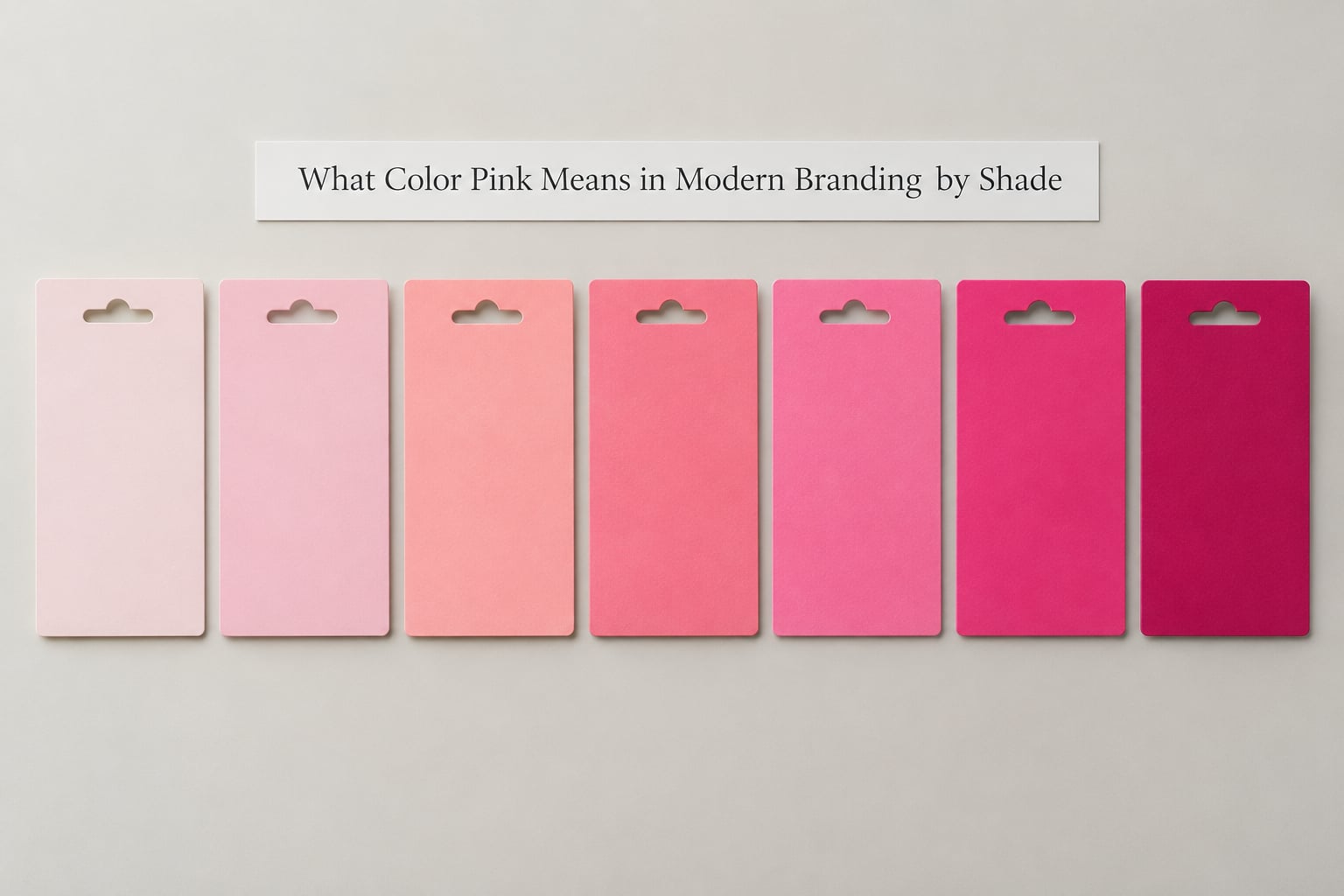
The table below is the practical version of all this. Hex values are approximations for web and screen; specify a Pantone or CMYK build for print, since a saturated magenta on screen and on coated stock will not match without a proof.
| Shade | Approx. hex | Core brand signal | Fits well | Main risk |
|---|---|---|---|---|
| Blush pink | #F5D7CE | Calm, care, gentleness | Wellness, skincare, baby, hospitality | Washes out on screen and in print; low contrast |
| Soft rose | #E8B4B8 | Warm, considered, quietly premium | Beauty, editorial, boutique retail, editorial packaging | Reads as generic beauty-category shorthand |
| Dusty rose | #C08081 | Dry, modern, adult, slightly matte | Craft beverage, fashion label, interiors, DTC skincare | Mudies quickly against dull greys and browns |
| Coral pink | #FF6F61 | Friendly energy, appetite, momentum | Food and drink, fitness apps, family services | Two accents competing with a primary colour |
| Bubblegum pink | #F4A6C0 | Youthful, sweet, nostalgic | Kids, confectionery, youth finance, social-first brands | Dates fast; heavily used by short-lived DTC brands |
| Hot pink | #FF3D8B | Confident, disruptive, unmistakably noticed | Beauty, entertainment, sportswear, events | Overwhelms layouts; hard to set body text on |
| Neon pink | #FF10F0 | Digital-native, experimental, meme-fluent | Gaming, crypto, Gen Z social, motion graphics | Print-hostile and rapidly exhausting on screen |
| Magenta | #D6006E | Premium drama, editorial confidence | Fashion, beauty, luxury, music and festival identities | Reads corporate when overused in signage and office signage |
Two patterns stand out. The pale end of the range runs into a technical problem: a light pink against white has almost no contrast, which is why blush-heavy interfaces tend to look unfinished and why blush body text fails accessibility guidance outright. The saturated end runs into a strategic problem: it is loud enough to be mistaken for somebody else’s brand.
What Does Pink Signal About a Brand?
Stripped of the pop-science, a pink identity is making a small number of claims. Recognising which one you are making is most of the work.
Approability and warmth
A pale, low-saturation pink says: this brand is not going to make you feel stupid. It suits services where people are already anxious — healthcare, childcare, financial advice, customer support. The signal is soft by design, and it works precisely because it lowers the perceived temperature of the interaction.
Confidence and disruption
A hot pink or magenta says: this brand knows what it wants and is not negotiating. It suits categories where the audience is bored of polite. The risk is that without strong typography and layout discipline, disruption reads as noise.
Care and attention to detail
Dusty rose and rose-adjacent tones carry a dry, grown-up warmth that suits brands selling craft, skincare formulation, or anything where the buyer is scrutinising quality. It is the pink most often used by brands that want to signal expertise rather than excitement.
Modernity and cultural fluency
A magenta used as an accent against black or off-white reads as current without being trendy. Brand teams use it as a signal that they know contemporary visual culture, which matters more in categories where the buying decision is partly aesthetic.
Quiet luxury and restraint
Low-saturation, warm-undertoned pinks — the rose-gold family of tones — have become the default register of premium-but-unshowy brands. They read expensive because they resist contrast, and they signal that the brand does not need to shout to justify its price.
Rebellion or reclaimed femininity
Saturated, maximalist pink, used deliberately and unapologetically, can signal that a brand has chosen a femininity that is not apologising for itself. Done with intent this is one of the most distinctive positions available. Done accidentally it is a liability.
How Culture and Audience Change Pink’s Meaning
Gender is the loudest filter, and the one people most often guess wrong. Pink was not always the feminine colour. In much of Europe before the Second World War, well-dressed infants of both sexes wore pink and blue in the same outfits, and pastel pink was widely treated as a masculine-adjacent, grown-up choice. The feminisation of pink in the United States is generally dated to the 1940s and 1950s, when department-store marketing and postwar domestic culture assigned colours by sex.
That history matters strategically for two reasons. First, it means the “pink is for girls” reading is a marketing convention roughly a century old, not a natural law, and treating it as permanent is a category error. Second, it means the convention still runs. In a 2020s context, a pale pink aimed at a mixed-gender audience usually needs help — a neutral wordmark, a second accent colour, or category language — because the pink alone will do some unintended narrowing work.
National culture shifts it further. In parts of East Asia, white and red carry funeral and celebration associations respectively, and pink sits between them with its own connotations; in parts of the Middle East and South Asia, a saturated pink can read as celebratory rather than tender. None of these readings are universal and none should be assumed away without local research. Colour meaning also shifts by age cohort: pink that reads adventurous to a nineteen-year-old reads nostalgic or dowdy to a fifty-year-old, and the same audience can hold both readings simultaneously.
Industry convention is the last and often strongest filter. A pink logo in beauty is close to invisible as differentiation. A pink logo in shipping logistics, insurance or B2B software is genuinely striking, because nothing in the category’s visual language prepares the viewer for it.
When Pink Works Best in a Brand Identity
The honest answer is that pink works best when your brand has a specific reason for it and a category that does not already saturate it. Everywhere else it is a cost.
Beauty is the category where pink is a commodity. It works there as an accent, a pack shot colour or a seasonal campaign colour, but as a primary identity colour it competes with an enormous existing library of pink logos and buys you almost no distinctiveness. The same is broadly true of fashion retail and confectionery.
Categories where pink is genuinely strong, because it is either unexpected or useful: telecom and consumer technology, where magenta reads as energetic and modern and has no deep category association; hospitality, where blush signals calm and care; wellness and mental health, where soft pink lowers perceived temperature; and children’s or family services, where the convention works in your favour.
Professional services are the interesting case. A rose or dusty pink accent on a law firm or consultancy identity is a deliberate rejection of the navy-and-grey default, and it can work well when the rest of the system carries the authority — a strong serif, disciplined spacing, a monochrome application. Used as the whole palette it will read as a boutique.
The Barbie effect of 2023 is worth studying precisely because it was not a pink logo. Mattel ran an intensely saturated pink as a campaign and collaboration platform, reportedly securing over 100 brand partnerships ahead of the release, with the associated selfie generator used more than 13 million times according to agency coverage of the campaign. Forever 21’s chief executive told the Wall Street Journal that pink accounted for roughly 15% of that retailer’s sales, which is a useful reminder that pink has moved from accent to primary in fast-fashion merchandising. Pantone named a very saturated pink, Viva Magenta (#18-1750), its colour of the year for 2023.
The lesson is about control. Barbie pink was owned by a brand with fifty-plus years of accumulated meaning behind it, deployed through partnerships rather than imitation. A new brand copying the same saturation without that history gets read as derivative, not as a cultural participant.
How to Use Pink Without Making a Branding Cliché
Four practical checks, then the craft points.
- Is pink already owned in your category? Search trademark registers, packaging shelves, app stores and stock imagery for your category before you commit. If five competitors already run pink, you will be the sixth regardless of how good the design is.
- Does pink narrow your audience? Put your actual audience in front of two routes: a pink-led identity and a neutral-led identity with pink as accent. Watch which one they describe as being “for” them. Designers report this test changes minds more often than any colour theory.
- Can you defend it in one sentence? If the rationale is “the client likes pink”, you have a preference, not a positioning decision. A useful rationale names the audience and the behaviour you want, for example “warm, low-pressure, for people who find clinics intimidating”.
- Does it survive the unglamorous touchpoints? Check the colour on a small-format invoice, an email signature, a loading state and a set of trousers. Most pink identities are designed in a logo lockup and die in a forms table.
On proportion, the rule of thumb is that pale pinks can carry a large area without complaint, while saturated pinks want to stay under roughly a tenth of any surface. If hot pink covers half the layout, the brand is screaming, and only some brands can afford that.
On pairing, pink sits well with charcoal, off-white, navy and deep forest green, because the contrast makes the pink read as an intentional choice. It pairs badly with another pastel of similar value, and it goes muddy against olive and khaki unless the pink is warm and saturated enough to hold its own.
On accessibility, this is where pink fails most often. Pale pink text on white is close to invisible for many readers and will fail the WCAG contrast guidance that governs body text. If your digital brand system uses pink, treat it as a background, a rule or a fill, and use a dark neutral for anything a person has to read. Verify it with a contrast checker rather than by eye, especially on a phone in daylight.
On typography and texture, a saturated pink paired with a neutral, slightly stiff grotesque reads modern; the same pink paired with a hand-drawn script reads nostalgic. Texture matters too — a grainy, printed-looking dusty rose texture shifts the reading toward craft and nostalgia, while a flat, high-chroma digital pink shifts toward tech.
And on defending it internally: the recurring client conversation is “just make it pink”. The answer that works is not a refusal, it is a reframe — offer two pinks with different jobs, one soft and one saturated, and let the choice be about positioning rather than taste. That converts a preference into a decision the team owns together.
What Color Pink Means in Modern Branding: Examples and Takeaways
Three hypothetical identities show how the same hue behaves differently under different constraints. These are illustrations of the principle, not descriptions of real companies’ identities.
A finance app for people anxious about money. The category convention is dark blue or green. The identity uses a dusty rose as the secondary colour, held at roughly 15% of the interface, with charcoal and warm off-white carrying everything else. Pink’s meaning here is low temperature and non-judgment, and the proportion keeps it from reading as decorative.
A plant-based protein brand. The category is saturated with green. Magenta at full strength on pack and in motion graphics, with a near-black type colour, positions the brand as loud and contemporary rather than virtuous. Here pink is doing the work green cannot: it signals that the brand has no interest in naturalism.
A boutique law practice targeting founders. A deep rose used as a secondary accent only, with a conservative serif wordmark and a monochrome logo variant for print and embossing. Pink says the firm is not the traditional corporate one; the typographic restraint says it is still a law firm. Splitting the roles is what makes it work.
Pull the lessons out and four things hold up. Shade does more work than hue — a single pink family can cover warmth, nostalgia and disruption. Proportion decides whether pink reads as considered or as a phase. Pink’s associations are learned, which means they can be built deliberately rather than inherited. And in an over-owned colour, the winner is usually the brand that uses pink precisely, not the one that uses it hardest.
Frequently Asked Questions
What does the color pink symbolize in marketing?
In marketing, pink most often signals warmth, approachability and playfulness in its pale forms, and confidence and disruption in its saturated forms. Because these associations are learned rather than innate, they vary by category and culture: pink reads as trustworthy care in a wellness brand, as nostalgia in a fashion campaign, and as a deliberate act of reclaimed femininity in an entertainment brand. Context and proportion usually matter more than the hue itself.
What does the color pink and gold symbolize?
Pink and gold together have carried several meanings, and which one applies depends on undertone and finish. Rose gold, a warm pink-gold alloy tint, reads as premium, romantic and quietly luxurious, and it has become a default in jewellery, beauty packaging and hospitality interiors. A hot pink paired with true gold reads louder and more ceremonial, closer to festival and nightlife branding. In brand terms the pairing almost always signals warmth plus value.
Is pink a symbol of love?
Pink has a traditional association with love, tenderness and affection, which is why it dominates wedding stationery, confectionery and Valentine’s merchandising. But that is the traditional-symbolism reading, not the modern brand reading. In a brand palette, pink alone signals care and warmth far more often than romance, and brands that want the romantic register almost always pair it with gold, red, cream or a serif typeface to make the intention legible.
What does the pink logo mean?
A pink logo communicates approachability and visibility, and whether it also reads as feminine, youthful or premium depends almost entirely on the shade. A pale pink logo reads soft and caring; a hot pink or magenta logo reads confident and contemporary. It also carries an implicit category statement: pink is common in beauty and fashion and comparatively rare in logistics, insurance and enterprise software, so in those sectors it functions as a differentiator rather than decoration.
What companies use pink in their logo?
Familiar examples include T-Mobile in magenta, Victoria’s Secret in a soft rose, Glossier in a pale pink, and Mattel through the Barbie brand, which built an intensely saturated pink into a cultural asset. Crayola has long used pink within its broader palette. Pantone’s colour of the year for 2023 was a saturated pink, Viva Magenta (#18-1750), which moved the hue into mainstream brand strategy. The list changes fast; check trademark registers and packaging search before choosing.
Can a brand trademark a color such as pink?
Colour marks are registrable in some jurisdictions, but only as a trade mark for specific goods or services, not as ownership of the colour itself. A UK law firm, Collas Crill, reported registering the pink used in its corporate identity with the Guernsey Registry in 2015 for legal services. Mattel has used Barbie pink extensively but has not secured a colour mark for it, so the widely repeated claim that Barbie pink is protected is inaccurate. Trade mark law is jurisdiction-specific, so get legal advice before relying on any of this.
Conclusion
Pink has no fixed meaning in branding, which is precisely what makes it useful and dangerous in equal measure. Its core modern signal is warmth combined with visibility, and everything else — care, playfulness, disruption, nostalgia, reclaimed femininity — comes from shade, proportion, pairing and category.
Start by writing down the personality you are actually trying to project. Pick the shade that matches it rather than the one that matches the trend. Then run the four checks: is pink already owned in your category, does it narrow your audience, can you defend it in one sentence, and does it survive on an invoice and in a forms table.
If those pass, pink is a distinctive and defensible choice. If they don’t, a warm neutral will serve the brand better.