Gray in branding is a signal of restraint and competence: it tells people a brand is serious, considered and modern rather than loud, playful or emotional. What color gray says about a brand is never fixed, though. Gray is achromatic, so it carries no emotion of its own and takes its meaning from shade, undertone, contrast and whatever sits next to it.
That is why gray reads as premium on one package and lifeless on another, even when the hex code is nearly identical. This guide covers what the color actually communicates, which shades carry which impressions, and how to test whether gray fits your brand before it reaches a hundred touchpoints.
Table of Contents
- What Does Gray Communicate About a Brand?
- How much of the color psychology claim is real?
- How Do Shades of Gray Change Brand Perception?
- Warm or cool: the undertone that flips the reading
- Gray, silver, charcoal, slate, gunmetal
- What Color Gray Says About a Brand by Industry and Audience
- How Do Contrast, Texture, and Other Colors Change Gray’s Meaning?
- How Can a Brand Use Gray Without Looking Bland?
- How Do You Test Whether Gray Fits Your Brand?
- Frequently Asked Questions
- What does grey color symbolize?
- Is grey a luxury color?
- What personality is the color grey?
- Is gray out of style for branding?
- What is the 3 color rule in graphic design?
- Conclusion: Start With Gray’s Context, Not a Universal Meaning
What Does Gray Communicate About a Brand?
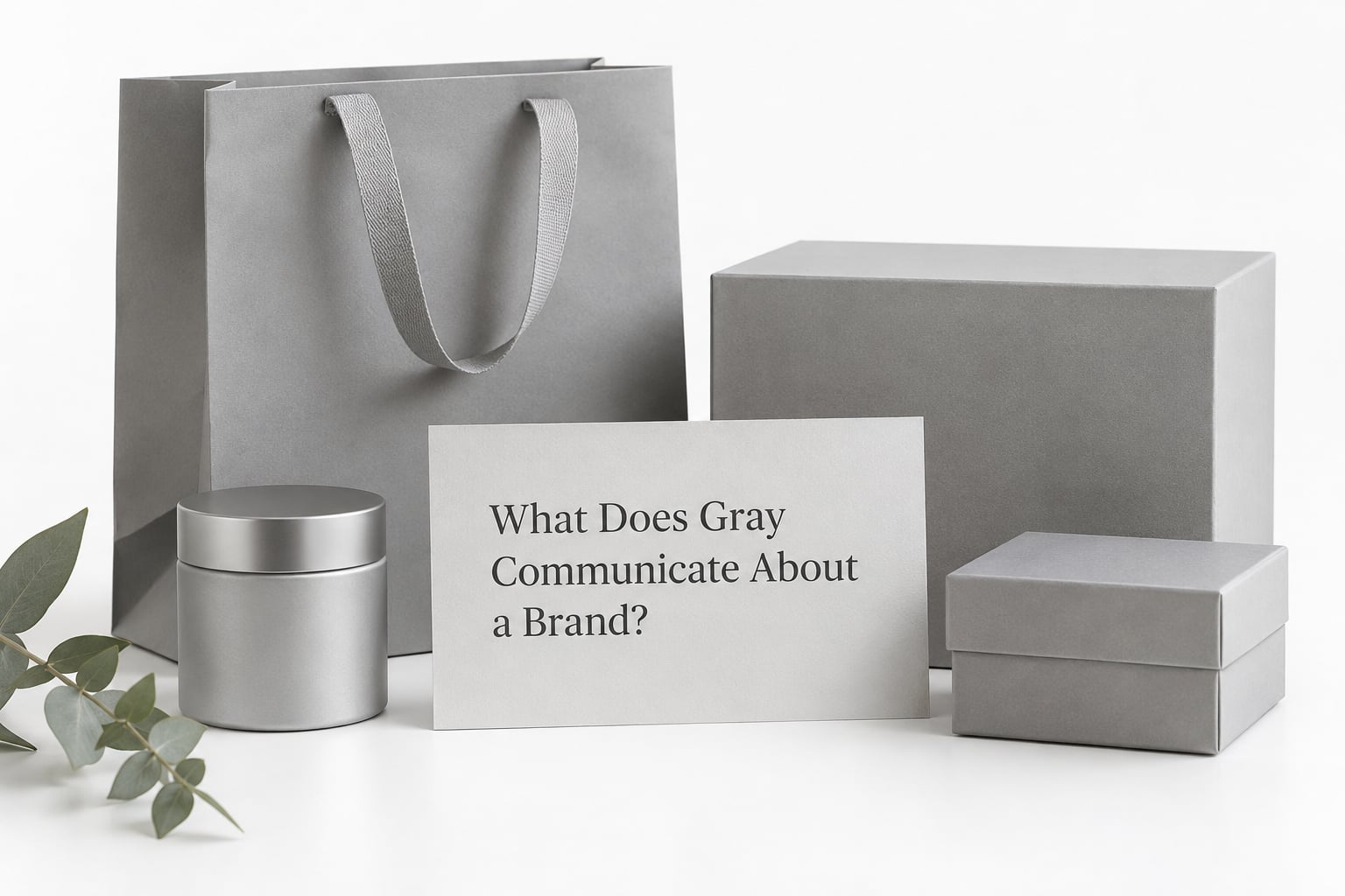
Gray communicates control, practicality and neutrality. In the middle of the value range it implies a brand that measures twice, takes the middle position rather than the extreme, and would rather be trusted than admired.
The mechanism is simple. Black carries authority, luxury and drama. White carries purity, openness and newness. Gray sits between them, so viewers tend to read it as the sensible third option, which is exactly why finance, law, enterprise software and premium automotive keep returning to it.
Used well, gray tends to signal these qualities:
- Restraint and self-control, the sense that nothing on the page is shouting
- Reliability and competence, a brand that expects to be measured on results
- Sophistication without ornament, a quiet read rather than a loud one
- Modernity, because neutral minimalism still looks current
- Maturity and permanence, a business built to outlast a trend cycle
- Emotional distance, calm in a category where everyone else is excited
- Engineering and precision, especially when it carries a cool undertone
- Timelessness, a color that does not date as fast as a saturated hue
Used badly, the same color reads as a different list entirely: dull, bureaucratic, cautious, aging, undecided, or the brand that picked a safe neutral because it could not commit. Gray sitting on white with gray text is the classic version, and it looks broken rather than refined.
How much of the color psychology claim is real?
Less than the industry admits. You will see figures quoted constantly, such as 85 percent of purchase decisions being driven by color, or 60 percent judging a product by color alone. These numbers circulate widely and are traceable to very thin sources, small samples and unreplicated studies. Treat them as folklore, not findings.
What survives scrutiny is duller and more useful. Color is judged before copy is read, and repeated exposure builds recognition over time. Nothing about a specific hue causes a specific behavior in a specific market. That is why color-psychology claims get treated as one variable among typography, imagery, price framing and category norms, never as a switch.
How Do Shades of Gray Change Brand Perception?
Shade does more work than hue does, because gray only has value and undertone. Move from light silver to near-black and the same neutral shifts from gentle and modern to serious and weighty, without changing brand category at all.
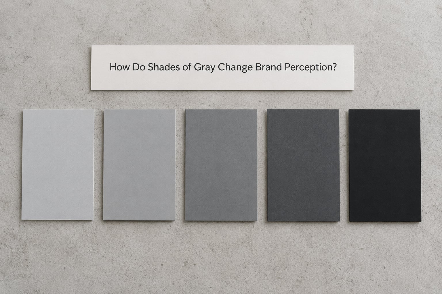
| Shade | Example hex | Usual impression | Where it fits |
|---|---|---|---|
| Light silver | #D9D9D6 | Clean, light, calm, contemporary | Wellness, beauty, interiors, fashion |
| Cool light gray | #C3C7CB | Airy, technical, understated | SaaS, architecture, minimal packaging |
| Medium neutral | #9AA0A6 | Balanced, unopinionated, flexible | Backgrounds, secondary surfaces, B2B |
| Slate gray | #6B7178 | Steady, confident, slightly cool | Consulting, industrial, editorial |
| Charcoal | #3C4043 | Authoritative, premium, controlled | Automotive, spirits, high-end retail |
| Near-black | #24262A | Luxury, drama, exclusivity | Jewellery, fashion houses, night venues |
Warm or cool: the undertone that flips the reading
There is no truly neutral gray in print or on screen. Every gray carries a trace of hue, and that trace decides whether the color feels welcoming or clinical. A gray leaning yellow or red is warm and softer, closer to taupe or stone. A gray leaning blue or green is cool and cleaner, closer to slate or gunmetal.
This is the single most useful variable most brand owners never consider, and it explains the palette that looks expensive on one screen and cheap on the next: a warm gray photographed under cool light shifts temperature visibly, while a cool gray in a warm room reads greenish.
Warm gray suits hospitality, food, beauty and anything handmade. Cool gray suits technology, engineering, finance and medical work. If your category sits between those, pick the undertone that matches your photography rather than your logo file.
Gray, silver, charcoal, slate, gunmetal
These read as separate choices, not synonyms. Silver is bright and reflective, so it implies modernity and jewelry. Charcoal is a dark neutral with a hint of brown or blue, which reads warmer and more premium than pure black. Slate sits mid-dark and slightly blue, which reads technical and architectural. Gunmetal is a dark, slightly green-gray used in hardware and machinery, so it reads industrial and precise.
What Color Gray Says About a Brand by Industry and Audience
What color gray says about a brand depends heavily on what the category has already trained people to expect. In enterprise software, gray says the product will integrate with your stack. In a children’s brand, it says the opposite of everything you wanted.
| Category | What gray signals | Watch out for |
|---|---|---|
| Technology and SaaS | Precision, neutrality, engineering credibility | Blending into a sea of identical dark-mode interfaces |
| Finance and legal | Stability, discretion, seriousness | Reading cold or institutionally unapproachable |
| Automotive and luxury goods | Craft, weight, expense, restraint | Too much gray and no accent can look like a showroom |
| Hospitality and interiors | Calm, cleanliness, comfort | Hospital grays and airport concrete carry baggage |
| Fashion | Modernity and understatement when sharp, drabness when soft | Value depends almost entirely on undertone and fabric |
| Professional services | Competence and neutrality of opinion | Clients may read it as risk-aversion or fence-sitting |
| Food and drink | Nothing, mostly. Appetite is driven by warmth and appetite appeal | Gray packaging on food suppresses perceived freshness |
| Youth and children’s | Nothing useful. It signals seriousness to the wrong buyer | Playfulness, energy and shelf shout are the job of color |
Audience culture matters too. In much of the Western world gray carries mourning and bureaucracy, which is why it reads as institutional. Across parts of East Asia it has sat alongside white in funerary contexts. In parts of the Middle East, gray clothing can read as mourning, which is a real problem for fashion brands shipping there. And gray hair, gray weather and gray skin carry their own baggage in advertising imagery.
None of that rules gray out. It means you check the market before you sign the palette, not after launch.
How Do Contrast, Texture, and Other Colors Change Gray’s Meaning?
Gray is a chameleon: it borrows the mood of whatever surrounds it. Set it beside a warm hue and it appears cooler. Set it beside white and it reads brighter than its value. This is why pairing does more for a gray brand than picking the perfect hex.
| Gray plus | Message it sends |
|---|---|
| Blue | Trust and institutional reliability, the safest pairing there is |
| Red | Energy and appetite against a controlled base |
| Green | Sustainability and growth, though it risks looking institutional |
| Yellow | Optimism and approachability, and the most visible way to break a gray palette |
| Orange | Warmth and energy, useful against clinical grays |
| Pink or coral | Warmth and softness, common in beauty and hospitality |
| Purple | Creativity and premium positioning without the coldness of black |
| Gold or bronze | Expense and heritage, a classic luxury pairing |
Contrast and texture do the rest. On screens, WCAG guidance asks for a contrast ratio of at least 4.5 to 1 between text and background for normal body copy. Mid gray on white fails that, which is why so many gray websites feel tired without anyone being able to say why. Use a darker gray for text and reserve the lighter one for surfaces.
Typography also shifts the reading. A light gray set in a heavy grotesque looks industrial and modern. The same gray in a light serif looks archival and conservative. Materials move it too: matte gray reads soft, metallic gray reads engineered, and concrete gray reads brutalist whether you meant it or not.
How Can a Brand Use Gray Without Looking Bland?
Gray goes bland when it does all the work alone. The fix is proportion, hierarchy and one opinionated contrast, not a brighter version of the same neutral.
- Give gray the majority and spend your accent sparingly, roughly 60 percent gray, 30 percent a supporting neutral or white, 10 percent accent. The accent should be a real hue, not another gray.
- Build hierarchy with value steps instead of extra colors. Four grays at different lightnesses plus one accent often reads more designed than five competing hues.
- Pick one undertone and hold it. Mixing warm and cool grays in a single layout is the most common reason a gray palette looks accidental.
- Pair gray with warmth where you want comfort, and with cool accents where you want precision. A gray brand without warmth often feels like an appliance.
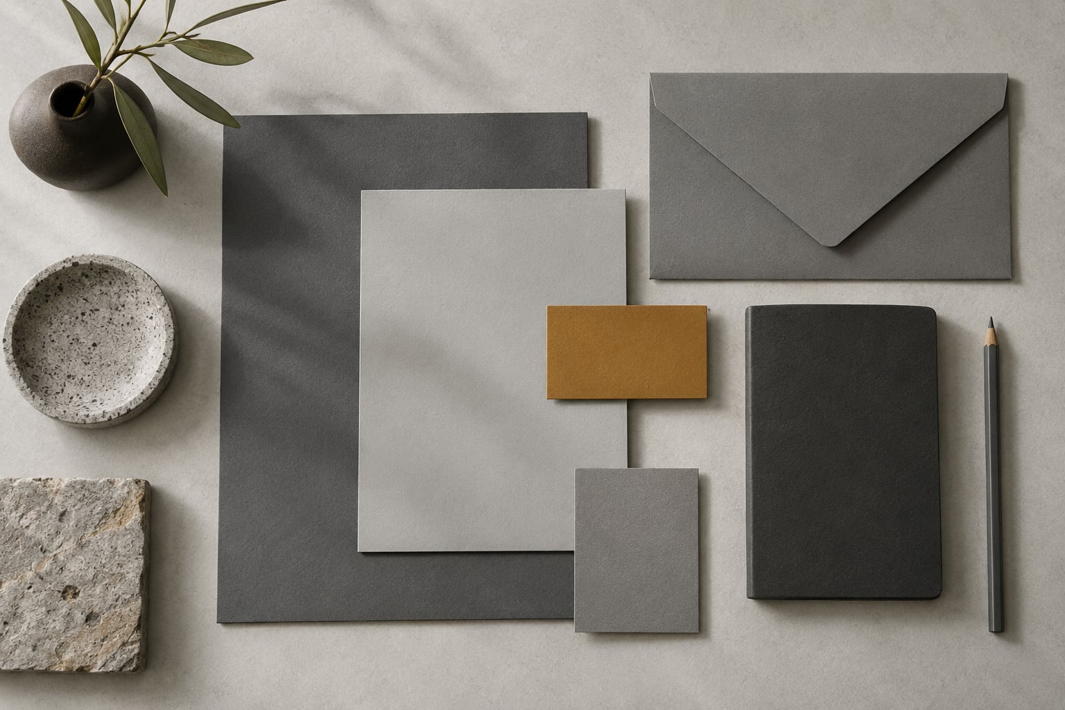
- Let texture do the work: uncoated stock, brushed metal, linen, raw ceramic. Materials give a neutral brand texture that pure color cannot.
- Contrast gray against black and white deliberately. A hard black line under a mid-gray heading reads crisp; a soft one reads tentative.
- Check the palette in the worst conditions. Storefronts, low-end phones and bad lighting expose weak grays faster than any mockup.
The role gray plays matters as much as its shade. Most strong gray identities treat it as the stage, not the actor: neutral surfaces, a structural color, and a signature accent that carries the personality. When gray is the only color you have, it has to be very dark or very light, and it needs a distinctive shape to sit in.
How Do You Test Whether Gray Fits Your Brand?
Testing gray is less about theory than about exposing it to people who have not seen it before. Work through these five questions before anything else:
- What single impression should gray carry? Written down, in one word. Precision, calm, premium or honest. If you cannot fill the line, the palette is unfocused.
- Is the undertone deliberate, and does it match your category and your photography?
- Does the gray meet contrast requirements for every text and background pair you actually use?
- Would you recognise the brand in gray if the name were removed? If not, you need an accent or a distinctive mark.
- Does it hold up at small sizes, in one color, and in black and white printing?
Then run two external checks. Put your palette next to the five closest competitors in the category: if yours disappears into the row, the problem is value and undertone, not the idea. And show the identity to five or ten people outside your company without saying what it is meant to feel like, then ask what the brand does and who it is for.
Run the same test on real surfaces, not just screens. Print it, hold it at arm’s length, and view it in daylight and in a dim room. Grays shift more between media than most designers expect.
Frequently Asked Questions
What does grey color symbolize?
Grey symbolizes neutrality, balance and compromise. It sits between black and white on the value scale, so it carries authority without drama and openness without innocence. In branding it reads as restraint, competence and maturity. It can also signal indecision, bureaucracy or aging, depending on shade, undertone and what sits beside it. The meaning comes from context rather than the color alone.
Is grey a luxury color?
Grey can carry luxury signals, but only through restraint. Luxury brands use charcoal and near-black greys with low contrast, generous space and metallic or warm accents, because the expensive reading comes from the discipline around the color. A light mid grey used the same way reads cheap. Desaturated palettes often support premium pricing because nothing on them argues with the product.
What personality is the color grey?
Grey is usually read as calm, controlled, independent, practical and mature. Designers often describe it as confident in a quiet way, and it suits brands that want competence without self-promotion. The same personality turns negative when the value is too light or the contrast too weak, which produces dull, washed-out and forgettable impressions rather than understated ones.
Is gray out of style for branding?
No. Gray remains one of the most used brand colors, largely because neutral palettes age slowly and photograph well. It is out of style when it is used as a default without a plan, which is a strategy failure rather than a trend. Brands that pair a deliberate gray with one strong accent and a clear typographic voice still stand out in crowded categories.
What is the 3 color rule in graphic design?
The three color rule says a design usually works best with no more than three main colors, which keeps hierarchy clear and stops a palette competing with itself. For a gray brand, the practical version is roughly 60 percent gray, 30 percent a supporting neutral or white, and 10 percent one accent hue. Treat it as a starting ratio to test rather than a law, since some identity systems run well past three.
Conclusion: Start With Gray’s Context, Not a Universal Meaning
What color gray says about a brand is decided by shade, undertone, contrast, typography and category, not by a fixed meaning anyone can look up. Write down the one impression you want, pick the gray value and undertone that carry it, add one accent you actually believe in, then test the palette against real people and real surfaces. If gray survives those checks, it is doing its job quietly, which is the point.