
Online product images affect conversion because they are the only physical evidence a shopper gets before buying. Clear, accurate, multi-angle images reduce the guesswork that would otherwise stall a decision, so listings with at least one photo roughly double conversion against listings with none, and two photos roughly double it again.
The effect is not subtle and it is not uniform. A single unclear shot can cost you the sale quietly, with no error message and nothing in your analytics to point at it. What follows breaks the research down into the mechanisms that matter, the number and type of images that carry their weight, how imagery behaves on a phone, and how to test a change on your own catalogue without fooling yourself.
Table of Contents
- How Online Product Images Affect Conversion
- What Makes Product Images Help Customers Decide?
- How Product Image Quality Influences Trust and Perceived Value
- Weak, adequate and strong image execution
- How Many Product Images Does a Page Need?
- Which Product Views and Details Should You Show?
- How Do Images Work Differently on Mobile?
- What Is the Psychological Effect of Social Proof in Images?
- How Can You Test Whether Product Images Improve Conversion?
- Frequently Asked Questions
- How many product images should a product page have?
- What image size and format should I use for online products?
- Does image order matter on a product page?
- Do lifestyle photos convert better than studio photos?
- Does product photography reduce return rates?
- How do I A/B test product images?
- Conclusion
How Online Product Images Affect Conversion
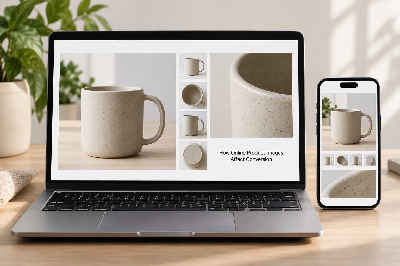
Images move conversion through five mechanisms, and they rarely work alone. Understanding comes first: the shopper forms an accurate mental model of the product from the imagery. Everything downstream depends on that model being right.
Conversion rate means the share of visitors who complete the action you care about, usually a purchase, sometimes adding to cart. When people talk about how online product images affect conversion, they usually mean the purchase rate on a product detail page.
Here is how the mechanisms stack up in practice.
| Mechanism | What the shopper feels | What you see on the dashboard |
|---|---|---|
| Product understanding | They know what they would actually receive | Fewer pre-purchase questions, longer dwell time |
| Reduced friction | Nothing left to check before the buy button | Higher add-to-cart rate |
| Perceived value | The item looks worth what you are asking | Price objections drop, value-based comparisons improve |
| Trust | The seller looks credible and accountable | Fewer abandoned checkouts, fewer returns |
| Attention capture | The listing earns the first fraction of a second | Higher click-through from category and search pages |
Attention capture is the one people underrate. Image processing begins in roughly 13 milliseconds, so a shopper often has already formed an impression of your listing before reading a single word of copy. If you sell through category pages, search results or ads, the gallery earns the click before the description earns the sale.
What Makes Product Images Help Customers Decide?
The useful test is simple: does this image answer a question a buyer would otherwise have to ask support about? If yes, it earns its slot. If it only makes the page look designed, it is decoration competing with evidence.
Accuracy outranks polish every time. A slightly rough image that shows true colour and true proportions converts better than a beautiful one that has been over-warmed, over-sharpened or cropped into a flattering lie. Buyers cannot detect the manipulation, they simply sense the mismatch on delivery, and returns follow.
Scale is the single most under-used image type. A sofa photographed in an empty white room looks like a sofa until you put a person or a door frame next to it. Size comparison imagery answers the question shoppers are actually asking, which is not “what does this look like” but “will this work in my space”.
Consistency across the catalogue also does quiet work. When every product in a grid shares the same background, angle and lighting, shoppers can compare products directly instead of comparing photography styles. That is what a category grid needs from you.
Context tells the shopper where the product fits, who it is for and what problem it solves. An unbranded kitchen tool shot on a plain surface competes with every other unbranded kitchen tool. The same tool in a working kitchen, mid-use, competes with nothing.
How Product Image Quality Influences Trust and Perceived Value
Presentation quality bleeds into judgments about the product itself. This is the halo effect, and it is the reason two identical items priced differently in a catalogue test produced different perceived values depending on how large the image was displayed.
The halo effect also cuts the other way. Eye-tracking work run through Speero and CXL found that enlarging images raised engagement for spec-driven products, where shoppers compare attributes, but lowered perceived value for design- and experience-led products, where a large image makes the item feel cheap. The same shirt, shown larger, read as less premium.
Here is the consolidated evidence, with the sources named so you can check them rather than take them on faith.
| Finding | Source | What it measured |
|---|---|---|
| One photo roughly doubles conversion; two roughly double it again | Marketplace listing data, summarised by Claid | Conversion by photo count |
| Display options lifted conversion: large 1.6x, picture pack 1.57x, slideshow 2.7x, supersize 2x | eBay | Conversion multipliers by display type |
| High-quality photos correlated with roughly 7% more bookings and 10.3% higher demand; reshot New York listings doubled revenue | Airbnb | Booking frequency and demand |
| 90% of shoppers rate photo quality extremely or very important | Etsy | Buyer survey |
| 90% of buyers rank product visuals first; multiple angles yielded 58% higher sales | Walker 2017 | Buyer survey and sales correlation |
| Product photos outranked reviews, title and description across 10,000 listings | Amazon listing study | Ranking factors |
| User-generated photos lifted conversion from 6.6% to 8.1%, about a 23% relative gain | GoodUI A/B test | Conversion rate, control vs variant |
| 78% of shoppers want more product photos | Square and BigCommerce survey | Buyer survey |
| Only 36% of the top 50 ecommerce sites link products inside inspirational images | Baymard Institute | Site audit |
| Shoppers spent 18% of category page viewing time on product photos | Nielsen Norman Group eye-tracking, 2010 | Fixation share |
| Removing an image lifted orders by 43% | Electronic Arts test, via Neil Patel | Orders, control vs variant |
| Larger product images lifted sales 9.46% | MALL.CZ test, via Neil Patel | Sales, control vs variant |
Two things stand out. The marketplace multipliers are large enough that image presentation belongs in your growth plan, not your operations backlog. And the weaker execution tiers are obvious: flat lighting with hard shadows, low resolution that blurs when zoomed, colour that shifts from the listing to the delivered item, and a background that crops awkwardly on a phone.
A note on source quality, because it matters here. Numbers like “good photos lift conversion 30%” circulate widely without a traceable study behind them, and sellers challenge them openly in places like r/PPC and r/FacebookAds. When a figure has no named organisation and no year attached, treat it as a marketing claim rather than evidence. The table above is worth more precisely because you can argue with it.
Weak, adequate and strong image execution
| Tier | What it looks like | Effect on the shopper |
|---|---|---|
| Weak | Low resolution, cluttered background, single angle, mismatched colour | Suspicion, hesitation, exit |
| Adequate | Clean background, correct colour, two or three views | Enough to buy, nothing more |
| Strong | Even lighting, zoomable detail, scale reference, context, consistent catalogue treatment | Confidence, faster decision, fewer returns |
How Many Product Images Does a Page Need?
There is no universal number, and anyone quoting one is describing their own catalogue rather than yours. The marketplace data gives you the shape of the curve: one photo roughly doubles conversion against none, a second roughly doubles it again, and returns flatten sharply after that.
So the useful question is not “how many” but “how many questions must the gallery answer before the buy button feels safe”. Build the count backwards from that list, and you will arrive at a number that is specific to your product.
For a simple, well-known object, three to five images is often genuinely enough. For furniture, apparel or anything bought on appearance, you will need eight or more because fit, proportion and finish all have to be judged visually.
| Question a buyer has | Image type that answers it |
|---|---|
| What exactly am I getting? | Clean front view on a neutral background |
| How big is it? | Scale reference beside a person, wall or familiar object |
| How well is it made? | Close-up of material, stitching, joinery or finish |
| What does the other side look like? | Back, underside and side angles |
| Will it work for my situation? | Lifestyle or in-use context |
| What else is there? | Packaging, contents laid out, accessories included |
| Can I choose a different version? | Colour and variant swatches shot consistently |
| Do other people like it? | Customer photos and reviews with images |
Piling on images past that point works against you. Long galleries push the add-to-cart button off the first screen, add weight to every page load, and invite the shopper to keep browsing instead of deciding. The dimming returns after two images are about wasted gallery slots, not a failure of photography.
Which Product Views and Details Should You Show?
Order matters as much as count. The sequence should mirror the order a cautious buyer asks questions, front view first, then the angle that shows depth, then the detail that answers quality, then scale, then context.
Front and back views are the baseline for anything with structure. A second angled view communicates thickness and form in a way flat shots cannot, and it is often the image that ends the “is it bigger than it looks” worry.
Close-ups do the heaviest lifting on perceived value. Zooming into a seam, a weave or a machine edge tells a shopper the build quality is real, and it is the fastest way to separate a considered product from a disposable one without writing a word of copy.
Dimensions belong in the imagery as well as the spec table, and they belong visually. A dimension line drawn across the product photo answers the question without a tap, which matters because most mobile shoppers will not tap.
Video and 360-degree views earn their cost in specific situations: complex assembly, furniture where the angle changes the read, apparel where fit is the entire decision, and anything with moving parts. On a simple mug or a t-shirt on white, they are overhead that buys almost nothing.
How Do Images Work Differently on Mobile?
Most of your traffic is on a phone, and a phone changes the rules. The gallery occupies a fraction of the space, the first image is often all a shopper sees before scrolling, and touch targets need to work with a thumb rather than a cursor.
Three mobile failures cost more than any styling choice. Images cropped badly by a fixed aspect ratio on narrow screens, text baked into an image that becomes unreadable below a certain width, and galleries so heavy the page stalls while the shopper waits. The first image has to land the essential product fact before that first scroll ends.
File weight is a conversion factor, not just an infrastructure concern. Deliver modern formats such as WebP or AVIF, serve responsive sizes so a phone is not downloading desktop-resolution files, and lazy-load everything below the fold. A shopper who waits for your gallery has already decided the site is not worth their time.
Zoom matters more on mobile than anywhere else, because a phone screen is physically small. If the only way to inspect a detail is to pinch-zoom a compressed thumbnail, most shoppers will not bother.
What Is the Psychological Effect of Social Proof in Images?
Customer photographs do something studio images structurally cannot. They show the product surviving contact with an ordinary person’s life, in ordinary light, which reads as evidence rather than promotion.
The GoodUI test is the clearest documented comparison. Swapping studio imagery for user-generated photos moved conversion from 6.6% to 8.1%, about a 23% relative lift. Relatability beat polish in that test.
The mechanism is reference and similarity. A shopper looks at a photo of someone with their build, in their climate, using the product the way they would, and quietly answers the question they could not otherwise resolve. Faces help here, and marketplace sellers report that images showing relatable people outperform abstract product shots.
Two honest limits. Customer photos are noisy, so curating them is work rather than a free lift. And they can mislead: a flattering review photo of a used item that ships with wear will produce the return instead of the sale. The best approach keeps curated customer images alongside a studio gallery rather than replacing it.
Sellers also worry that AI-generated product imagery will erode trust or breach marketplace policies. The concern is legitimate, and the safe position is that AI is fine for backgrounds and retouching, but a synthesised image presented as a photograph of the actual item is a different matter entirely.
How Can You Test Whether Product Images Improve Conversion?
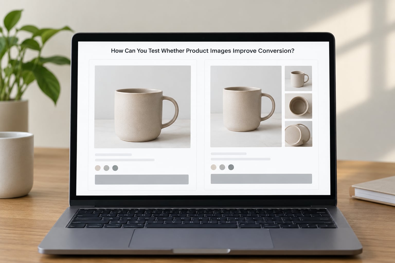
Testing is the only way to separate an image effect from every other thing moving at once. Merchants on r/PPC and r/FacebookAds say the same thing repeatedly: image quality correlates with conversion, but it arrives tangled up with traffic source, offer strength and seasonality. If you do not isolate it, you will credit your gallery for a discount you ran last week.
The protocol I would use runs in six steps.
1. Write the hypothesis as a sentence. “A scale reference image will reduce size-related questions and lift add-to-cart rate for our sofa range.” A vague goal produces an unreadable result.
2. Change one thing. One gallery, one product set, one variable. Adding three new images and a new headline together tells you nothing about either.
3. Pick one primary metric. Add-to-cart rate is cleaner than revenue for image tests, because revenue moves with pricing and promotion. Hold secondary metrics for context, not for the decision.
4. Size the sample before you start. Decide what change you want to be able to detect, work out the traffic and duration needed to detect it, and stop the test there. Most amateur image tests end early because someone got bored, which is how false wins get declared.
5. Run it through a full buying cycle. A week is usually too short to see anything above a few percent.
6. Read the result with returns attached. An image test that lifts add-to-cart and doubles your return rate has not worked. The gain was borrowed from a later loss.
Useful starting hypotheses, drawn from published tests:
| Change | Hypothesis | Primary metric |
|---|---|---|
| Add a scale reference image | Size uncertainty is blocking the decision on large items | Add-to-cart rate |
| Swap studio photos for curated customer photos | Relatability beats polish for an unfamiliar product | Conversion rate |
| Increase hero image size | Attention capture is the bottleneck, not persuasion | Product page clicks from category |
| Reduce hero image size | A smaller image raises perceived value on a design-led product | Conversion rate |
| Remove one gallery slot | The gallery is pushing the buy button out of reach | Add-to-cart rate |
| Convert files to a modern format | Load weight is costing you mobile shoppers | Bounce rate on mobile |
The last two rows are the ones most catalogues skip. Good practice can backfire: one documented test removed a banner image and lifted orders 43%, and another saw sales rise 9.46% purely from enlarging product images. Whether either would repeat on your catalogue is unknown, which is exactly why you test rather than assume.
If you have thousands of SKUs and cannot reshoot everything, prioritise by revenue concentration first, then by return rate. High-revenue SKUs move the most money per fixed shoot cost, and high-return SKUs indicate an imagery problem you are already paying for twice, once in the shoot and once in the refund.
Frequently Asked Questions
How many product images should a product page have?
Most pages need three to five images to cover the essential buyer questions: what the product is, how big it is, how well it is made, and where it fits. Beyond that the gains flatten sharply. Marketplace data shows one photo roughly doubles conversion against none and a second roughly doubles it again, with little gain after two, so build the count from the questions your buyers ask rather than from a category average.
What image size and format should I use for online products?
Serve responsive images so each device downloads an appropriately sized file, and use modern formats such as WebP or AVIF to cut weight. A roughly 1:1 or 4:5 aspect ratio works across most templates. Keep files small enough that the gallery loads quickly on a phone, since most traffic is mobile and slow imagery costs you shoppers before it costs you rankings.
Does image order matter on a product page?
Yes. Put the clearest front view first because it earns the click and often carries the whole first impression. Then follow the order a cautious buyer asks questions: angle, detail close-up, scale reference, then lifestyle context. If the second image is a cluttered scene shot, you are spending the slot that should have answered the size question.
Do lifestyle photos convert better than studio photos?
It depends on what you sell. Studio images on clean backgrounds win for spec-driven products where shoppers compare attributes, and for marketplace main images where rules require a neutral background. Lifestyle images win for unfamiliar products where the shopper needs to picture the item in use. The safest pattern is a studio gallery for evidence and lifestyle imagery for context, not one replacing the other.
Does product photography reduce return rates?
It does when the imagery answers the questions that drive returns, mainly size, fit, colour and material. Accurate scale references and zoomable detail shots set expectations before purchase rather than after delivery. Imagery that flatters a product into looking bigger, softer or lighter than it is moves the sale to the refund column, and you pay for both.
How do I A/B test product images?
Write a specific hypothesis, change one thing on one product set, and choose a single primary metric such as add-to-cart rate. Decide the sample and duration you need to detect a meaningful change before starting, then run the test through a full buying cycle. Read the result alongside returns and revenue, because a gallery can lift add-to-cart while quietly increasing refunds.
Conclusion
Open your ten best-selling product pages and list, for each one, the questions a buyer must still have after looking at the gallery. The largest unanswered question on that list is your biggest source of uncertainty, and it tells you exactly which image to make next.
Then test that one image properly. One change, one metric, one full buying cycle, and read the result next to your return rate before you call it a win.