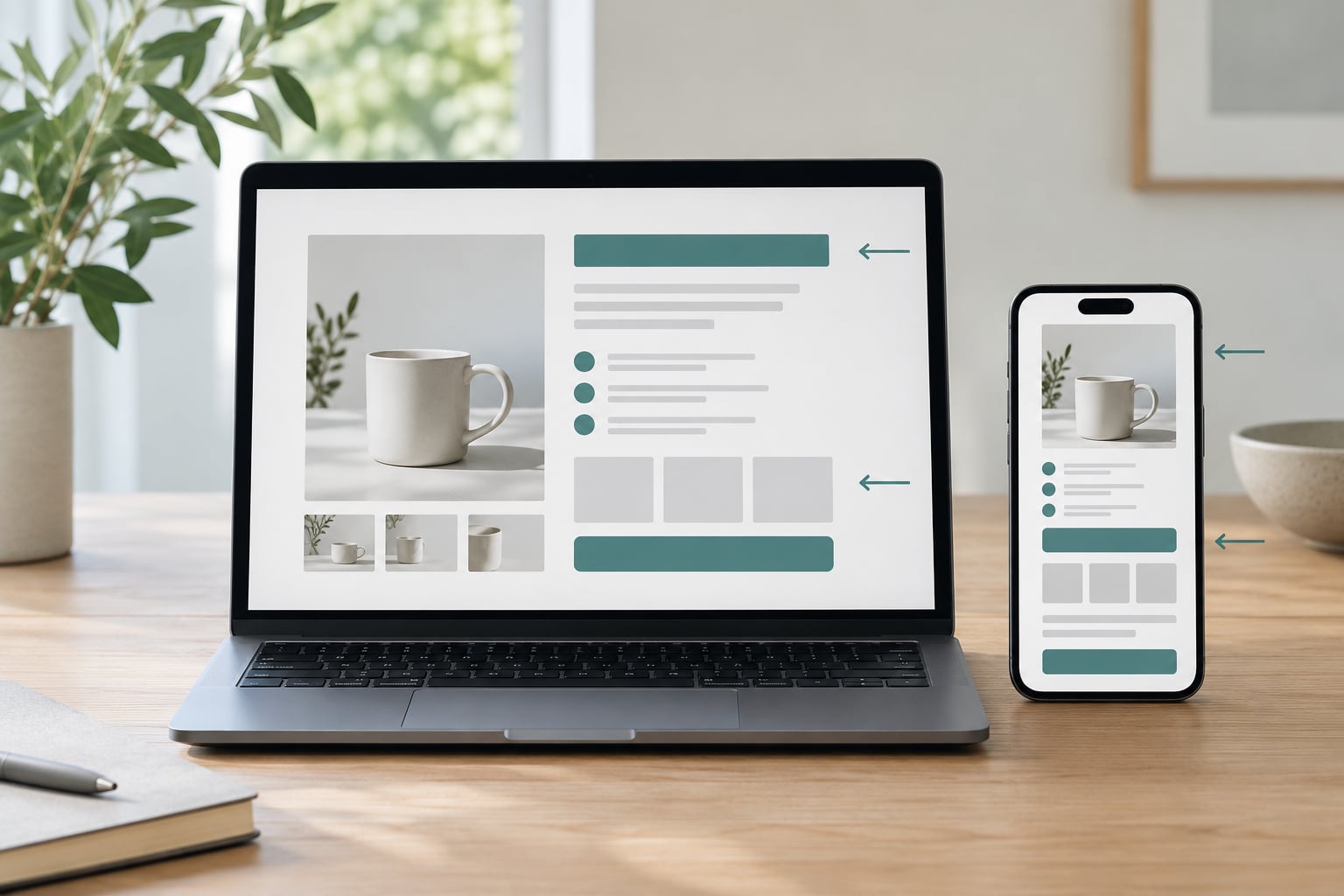
Product page copy order is the sequence in which the written blocks of a product page appear. Understanding how product page copy order affects conversion comes down to one observation: most shoppers skim rather than read. Whatever lands first sets the frame for everything after it, so a benefit placed below the specifications gets read through a frame the reader has already built. The same words in a different sequence can produce a materially different conversion rate.
That is why the order of elements on a product page deserves its own argument instead of a bullet buried in a general checklist. Copy length and copy wording get most of the attention. Sequencing decides what the reader thinks about first, when doubt arrives, and whether the objection they have in mind gets answered before they leave.
Table of Contents
- How Product Page Copy Order Affects Conversion
- How Product Page Copy Order Should Open a Product Page
- How Buyer Decision Stages Shape Copy Order
- A Practical Product Page Copy Order Framework
- Product Page Copy Order Examples
- How Product Page Copy Order Affects Mobile Shoppers
- How to Test Which Copy Order Converts Best
- Common Copy-Ordering Mistakes
- Frequently Asked Questions
- What is the best order for product page copy?
- Should product benefits come before product features?
- Where should social proof appear on a product page?
- Should the main call to action be repeated throughout the page?
- How long should a product page be before testing copy order?
- Does copy order matter more on mobile devices?
- Conclusion
How Product Page Copy Order Affects Conversion
Copy order matters because it governs four separate jobs on the page: attention, perceived relevance, confidence, and decision friction. Each one fails differently when a block arrives in the wrong place.
Attention is a budget, not a gift. A visitor decides within seconds how seriously to take the page, and the first screen does most of that deciding. Put a dense specification table there and the reader concludes the product is complicated before they know what it does.
Perceived relevance is set by the first claim. If the opening line names a use case the visitor recognises, everything after it gets read as evidence for that use case. If it opens with brand history, the reader has to work out on their own why they care, and most of them skip that step.
Confidence comes from proof sitting next to the claim it supports. A review count separated from the benefit statement by four screens of specifications reads as decoration. Reviews placed directly under the promise they confirm do a different job.
Decision friction is the stack of unanswered questions that forms between interest and add to cart. Order controls when those questions get raised. A returns question answered after the CTA is answered for the buyer who already had it; a returns question raised by a line of copy the reader just saw, and left hanging, is friction created by the sequence itself.
Here is the counterpoint, and it matters: no single sequence wins everywhere. Order is a filter, and a filter that hides the wrong information costs more than it gains. A watch with forty spec lines needs the specs close to the top. A gift buyer who already knows the product does not need a comparison chart. The useful question is never which order is best, but which order fits this buyer, this product and this traffic.
How Product Page Copy Order Should Open a Product Page
What comes first should be the thing this particular visitor most needs in order to keep reading, and that changes with context rather than with taste.
Start with awareness. A visitor arriving from a search for a specific problem needs the benefit first, in their language. A visitor landing on your homepage from a brand campaign already knows the category, so product identity and proof can lead. A returning customer arriving through a saved link needs availability and variant options, not a re-pitch.
Traffic source is the second variable. Paid search visitors carry a stated intent in the query. Social traffic often carries none at all, which is why pages that work for one source stall for another. Email traffic is usually the most qualified traffic you get, and the least tolerant of a slow build-up.
Product familiarity decides the third. Anything with visible physical differences, where the shopper can picture the use, tolerates a shorter page. Anything where the buyer cannot picture the outcome, a mattress, a service, a subscription, needs the value argument before the detail.
Purchase risk is the fourth and often the strongest. The more expensive the item, the longer the gap between interest and action, and the more room the page has to build a case. That is where ordering matters most, because each unanswered question adds friction to a decision the buyer is already taking slowly.
How Buyer Decision Stages Shape Copy Order
A shopper moves through five stages, and each stage asks a different question. A sequence that answers one stage twice and skips another wastes the reader’s attention on something they no longer need.
Noticing the product. The question is what this is. Product identity, image and title belong here, and any benefit claim that depends on category understanding comes second. A skincare page that opens with a formulation detail has skipped the stage.
Understanding relevance. The question is what this does for me. This is where the value proposition and the primary benefit block belong, written as a situation the buyer recognises. On a coffee grinder page it is grind consistency and mess; on a payroll service it is filing time saved.
Evaluating the offer. The question is why this one over the alternative. Features, comparisons, materials and proof come here, and price lands in this stage because price only means something next to the value it is being weighed against.
Resolving objections. The question is what stops me. Returns, delivery, warranty, fit, compatibility, cancellation terms. This stage is where most pages fail, because they place these answers in the footer, at a distance that turns a live question into a lost sale.
Acting. The question is how. Variant selection and the call to action sit here. The CTA should be reachable from every stage, but the reasoning behind it should already be finished before this one starts.
Most weak sequences put stage four content in a footer and expect stage five to do all the work. The reader who is two objections deep when the button appears has no reason left to press it.
A Practical Product Page Copy Order Framework
Here is the sequence I start from, and then adjust. Treat it as a starting arrangement rather than a template, because the whole point is that some blocks move.
- Product identity and primary image. Name and image first, so the reader knows what category they are evaluating. One line, no adjective pile-up.
- Value proposition in one sentence. The outcome, in the buyer’s words, with the mechanism implied rather than explained.
- Price and variant availability. Placed here for considered purchases, where price is part of evaluating rather than a surprise. On low-risk items it can move up beside the title.
- Primary benefits, three to five of them. Benefit-first, with the supporting feature attached inline rather than in a separate block the reader has to reconnect.
- Proof attached to the claim it supports. Ratings, review counts, certifications, press or test results, each placed beside the specific statement it verifies.
- Essential detail block. Specifications, dimensions, materials, compatibility, what is in the box. Scannable. No prose.
- Objection handling. Returns, delivery, warranty, sizing, cancellation, gift options. Written as direct answers to the questions buyers actually ask.
- Comparison or use-case guidance. Optional, and usually skipped for commodity products where the choice was made before the visit.
- Call to action. At the point where the case is complete, with the secondary reassurance one line beneath it.
- Secondary content. FAQ, related products, editorial. Below the decision, not beside it.
The framework breaks in useful ways. Merge steps two and four on a page with a short buying cycle. Split step five across the page when the product has strong reviews and distinct use cases. Move step three up for anything under a few dozen dollars, and pull it down and add comparison content for anything expensive.
What never changes: proof stays attached to its claim, objections stay before the CTA rather than after it, and secondary content never interrupts stages one through five.
Product Page Copy Order Examples
Low-risk everyday item. For a kitchen utensil or a phone case, the sequence compresses. Identity, image, price, two or three benefits, the star rating and count, then the button. Objection handling shrinks to one line on returns. Deepening this page costs you nothing because the reader is not thinking hard anyway.
Considered purchase. A mattress needs the value argument first, then the specifics, then a long objection block, then social proof spread through rather than stacked. Price comes late because a number without context either terrifies or bores. Here order carries the heaviest load, since the buyer is spending real money over several sessions.
Technical or specification-heavy product. A router or a monitor inverts part of the framework. Compatibility and specification summary move up near the title, because the first filter is does this work in my setup. Benefits follow, framed around use cases. The CTA is kept lower because the qualifying shopper is still verifying compatibility, not yet buying.
Repeat customer. The second purchase is not a persuasion problem, it is a reorientation problem. Identity, availability, variant or subscription controls, delivery, and a button. The original benefit argument is compressed to one line. Long editorial content that served the first purchase becomes friction here.
How Product Page Copy Order Affects Mobile Shoppers
Mobile changes the problem more than most guidance admits. The first screen shows roughly a fifth of what a desktop viewer sees, so whatever you place first is the only thing most mobile visitors will reliably read.
The reading pattern is the real constraint. Mobile behaviour clusters around short bursts of vertical scanning, so the content that survives the cut is whatever is compact, near the top, and self-contained. A benefit paragraph split across a collapsed accordion does not survive. A three-item benefit row does.
What has to stay visible before any interaction is narrower than most templates assume: the product identity, the price, a rating or proof signal, the primary benefit in one line, variant selection if there is one, and the button. Everything else can sit below a tap or a scroll.
Staging matters more than trimming. On desktop you can rely on the reader sampling a long page. On mobile, secondary content should be behind intentional disclosure, so it stays available to the shopper who wants it without pushing the CTA off the second screen.
This is why the desktop optimum often inverts on mobile. Proof that works well as a mid-page block on desktop belongs above the button on mobile, where attention is scarcer and doubt arrives sooner.
How to Test Which Copy Order Converts Best
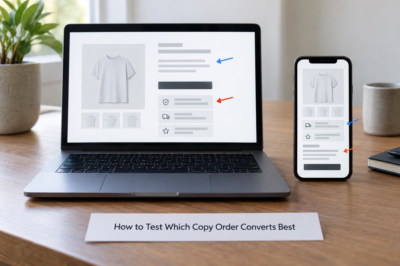
Opinion gets you to a hypothesis. A swap test gets you evidence. Testing how product page copy order affects conversion only means something if you hold wording constant and change position, because the moment both move you cannot attribute the result to either.
Write the hypothesis as an order statement rather than a copy statement. Something like benefit before specification, or proof attached to the claim rather than collected below it. A hypothesis you can falsify is worth running.
Build two variants that contain identical text. The only differences are vertical position and any visual element whose size depends on position. If you change the headline while you reorder, you have run a combined test and learned nothing about order.
Pick one primary metric. Add-to-cart rate or completed purchase rate, decided before the test starts, not after you have seen the numbers. Then pick two diagnostic metrics: scroll depth past the reordered block, add-to-cart rate from mobile separately, and exit rate on the variant. Diagnostics explain a flat primary result, which is common and otherwise very confusing.
Run long enough. There is no universal number, but two full business cycles at minimum, so weekday and weekend behaviour both appear, and longer if your traffic is seasonal.
On sample size, be honest with yourself. Small samples make lift impossible to attribute, and the CRO communities are full of people who chased noise for a quarter. Before starting, calculate roughly how many conversions your baseline rate produces per week. If that number is in the low tens, treat the test as directional, and prefer changing one larger thing over testing a subtle reorder.
If you cannot run a real test, run a cheap one instead. Sequential session recordings of the first ten seconds, or five moderated sessions watching where people look first, will not produce a conversion rate but they will show you whether your first block is being read at all. Keep a small log of every order test you run with date, hypothesis, result and traffic context, because the second most common CRO failure is rerunning a test that was already answered eighteen months ago.
Common Copy-Ordering Mistakes
Burying the product meaning. The category promise sits under four paragraphs of brand story, so a shopper who already knows what they want has to read past material they came to skip. Fix: move the plain description to the first line and let the story live below the purchase.
Leading with the brand. Founders and heritage are compelling to people inside the company and mostly irrelevant to a first-time buyer deciding whether they have come to the right place.
Specifications before benefits. This is the most common structural error. A reader given dimensions before value evaluates on cost per spec, which is the comparison you least want them making.
Separating claims from proof. A strong promise in the opening and a review count at the foot of the page leave the reader to connect them. Proof belongs where the doubt appears, which is usually right where the claim is made.
Repeating the call to action too early. A button above the case is finished invites a click that leads to hesitation, and it teaches visitors that this page asks before it answers.
Changing too many things in one test. Reordering the page, rewriting the headline and swapping images at once produces a result you cannot interpret, and it is the most common reason teams conclude that a change worked when it was the change beside it.
Frequently Asked Questions
What is the best order for product page copy?
There is no single best order, but the most reliable starting sequence runs from product identity to a one-line value proposition, then price, primary benefits, proof attached to each claim, essential details, objection handling, and finally the call to action. Shorten it for low-risk items, extend it for considered purchases. The rules that survive every variation are proof staying beside its claim and objections appearing before the button rather than in a footer.
Should product benefits come before product features?
Usually yes, because a feature only carries meaning once the reader knows what outcome it produces. Lead with the benefit in plain language, then attach the feature inline as the reason it is true. Two exceptions are worth making: specification-driven categories such as networking hardware, where compatibility filters buyers out fast, and repeat purchases, where the benefit was established on the first visit and space is better spent on availability and variants.
Where should social proof appear on a product page?
Next to the claim it verifies, not collected in one block at the end. A rating summary belongs near the product title so it registers during the first scan, review excerpts belong beside the benefit they support, and long review content belongs below the call to action where it informs without interrupting. Proof placed far from its claim still works as reassurance, but it does much less work as evidence.
Should the main call to action be repeated throughout the page?
Yes, but only after the case is made. Repeating the button keeps it reachable for the reader who has scrolled the full page and is ready, and for mobile shoppers whose first screen held no button at all. Repeating it too early is the problem, since a button above the proof invites a click from someone who has nothing to click on yet and then leaves. Test placement rather than assuming.
How long should a product page be before testing copy order?
Length matters less than whether each block earns its position. Build the full case first, using whatever length that takes, then test order on a page that already works on its own terms. Testing order on a page that is missing objections, proof or variant handling measures your gaps rather than your sequence. Trim dead sections before the test so the only variable left is position.
Does copy order matter more on mobile devices?
It matters differently, and in some ways more. Mobile buyers see only a fraction of the first screen and scan in short vertical bursts, so the top blocks carry disproportionate weight and collapsed content often goes unread. Keep identity, price, a proof signal, one benefit line, variants and the button above the interaction point. Proof that sits mid-page on desktop frequently needs to move up on mobile.
Conclusion
How product page copy order affects conversion is a buyer-first decision, not a template. Start by writing down the questions your traffic arrives with, in the order they actually ask them, then place each block where its answer is needed rather than where the design grid finds room. Hold the wording still when you test, change one position at a time, and keep a log of what you have already learned.