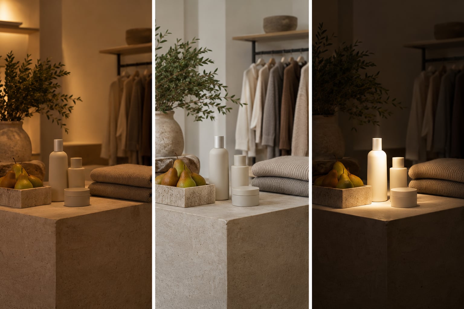
Lighting decides what a product looks like. The same bottle, jacket or loaf of bread reads differently under a warm bulb, an even panel and a bright spot, because colour, apparent brightness and visual focus are supplied by the light rather than by the object. Retailers who treat lighting as decoration lose control of both the sale and the return.
This guide is written for store owners, visual merchandisers and brand teams who need to know what the light is doing to the product before a shopper does. It covers the five levers lighting pulls, the numbers worth arguing about in Kelvin, lux and CRI, and a way to test a store’s lighting before spending anything on it.
Table of Contents
- What Does Retail Lighting Do to Product Perception?
- How Lighting Affects Product Perception in Retail
- How Brightness and Contrast Change Product Appeal
- Why Color Temperature Matters for Products
- Does Color Rendering Make Products Look Better?
- Which Retail Lighting Works Best by Product Type?
- How to Test Lighting Before Changing a Store
- How Retailers Can Optimize Lighting Without Overspending
- Frequently Asked Questions
- What lighting makes retail products look most attractive?
- What color temperature is best for a retail store?
- Does a higher CRI always make products look better?
- Are LED lights always better for retail displays?
- How can a retailer measure the effect of lighting on product perception?
- Conclusion
What Does Retail Lighting Do to Product Perception?
Lighting changes three things a shopper uses without noticing: the colour a product appears to be, how bright and how solid it looks, and what the eye is drawn to first. Change any one of those and the shopper’s judgement of quality, price and suitability moves with it, even though the product itself has not changed.
Perception comes before preference. A shopper who has not formed an accurate picture of a garment, a foundation shade or a piece of furniture cannot form a genuine preference for it, so environmental cues do their work at the earliest stage of the decision, before any brand or price information is read.
How Lighting Affects Product Perception in Retail
Light arrives with a spectral distribution, and the eye judges a colour by comparing the light that hits a surface with the light the surface throws back. Swap the light and the ratio changes, so the brain reads a different colour and a different quality from the same object. That single physical fact drives everything below.
- Brightness. Apparent brightness sets how visible, and how carefully, an item gets examined. Too little and shoppers skim; too much and flat packaging glare washes out the detail that justifies the price.
- Color temperature. Measured in Kelvin, it shifts hue. Warm light pushes yellows and reds forward and mutes blues; cool light does the reverse, and it also reads as more clinical.
- Color rendering. The Color Rendering Index scores how faithfully a light reproduces the colours of a surface. A high-lumen, low-CRI source can make a good product look dull and dirty.
- Contrast and focus. The eye reads difference, not absolute brightness. A lit display next to a brighter aisle looks dim; a pool of light on an otherwise plain wall makes the same item look deliberate.
- Glare. Harsh bright spots force shoppers to look away or to squint, and both reduce the time they spend with the product.
Areni and Kim’s 1994 review of in-store lighting work established the field’s core claim: illumination shapes shoppers’ emotions and behaviour, not just their view of an object. Later work sharpened the mechanism. Zielke and Schielke (2016) found that store illumination affects both store perception and shopping intention, and Pinto, Hebert and Summers (2010) found cooler light produced a premium perception in a high-end fashion store.
Brightness cuts both ways, which is why queue lines are lit harder than the shop floor. Huang, Dong, Labroo and Sit at Kellogg found that dim light reduced shoppers’ sense of social connection and pushed them toward hedonic, impulse choices, while very bright light intensified emotion and sped up decisions in the checkout zone.
How Brightness and Contrast Change Product Appeal
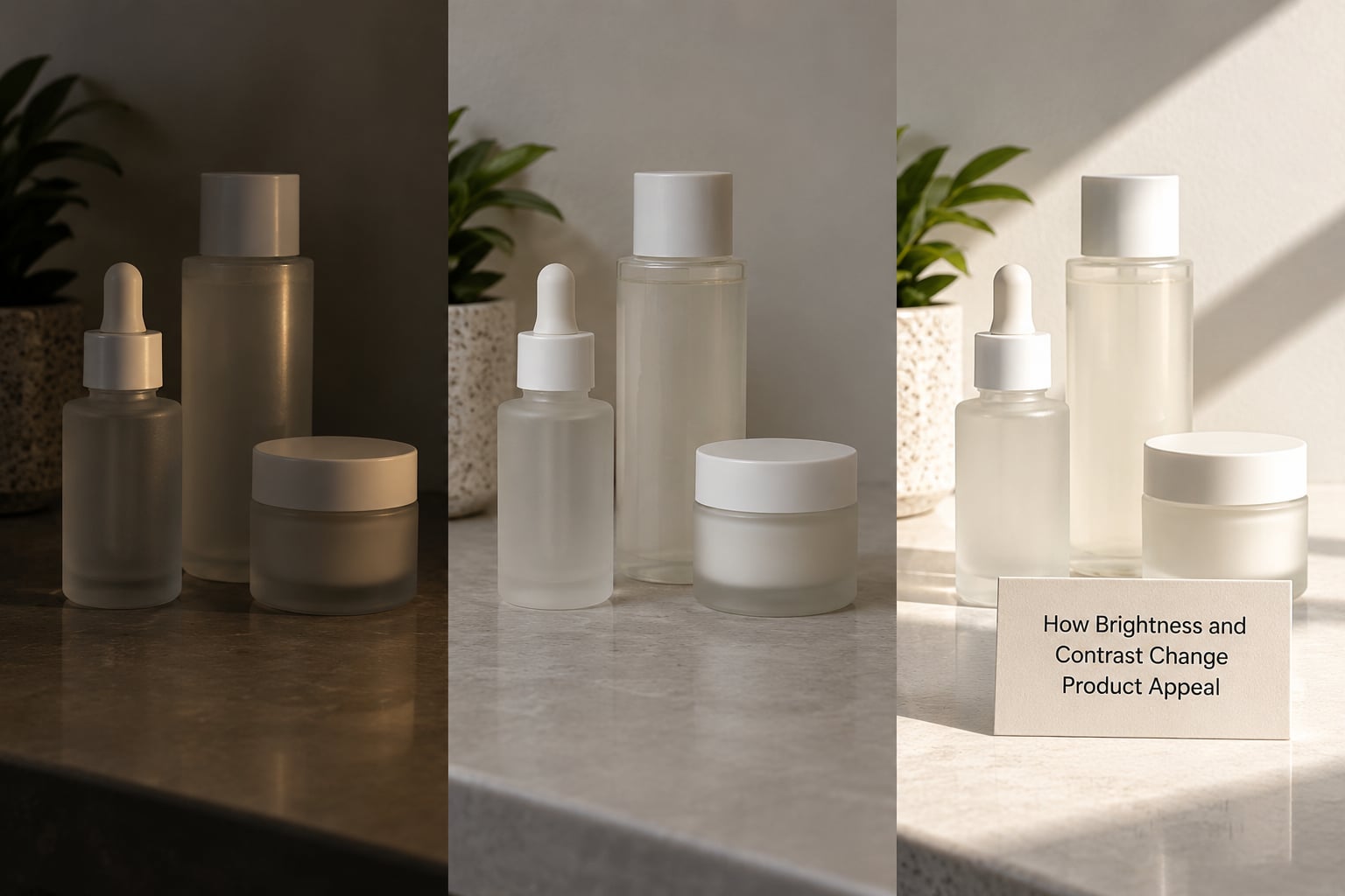
Illuminance is how much light lands on a surface, measured in lux or foot-candles. Luminance is how bright that surface then looks to the eye, and it depends on the surface’s reflectance as well as the light. A white wall under the same fixture as a black one produces two very different apparent brightnesses, which is why average store lux figures say little on their own.
What shoppers actually respond to is contrast between elements. The classic failure is a well-lit display sitting beside a brighter circulation aisle: the display recedes, the aisle looks like the destination, and the products in the display lose their pull. Reversing the relationship fixes it without adding a single fixture.
Working ranges for most stores sit around 20 to 40 foot-candles for circulation, 50 to 100 for merchandise on the floor, and 150 to 300 for feature displays that need to hold attention from several metres away.
| Lighting condition | Perceived prominence | Perceived quality | Likely shopper response | Where it fails |
|---|---|---|---|---|
| Underlit and flat | Low; items disappear into the wall | Cheap, tired, hard to inspect | Skim, move on, assume the worst | Fine in a corridor nobody lingers in, bad anywhere a sale happens |
| Even and neutral | Consistent; nothing jumps out | Honest, dependable, unremarkable | Compare properly, check labels, trust the sizing | Flat displays lose impact; nothing feels curated |
| Focused accent | High; the eye lands on one item first | Premium, deliberate, worth a second look | Dwell longer, pick up, sometimes impulse | Harsh angles create shadow and glare on the product itself |
| Bright and uniform | Everything competes equally | Clinical, functional, value-coded | Fast decisions, price comparison, queue behaviour | Makes fashion, cosmetics and jewellery look worse than they are |
| Warm and low | Soft, pooled, selective | Intimate, calm, slightly exclusive | Longer dwell, less comparison, higher basket in some formats | Colours and fine detail become unreliable |
| Flickering or drifting | Unstable between visits | Unmaintained, cheap | Distrust, repeat visits that look different | Fails everywhere; the most common avoidable fault |
Why Color Temperature Matters for Products
Color temperature describes the color of the light itself, not of the product, and it is measured in Kelvin. Lower numbers are warmer and more amber, higher numbers are cooler and bluer. Around 2700 to 3000K reads as warm and residential; 3500 to 4000K reads as neutral daylight; anything above 5000K starts to read as clinical or institutional.
Because the light’s color is added to the product’s own color, the same shirt changes identity between aisles. Warm light inflates yellows and reds and pulls blues down, which flatters skin tones and autumn palettes and wrecks denim, silver and cool greys. Cool light does the opposite, sharpening blues and greens and draining warmth out of wood, brass and warm neutrals.
| Retail zone | Kelvin range | Perception it creates | Where it fails |
|---|---|---|---|
| Fresh produce and bakery | 4000 to 5000K | Fresh, crisp, just-replenished | Too warm and bread and meat look tired rather than fresh |
| Apparel and general floor | 3000 to 4000K | Neutral, honest, easy to compare | Mixed fittings across zones make colourway confidence collapse |
| Cosmetics and jewellery counters | 4000 to 5000K with high CRI | Accurate, clinical, trustworthy for shade matching | Any drift in lamp age shows up immediately on skin tones |
| Electronics and tech | 4000 to 5000K | Precise, specification-led | Overly warm light makes screens and aluminium look dull |
| Home, furniture and lifestyle | 2700 to 3000K | Warm, comfortable, lived-in | Greys and cool fabrics read yellow and drab |
| Premium and heritage boutiques | 2700 to 3000K, low and pooled | Exclusive, private, unhurried | Not for self-serve browsing or colour-critical goods |
Consistency matters more than the individual choice. Shoppers who visit the same store twice and see the same product under two different lights have no way to reconcile them, and shoppers on r/colouranalysis describe exactly that: something looks great in the dressing room and then completely different once they see it in daylight.
Does Color Rendering Make Products Look Better?
The Color Rendering Index scores how closely a light reproduces the colors of a surface compared with a reference source, on a scale from 0 to 100 where higher is truer. Ra is the general average across the standard test colors. R9 is the separate score for saturated red, and it is the one that decides whether lipstick, fresh meat, brick and autumn fabric look alive or muddy.
High lumens with low CRI is the trap most stores fall into. A fitting room can be genuinely bright and still make skin look sallow and every garment look flat, because the light is delivering energy without delivering color. Moderate output with a CRI of 90 or above beats high output at 80 for anything a shopper judges on appearance.
Higher CRI is not always the answer, though. On fully rough or matte surfaces, where almost no specular reflection reaches the eye, the difference is small. It matters most where the shopper is comparing colors under the same light: cosmetics shade matching, denim and fabric swatches, fresh produce, artwork, paint and packaging. Those are the places to spend on CRI, and the places to keep uniform.
One number is not enough to specify a lamp properly. Practitioners on r/LEDchannels and r/Lighting trade foot-candle and CRI figures constantly, and the recurring point is that a lumen rating without a CRI rating tells you almost nothing about how a product will look.
Which Retail Lighting Works Best by Product Type?
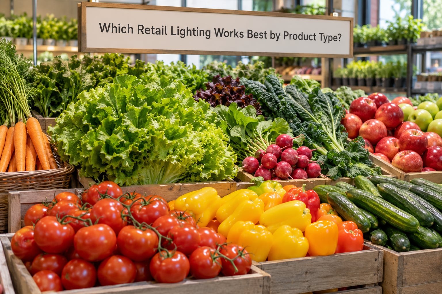
There is no best lighting setup for retail, only the best setup for a given category. The pattern below is a starting point, not a rule, but it keeps the three questions in the right order: how bright, how warm, how accurate.
| Category | Light level | Color temperature | CRI priority | Focus and contrast |
|---|---|---|---|---|
| Fashion and apparel | 50 to 100 fc on the floor | 3000 to 4000K, consistent end to end | 90+ including R9 | Even; a high CRI rail plus soft accent, never pools of light on one rack |
| Cosmetics and jewellery | 150 to 300 fc at the counter | 4000 to 5000K | 95+ | Focused, near-shadowless, with a high CRI mirror or lit tester surface |
| Fresh produce and grocery | 85+ fc, brighter on chill | 4000 to 5000K | 85+ with a high R9 | Even, cool and bright; warmth reads as wilting |
| Electronics | 100 to 150 fc | 4000 to 5000K | 90+ | Controlled reflections; any glare lands straight on a glossy screen |
| Furniture and home | 50 to 100 fc | 2700 to 3500K | 90+ | Layered, with accent on texture and matte finishes |
| Value and high-turnover | 100+ fc, uniform | 4000K | 80+ | Bright and flat by design; it codes as price and speed |
Fitting rooms deserve their own line in any plan. They are where the perception gap is felt hardest, and they are usually the least considered space in the store. On r/PaleMUA, shoppers compare two stores ten minutes apart and conclude that store lighting can really skew the appearance of swatches; on r/MakeupEducation the concern is stated even more plainly, that a shade matched in store will look like a completely different colour at home. A cool, high-CRI light close to the mirror, matched to daylight, is the difference between a confident decision and a return.
How to Test Lighting Before Changing a Store
You can learn most of what you need in an hour, without a photometric survey and without spending anything. The point is to compare like with like, and the only honest reference is daylight.
- Photograph one display in place (10 minutes). Take one photo in shade, one in open daylight and one in a shop that sells the same category. Colour on a phone screen is unreliable, so use it for shape, spacing and obvious brightness differences rather than for judging hue.
- Record what the current light is doing (10 minutes). Note where the shopper’s eye stops, where the product disappears into the background, where shadows fall across a face or a garment, and whether any fixture is visibly flickering or noticeably dimmer than its neighbours.
- Put one product under a controlled reference (10 minutes). Take it outside, or to a window, and let your eye adjust for about a minute before judging. Anything that shifts noticeably between the store and daylight is a colour-rendering problem, not a taste difference.
- Compare at shopper eye level (15 minutes). Stand where a shopper stands and check legibility of labels, small print and shade strips. Count how many products are visible from the entrance without moving your head.
- Watch the same display twice (15 minutes). Look again at a different time of day. Retail lighting that depends on daylight without sensors will read differently at noon and at dusk, and shoppers notice the inconsistency even when they cannot name it.
If you want to test an idea before committing, the cheapest controlled experiment is to relamp one display with two lamps at different color temperatures and watch how people handle the product. That is a better guide than a rendering, because it measures attention rather than opinion.
How Retailers Can Optimize Lighting Without Overspending
Most lighting problems in a store are not lighting design problems. They are consistency, dirt and aiming problems, and they are fixable in a day. Work down this list before anyone talks about a redesign.
- Match the lamps. Mixed Kelvin values and mixed CRI across one floor produce exactly the in-store versus at-home mismatch shoppers complain about, even when every fixture is new.
- Clean the optics. Yellowed lenses and dusty reflectors cut output and flatten contrast. It is the cheapest brightness improvement available and it needs no capital.
- Re-aim before adding. A small beam-angle change on an existing track often separates a display from its neighbour better than a new fixture does.
- Group products by light. Food, cosmetics and jewellery want cool accurate light; timber, textiles and lounge furniture want warm. Mixing zones in one room under one temperature is why a floor can look wrong without anyone being able to say why.
- Use the controls you already have. Daylight dimming near windows and switching in low-traffic back-of-house areas buy hours of light level without touching the design.
- Watch for the stinginess effect. Lighting that visibly reads as energy-starved and slightly green or dim signals a low-budget brand to shoppers who never consciously register the reason. Shoppers read the light as a statement about the business, not as a specification.
Brightness also carries a social signal. Pooled, low, warm light codes as exclusive and slow; flat, bright, uniform light codes as value, speed and high turnover. Chebat and Michon (2003) connected store atmosphere to approach and avoidance behaviour, and most formats choose between the two codes deliberately even when they would not describe it in those words.
One last consideration for 2026: more shoppers now meet the product in a lit window, photograph it on a phone, and collect it in-store. The same light then has to survive a phone camera and a handover counter, which makes lamp age, flicker and colour drift a commercial problem rather than a maintenance one.
Frequently Asked Questions
What lighting makes retail products look most attractive?
Accurate, even and slightly brighter than the surrounding space. Attraction comes from contrast and color fidelity, not maximum output: a focused pool of 4000 to 5000K light at CRI 90 or above on one product, surrounded by lower ambient light, reads as premium and shows detail. Uniform high output everywhere flattens a display and makes everything look like a warehouse shelf.
What color temperature is best for a retail store?
It depends entirely on the category, and consistency matters more than the exact number. Produce, cosmetics and jewellery work best at 4000 to 5000K; apparel sits comfortably at 3000 to 4000K; furniture and home warm up at 2700 to 3500K. The failure mode is mixing values within one sightline, because shoppers have no way to reconcile two colours of light for the same garment.
Does a higher CRI always make products look better?
On color-critical goods, yes, and often immediately. On rough matte surfaces that throw almost no light back, the difference is small and rarely worth paying for. Judge CRI on Ra and R9 separately, since a good general average can hide weak saturated red, which is what decides whether lipstick, meat, brick and autumn fabric look alive. High lumens with low CRI is worse than moderate lumens with high CRI.
Are LED lights always better for retail displays?
They are more efficient and they last longer, but efficiency is not perception. A cheap LED array with a CRI of 80 and a strong green cast can make good products look worse than the halogen or fluorescent fittings it replaced, and shoppers notice the change without knowing why. Specify CRI, R9, Kelvin consistency and dimming quality before you specify wattage, and replace lamps as a group rather than one failing unit at a time.
How can a retailer measure the effect of lighting on product perception?
Watch behavior rather than asking for opinions. Record dwell time and stop rate at a display before and after a change, count how many shoppers pick up and return a product, and track returns and exchanges by category over the following months. Pair those numbers with a simple reference check: photograph the same item in store and in daylight and see whether the color shift has narrowed.
Conclusion
Lighting is the cheapest variable a retailer controls and the only one that physically edits the product. Start with one display: assess it under its current light, take it to daylight for reference, then compare a high-CRI neutral setup against a focused option and watch what shoppers actually do. That one test will teach you more about how lighting affects product perception in retail than any specification sheet.