Typography does not make a brand trustworthy, but it changes what readers assume before they have read a single sentence. A typeface is read as evidence: where it comes from, who it is for, and whether the people who made it had their act together.
I spend a lot of time looking at brand systems the way a stranger would, and the pattern holds up. The verdict arrives in milliseconds, it is usually about competence rather than beauty, and it is almost never about the font category itself.
So let me separate the folklore from the evidence, then give you a selection rule you can actually use this week.
Table of Contents
- How Serif and Sans Serif Fonts Affect Trust
- What Typography Signals Make a Brand Feel Trustworthy?
- Familiarity and category fit
- Clarity and legibility
- Warmth
- Authority
- Context and the reading situation
- Why Serif Fonts Often Feel More Trustworthy
- Why Sans Serif Fonts Can Feel Equally Credible
- How Serif and Sans Serif Fonts Affect Trust Differently
- Does Familiarity Matter More Than Serif or Sans Serif?
- Category examples that hold up
- The blandness trap, which is the finding nobody quotes
- Font meaning is not universal
- Which Typeface Should You Choose for a Trustworthy Brand?
- How to Test Whether Your Typography Builds Trust
- Frequently Asked Questions
- Are serif fonts more trustworthy than sans serif fonts?
- Which font is best for a trustworthy website?
- Do sans serif fonts make a brand seem less credible?
- Can I use serif and sans serif fonts together?
- What font should a luxury or professional-services brand use?
- How can a business test whether its font increases trust?
- Conclusion
How Serif and Sans Serif Fonts Affect Trust
Typography shapes trust because readers judge a source’s character before they finish reading it. Serif letterforms, rooted in print, tend to signal heritage, authority and institutional stability. Sans-serif letterforms, rooted in screens, tend to signal clarity, precision and modernity. Neither category is trustworthy by default. Fit between the typeface, the category and the reading context predicts credibility far better than the label on the font.
That last sentence is the one most brand teams skip. They argue about whether serif wins or whether sans-serif wins, when the research has been pointing somewhere else for twenty years.
What Typography Signals Make a Brand Feel Trustworthy?
Readers make inferences from letterforms the same way they infer them from a uniform or a handshake. Five signals do most of the work.
Familiarity and category fit
A typeface that looks like the ones used in the reader’s own category borrows that category’s credibility. Newspapers, courts and universities have trained decades of readers to read serif as the shape of serious, verifiable information.
Clarity and legibility
Open counters, generous spacing, a tall x-height and sensible line height reduce cognitive load. When reading feels effortless, the writer seems competent. When it feels like work, the writer seems careless.
Warmth
Stroke contrast, rounded terminals and slightly irregular forms read as human. Monotone geometry reads as institutional, sometimes cold. Warmth is not friendliness; it is a sense that someone chose the letters on purpose.
Authority
Weight, scale and disciplined hierarchy do more here than the serif bracket itself. A confident type system, used consistently, signals an organisation that keeps its rules.
Context and the reading situation
The same face lands differently on a legal contract, a checkout page and a hospital discharge summary. Trust is judged against the job the reader is trying to finish.
It helps to know that researchers treat trust as several separate things rather than one feeling. Shaikh, Fox and Chaparro measured a company’s ethos on four scales in their 2007 study: professionalism, believability, trustworthiness and intent to act. A typeface can lift one and leave the rest alone, which is exactly why arguments about which font is more trustworthy tend to stall.
Ethos, borrowed from rhetoric, is the term that most of this literature uses. It is the audience’s assessment of a source’s character and credibility, formed before the content is weighed properly.
Why Serif Fonts Often Feel More Trustworthy
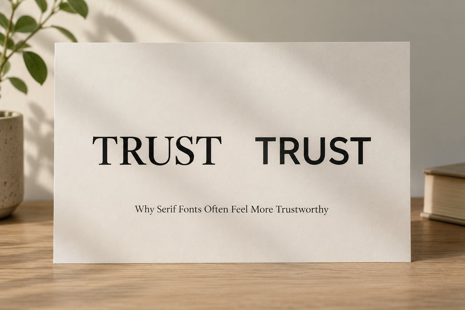
Serifs win the heritage vote for structural reasons, not arbitrary ones. The small finishing strokes at the ends of strokes act as visual guideposts for the eye, and they originated in handwritten and carved text long before the printing press.
Three features carry most of the association:
- Stroke contrast. Thick and thin strokes echo a pen held at an angle, which reads as human authorship rather than machine output.
- Transitional proportions. Classic serifs have moderate letter widths and a tall x-height relative to the em square, so paragraphs look settled.
- Historical proximity to institutions. Legal contracts, bank statements and broadsheets were all set in serifs for a very long time.
The effect shows up consistently in the perception literature. Chaparro’s 2006 work groups fonts by ascribed traits and finds stability and maturity clustered with serif faces. Childers and Jass (2002) reported that typeface semantic associations moved brand perception along with recall, which is the link most marketing blogs leave out.
Where serifs go wrong is category mismatch. A heavy Victorian serif on a developer tool site reads as costume. Set at 14px on a pale grey background, a low-contrast serif reads as an accessibility failure, and readers translate that into distrust faster than any survey would suggest.
Why Sans Serif Fonts Can Feel Equally Credible
A restrained sans serif carries a different set of associations, and they are trustworthy ones. Letterforms without terminals were standardised for signage, then adopted for screens, so the family reads as legible, current and engineered rather than inherited.
What sans-serif type tends to signal:
- Precision, because uniform stroke weight feels measured.
- Transparency, because nothing is ornamented or hidden.
- Neutrality of intent, because the letters make no claim on the reader.
Healthcare portals, security products and developer tools have built credible identities on exactly that reading. Helvetica and Arial became trust carriers in a specific context: government forms, transit signage, forms and instructions. Set those shapes against an ornate serif and the institutional reading arrives before the first word.
Three failure modes spoil it. The first is the untouched default. Calibri and Arial still ship as system choices, and practitioners in branding communities consistently report that an unmatched default reads as a template rather than a decision.
The second is spacing. Tight tracking, a weak type scale or a heading that fights the body copy signals that nobody checked the details, and readers treat unchecked details as unchecked claims.
The third is novelty. Script and decorative faces are fine for a bottle of wine and terrible for a refund policy. Shaikh’s appropriateness continuum put a decorative face at the bottom, and the same reasoning applies to any attempt at cleverness in a context that demands a promise.
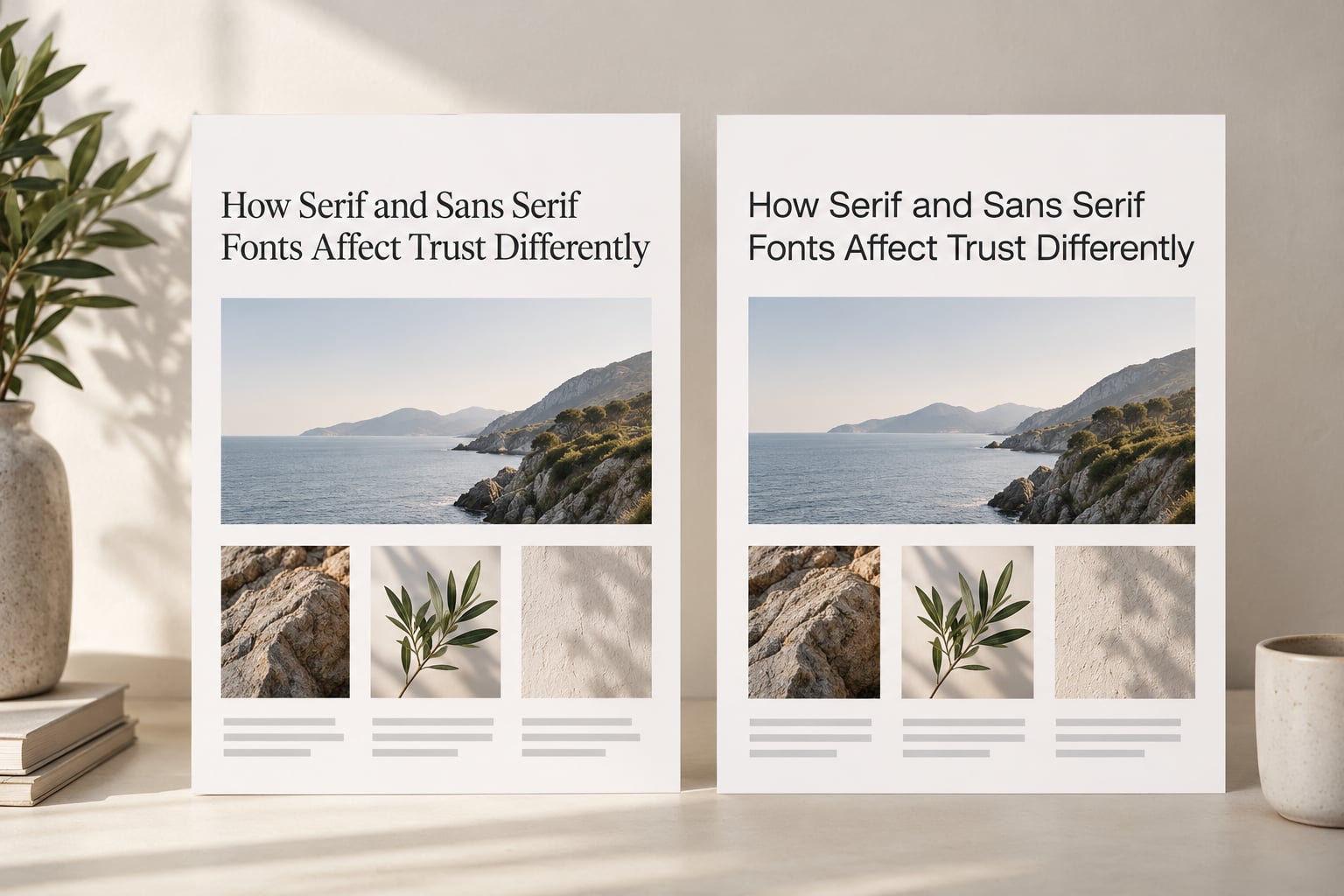
How Serif and Sans Serif Fonts Affect Trust Differently
| Dimension | Serif | Sans serif |
|---|---|---|
| Primary trust signal | Heritage, permanence, editorial authority | Clarity, precision, current competence |
| Perceived authority | High, especially at small sizes | High when weight and spacing are disciplined |
| Perceived warmth | Moderate to high, depends on contrast and terminals | Low to moderate; rounded forms raise it |
| Formality | Reads as formal by default | Reads as informal unless weight is controlled |
| Screen legibility | Fine above roughly 16px; weak below with low contrast | Generally strong at small sizes, especially with a tall x-height |
| Best-fit categories | Legal, finance, publishing, heritage, luxury | Technology, healthcare, marketplaces, product UI |
| Common failure mode | Looks dated or costume in a fast-moving category | Looks generic, unbothered or like an untouched default |
| What raises trust | Consistent pairing, readable sizes, restrained weights | Custom or distinctive details, careful spacing, real hierarchy |
Read the last row before you read the first. Both columns have a fix available, and neither is the other column.
Does Familiarity Matter More Than Serif or Sans Serif?
More often than not, yes. Prior exposure does most of the work in every study worth reading, and category convention is where that exposure lives.
Category examples that hold up
Financial services and legal sites lean serif because that is what the category has looked like for a century, and nobody is trying to be the first bank to signal risk. Publishing leans serif for the same reason, compounded by the fact that readers meet it on paper first. Technology and SaaS sites lean toward neutral sans-serif because the category’s entire story is speed and precision. Hospitality sits in between, and a serif in the wordmark with a clean sans-serif through the booking flow is a familiar, defensible pattern.
Test how serif and sans serif fonts affect trust in your own category first, because the conventions of that category are inherited, not chosen.
The blandness trap, which is the finding nobody quotes
In Shaikh, Fox and Chaparro’s study, participants rated websites on a paired-comparison appropriateness continuum across eleven typefaces. The decorative face sat at the bottom. The surprise is that a plain neutral default performed close to it.
In that study, neutral and low-appropriateness typefaces reduced judgements of professionalism, believability and trustworthiness together. The effect was large in statistical terms: partial eta-squared of .50 for professionalism, .38 for believability, .35 for trustworthiness and .46 for intent to act, from 115 participants on seven-point scales.
The lesson is sharper than “pick a nicer font”. Blandness is a trust liability. A default that communicates nothing is read as low effort, not as safety.
Font meaning is not universal
These associations were largely measured with Latin script and Western readers. A Turkish study in 2025 found typeface personality ratings shift with language and local design context, so an association that feels solid in London can be flat or reversed elsewhere. If you operate across scripts, test in the market you are actually selling to.
Which Typeface Should You Choose for a Trustworthy Brand?
Start from the impression you need, not from a preference between two categories. Then pick the category that fits the impression, and then spend your effort on the individual face, which is where most of the trust effect lives.
| Brand category | Usual type system | Reason |
|---|---|---|
| Financial services | Serif headline with neutral sans-serif body | Meets the category convention without hurting body readability |
| Legal and professional services | Traditional serif, used carefully | Perceived permanence and established practice |
| Editorial and publishing | Serif throughout, generous leading | Long-form reading and reader expectation |
| SaaS and developer tools | Neutral or geometric sans-serif | Speed, clarity and precision |
| Healthcare | Humanist sans-serif with large sizes | Approachability plus clinical legibility |
| Luxury | High-contrast serif wordmark, quiet sans-serif elsewhere | Prestige in the mark, restraint in the interface |
| Ecommerce and consumer | Distinctive wordmark plus highly legible body | Personality at the door, clarity at the checkout |
Three constraints apply whatever you choose. Accessibility is not a separate concern from trust: WCAG contrast requirements, a real type scale and sizes that survive a 6-inch phone screen are all trust work, because a page that strains to read strains credibility.
Second, judge the face at the size and in the colour it will ship in. A specimen on a poster tells you almost nothing about 15px body text in medium grey.
Third, if your type is a stock font that half your competitors also use, spend your budget on custom letterforms for the wordmark instead. Distinctiveness is the cheapest available lift in perceived effort.
How to Test Whether Your Typography Builds Trust
You can settle this for your own brand with a small amount of work, and the test is easy to run because typography is one of the few variables you can swap without rewriting the page.
- Pick one honest outcome. Choose a measure tied to trust rather than taste: time on page, form completion rate, or a direct rating of how trustworthy the site seems in a one-question survey.
- Swap only the type. Replace the current system with the candidate while holding layout, colour, copy and imagery constant. Anything else and you will learn nothing.
- Use unbranded pages. Show participants the layouts without the company name. Shaikh’s study did exactly this with nonsense text, and it is the cleanest way to isolate the typeface from prior knowledge.
- Sample your actual audience. Your buyers, not your colleagues. Trust is a claim about fit, and your colleagues already know the company.
- Test on a phone first. If the candidate falls apart at small sizes on a real screen, it loses regardless of how it performs on a desktop.
- Check the legibility floor. Run the contrast and size checks before launch. A legibility failure reads as incompetence, and no amount of first-impression data will outvote it.
Field work supports the same logic from a different direction. Bottomley and Doyle (2004) varied the typeface on a familiar packaged product and asked consumers to choose between competing brands; appropriate typographic treatment attracted selections roughly twice as often. Consumers could not say why. They simply picked the one that looked right for the category.
That is the whole finding, repeated across two decades of research: readers cannot explain the judgement, but they act on it.
Frequently Asked Questions
Are serif fonts more trustworthy than sans serif fonts?
No. Serifs carry a mild default toward heritage and authority, and sans-serif fonts toward clarity and modernity, but neither category is reliably more trustworthy. In Shaikh, Fox and Chaparro’s 2007 study, low-appropriateness typefaces were rated less trustworthy, professional and believable, and neutral defaults scored close to badly matched decorative faces. What moves trust is fit between the typeface, the category and the reading context.
Which font is best for a trustworthy website?
The one that fits your category and stays legible at real sizes. Most professional sites pair a serif or distinctive sans-serif for headlines with a highly legible face for body copy, then check contrast and line length on a phone. Trust comes from the system being deliberate and consistent, not from belonging to a category.
Do sans serif fonts make a brand seem less credible?
Only in categories where credibility has been coded as heritage. A law firm set entirely in a neutral sans-serif can read as an office that will not commit, while the same treatment on a security product reads as competent and current. Judge the pairing against what readers expect from your sector, not against a general rule.
Can I use serif and sans serif fonts together?
Yes, and it is the normal way professional type systems work. Give each face one job: serif for headlines or long-form reading, sans-serif for interface, navigation and small text. The risk is not mixing but mixing badly, where the two faces compete at the same size and weight instead of building a clear hierarchy.
What font should a luxury or professional-services brand use?
Luxury usually works best with a high-contrast serif or a restrained custom wordmark, paired with a quiet sans-serif for navigation and body copy so the interface stays calm. Professional services tend to do better with a traditional serif used conservatively. Avoid decorative faces outside the wordmark; they undercut exactly the stability the category is selling.
How can a business test whether its font increases trust?
Run a typography-only A/B test: swap the type system while holding layout, colour and copy constant, show unbranded pages to people from your actual market, and measure one trust-linked metric such as form completion or a single-question credibility rating. Check the winning candidate on a phone and against contrast requirements before shipping it.
Conclusion
Serif and sans-serif fonts affect trust, but neither wins. They carry different defaults, and the defaults only matter relative to your category, your audience and the job the reader is trying to finish on your page.
So here is the order of operations. Decide what impression you need, whether that is stability or precision, then pick the category that fits it. Choose the specific face on legibility at real sizes rather than on a specimen. And spend the leftover budget on making the type system look deliberate, because in every study on this topic, effort reads as trustworthiness more reliably than category does.