Brand consistency matters more than creativity because it compounds while creativity spikes. A fresh campaign earns attention for a few weeks, then decays. The same colours, words and promise repeated across every touchpoint build recognition that keeps working long after a post is buried. That is why brand consistency matters more than creativity for almost every business: creativity decides whether people notice you once, and consistency decides whether they still choose you a year later.
The argument sounds one-sided, and it usually gets quoted as one-sided, which is exactly why it does not survive contact with a real marketing team. Brands that nail consistency by publishing the same three assets on rotation get boring fast, and boredom costs attention just as surely as confusion does. The useful question is not which one wins. It is which one you spend, and on what.
Over the past few years I have watched the same failure repeat across client work: a brand with a genuinely good idea launches it brilliantly, then spends the following eighteen months shipping whatever the calendar demanded. Nothing is badly wrong with any single asset. Stacked together, they look like four different companies, and the numbers quietly follow.
Table of Contents
- What Is the Difference Between Brand Consistency and Creativity?
- What brand consistency actually means
- What brand consistency does not mean
- What creativity actually means
- Why the two are complements, not opponents
- Why Brand Consistency Matters More Than Creativity
- What Does Consistent Branding Actually Include?
- Positioning
- Visual identity
- Tone of voice
- Messaging framework
- Customer experience
- Product promise
- Distribution and channel presence
- Internal alignment
- How Inconsistency Weakens Customer Trust
- Where Should Brands Still Be Creative?
- Creative territory: concept, format, channel and story
- The AI-era problem: consistency and sameness at the same time
- How Do You Balance Consistency and Creativity?
- Write down your non-negotiables first
- Separate the fixed from the flexible explicitly
- Define creative boundaries, not creative rules
- Test recognition before you ship
- Tell productive variation from avoidable drift
- How Can You Measure Whether Your Brand Is Consistent?
- Frequently Asked Questions
- Does brand consistency mean a brand cannot be creative?
- How much consistency is too much?
- Should every channel use exactly the same brand message?
- Can a brand be consistent while changing its visual identity?
- How often should a brand audit its consistency?
- Is it better to prioritize creativity or brand consistency?
- The First Step to a More Consistent Brand
What Is the Difference Between Brand Consistency and Creativity?
Brand consistency is the practice of repeating the same core identity elements — values, promise, tone of voice, colour, typography and core message — across every customer touchpoint, so each new encounter reinforces what the audience already knows instead of resetting it.
Creativity in this context is the generation of new ideas: a campaign concept, a headline, a format, a story, a product feature, an angle that has not been used before. Creativity produces the raw material. Consistency decides whether that material gets recognised as coming from you.
Let me be precise about the terms, because vagueness here is what makes the debate unresolvable.
What brand consistency actually means
Consistency is repetition with intent. It is not a fixed list of rules for its own sake; it is a decision about which attributes carry your identity and which are free to move. Marketing courses sometimes teach a “five C’s of branding” shorthand — clarity, consistency, creativity, connection and character. Treat it as a classroom mnemonic rather than a law, but the useful part is the first two: a brand that is not clear cannot be consistently recognised, because there is nothing fixed to recognise.
What brand consistency does not mean
It does not mean sameness. It does not mean every channel carries an identical message, every asset uses the same layout, or that anyone at the brand is forbidden from having a good idea. It does not mean the brand froze at the moment it launched. A frozen brand is a different failure, and a slower one.
It also does not mean copying a competitor’s playbook. Consistency means your signals recur. Distinctiveness comes from what the signals are, not from how often you repeat them.
What creativity actually means
Creativity is variety with purpose. The test of a creative idea is not novelty for its own sake — it is whether it produces a new way for people to recognise an idea they already associate with you. A second execution of a familiar format can be highly creative. A genuinely new format that looks like nothing else in the category can be the least creative decision you make all quarter.
Why the two are complements, not opponents
Creativity is where the raw attention comes from. Consistency is where the memory goes. A brand with only the first is a one-hit wonder; a brand with only the second is forgettable wallpaper. The ratio that works sits somewhere around one new idea for every several recognisable ones — enough novelty to stay worth following, enough repetition to stay worth choosing.
Why Brand Consistency Matters More Than Creativity
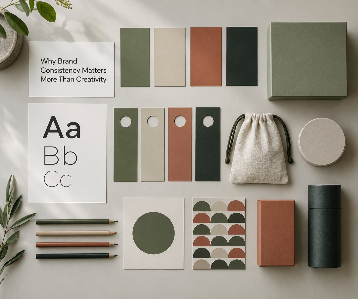
Why brand consistency matters more than creativity comes down to how the two behave over time. Creativity produces a spike in attention that peaks fast and fades. Consistency produces a slow accumulation of familiarity, and familiarity keeps paying out because people spend less effort each time they meet you.
Think about a hypothetical brand before and after a cleanup. Before: a deep blue logo, a lime secondary, a serif headline in ads, a friendly sans-serif on the website, three taglines across two years, and pricing promises that changed every quarter. After: one blue, one neutral, one type pairing, one sentence about what the product does, one line about what it costs. Nothing in the second version is more imaginative. Everything in it is recognisable, which is what made the sales team faster and the returns lower.
| Dimension | Brand consistency | Creativity |
|---|---|---|
| How it behaves over time | Compounds with every repetition | Spikes, then decays |
| Effect on memory | Strengthens one set of associations | Adds a new association, sometimes replaces an old one |
| Cost to produce well | Front-loaded setup, cheaper at volume | Recurring per asset and per campaign |
| How you measure it | Recognition, recall, promise delivery, drift rate | Attention, engagement, originality against a brief |
| Main risk | Stagnation and category blandness | Recognition debt that never gets repaid |
| Reversibility | Hard to undo once memory has formed | Easy to retire; campaigns end cleanly |
The row most people skip is reversibility. A bad campaign disappears. Bad branding sits in someone’s head for a decade. That asymmetry is why the conservative choice wins on average even when it feels like the dull one.
There is also a cost asymmetry in production. Building a usable identity system is expensive and slow, roughly a month of work for a small brand and more for a larger one. Once it exists, applying it is close to free: templates, a style guide, a locked colour set. Creative work, by contrast, has to be bought again every single time you need attention, and quality varies with whoever is available that week.
What Does Consistent Branding Actually Include?
Brand consistency is not one thing. It sits across eight areas, and each behaves differently when it changes. Knowing which are load-bearing tells you where drift actually costs you.
Positioning
Who you are for, against what alternative, on what basis. This is the one that should change most rarely. A repositioning that quietly happens twice in three years leaves customers with no stable frame for evaluating you.
Visual identity
Logo, colour, typography, imagery style, layout logic. Some of this must be fixed and some can flex: the logo and primary colour should not move, while photography style, illustration approach and layout templates can vary without breaking recognition.
Tone of voice
Not identical sentences, a consistent register. A brand can be wry on social and plain-spoken in support replies as long as both sound like the same organisation. What breaks consistency is switching between a formal corporate voice and a slang-heavy one in the same week.
Messaging framework
The fixed elements — the promise, the three pillars, the core sentence about what you do — plus the variable slots that hold evidence, offers and specifics. Write the fixed part once and reuse it; this is the single highest-leverage document most small teams never produce.
Customer experience
Packaging, onboarding, invoices, support replies, the confirmation email. This is where promises get settled, and where a mismatch between marketing tone and service reality does the most damage.
Product promise
If you claim speed and deliver slowly, no amount of visual consistency repairs it. Promise consistency is the one form of consistency that requires an operational fix rather than a design fix.
Distribution and channel presence
The same identity whether someone sees you on a shelf, a screen, a billboard or a marketplace listing. Each channel gets a format adaptation, not a different brand.
Internal alignment
Sales decks, proposals, and the answers your team gives when a prospect asks what you do. Most brand drift is internal before it is public.
How Inconsistency Weakens Customer Trust
Inconsistency does more than look untidy. It creates work for the audience. Every time signals change, the person meeting your brand has to re-decide whether this is the same organisation, whether the promise still holds, and whether it is worth the attention required to work that out.
Psychologists call the effort of processing something easy processing fluency, and easy-to-process experiences are judged as more pleasant and more trustworthy. Inconsistent branding raises processing effort quietly, and readers rarely notice the effort. They just come away with less confidence.
The emotional side is uncertainty. Trust is largely a bet that a brand will behave predictably. Change the logo, change the colour, change the tagline, change the price promise within one year, and you have trained your audience to expect change — which is a bet most people decline.
Then there is brand drift, the slow version. Nobody decides to drift. A new marketing hire picks a typeface that looks modern, an agency proposes a new direction for a pitch, a founder redraws the logo for a conference banner. Each change is small, survivable in a meeting, and impossible to reverse without effort. Six months later, no one can say what the brand looks like, and the audit that would have caught it in week three is now a project.
The small-business version looks like this: one person holds the entire identity in their head instead of in a document. Everything is consistent until that person is ill, busy, or leaves. Then the brand changes shape in a fortnight, and nobody notices the cause because there was never a written standard to break.
Where Should Brands Still Be Creative?
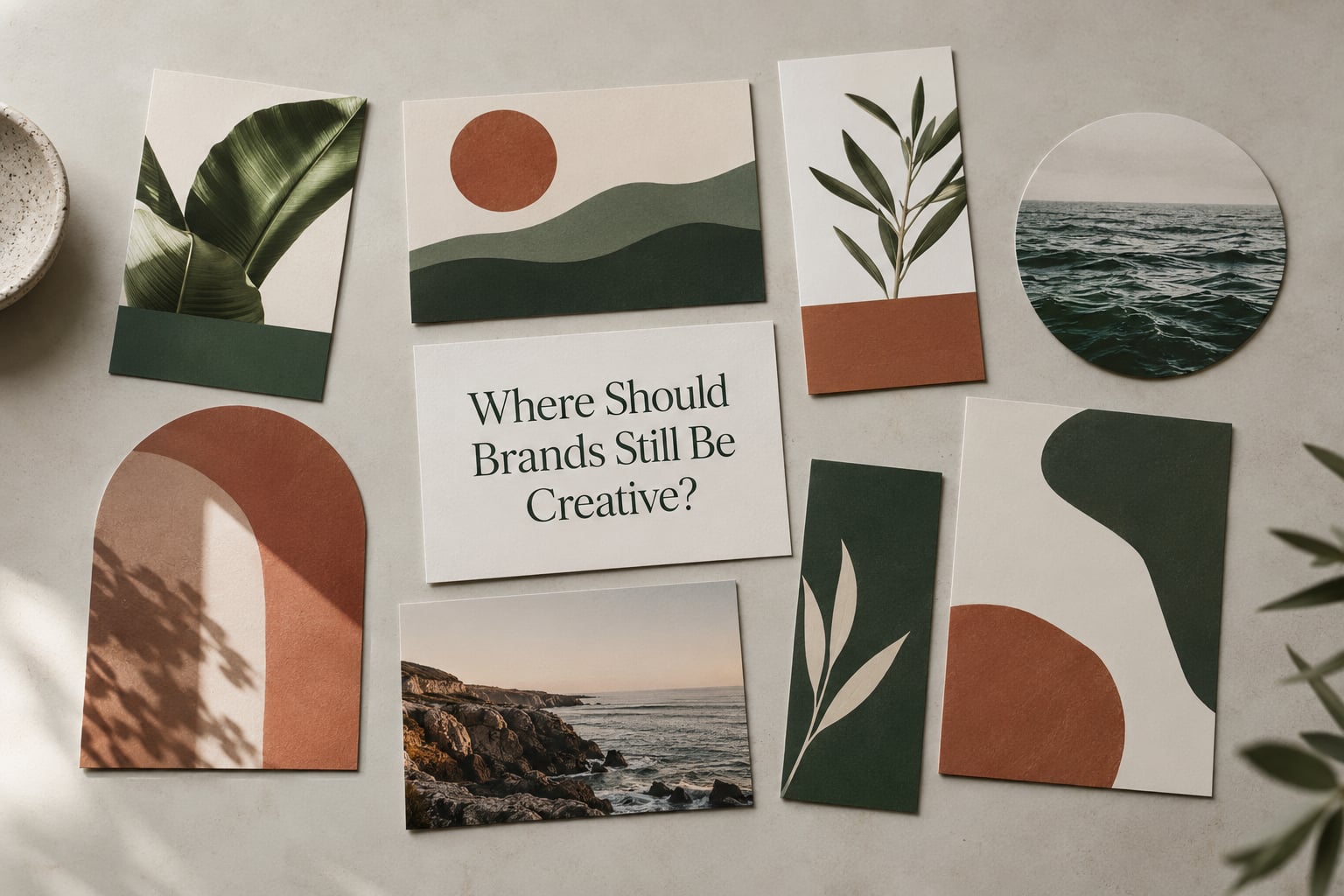
Strategic consistency belongs to a small set of load-bearing attributes. Everything else is where creativity should live, and it should live there aggressively. If you are only being consistent across eight things, you have room to invent on everything else.
Creative territory: concept, format, channel and story
Campaign ideas are the clearest place to be bold, because the campaign is the wrapper, not the identity. Formats should change with the platform: a fifteen-second vertical video and a long-form article can carry the same brand without looking like the same asset. Storytelling, humour, the angle you take on a topic, and the audience-specific version of a message all belong to the creative side.
Product and service design is creative territory too, as long as it does not betray the promise. Packaging should be recognisable from three metres away, which is a design problem worth real effort rather than a compromise.
The AI-era problem: consistency and sameness at the same time
This is where the practitioner debate got genuinely unsettled. The same tools now in use across thousands of brands make off-brand output cheaper to produce at scale, which improves consistency and damages distinctiveness in one move. Designers on forums are blunt about the result: everything starts to look the same because everyone is using the same generation systems and the same template habits.
The honest answer holds both halves. Automation does raise alignment — it stops a regional team from inventing its own version of your logo — and it does flatten expression. The fix is to hold your distinctive assets by hand. Anything you can pin down as recognisably yours (a specific colour pairing, a layout rhythm, a sentence structure, an illustration approach) should be protected from templates, and the template should handle everything ordinary. Consistency achieved by refusing to use any system at all is not a strategy; it is a small team’s guess at what happens when volume hits.
How Do You Balance Consistency and Creativity?
The balance is an operating decision, not a taste decision. Five steps get you most of the way, and the table answers the question teams ask most often: which attributes stay, which move.
Write down your non-negotiables first
One page. The promise, the audience, the position against alternatives, the primary colour, the type pairing, the logo clear space, and three sentences of tone of voice. If it is not on that page, it is flexible. Most teams discover their list is shorter than they assumed, which is what makes the page useful.
Separate the fixed from the flexible explicitly
Anything not on the one-pager is flexible, and you should name the flexible zones rather than leaving them to guesswork. Photography, headlines, campaign concepts, video length, subject matter — all fair game.
Define creative boundaries, not creative rules
Rules like “use no more than two colours” constrain a designer without improving the work. A boundary like “every image must feel warm and hand-made, never clinical” gives a direction a creative person can solve. Boundaries describe the destination; rules describe the route.
Test recognition before you ship
Show five unrelated assets to twenty people for four seconds each, without labels, and ask which ones belong to the same brand. If the answer is scattered, you have a consistency problem regardless of how good the individual work is. The five-second recall test costs nothing and catches more than a design review does.
Tell productive variation from avoidable drift
Variation is productive when the identity signals stay recognisable and the idea changes. Drift is when the signals move. When a piece is finished, ask one question: could this have been made by a different company? If yes, it is drift.
| Keep stable | Let vary |
|---|---|
| Core promise and positioning | Campaign concept and headline |
| Logo and clear space | Format, aspect ratio and length |
| Primary colour palette | Photography and illustration subject |
| Type pairing | Layout templates within the system |
| Tone of voice register | Channel-specific wording |
| Distinctive brand assets | Humour, story and angle |
| Promise delivered in service | Channel-appropriate length and detail |
How Can You Measure Whether Your Brand Is Consistent?
Advice without a measurement is how consistency efforts quietly die in month three. These six checks take about a day, and most brands find something uncomfortable in the first ten minutes.
Asset audit. Collect every live asset you can find — social profiles, ads, emails, packaging photos, site, documents. Count how many colours, typefaces and logo versions appear. Anything appearing once or twice is drift, not a system.
Message alignment. Pull your last twelve months of headlines and ask how many distinct core messages they state. If the honest answer is more than two, your messaging framework is missing.
Five-second recall test. The recognition check described above, run twice a year and after any identity change.
Promise delivery. Compare what you claim against what a new customer actually experiences in the first thirty days. Marketing-audience drift and service-experience drift show up here first.
Drift rate. Count off-brand assets caught per month since the last audit. A rising number means the guidelines are not being used, not that they need writing.
Repeated theme coverage. How many campaigns in the last year could a customer reasonably describe as the same idea wearing different clothes? Zero means you have stopped investing in repetition; ten means you have stopped investing in creativity.
| Signal | Question to ask | Warning sign |
|---|---|---|
| Visual recall | Can people name the brand after a four-second look? | Correct category, wrong brand |
| Message clarity | Can a new hire state the promise in one sentence? | Three versions in circulation |
| Asset spread | How many typefaces are live? | More than two |
| Logo integrity | Does every version follow the clear space rules? | Stretched or recoloured variants |
| Promise gap | Does service match the advertising claim? | Refund or complaint themes |
| Tone drift | Do support replies sound like the ads? | Formal brand, casual desk |
Score each row from one to five and total them out of thirty. Under twenty means the basics need fixing before any new brand work is worth funding. Most teams find their lowest scores in asset spread and message clarity, which is also where repairs are cheapest.
Frequently Asked Questions
Does brand consistency mean a brand cannot be creative?
No. Consistency covers a short list of load-bearing attributes, typically the promise, the logo, the colour palette, the type pairing and the tone of voice. Campaigns, formats, stories, headlines and channel-specific versions stay fully open. The useful test is whether someone could tell your assets were made by the same company without seeing the name on them. If yes, you have consistency. If you are also bored by your own feed, the creative layer needs more range, not a new logo.
How much consistency is too much?
Too much consistency shows up as sameness: the same layout on every channel, the same three posts recycled, the same sentence in every email. Recognition is high but attention is not, because nothing new arrives. A workable test is to look at your last six months of output and ask whether a customer could describe a single campaign idea running underneath them. If they could, your creative range has collapsed even though your standards are high.
Should every channel use exactly the same brand message?
No. The core promise stays identical; the expression adapts. A LinkedIn post, a product page and a support reply can each be written differently while still making the same underlying promise, because audiences arrive with different questions. What must not vary is the claim itself. Teams that copy one message across five formats end up with five mediocre assets, and the audience notices the flattening long before they can articulate it.
Can a brand be consistent while changing its visual identity?
Yes, and evolution is usually safer than revolution. Colours can shift, typography can be refreshed and photography can change if the underlying signals still feel like the same organisation. Wholesale logo changes and full palette replacements are riskier because they invalidate years of accumulated recognition. If you are considering a rebrand, test whether the current identity is the actual problem or whether a positioning shift is what is really needed, since only one of those has a genuine business case.
How often should a brand audit its consistency?
Twice a year for most brands, and immediately after any identity change, new channel launch or agency handover. Small teams with a single person holding the brand in their head should look quarterly, since they have no document catching drift for them. The audit itself takes about a day: collect live assets, count typefaces and colours, review the last twelve months of headlines, and run the five-second recall test with twenty people.
Is it better to prioritize creativity or brand consistency?
Consistency first, then creativity, because creativity without a stable identity produces attention that cannot be converted or repeated. Once the identity is documented and holding, creativity is where the marginal return sits. The exception is a genuine repositioning, where a new creative direction comes first and the identity is rebuilt around it. Even then, fixing consistency first and creative second works better far more often than teams expect.
The First Step to a More Consistent Brand
Write the one page. The promise, the audience, the position against the alternative, the colour, the type, and three sentences of voice — then stop arguing about consistency in the abstract and go fix whatever that page contradicts.
Then audit what is live, find the two or three touchpoints where the gap between the page and reality is widest, and repair those first. Largest gaps first, because that is where the money is and where the internal disagreement is easiest to settle with evidence rather than opinion.
Once the identity holds, set a recurring slot for creative work that sits outside the guardrails rather than inside them. Brands that answer why brand consistency matters more than creativity end up with the same operating shape: a small fixed spine that never moves, and a wide surface above it where the interesting work happens.