
A brand funnel built from survey data is six stacked percentages — Awareness, Consideration, Preference, Purchase, Loyalty and Advocacy — where each number comes from what respondents actually said when you asked them. You score every person into a stage, divide by your weighted respondent base, and read the gaps between stages to see where the brand loses people. It takes most teams about half a day of desk work once the survey is fielded, and the hard part is arithmetic discipline, not collection.
The reason this is worth doing: sales data tells you what happened and analytics tells you what happened on your site, but neither one explains why someone heard of you and never went further. Survey data fills that gap, as long as you code it properly instead of pasting an engagement score into a deck.
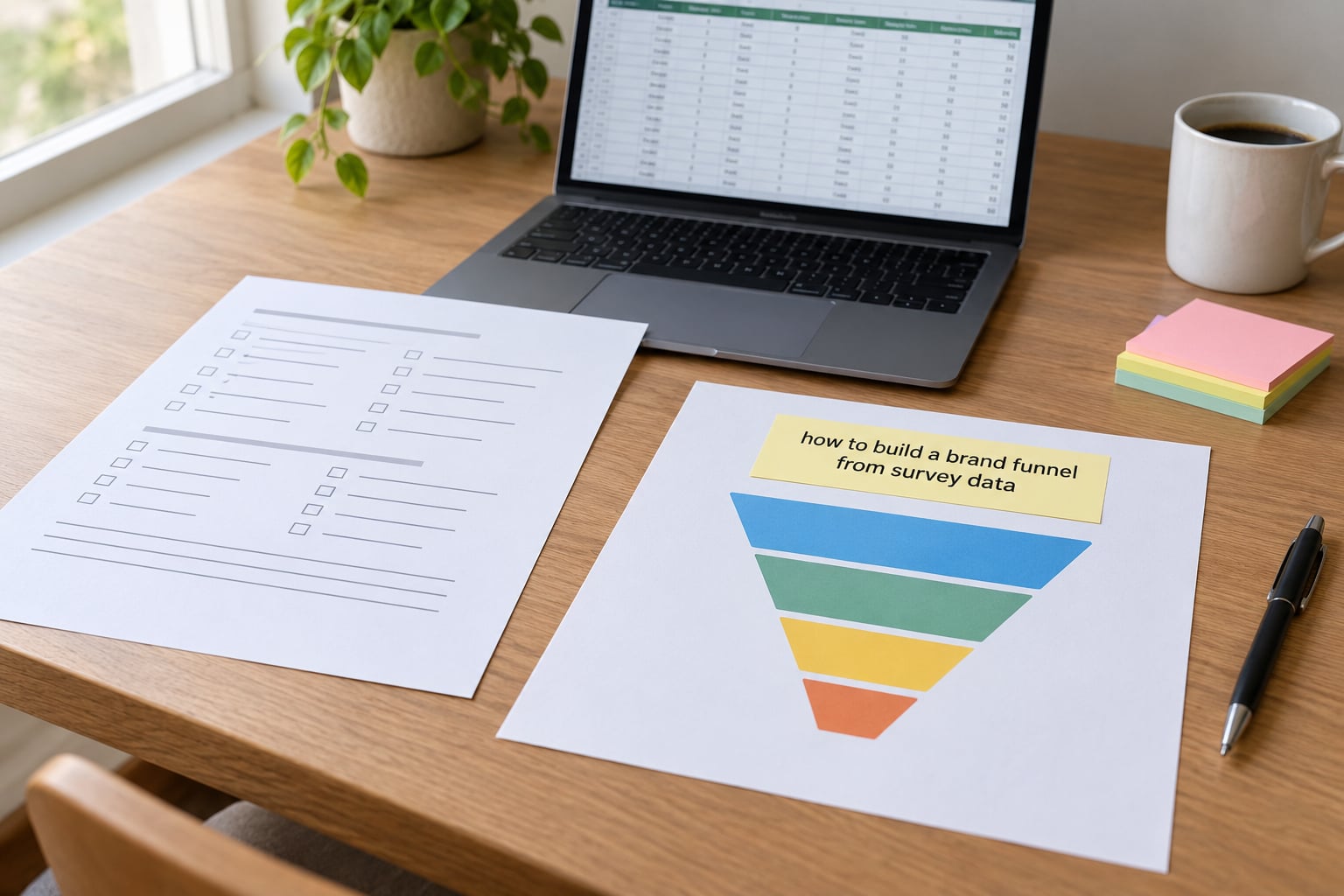
Table of Contents
- What You Need
- Step-by-Step: Building a Brand Funnel From Survey Data
- 1. Define the brand decision and funnel stages
- 2. Select the survey measures for each funnel stage
- 3. Segment the responses before interpreting them
- 4. Convert findings into funnel-stage scores
- 5. Diagnose the biggest leaks and barriers
- 6. Turn survey evidence into activation actions
- 7. Validate the funnel and track movement
- Common Mistakes
- Frequently Asked Questions
- How many survey responses do you need to build a brand funnel?
- What is the difference between aided and unaided brand awareness?
- How do you calculate a stage transition rate from survey data?
- Can a survey tell you what people actually buy?
- Should the brand funnel and the conversion funnel be one model?
- How do you report a brand funnel so stakeholders act on it?
- Conclusion
What You Need
Six things, and you cannot skip the first one. If the decision is vague, the funnel becomes a decorative chart that survives one meeting and dies in the next.
A named decision. “Improve the brand” is not a decision. “Decide where to put next quarter’s awareness spend between two entry points” is. Write it on one line, with the choice you need to make and the deadline attached.
A raw response file with weights. Respondent-level rows, one column per question, plus a weight column if the sample was quota-controlled or post-stratified. Totals tables from a vendor are not enough — you cannot cross-tab them without the microdata.
A screening question. One question confirming the respondent belongs to the target market. Without it, your awareness percentage is diluted by people outside the category, which is the most common reason a brand funnel contradicts the sales data next to it.
One measure per stage. Awareness through Advocacy needs six questions minimum. I have listed exact wording in the table under step 2, and you can adapt it, but commit to one measure per stage so the arithmetic stays comparable across waves.
A coding rule. A written rule for how a set of answers maps to a stage, agreed before anyone opens the data. Decide now whether a respondent must answer in the affirmative at every stage to count in the last one, or whether each stage is scored independently.
A comparison point. Either the previous wave of your tracker or an external benchmark. A funnel with no comparison point produces a ranking of stages, not a verdict.
Step-by-Step: Building a Brand Funnel From Survey Data
1. Define the brand decision and funnel stages
Start by naming the behaviour you want more of. “Higher unaided recall in the under-35 segment” is a behaviour-shaped goal; “better brand perception” is not measurable at all. From that behaviour, pick the funnel objective — the stage where the biggest change would pay off commercially — and mark it.
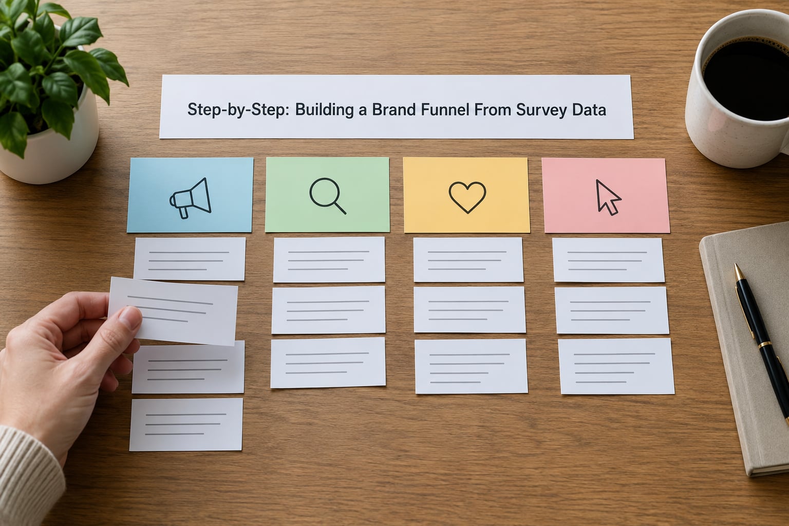
Then fix the stage list. Six stages is the standard model and matches the way most brand trackers are built. Awareness, Consideration, Preference, Purchase, Loyalty, Advocacy. The stage that holds your objective becomes the stage you watch most closely.
One honest caveat before you go further: respondents do not walk through these stages in a straight line, and a survey measures the state of their answers on the day they filled it in, not a sequence of events. Treat the funnel as a snapshot of how far each person has travelled, not a journey log. If someone says they consider you and also prefer a competitor, they sit in consideration, not preference.
2. Select the survey measures for each funnel stage
This is the step most guides skip and it is where your funnel is won or lost. Each stage needs one question whose answers can be scored unambiguously by one person in one afternoon.
| Stage | Measure | Question wording | Scoring rule |
|---|---|---|---|
| Awareness | Unaided recall | Which brands in this category have you heard of? (open text, blank) | Share naming your brand unprompted. Report separately from aided. |
| Awareness | Aided awareness | Which of the following brands have you heard of? (list shown) | Share selecting your brand. Use this as the funnel entry point. |
| Consideration | Consideration set | Which of these brands have you seriously considered buying in the past 12 months? | Share selecting your brand. Set must include all named competitors plus two filler brands. |
| Preference | First-choice preference | If you were buying one of these next month, which one would you pick? | Share naming your brand first. Preference share must sum to 100 across the set. |
| Purchase | Purchase or intent | Have you bought from this brand in the past 12 months? Yes / No / Not yet but likely | Yes alone for a conservative base. Report “not yet but likely” as intent, not purchase. |
| Loyalty | Repeat behaviour | How many times have you bought from this brand in the past 12 months? | Two or more counts as loyal. State the threshold in a footnote. |
| Advocacy | Recommendation intent | How likely are you to recommend this brand to a friend or colleague? 0-10 | 9 or 10 is a promoter, 0 to 6 a detractor, 7 or 8 passive. Report the Net Promoter Score as promoter minus detractor. |
Two wording rules. Never show your brand first or last in the list consistently — rotate the order or you will manufacture a primacy effect. And never let an answer to one question be assumed from another: someone who does not name your brand in open-ended recall has almost certainly not considered it, but someone who considered you did not necessarily prefer you.
3. Segment the responses before interpreting them
A single average across a mixed base hides the decision. Split the file by the two or three variables that actually change behaviour in your category — typically category user status, age band, region or channel of last purchase — and build a separate funnel for each.
Two guards against reading noise. First, only treat a segment as real if its base clears a workable size; under about 100 weighted respondents, a stage percentage swings several points on sampling error alone, and a three-point difference is not a finding. Second, never report a sub-segment you only thought of after seeing the data. Choose segments before you look, or label them exploratory so nobody treats a coincidence as a target market.
4. Convert findings into funnel-stage scores
Now do the coding. For each respondent, look at their answers to the stage questions and apply your written rule. The common rule is nested: a respondent counts in Consideration only if they are also Aware, counts in Preference only if also Considering, and so on. That produces a genuinely nested funnel where each number is a subset of the one above it, and every transition rate is meaningful.
Weighting comes next. If your sample carries a weight column, apply it before dividing, otherwise the respondent base is distorted wherever you oversampled. Then express each stage as a share of the weighted base, and calculate the transition rate as stage n divided by stage n minus one.
| Stage | Share of base | Transition from previous stage | Typical reference point |
|---|---|---|---|
| Awareness | 62% | Entry point | Aided awareness in most established categories |
| Consideration | 41% | 66% of awareness | Roughly half to two-thirds of aided awareness |
| Preference | 19% | 46% of consideration | Share of category demand you can realistically expect |
| Purchase | 14% | 74% of preference | Self-reported rate runs above actual by a wide margin |
| Loyalty | 8% | 57% of purchase | Repeat rate depends heavily on category cycle length |
| Advocacy | 4% | 50% of loyalty | Promoter share of all buyers |
Those numbers are illustrative, not benchmarks to hit. The pattern in them is the thing to notice: preference from consideration is the weakest transition in the whole funnel, while purchase from preference is comparatively strong. That gap is a positioning and claim problem, not a distribution problem.
Keep margin of error visible on this table. At a 62% stage share with a base of 400 weighted respondents, the 95% confidence interval is roughly plus or minus 4.7 points. Any transition rate that shifts by less than its own margin between waves has not moved, and reporting it as movement is how brand funnels lose credibility with a finance team.
5. Diagnose the biggest leaks and barriers
Largest absolute drop is the wrong target, and it is the mistake most teams make. Awareness to consideration always loses the most people in absolute terms simply because awareness is the widest stage, and chasing it usually means spending on reach you already have.
Rank the transitions by weakness instead: the transition with the lowest rate is where the argument is failing. Preference from consideration at 46% when purchase from preference runs at 74% says people like the brand and still choose something else, which points at the reason for choosing — price, proof, comparison, availability. Go back to the survey and find the barrier evidence: which competitor wins the preference question among people who consider you, and what attribute did those people say drove the choice.
Segment the leak the same way you segmented the funnel. A transition that collapses in one segment and holds in another is a targeted problem with a targeted fix, and it is the strongest argument you can bring to a leadership team.
6. Turn survey evidence into activation actions
Match the intervention to the leak type, not to the stage name.
Awareness to consideration leaks usually mean low relevance or category salience. Communication fixes work here: sharper category framing, more distinctive assets, tighter targeting so fewer irrelevant impressions land.
Consideration to preference leaks mean the brand is in the set but never wins the argument. This is an offer or claim problem — a proof point, a comparison, a guarantee, a reason to switch that a competitor cannot copy.
Preference to purchase leaks mean people want you and cannot act. That is experience and distribution: availability, stock, delivery, onboarding friction, the first ten minutes after buying.
Purchase to loyalty leaks mean the second purchase never happens. Retention is the fix — replenishment, reactivation, subscription, or simply being remembered at the right moment.
Loyalty to advocacy leaks mean satisfied customers who stay quiet. Service recovery and referral mechanics move this stage more than any campaign.
Write each action against one transition, with the survey evidence attached and the stage it should move named. An action without a named transition is a task, not a plan.
7. Validate the funnel and track movement
Hold the survey funnel next to your behavioural data before anyone builds strategy on it. Take the reported 14% purchase share, then check what share of actual customers that percentage represents. If they sit far apart, you have learned something important about self-report, and the survey funnel should be presented as a perception model rather than a demand estimate.
Set one KPI per transition, not per stage — the six rates are the things you are trying to move. Then rerun the same questions, in the same wording and the same order, on the same cadence. Changing wording mid-tracker breaks comparability, and a small team can rarely afford a restatement.
Wave over wave, report three things: the stage percentages, the transition rates, and whether each change clears the margin of error. That third column is the one that keeps the tracker credible through year two.
Common Mistakes
Treating engagement scores as funnel stages. If your stages are built from liking and relevance scales, you have an engagement index, not a funnel. Consequence: no transition rate is interpretable and nothing connects to behaviour. Correction: use behavioural and attitudinal questions with concrete answer options.
Skipping the category screen. Funnel numbers computed across non-buyers describe a market, not a funnel. Correction: screen for category user or purchase in the past 12 months, and reweight the base to the screening population.
Mixing nested and independent scoring. If Preference counts people who never considered the brand, the transition rate above it can exceed 100% and the whole shape breaks. Correction: pick one rule, write it down, apply it consistently.
Reading small segment gaps as signals. Correction: check the weighted base and the margin of error before you brief anyone.
Comparing against benchmarks built on different questions. A consideration rate from a “seriously considered” prompt is not comparable with one from a “would consider” prompt. Correction: match question wording, or label your number as directional.
Reporting preference share as market share. Preference sums to 100 across the set you showed, which is not the market. Correction: show the full set and say the denominator is the consideration set.
Rebuilding the model every wave. Correction: freeze the question wording, the coding rule and the segment definitions at launch, then change one thing at a time.
Frequently Asked Questions
How many survey responses do you need to build a brand funnel?
A base of 400 to 500 weighted respondents gives you stage percentages with a 95% margin of error of roughly plus or minus 4 to 5 points, which is enough to spot stage-level gaps and compare waves. If you plan to report three or four segments, each segment needs its own base of around 150 minimum or the transition rates inside it become unreadable. Anything under 100 respondents per segment supports exploration, not a decision.
What is the difference between aided and unaided brand awareness?
Unaided awareness asks which brands come to mind first with no prompt, so it measures salience: whether your brand has a place in memory at all. Aided awareness shows a list and asks which brands the respondent has heard of, so it measures recognition: whether the name means anything once it is in front of them. Unaided figures are always lower and always more flattering to the category leader. Report both, and use aided awareness as your funnel entry point because it matches how the other stages are measured.
How do you calculate a stage transition rate from survey data?
Divide the number of respondents who reach stage n by the number who reached stage n minus one, using your coded nested stages, and multiply by 100. In the worked example, 41 of 62 reaching consideration gives a transition rate of 66 per cent. Always apply survey weights before dividing. Attach the margin of error to the underlying stage percentages rather than the rate, since the rate inherits the error of both stages it is built from.
Can a survey tell you what people actually buy?
No, and it never has. Self-reported purchase rates typically run well above verified purchase data, partly from recall error and partly from the social pressure of saying yes to a stranger. That gap is not a reason to discard the survey. It is the reason to present the survey funnel as a model of perception and brand health, then validate it against your transactional data each wave and report both side by side.
Should the brand funnel and the conversion funnel be one model?
Keep them separate and put them next to each other. The conversion funnel is behavioural, built from analytics events on known visitors, and it measures what people who already arrived actually did. The brand funnel is attitudinal, built from a screened sample that includes people who will never visit your site, and it measures how far people have travelled toward you. Where they disagree, the difference is usually either a positioning problem or an acquisition problem, and finding out which is worth more than any single score.
How do you report a brand funnel so stakeholders act on it?
Lead with the transition rates, not the stage percentages. Put the worked table on one slide with the benchmark column beside it, mark the weakest transition, and name the intervention you are funding against it. Leave out composite brand health scores, because a single number invites arguments about weighting and hides the one transition you actually want changed. If you build a brand funnel from survey data but the deck contains no decision on the slide, the work gets filed and forgotten.
Conclusion
Start with the decision, not the chart. Write down the one choice you need the funnel to inform, pick one survey measure per stage with answer options specific enough to score, and then find the transition with the lowest rate rather than the largest drop. That number is your next quarter’s work, and it is the one thing the research was for. Updated for 2026, the model is not new — what makes it useful is that anyone can open the spreadsheet and see exactly where each percentage came from.