
Net Promoter Score misleads brand teams because it reports what people say they would do on a self-selected survey, not how customers actually behave or what they think of the brand. A rising score can sit next to falling repeat purchase, and a flat score can sit next to a real shift in loyalty. The arithmetic is not broken. The inference from it usually is.
That distinction matters more for brand and marketing teams than for customer operations teams, because brand budgets are large, slow to reverse and judged by the board. A metric that flatters gets promoted into agency scorecards and compensation plans, where it stops being a measurement and becomes a target.
I have watched teams defend a six-point NPS gain in a quarterly review while their referral channel traffic was flat and their churn for the smallest cohort was up. Nothing was fraudulent in that room. Everyone believed the number they were looking at.
Table of Contents
- What Net Promoter Score Actually Measures
- Why Net Promoter Score Misleads Brand Teams
- The Five Measurement Traps Behind a Misleading Score
- Trap 1: The three-band split throws away most of what customers said
- Trap 2: Self-selected samples get worse every year
- Trap 3: Benchmarks and rank changes arrive without any context
- Trap 4: The link to behaviour is looser than the folklore claims
- Trap 5: Small swings and target-linked pressure corrupt the signal
- The Average Hides Valuable Differences
- Benchmarks and Rank Changes Lack Context
- The Score Says Little About Why Customers Respond
- How to Audit Your NPS Measurement
- What to Measure Alongside NPS
- A Better Framework for Using the Score
- Frequently Asked Questions
- Is net promoter score misleading?
- What is the biggest problem with NPS?
- Is NPS better than customer satisfaction?
- How many responses are needed for a reliable NPS?
- Should a brand team use industry NPS benchmarks?
- How can NPS improve customer loyalty measurement?
- What Brand Teams Should Do First
What Net Promoter Score Actually Measures
Net Promoter Score comes from a single question asked on a 0 to 10 scale: how likely are you to recommend us to a friend or colleague? Fred Reichheld at Bain & Company published it in Harvard Business Review in 2003, and the formula has not changed since.
Respondents are sorted into three bands, and the score is the percentage of promoters minus the percentage of detractors.
| Group | Scores | What the band assumes |
|---|---|---|
| Promoters | 9 and 10 | Likely to recommend and likely to buy again |
| Passives | 7 and 8 | Neutral, or positive but not moved |
| Detractors | 0 through 6 | Unlikely to recommend |
The result lands somewhere between -100 and +100. Passives contribute nothing at all, which is the first place the arithmetic starts doing something no customer did.
That is genuinely all it measures: a stated intention, from whoever chose to answer, at the moment they answered.
Why Net Promoter Score Misleads Brand Teams
NPS misleads when teams read it as a direct measure of customer loyalty or brand strength. It is neither. It correlates loosely with some behavioural measures, it collapses a distribution into a single scalar, and it inherits every sampling weakness of whoever ran the survey and when they ran it.
The gap between the two readings looks like this.
| What the score appears to indicate | What it actually indicates |
|---|---|
| Customer loyalty | Stated likelihood to recommend at one point in time |
| Brand strength | Nothing about awareness, consideration, preference or emotional attachment |
| Experience quality | A verdict on one interaction, if that is when the survey was sent |
| Growth potential | Word-of-mouth intent, which converts at a rate nobody publishes consistently |
| Competitive position | Your score relative to others only if wording, sampling and timing match exactly |
None of this makes NPS useless. It makes it a signal with a narrow reading, and the brand-team trap is treating it as a verdict.
The Five Measurement Traps Behind a Misleading Score
Trap 1: The three-band split throws away most of what customers said
Here is the arithmetic nobody shows you in a board deck. Take four customer groups, all reasonably satisfied, and see what the score does with them.
| Every respondent answers | Promoters | Detractors | NPS |
|---|---|---|---|
| 6 | 0% | 100% | -100 |
| 7 | 0% | 0% | 0 |
| 8 | 0% | 0% | 0 |
| 9 | 100% | 0% | +100 |
A customer who moves from 6 to 7 to 8 registers a hundred points of improvement and lands on exactly zero. Jared Spool’s critique, quoted at length by digitalwaveriding, put it plainly: the 6-to-7 step produces no movement at all, and the boundary between detractor and passive has no justification in the data.
Brand teams feel this most sharply. A rebrand that makes people mildly positive but not enthusiastic moves the average. An operational fix that rescues a customer from a 3 to a 7 also moves nothing, because passives are invisible.
Trap 2: Self-selected samples get worse every year
NPS surveys are almost always opt-in, so you are measuring whoever cared enough to click. That population is not your customer base. It skews toward strong feelings in both directions and away from the quiet middle that spends the most and complains least.
Response rates have fallen steadily. One vendor’s own client data put its median program response rate at around 30% in 2014 and 25% in 2023, with top-quintile email programs dropping from roughly 47% to 36%. Public opinion polling tells the same story, with response rates falling from about 36% in the late 1990s to about 6% by the late 2010s.
At a 25% response rate you cannot make claims about brand health across a market. You have a self-selected panel of the activated, and it drifts further from the population every year you run it.
Survey fatigue compounds it. When customers are asked five times a year about five different things, the people who stop answering are disproportionately the satisfied ones who never had a problem worth reporting.
Trap 3: Benchmarks and rank changes arrive without any context
Industry benchmark tables rarely state whether the sample was transactional or relational, when in the relationship the survey fired, what the response rate was, or whether the question wording was identical. A comparison built on four unknown methodology choices is a comparison of sampling decisions, not of brands.
That is why a team can beat the published industry average and learn nothing at all.
Before trusting any vendor benchmark, ask five questions: what was the sample frame, what was the response rate, when was the survey triggered, was the exact question wording the same, and was it relationship-level or transaction-level.
Trap 4: The link to behaviour is looser than the folklore claims
Reichheld’s original evidence rested on cross-sectional correlations between NPS and retention across many companies, and he later acknowledged imperfections in the analytics. When researchers attempted an independent replication, the relationship did not hold up in the way the folklore implies.
The NHS example is the one I use with clients. Hip replacement patients scored an NPS around 71, knee replacement patients around 49, and only about 40% of the variation in the score was explained by patient satisfaction. Same institution, same survey, two very different experiences, and the gap between the numbers says much more about which operation patients rate more enthusiastically than about anything you can act on.
The underlying relationship is real but modest, and it is directional rather than predictive. Behaviour over time, especially retention and repeat purchase, is the ground truth NPS is allowed to hint at.
Trap 5: Small swings and target-linked pressure corrupt the signal
Because the score is a difference of two percentages, it is unstable at the sample sizes most teams actually use. A shift of a few points can be pure noise, and teams reliably react to it as if it were signal.
Practitioners on r/customerexperience describe the predictable pattern that follows: a sudden move, then an argument about cause, then a small campaign, then another survey, then another move.
Then the incentives arrive. The documented tactics include offering discounts for feedback, surveying only customers whose last interaction was positive, controlling who receives the survey, and staff or sales teams completing surveys on behalf of customers. One agency owner reported an 80-plus point improvement achieved with no organisational, team or individual target at all, which is the clearest argument yet that targets are what corrupt the number.
For brand teams the damage is structural. NPS gets pulled into agency scorecards, into agency compensation, and into a single line of a board deck. Once a number sits in a commission plan, the honest version of it stops being what the board sees.
The Average Hides Valuable Differences
A single company average is a weighted blend of customers whose situations have almost nothing in common. Two brands with an identical NPS of +30 can have opposite problems underneath.
Take a subscription business reporting +30. New customers at 90 days sit at 62. Customers in month eight sit at 24, because the ones who disliked month one already left and never got surveyed. The highest-paying enterprise segment sits at 38, and their complaints cluster around a single integration that only affects accounts over a certain size.
The blended 30 is arithmetically correct and operationally useless. A team that fixes the integration might add four points overall while the score barely moves, and a team that does nothing keeps reporting the same number for three quarters.
Segments worth splitting almost always: tenure, product or plan, geography, channel, price tier and account size. In B2B, add stakeholder role. One respondent, one score, across an account with five stakeholders tells you almost nothing about whether the account renews.
Cultural and language effects make this worse across markets. A 0 to 10 scale does not behave identically in every country, and acquiescence bias pushes some populations upward while others compress toward the middle. Comparing a score collected in one market to a score collected in another is not a benchmark, it is an artefact.
Benchmarks and Rank Changes Lack Context
Year-over-year movement is the other comparison teams over-read. Before treating a four-point gain as improvement, establish that the sample frame, question wording, trigger points and weighting are unchanged, and that the movement is larger than the uncertainty around it.
Seasonality alone can produce swings that look like strategy. Retail peaks, renewal cycles cluster, support volume shifts, and any survey fired after a busy period reads differently from one fired in a quiet month.
Before you act on a jump, check whether the survey trigger moved. Practitioners are consistent on this point: a sudden spike usually means the invitation list changed, not that the brand suddenly became excellent.
And when the number does move for a real reason, that is still a signal about recommendation intent. Whether it maps to more purchases is a separate question with a separate answer.
The Score Says Little About Why Customers Respond
A rating is a verdict without a reason attached. Two customers giving identical 4s may be reacting to price and to a slow delivery, and they need opposite responses.
Recommendation intention is also distinct from the things brand teams actually care about. Satisfaction with a transaction, emotional attachment to a brand, perceived value against alternatives, and the intention to buy again are four different constructs with four different drivers.
This is why the follow-up question matters more than the score. Ask why, in the respondent’s own words, and route the answers by band. Detractors get closed-loop follow-up within 48 hours. Promoters get asked what they would tell a friend. Passives get asked what would move them one point, which is the segment everyone else ignores and often the largest group in the file.
Transactional and relational NPS fail in opposite directions. Transactional surveys fire right after an interaction, so they grade the interaction and flatter the brand. Relational surveys ask about the whole relationship and usually run lower, sometimes much lower, because a customer can dislike a specific moment while still trusting the company.
eNPS, the digital version, compresses the distribution further because digital users rate in narrower bands, so a small change in the underlying experience produces a smaller change in the score. That makes it harder to read, not easier.
How to Audit Your NPS Measurement
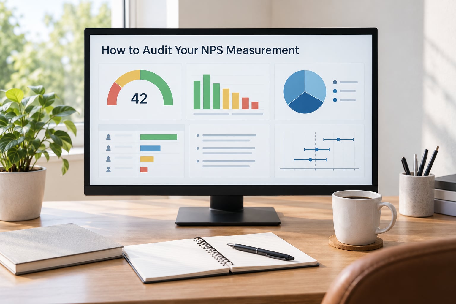
Run this audit before you debate whether the score is good or bad. Most disappointing numbers turn out to be a design problem rather than a customer problem.
- Write down the decision the score is meant to inform. If nobody can name a decision, the score is decoration.
- Check the sampling frame. Who is eligible, who is invited and who actually answers.
- Record the response rate by segment. A blended figure hides the segments that stopped replying.
- Confirm the question wording is identical. One reworded word breaks the time series.
- Map every survey trigger. Note when it fires, because the trigger shapes the answer.
- Verify the weighting. Check it against actual customer counts, not just last year’s customer counts.
- Check subgroup coverage. If a segment is under 30 responses, say so rather than reporting a number.
- Attach a confidence interval to every reported figure. A point estimate alone invites over-reading.
- List every place the number appears. Scorecards, bonuses, decks, agency reports. That list is where the pressure lives.
Then look at the distribution, not the average. The shape of the response distribution tells you whether you have a genuine loyalty base or a pile of mildly positive passives with a thin tail of advocates.
What to Measure Alongside NPS
NPS holds its place as one directional signal. It gets dangerous when it is the only one. A workable brand measurement system pairs what people say, what they do, and what they tell you in their own words.
| Measure | Question it answers | Gap it closes that NPS leaves open |
|---|---|---|
| Customer satisfaction (CSAT) | How did this specific interaction go | NPS gives no indication of which part of the journey failed |
| Customer effort score (CES) | How much work did this take me | Shows friction that produces quiet dissatisfaction rather than detraction |
| Relationship strength | How much do they trust us, how hard would they be to lose | Recommendation intent is not the same as switching resistance |
| Retention and churn rate | Do they actually stay | Behaviour beats stated intent, always |
| Repeat purchase frequency and customer lifetime value | How much does this relationship produce | Turns loyalty into a number the finance team recognises |
| Referral rate, counted in actual sign-ups | Do they act on the recommendation | Turns the intent NPS measures into an observed behaviour |
| Complaint incidence and resolution time | What is going wrong, and how fast is it fixed | Captures problems that never reach a survey |
| Qualitative voice of customer | Why, in their words | Restores the signal a scalar destroys |
Brand tracking sits alongside all of this rather than inside it. Awareness, mental availability, consideration and preference answer a different question: whether the brand is in the set at the moment of demand. No customer experience metric substitutes for that, which is the core reason why net promoter score misleads brand teams even when the survey itself is well run.
A practical reference point on ambition: Bain’s oft-cited work suggests that a 5% improvement in retention can lift profit in the 25% to 95% range depending on sector. Whatever the survey says, retention is where the money is.
A Better Framework for Using the Score
If you keep NPS, this is the sequence that keeps it useful.
- Start from the business question, not from the metric. Retention in a specific cohort is a question. NPS is a lens on it.
- Segment before you interpret. Report by tenure, product, geography, channel and account type, and set a minimum sample size below which you publish nothing.
- Read the distribution, then the average. Watch the promoter share and the passive share separately, because passives are where movement happens without moving the score.
- Always ask why, and code the open text. That is what turns a number into a diagnosis.
- Quantify the likely impact before you spend. Link each score change to a behavioural change in the same segment.
- Compare options against behaviour, not against each other. If two initiatives produce the same NPS move, choose the one with better retention evidence.
NPS still works well in three places: as a low-cost directional weather forecast read next to retention cohorts, as a trigger for closed-loop follow-up with unhappy customers, and as a comparable trend within your own program over time.
It does not work as a benchmark against other companies, as a UX rating, as a measure of customer loyalty, or as a number attached to financial reward.
If the board has mandated NPS, keep it and put guardrails around it: no target tied to compensation, published response rate and interval beside every figure, a written rule that benchmarks must disclose methodology before use, and a second and third metric that carry equal weight in the deck.
One practitioner framing I like: run NPS as a weather forecast. It is cheap, occasionally wrong, and worth glancing at before you go outside. Just do not plan a trip on it.
Frequently Asked Questions
Is net promoter score misleading?
It can be. NPS reports stated recommendation intent from a self-selected sample, not brand strength, purchase behaviour or experience quality. The calculation is accurate; the inference drawn from it often is not. A score can rise while repeat purchase and referrals fall.
What is the biggest problem with NPS?
The biggest problem is inference. Teams treat a relative ranking metric as a direct measure of loyalty, skip segmentation, and compare benchmarks collected with different sampling and timing. The three-band split hides most nuance, so real improvement from a 6 to an 8 shows up as no change at all.
Is NPS better than customer satisfaction?
They answer different questions, so neither replaces the other. NPS asks whether the customer would recommend you, which captures overall relationship sentiment. CSAT asks about a specific interaction, which tells you where friction happened. Most credible programs run both and read the gap.
How many responses are needed for a reliable NPS?
There is no single number, because precision depends on the margin of error you need and on how many subgroups you intend to report. With a 25% response rate you get a clean blended figure that still says little about people who declined. Publish the interval, not just the point estimate, and avoid reporting subgroups under 30 responses.
Should a brand team use industry NPS benchmarks?
Only with caveats. Benchmarks rarely publish response rates, sampling frames, trigger timing or exact question wording, so a comparison often measures methodology rather than brand performance. If you use one, ask those five questions first, and prefer your own historical trend against an unchanged survey design.
How can NPS improve customer loyalty measurement?
Keep it as one directional signal inside a wider system. Add a why question, segment by tenure, product, geography and channel, follow up with detractors within 48 hours, and pair the score with retention, repeat purchase and counted referrals. Behavioural data tells you whether the loyalty is real.
What Brand Teams Should Do First
Stop reporting the score on its own. Open every deck with the response rate, the interval and the segment breakdown beside it, and refuse to celebrate a move smaller than the uncertainty around it.
Then pull the subgroup distributions and read the passives, because that is where the room to move is. Add the why question, code the answers, and route detractors to a human within two days.
Next, connect the score to behaviour: retention, repeat purchase and counted referrals in the same segments. If NPS moves and behaviour does not, believe the behaviour.
Finally, write down an uncertainty rule your team will not break, and treat NPS as one signal in a broader customer measurement system rather than the brand’s verdict on itself.
Used that way, the score is a cheap directional read that occasionally warns you something real. Used alone, it is a single number that quietly makes the important decisions for you.