Store layout shapes basket size because it decides where shoppers walk, what they pass on the way, and how long they stay in the building. A floor plan controls movement, movement controls exposure and dwell time, and those two together decide what lands in the basket alongside the item the shopper came for.
Here, basket size means the transaction, not the wicker one. It is usually tracked as average transaction value or units per transaction, and it is the metric that responds to fixtures, category adjacency, signage, and the checkout run rather than to price or promotion. Since the query keeps surfacing home-decor pages about storage baskets, that distinction is worth making up front.
As of 2026, the honest summary is that layout is one of the cheapest levers a retailer has and one of the hardest to get wrong. It is also the easiest one to get wrong, because a plan that sends shoppers the long way round can raise revenue in one week and cost you the same shoppers in a month.
Table of Contents
- How Store Layout Shapes Basket Size: What Actually Changes
- What Is Basket Size, and Which Store Layout Changes Actually Matter?
- Why Do Shoppers Behave Differently in Stores With the Same Floor Plan?
- How Do Entrances, Aisles, and Circulation Routes Affect Purchases?
- Why Does Product Adjacency Change What Shoppers Buy?
- How Do Visibility, Signage, and Displays Guide Decisions?
- Why Do Small Purchases Lead Shoppers Toward the Checkout?
- How Can Retailers Design a Store to Grow Basket Size Responsibly?
- How Do You Test Whether a Store Layout Change Works?
- What Mistakes Can Make a Layout Change Hurt Performance?
- Frequently Asked Questions
- Does a bigger store necessarily lead to a larger basket?
- What store layout encourages impulse purchases without increasing customer stress?
- How should complementary products be positioned in a store?
- Does eye movement mean a shopper will buy a product?
- How many weeks should a retailer test a new store layout?
How Store Layout Shapes Basket Size: What Actually Changes
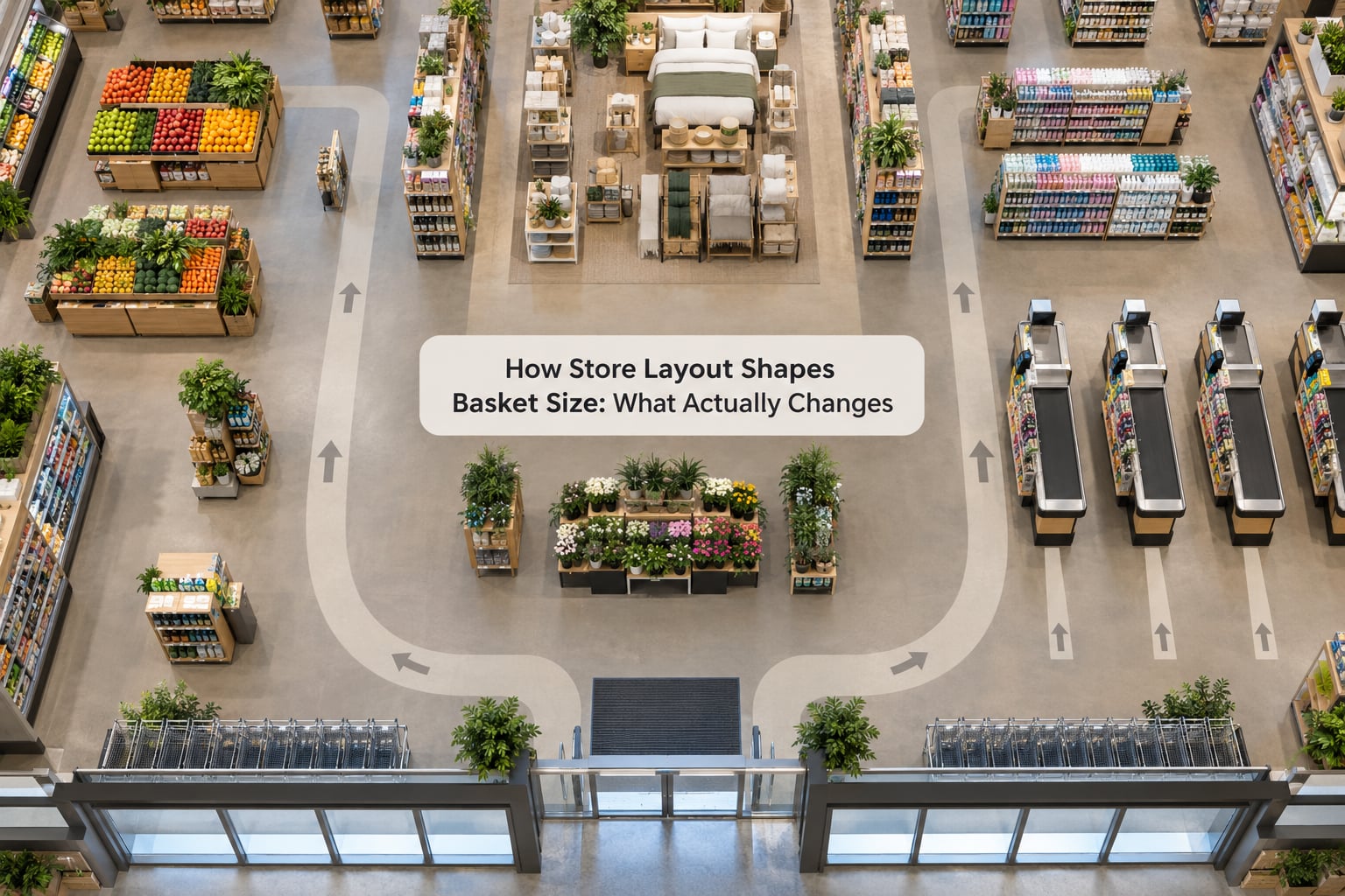
Five levers do most of the work: circulation, category adjacency, visibility, destination anchors, and choice architecture. Each one changes what a shopper meets and in what order, which is where the basket effect comes from.
| Layout lever | What it changes | Likely basket-size effect |
|---|---|---|
| Circulation | The route a shopper is funnelled along | More products encountered per minute of shopping; lift depends on whether the route feels efficient |
| Category adjacency | Which categories sit next to each other | Most direct lever for add-on purchases, since it puts the second item in front of someone already holding the first |
| Visibility | What is seen, from how far away | Sets the ceiling on consideration; no exposure means no chance to add |
| Destination anchors | Where the shopper is heading first | Determines whether the rest of the floor is walked at all |
| Choice architecture | How many options face the shopper at a decision point | Fewer, clearer choices shorten decisions and speed the whole trip |
None of these is a switch you flip once. They interact, which is why a plan that looks good on paper can behave oddly on a real floor.
What Is Basket Size, and Which Store Layout Changes Actually Matter?
Retailers use basket language for at least four different things, and mixing them up is how well-meant layout work ends up unmeasured.
Basket value is the money in one transaction. Units per transaction is the item count. Attachment rate is the share of transactions where a given category was bought alongside another, usually tracked as a percentage of the base category. Basket composition is the mix, the pattern of which categories travel together.
These can move in opposite directions. A tighter plan can raise attachment rate on coffee while lowering units per transaction, because people find the coffee faster and leave the aisle sooner. A more generous aisle can do the reverse.
It also helps to separate what a retailer controls from what it does not. Fixture placement, adjacency, signage, sightlines, queue design, and cart capacity are yours. Shopping mission, trip frequency, store format, weather, seasonality, and local customer mix are not. A refit that lands three weeks before a seasonal buying peak will flatter itself in the data, and a competent analyst will read it that way too.
Why Do Shoppers Behave Differently in Stores With the Same Floor Plan?
Two shops can run identical floor plans and produce different baskets, because layout is a prompt rather than a command. The response depends on who walked in and what they came for.
A shopper with a list of nine items is in planned mode. She moves fast, scans labels, and ignores most of what she passes. In that state, layout matters mostly through speed and findability: a clear aisle gets her back to the checkout sooner, and endcaps get glanced at only if they are on her actual path.
A shopper without a list is in exploratory mode. She browses, doubles back, and picks up things she could not have named on the way in. Here, exposure is doing the work, and a plan that funnels her past a well-placed pairing is worth more than a plan that gets her through the door quickly.
Then there are the modifiers. Time pressure compresses the trip and kills exploratory browsing. Familiarity with a store lets a shopper skip the signage entirely and go straight to a known aisle, which makes adjacency matter more and wayfinding matter less. Crowding does something stranger: a 2021 study by Aydinli and colleagues asked how customers alter basket composition when they perceive the store as crowded, and the finding runs against the popular story that a busy floor lifts baskets. Under perceived crowding, shoppers changed what they bought rather than buying more of it.
Store atmosphere works on the same channel. Music, lighting, scent, and temperature are grouped in the literature as atmospheric cues, sitting alongside layout and design rather than separate from it.
How Do Entrances, Aisles, and Circulation Routes Affect Purchases?
Circulation is the spine of the plan. Get it wrong and every other decision gets discounted, because the shopper has already spent attention on being annoyed.
Entrances. What the shopper can see from the threshold sets their first expectation of the store. A visible anchor department, whether that is a produce wall, a footwear bay, or a coffee counter, pulls people deeper before they have decided to commit. If the anchor is tucked around a corner, more of the floor is skipped.
Loop or racetrack routes. A defined path gives most shoppers a simple heuristic for where to start and where to finish. The trade-off is that it repeats the same floor plan in every store, and shoppers learn it, then walk through it on autopilot with their eyes off the shelves.
One-way aisles. These help in crowded conditions and in formats where flow control is the operational problem, such as a small supermarket at peak hours. They reduce backtracking and improve the sightline down the aisle. They also remove the option of turning around after seeing something, which costs a little exposure on anything that needs a second look.
Aisle width. A narrow aisle raises the chance of a pause or a side glance; a wide aisle lets two-way traffic and browsing coexist. Very narrow aisles with hardlines on both sides are where shoppers stop rather than look.
Dead ends and blind corners. A dead end reads as a mistake. Shoppers who hit one tend to disengage from the plan for a while and start improvising, which is not the same as exploring product.
Shelf orientation. Aisles that run perpendicular to the entrance sightline pull people across the floor. Aisles that point straight out into a back wall can send them into a corner rather than onward.
Checkout placement. Checkouts that are visible from the entrance give an early signal about how easy the exit will be, which affects how willing shoppers are to keep walking. Checkouts hidden behind a display wall can lengthen the visit and leave people queueing in a place they did not expect.
What no route does is raise a basket automatically. A shopper on a mission who finds everything the first time buys what they came for and leaves. Circulation raises the ceiling on exposure; whether that turns into items is a merchandising and mission question on top of it.
Why Does Product Adjacency Change What Shoppers Buy?
Adjacency is the cheapest layout lever with the most direct effect on basket size, because it puts a second item in front of someone who is already holding the first.
The mechanism is sequential buying. Someone picking up pasta sauce is in a decision state for pasta, pasta sauce, and the cheese that goes with it, all at once. Put the grated cheese on the same run and the basket grows with no extra persuasion. That is the whole trick, and it works in both grocery and general merchandise.
Cross-merchandising is a deliberate version of it: a bread display at the deli counter, a shower curtain beside a towel rail, a screen protector at the till of an electronics counter. The useful test is whether the second item answers a question the first item raises. If it does, shoppers read it as helpful. If it does not, they read it as clutter.
Affinity-based placement uses your own transaction data instead of intuition. Take the item pairs that already appear together often and put those departments side by side. Aydinli’s crowding work is a useful reminder of the other half of the picture: shoppers respond to conditions, and a plan tuned for a calm Tuesday can behave differently on a busy Saturday.
Where adjacency fails is crowding and distraction. Overstacking a run with related items makes shoppers stop and assess, which sometimes helps and sometimes makes them leave the aisle to get on with the list. Signs of that are easy to see: the queue at the end of the aisle shortens, or the shelf gets picked over rather than bought.
Substitutes are a special case. Putting two competing versions of the same thing next to each other makes a real comparison, and sometimes it produces a purchase and sometimes a decision to come back later. Comparison sets earn their space in categories where the difference matters and waste it where it does not.
How Do Visibility, Signage, and Displays Guide Decisions?
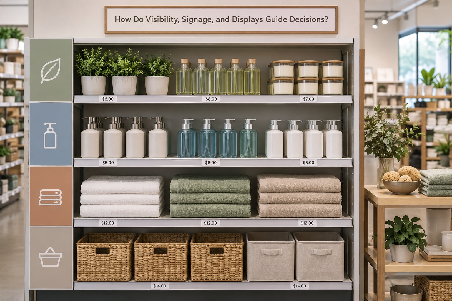
Visibility sets the upper limit on basket size. A product nobody sees cannot be added, however well it is placed for the person who does look.
Shelf position is the bluntest version of this. Eye-level and hand-level runs get noticed and get picked over first; the bottom shelf does a different job, which is holding stock that does not need to sell quickly. Top shelf above eye line works for bulky items you want seen in outline. Buyers already know, so the honest use of the low run is storage and price messaging.
Signage does two jobs. Department markers give people a map without having to read the products, which cuts the time to find something and cuts the number of people who give up. Price and promotional signs carry information. Both work best when they are legible from the aisle, not readable only from arm’s length.
Endcaps and focal displays get a share of attention far larger than their footprint, mostly because they break the visual rhythm of a shelf run. The cost is that they cannibalise: some of what they sell would have sold anyway.
Shelf capacity is the quiet constraint. A display with room for twelve items holding forty looks abundant in a photo and blocked on the floor. If you want people to browse, you need the facing to be readable.
Here is the caution that most write-ups skip. Attention is not purchase. Eye-tracking tells you a shopper looked; it does not tell you they took the item, or that they would have missed it somewhere else. Treat a gaze study as a hypothesis about placement, then check the hypothesis against transactions. Exposure that does not convert is usually a merchandising or stock problem, not a layout one.
Why Do Small Purchases Lead Shoppers Toward the Checkout?
Checkout-adjacent merchandising is the most visible basket lever and the one most likely to annoy people, so it deserves a plain look rather than a sales pitch.
The honest version of the case for it is this: at the till a shopper is already committed, already waiting, and has low tolerance for anything that slows the transaction. A small, genuinely relevant add-on, such as a battery or a snack to go with the item just scanned, can be added without anyone rethinking their purchase.
That tolerance has a limit. Anything that requires a decision, a search, or a walk to a back aisle turns the queue into an obstacle other shoppers have to navigate. Researchers in the queue-and-waiting line literature have looked at exactly this: perception of fairness and the sense that the line is moving affect how people respond to being asked to buy more.
There is a second reason to be careful, and it is not about stress. Basket behaviour at the checkout is where shoppers notice manipulation most sharply, because that is where the ask is explicit. A store that runs this zone well gets credit. A store that overplays it gets remembered.
If you are testing it, measure three things rather than one: whether total basket value moved, whether the queue felt longer to shoppers, and whether anything else in the store got worse. A change that lifts the till and slows the exit is a trade, not a win, and only the third measurement tells you whether it was a good one.
How Can Retailers Design a Store to Grow Basket Size Responsibly?
Layout work goes wrong when it starts with fixtures and works backwards to a shopping mission. The order below starts with the trip and lets the plan follow.
- Map the missions, not the departments. Write down the top five reasons people walk in, and check what fraction of shoppers are on each. A store serving mostly top-up missions needs findability. One serving occasional stock-up missions can afford more browsing space.
- Chart the current journey. Watch or count how people move through an ordinary trading day, including where they stop and where they turn around without buying. The parts of the plan they ignore are the parts that are not doing a job.
- Identify complementary needs from your own data. Use basket analysis to list the categories that genuinely co-occur. This is more reliable than a brainstorm, and it is data most chains already have.
- Build adjacency along real pairings. Place those categories along one continuous run where a shopper can see both without a decision point. Keep the pairing legible, not crowded.
- Protect navigation. Sightlines, department markers, and a visible checkout all protect the path. Every gain in exposure that costs a shopper their sense of where they are gets repaid later in abandoned trips.
- Pilot before you refit. Test one change in one part of the floor, or in a small number of stores, before committing fixture money.
A quick pre-flight checklist: can a first-time visitor find the main departments in under a minute, is every category marker readable from the aisle, is anything blocking a sightline you need, does any pairing interrupt a list-driven route, can a wheelchair or a loaded trolley pass through the tightest point, and would you be comfortable explaining this plan to the customer who complains about it.
That last question is doing more work than it looks. It catches the plans that technically raise a number while making the store feel worse to be in, which is how basket growth turns into customer loss.
How Do You Test Whether a Store Layout Change Works?
Layout testing is awkward because you cannot run two versions of the same store at the same time, and because stores are noisy. The designs below handle that, in rough order of increasing cost.
Matched-store comparison. Pick test stores and control stores similar in size, format, trade area, and historical performance, then apply the change to the test group only. This is the workhorse for a multi-site chain. It needs enough stores in each group that the result is not just one good week.
Sequential before-and-after. Cheapest, and the easiest to get wrong, because trading conditions drift underneath you. If you must, use the same stores, the same seasons, and a reasonable baseline window, and be humble about what a single comparison can prove.
Staged rollout. Apply the change to a single area of one floor first. Cheap, fast, and it tells you about local response rather than whole-store effect. Watch out for shoppers routing around the changed zone, which quietly transfers sales elsewhere.
Whichever design you use, decide the metric before you start, and pick one primary. Basket value is the most familiar but the noisiest, since it moves with mix. Units per transaction is cleaner for layout work because it is less sensitive to a price change. Attachment rate on a specific pair is the most direct read on an adjacency change. Conversion rate tells you whether the plan is working at all.
| Metric | What it isolates | Main caveat |
|---|---|---|
| Units per transaction | Whether shoppers take more items per trip | Ignores price and mix changes |
| Basket value | Total money per trip | Moves with promotions as well as layout |
| Attachment rate | Whether two categories co-occur more often | Slow to move in low-frequency categories |
| Dwell time | Whether the plan holds people in the store | More time is not automatically more basket |
| Conversion rate | Whether transactions as a share of footfall | Sensitive to counting errors and staffing |
Then control the noise. Keep promotions, price changes, and seasonal events out of the window or hold them constant across groups. Keep availability steady across both groups, because a hero product running out or missing from the shelf looks exactly like a layout failure. Note the weather, the local events, and the footfall mix. And give it long enough that you are not reading a novelty week: most store trading cycles have a rhythm, and a change measured across one quiet period is a coin flip.
Set the decision rule before you launch. How long, what magnitude, and what happens if it lands in between. Add a qualitative check, because shoppers will tell you things the till does not, particularly about whether they could find things.
What Mistakes Can Make a Layout Change Hurt Performance?
Most underperforming refits share a short list of causes, and each one has a straightforward correction.
Changing everything at once. If the plan, the signage, the assortment, and the pricing all move together, you will attribute the result to the part you like best. Change one variable, or accept that you are buying information rather than proof.
Maximising exposure past the point of comfort. Dwell time is not the goal; a sale is. Layouts that keep people moving in narrow, cluttered aisles often reduce both.
Blocking sightlines. Tall stacks and gantry displays hide the departments behind them. The shopper sees products, not a store, and spends the visit decoding rather than buying.
Confusing a maze with discovery. Difficult routes are not the same as interesting routes. If people cannot describe the path afterwards, the plan cost you time without buying anything.
Relying on one impulse zone. A single till display or endcap is a lottery. Build the add-on logic into the main run instead of parking the whole strategy at the exit.
Weak adjacency. Placing departments near each other without a real relationship between them adds distance to the trip and nothing to the basket.
Declaring success on revenue alone. Revenue can rise because the best customers spent more while casual shoppers left. Check conversion and repeat behaviour before you roll the plan out.
Frequently Asked Questions
Does a bigger store necessarily lead to a larger basket?
No. A larger store raises the amount a shopper can encounter, but basket size depends on what the shopper came for and how easily they find it. A bigger floor with poor signage and scattered categories can produce a lower basket than a tight, well-signed store. Test store size as one variable, not as a strategy.
What store layout encourages impulse purchases without increasing customer stress?
Layouts with clear sightlines, comfortable aisle widths, visible department markers, and a visible checkout. These keep shoppers oriented and moving at their own pace, which is what creates unplanned add-ons. What raises stress is crowding, blocked sightlines, queues that stall, and displays that force a decision while the shopper is waiting to pay.
How should complementary products be positioned in a store?
Put them on the same continuous run, visible from the main aisle, with the shared decision in clear sight. Use real basket data rather than intuition: the categories that already co-occur most often are the safest pairings. Keep the pair legible instead of crowded, since an overstacked run can push a list-driven shopper out of the aisle.
Does eye movement mean a shopper will buy a product?
No. Attention is a necessary step, not evidence of purchase. Shoppers look at products they have no intention of buying, and they miss products they end up wanting. Treat gaze data as a hypothesis about placement, then check whether the shelf actually sells more after the change.
How many weeks should a retailer test a new store layout?
Long enough to see at least two full trading cycles, which usually means six to eight weeks for a grocery or convenience store and eight to twelve for a slower format. Match control stores on size, format, and trade area, and keep promotions constant. Deciding the decision rule before launch matters more than the exact length.
If you only have time for one thing this quarter, chart how shoppers actually move through your floor before moving a single fixture. Layout works because it changes the route, and the route is the part most retailers have never actually watched.